
Mood Board
Ole Christiansen
Christiansen has worked to create several record covers, magazines and exhibitions during his photography career. He gravitates towards photography that links to music, which involves photography for album/record labels and sometimes the artist themselves.
Image Analysis
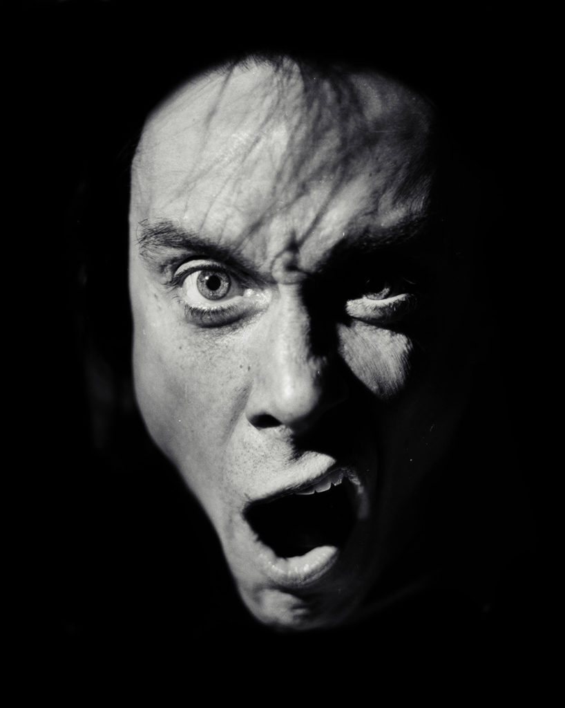
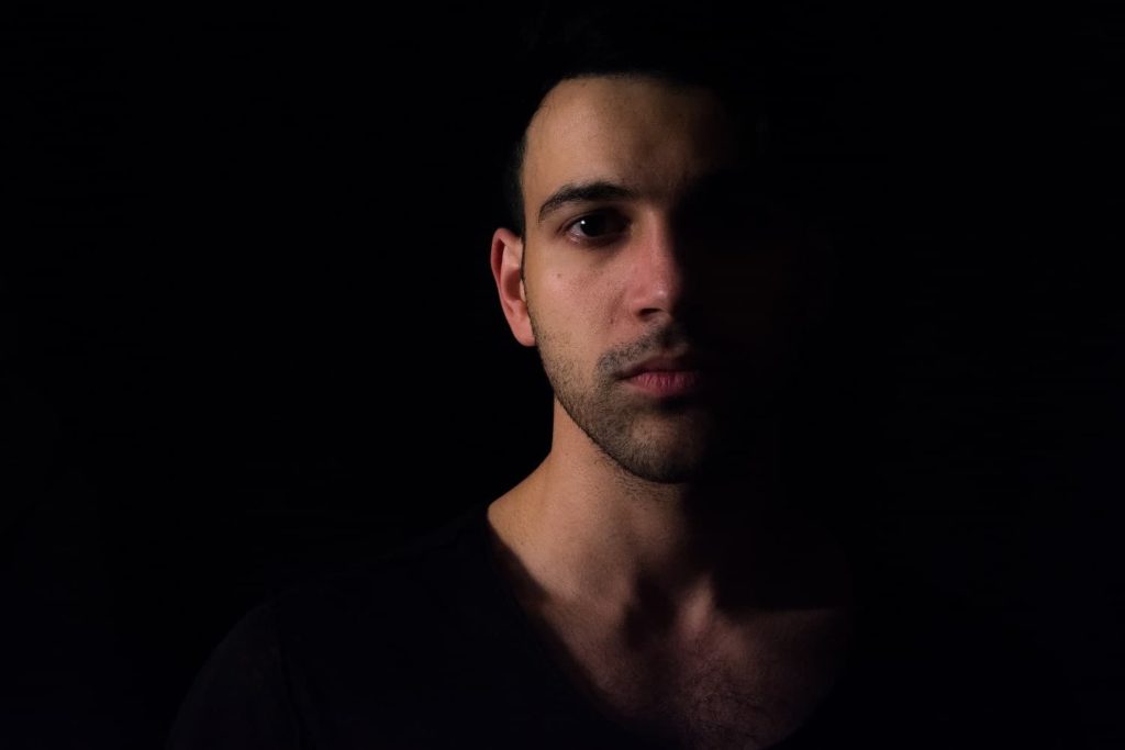
This image uses a light which has been positioned to show only the model’s face, with a Rembrandt angle. The lighting is harsh, as it creates a bold shadow behind the nose which leads to the right side of the face, the shadowed parts are pitch black, which heavily contrasts with the lit up parts on the left side of the model’s face, giving it a chiaroscuro look. I think a black and white filter is appropriate for this image as it allows that contrast to be seen more easily. I like the way the model’s facial expression and the lighting makes the image look that much more mysterious and isolates the emotion from the facial expression, emphasizing it. I think that a straight-on viewpoint was also effective as it allows the face to be centre in the image, while making the staring expression of the model that much more noticeable.
My own Images
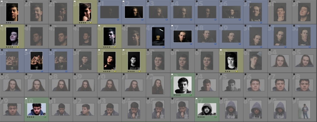
My Best Images

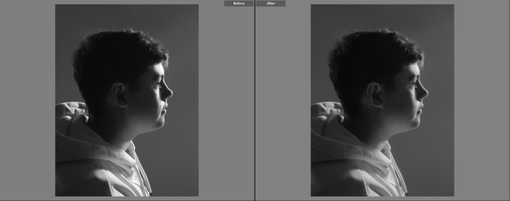
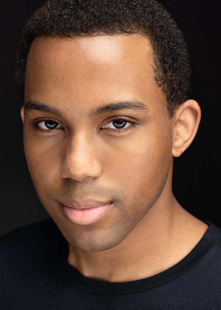
I chose this image because I like how the model’s face is lit up, it allows his facial features to be seen more easily, despite being a side-on shot. I also think that the lighting helps give his face slightly more depth. There is not a lot of contrast in this image, likely due to how the majority of his face/head and the background are a similar tone of grey, however the white on his clothing and darker black of his hair does create an interesting contrast.

I mainly like this image because of its colder tone which gives the image a look that is close to black and white, but not exactly. I like the way the side/one-point lighting creates a dense shadow on the left side of the models face, completely obscuring it. The shadow contrasts greatly with the highlights on the models face and makes the left of the image almost completely black, creating a harsh divide between the sides, which makes the image slightly more mysterious.
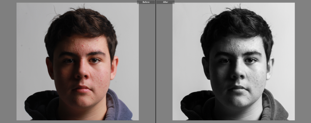
I like this image because of how simplistic it is, I think it, paired with the front facing stare, allows the model to take all of the attention of the viewer. I think that black and white works well in this image as it allows the shadow to become harsher and more distinguished from the lighter parts of the image. This image uses Rembrandt lighting which gives the model slightly more light, which makes more of his face visible. I think that the white background helps isolate/frame the model nicely.
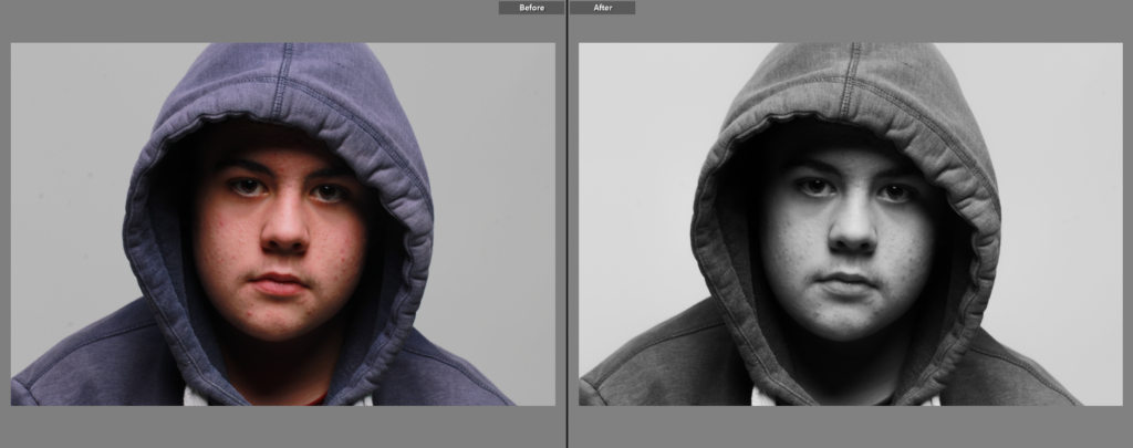
I chose this image as a final image because I like the way that the hood casts a shadow over the model’s eyes and chin (making the face stand out behind a black ‘frame’), but allows for a butterfly light to appear as well. I think the black and white filter was appropriate for this image as it makes the shadows darker, creating a greater contrast between the highlights and the white background of the image.

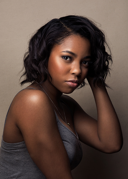
I chose this image because I like how the model’s face’s colour contrasts with the rest of the image, his clothes specifically being made up of dark blues and purples. I also think that the simple, casual pose paired with his relaxed facial expression creates a nice, calmed atmosphere about the image. I think that the softer lighting, which illuminated the grey backdrop, also helps with this calmed atmosphere, with the grey backdrop providing some contrast, but not too much.