I went through all my photoshoots and picked some photos from each that I thought were successful photos, checking the lighting, framing and sharpness of each image, before adding to a collection I created in Lightroom for printing, having about 20 photos in total. From there, I went through all my photos again and lowered it down to these final 11 where I made some small adjustments to each image and exported them in he correct size, ready for printing.

My Final Images:

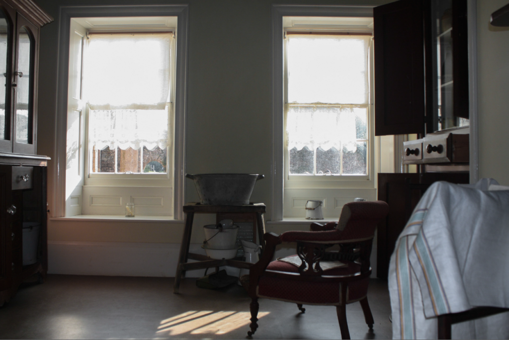
I decided to print this image as I liked the composition of it along with the lighting. I think these elements work well together and create an interesting photo that accentuates the emptiness of the once lively house.

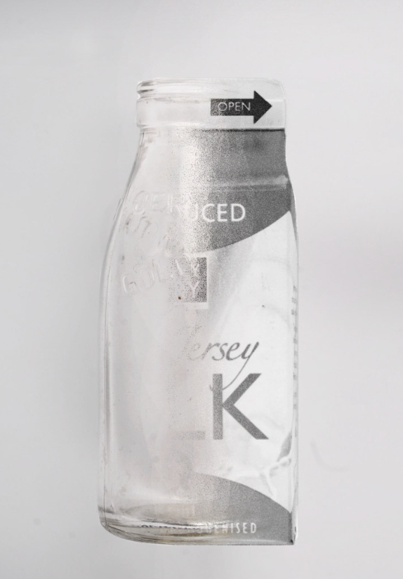
I chose to print this image as I liked it’s simplicity along with the contrast between the natural lighting and shadows inside. I think it creates a peaceful scene especially as the light hits the vase at an angle which emphasises the desaturated colours of the photo [excluding the flowers], creating a soft morning look.

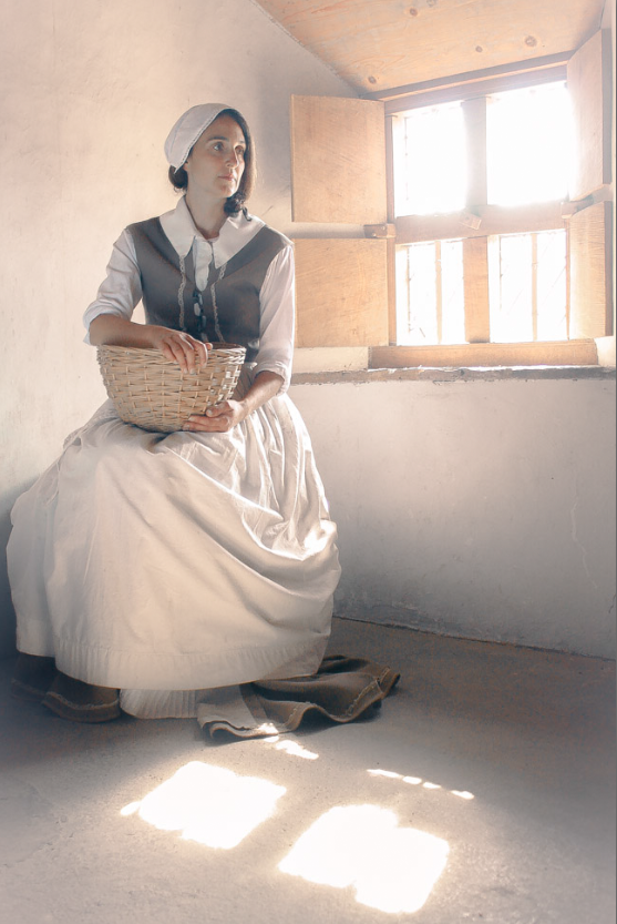
I picked this image as I thought the framing created an interesting scene, especially as the light going through the window is being reflected onto the floor making the photo look more interesting . I also think the warm tones of the photo add to the image as they emphasise the shadows and overall help add to the dream-esque image.

This image was selected as it was in focus, allowing all the details of the basket plus any background details to be clearly seen. Along with this, I like the contrast between the shadows and the warm light falling across the basket as it highlight’s the texture of the basket.

I decided to print this image as I think the birds-eye-view created a well framed image [even though it’s slightly out of focus]. I also like how there’s enough light so that the colours of the fruit stand out against the red tone of the table without overpowering the whole image.

This image was selected as it was in focus, allowing the details on the objects and wall to be seen clearly and because I liked the lighting. Although it’s dark, the highlights on the objects stand out, further accentuating the details in the image.

I chose this image as I liked the angle of the photo and thought it worked well with the newspapers that I was photographing. I also like the yellow tint of the photo, giving the newspapers and older look.

I selected this image as I liked how different it was from my previous edits. I thought it would stand out, especially with the colour scheme and composition of the image which would vary the type of images I chose to print.

This photo was chosen as I like how seamless the transition between the two images is. I also like how bright it is, mostly due to it being a black and white image, allowing the image to stand out even with the lack of colours.

I decided to print this image as I liked the amount of texture within it, the creases disrupting the otherwise organised photo. I also like how the bright the image is as it helps amplify the shadows and colours within the image.

Finally, I chose this image as I like how well the 3 different images blend together [the flower, the room and the woman]. I think the subtle shadows around each subject helps bring the images combine to become one photo. I also think the colours work well together and help bring life to the image as the warm tones are contrasted by the white background of the woman, drawing more attention to the centre of the image and allowing the eye to fully immerse in the story the photo has to tell.
