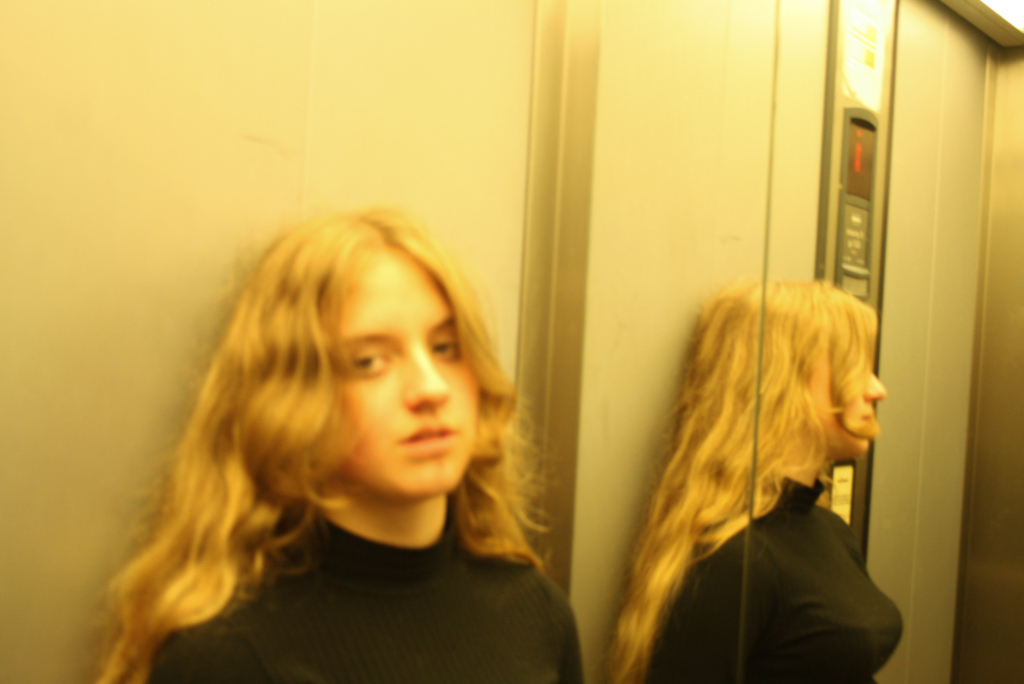
I chose this image because I really like the yellow tones in the image and how the majority of the image is blurry with the exception of the reflection of the subject, I think this creates a really unusual contrast as -in the portrait- attention to drawn to the side where you cannot actually see the main subjects face which is unusual for portrait photography, it also really reminded me of Larry Clark‘s photographic style.
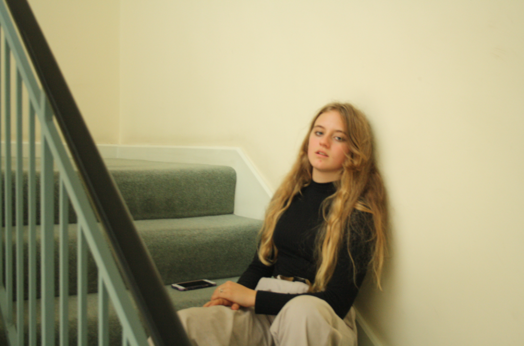
I chose this image because it really reminds me of Michelle Sank‘s photography, although the composition of the image is plain I really like how attention is drawn to the subject as they are the only interesting thing in the image- making the viewer “judge” the subject.
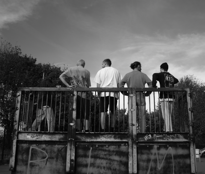
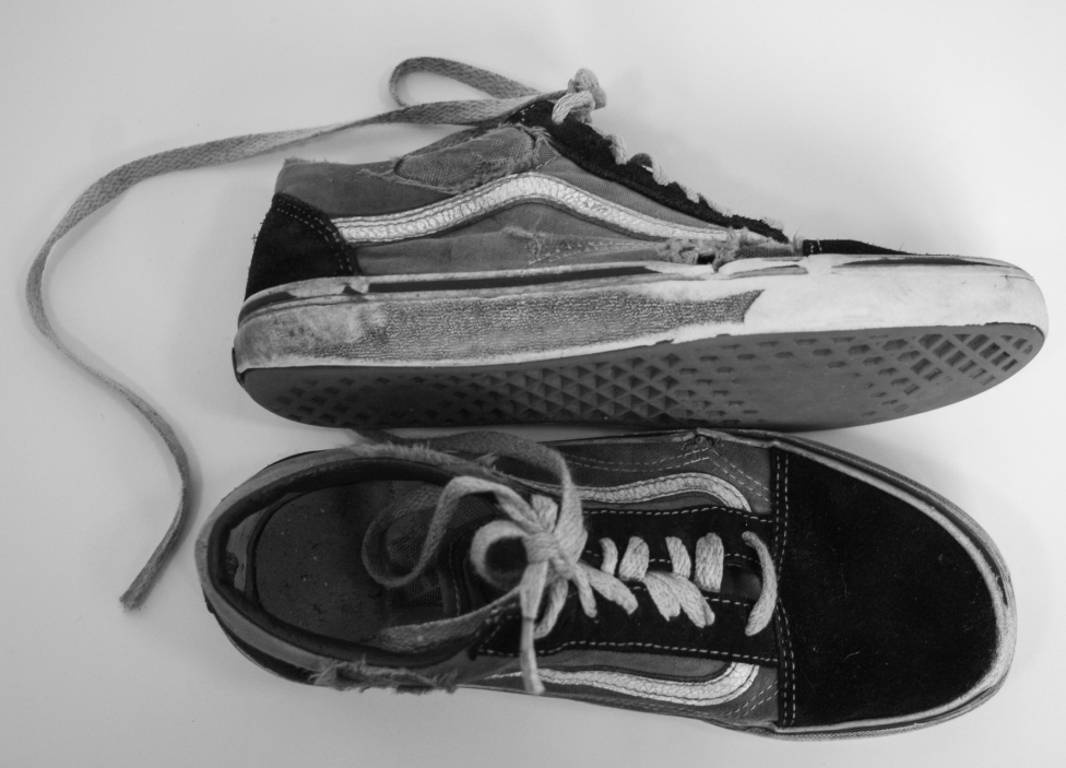
I have decided to print the two images above as a set as I really like the contrast between the skaters actually in the skatepark versus the almost commercial image of the torn skate shoes which implies the reality of skating: clothes getting torn, injuries and wrecked shoes.
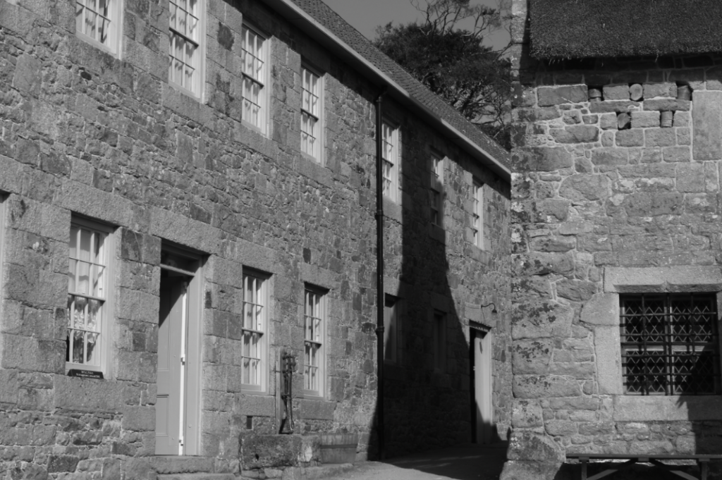
I chose this image because I really like the contrast of the shadow between the two buildings and how the two building almost look attached due to the perspective the photo was taken from. I also really like the wide variety of tones in the image and the texture of the Jersey granite (an important part of Jersey’s heritage) on the buildings as it creates interesting textures.
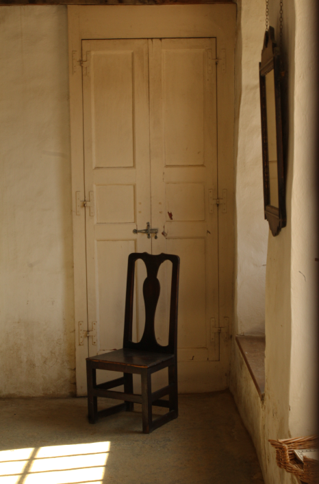
This is one of my favourite images so I tried to do the most minimal editing for this image because I really like how the walls and light almost frame the chair in the middle. I also really like how simple the composition is, with the empty chair in the middle- almost looking lonely.
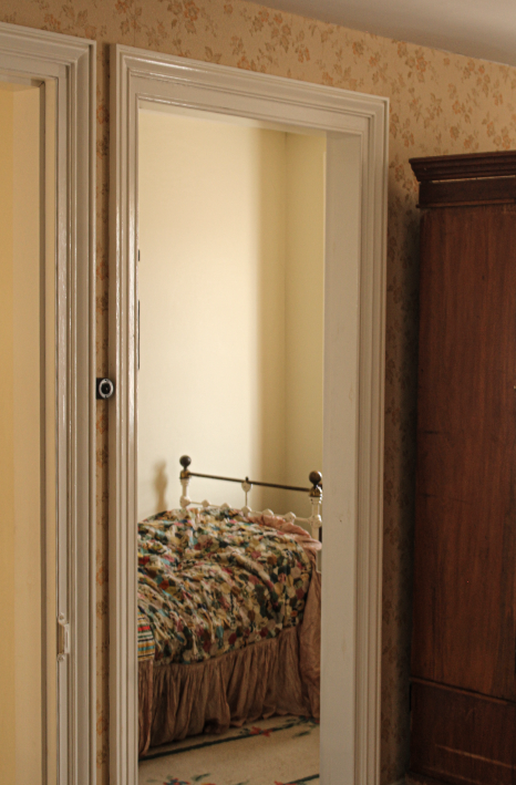
In this image I really liked how the doorframe framed the bed and made it the centre subject. I also really like the shadows and light in the image so I tried to make the shadows more visible.
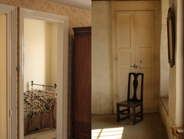
I decided to make the two images above a set as the similar compositions create a set of images that look almost abandoned and empty- possibly bringing in the theme of heritage as Hamptonne is no longer a used farm yet these rooms did once have people living in them.
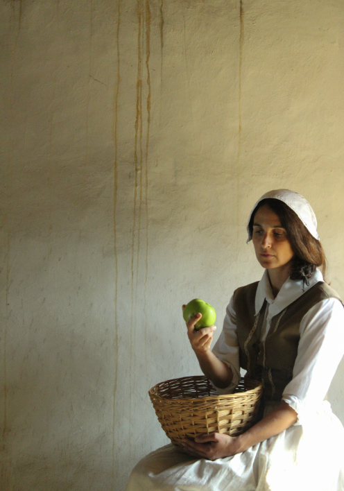
I have decided to print this image because I really like the natural lighting on the model’s face and how the light hits the apple. I also believe the composition of the image is unusual, with the subject in the bottom right corner surrounded by empty space- displaying a sense of isolation.
PRODUCT TABLE
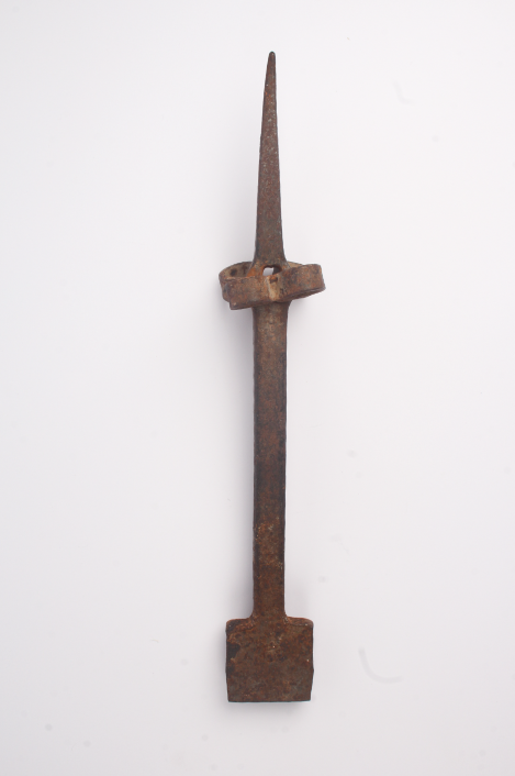
I included this image of a tool taken on a product table because it is obvious of -my inspiration- Walker Evans’ photographic style in ‘Beauties of the Common Tool’. I also really like how you can see every detail on the tool, especially the rusty colour.
