After all of our photoshoots, editing and research, I collected my final images from this project.
Final Images
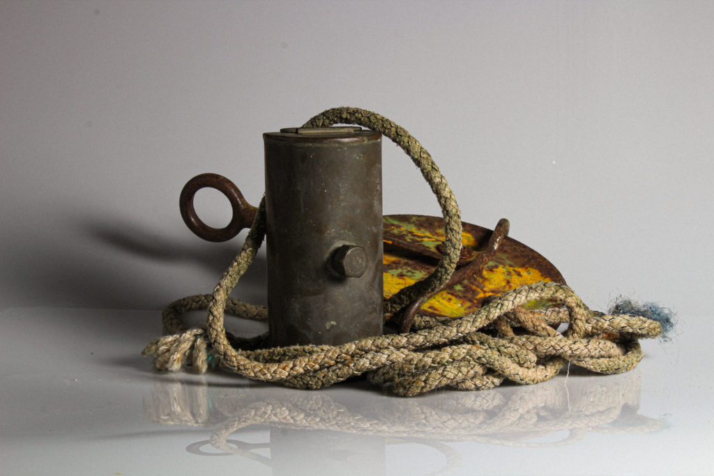
I chose this image firstly due to the reflection created in the bottom of the image, as well as the darker toned shadow to the left of the image. I also like the arrangement of the subject and the centring of the image. I used two point lighting to photograph this image, using a perspex infinity screen to create the reflections. I think that the focal point in this image is the orange and green rusted part of the subject, which I think is due to the vibrance and different textures in that part. The image is slightly underexposed to the left in the area of shadow – however I think this adds depth to the image. The tone in this image is lighter in the background and right side, and darker to the right.
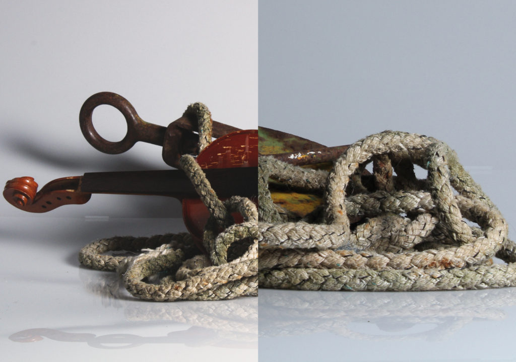
This image is one of my own photomontages, inspired by Darren Harvey Reagan. I chose this image due to the depth and contrast in each part of the image, and the different shapes that the spliced image creates. The two images used to create this image were also taken with two point lighting, using an infinity curve. This helped to create the shadow along the bottom of the montage which I love – I put this montage together using photoshop. To the left, a part of the violin is underexposed, however I think this adds to the high contrasted effect of the image. The leading lines in this image lead the eye around the ropes, and across to the shadow next to the violin.
Darren Harvey Regan’s work – comparison
Darren Harvey Regan’s splicing work
This image, part of my collection of pictures from hamptoune, is my favourite image from our heritage project. This is because I think that it clearly shows the interiors of hamptoune, and the architecture. The lighting in this image is natural window lighting. This lighting creates interesting geometric shapes and shadow, creating a natural focal point. The lines within the window and bricks lead the eye from one edge of the image to the other, with the underexposure to the right creating framing, and helping to balance the composition.
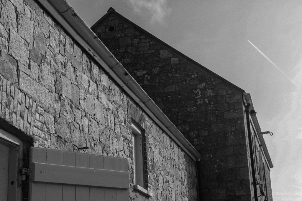
This image is also from my hamptoune collection. I chose this as one of my best due to the shapes created by the buildings, and how they show the surroundings of Hamptonne, as well as an insight into the heritage of the location. This image uses natural lighting. The buildings in the image create deeply contrasting shapes into the sky, and dramatic areas of shadow in some parts – for example in the middle of the image, to the left of the second building. I turned this image monochrome in photoshop, to really bring out the high levels of contrast and all the different shapes.
I chose this image as one of my best as it shows an insight of the goodwyf’s life at Hamptonne in a previous time – I think that it also it has a well-balanced composition. This image has a semi yellow tone, with a warm temperature. There is slight shadow coming across the subject’s face, coming from the underexposed area in the doorway. The contrast between this area and the brightness of the subject’s dress makes her a natural focal point, and creating a frame for her.
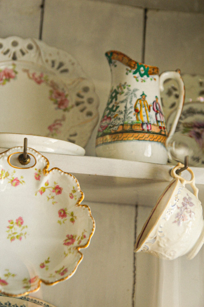
Another from my hamptonne collection – I chose this image because of the angle it was taken at, as well as the arrangement of the different subjects. The lighting was natural in the image. The image is more highly saturated in the detail on the cups, with increased temperature here too. This image uses the rule of thirds well, adding structure to the composition. I believe that the focal point in this image is the middle jug. – the detail on the jug attracts the eye.
One of my more abstract images. I like this image because it is kind of mysterious – it gives a peak into the houses of the time in which Hamptonne was a functioning farm. The image has a dark, faded tone, which creates an aged look. The picture inside the background creates a frame for the rest of the image. The edges of the image are a little underexposed, which also creates a natural vignette. In the foreground, the texture of the lamp adds to the realistic outlook of the era in the image.
One of my images inspired by Tom Kennedy – I like this image due to the dramatic lighting on the subject’s face. This lighting comes from window behind the subject. This image is underexposed to the left, creating vignette. The subject’s expression, her dress and object she is holding helps to create a picture of how life was for those on the farm in the era. In my opinion the focal point is the subject’s face, due to the different shadow.
This is one of my environmental portraits – inspired by Michelle sank. I tried to recreate Michelle’s work by capturing my subject in his normal environment, with no manipulation. I like this image due to its rawness – I like how it captures my subject in his natural working environment. The colours are vibrant in some areas- for example the suit of the subject’s. The high level of contrast in the image helps to bring forward the subject’s face, showing his personality.
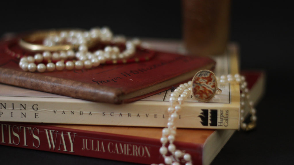
This image is one from my vanitas collection – inspired by Paulette Tavormina. This image has high levels of highlights – creating a natural focal point. The use of jewellery in this image links to the idea of wealth and power, which my studied artist also draws inspiration from.
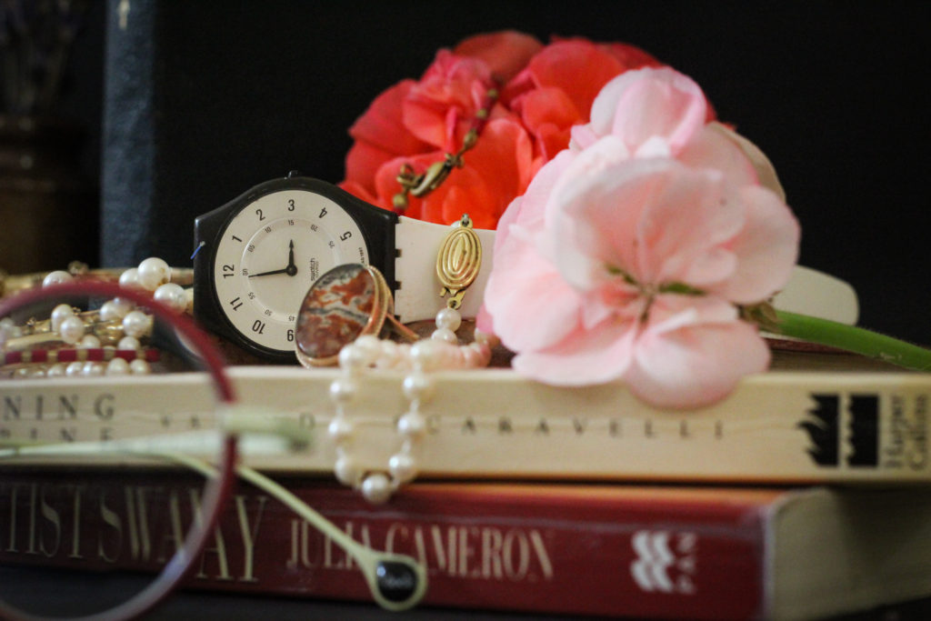
Another one of my Vanitas images – I chose this due to the composition, and the arrangement of the objects, as well as the colours. The focal point in this image is the centre – the flowers, watch and jewellery – these items link further to the ideas of materialism, life and time, which link to the works of Tavormina. The leading lines in the image take the eye from the top left hand corner, over the top of the flowers and down to the bottom right. The foreground is slightly blurred, shifting the focus to the items in the background and centre. There is also slight vignette in the image, in the corners – these underexposed areas frame the brighter images nicely.
Paulette Tavormina’s work – comparison
Paulette’s work
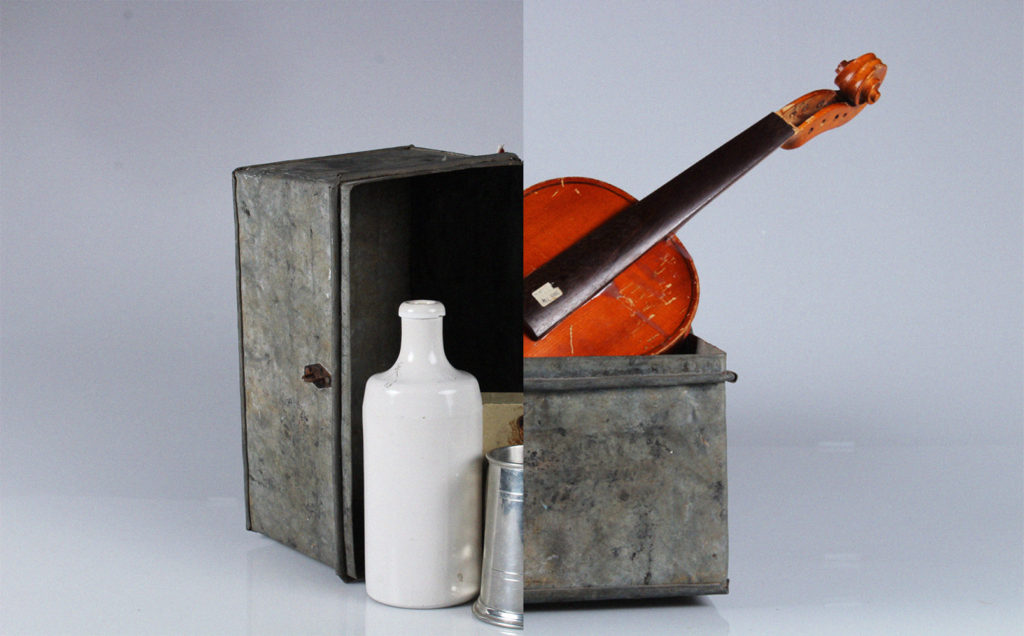
This is another of my photomontages. I like this one because of how the two pictures fit together almost seamlessly. Further more I think these images fit well together as a pair because of how they both feature the same metal box – it ties them together well while highlights the differences between the two. This image uses the rule of thirds – the left and right objects fit perfectly, as well as the split between both images directing the middle third. I used two point lighting to photograph each image – creating shadow and light on each side differently. The right is slightly higher saturated, with the violin becoming the focal point due to its bright orange colour. There is underexposure to the left, inside the metal box, however this contrasts nicely with the stark whiteness of the jug.
Another of may photomontages – I chose this image because of the arrangement of the images. think that the placement creates interesting composition, along with the shadows created with the infinity screen. I created this montage along with my others in photoshop, using another of my images from my hamptoune collection. I think that combining two different collections creates a stronger sense of heritage, and creates links between the places and the products created in the island. The tones in this image are light, except from the darker ones in the window pane – this darkness creates a contrast with the lighter background. This window pane becomes a natural focal point because of this contrast. The eye is also drawn to the reflections at the bottom of the image.