Overview
Below I have displayed my final images, which will be printed as A3, A4 or A5 photographs as are going to be graded as our final work for this segment. These photos include environmental portraits (taken in the Troubadour pub and at Troys estate agent), Hamptonne portraits, Hamptonne interiors, still life work and one digital experimentation.

I like the symmetry of this photograph and the wide variety of colours especially from reds in the top left corner to blues in the top right corner. In addition, this image turned out oddly similar to Annie Leibovitz’s work as this helped inspire me, the composition of the image, with Noel being in the middle and the light shining on him, illustrates how the background of the image is just as important as the focus of the image itself. I edited this image but increasing the exposure, as when I took the original image the ISO was low and the shutter speed was too high, also added some saturation to bring the background forward.
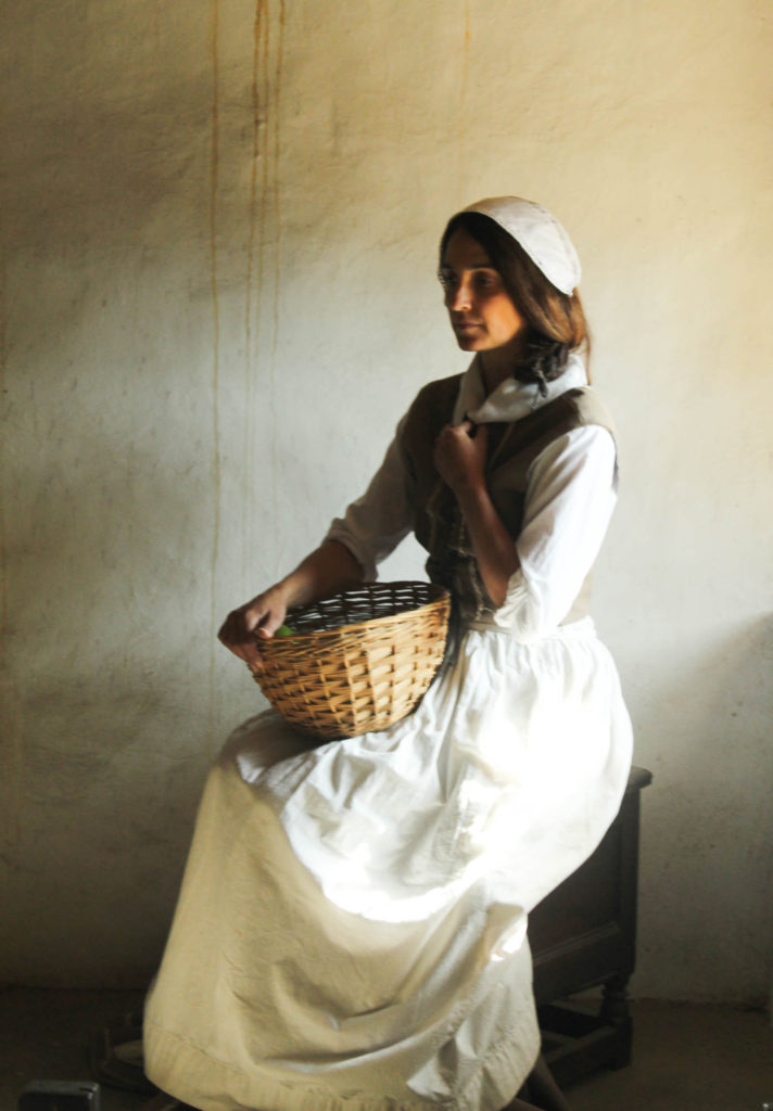
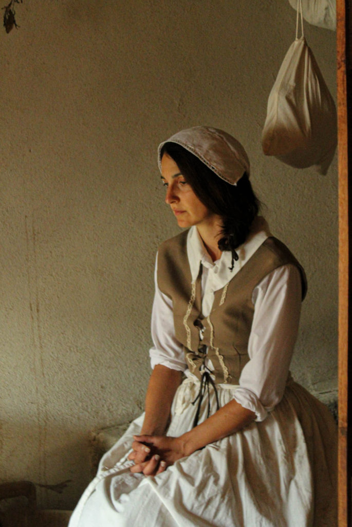
Here are two of my best final Hamptonne portrait images, that i have selected to be apart of my final images collection. I like how both these images are so similar yet so different, as the subject of the photo is the same but the background, lighting and images are so varied. Furthermore, as the living history characters is looking away in both images. it attracts our attention to her clothing and other areas as her facial features aren’t an important part of these images.

The most eye catching part of this still life image has to be the Jersey cow bell in the centre, as the surroundings of this object all look edited to be monochromatic, this makes this object appear more vibrant even when the old glass milk bottle is probably the most focused part of the image. This was composed of three old Jersey heritage objects and I like how these gave the image an old fashion aspect whilst being taken with a very modern camera, and altered which modern editing.
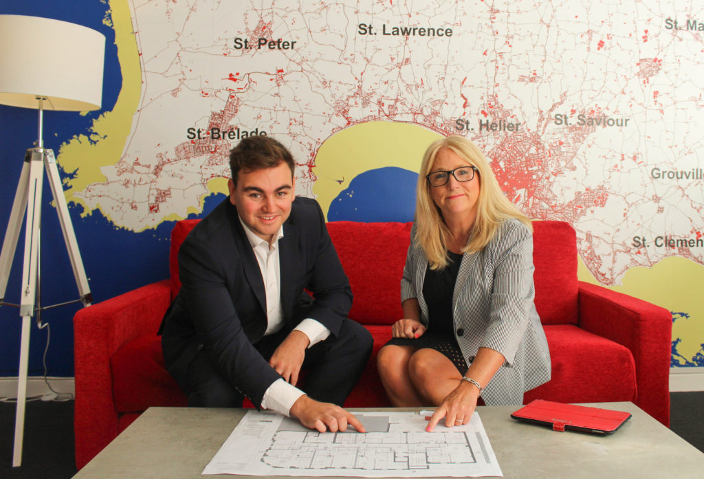
Images including vibrant colours such as this one make for cohesive final images, as the red lines in the background of the photograph match with the bright red material of the couch. In addition, I like how this is my strongest environmental portrait, with the lighting being the best without much editing and the people being central. This photograph required the most editing, as the original portrait was far too zoomed out, with unwanted aspects in the surroundings.
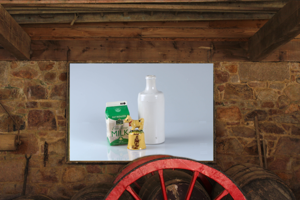
As part of my final images it was advised to add an experimentation, using an interior image from Hamptonne and a still life image in Photoshop, I created this piece of work. I used the erase took to keep the top of the red wheel (at the bottom), this was an attempt to keep the authenticity of the original picture. In addition, I like the contrasting colours of red and green, which also helps with to highlight the difference between the old Hamptonne building and the very modern studio we took the still life images in.
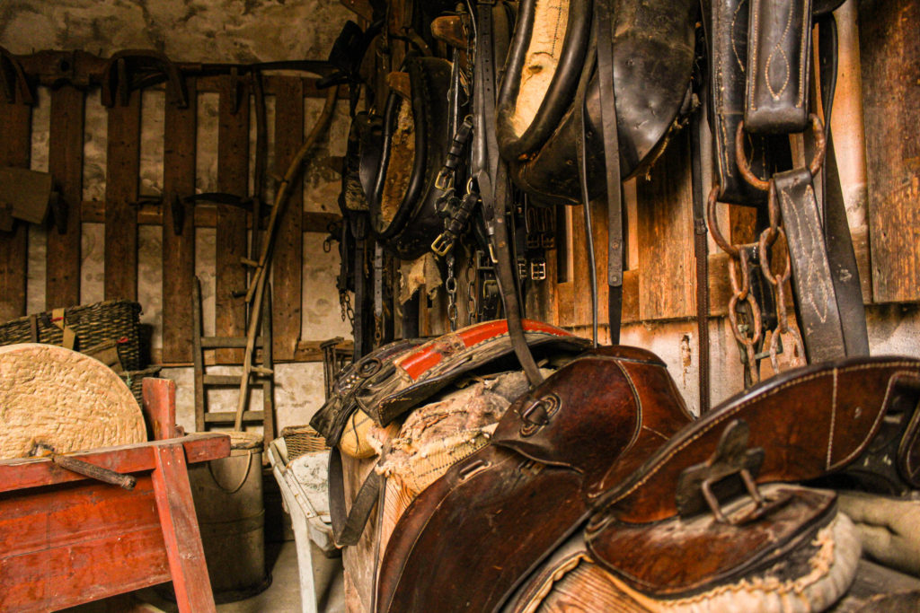
Above is one of my best Hamptonne interior images, I have selected it as one of my final images as it is a busy image, with each object matching well together, and being edited by altering the exposure, I have created a successful final piece. Furthermore, it is one of my most unique images as the angle is at a much lower level compared to eye level, making the saddles in the foreground of the image appear larger and the ladder in the background appear smaller.
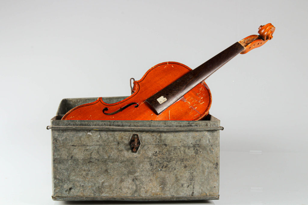
Finally, I have selected this object image as I like the contrast of the brighter orange wood in the violin compared to the stale grey metal of the box. This created an aesthetic image as the image as I edited the angle of the image, making it straighter. Additionally, I think the difference in shapes creates an aesthetic piece as the violin is made of straight and curved edges, whilst the box is just made from straight edges.

