
At Hamptonne, there were several 15th century buildings, fields and farm areas which provided me with interesting exterior perspectives.
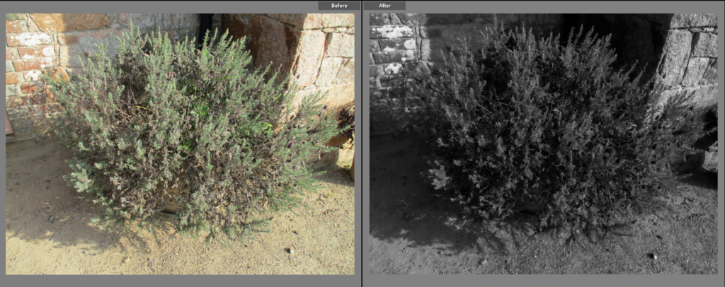
I chose this as a Final Image because I think that it’s use of shadow is effective. This picture was taken at the start of the trip so it was fairly early, which allows the rising sun to create a bold shadow on the left of the plant, as well as between it’s stems which creates a clear contrast between light and dark parts. I decided to make the image black and white because I wanted to emphasise the shadows, rather than the colours of the original (I like how you can still tell what time of day it is even with the black and white filter on). I think the erratic lines coming off of the plant creates an intriguing effect as it contrasts with the straight lines on the walls behind it, as well as the lack of lines below it.
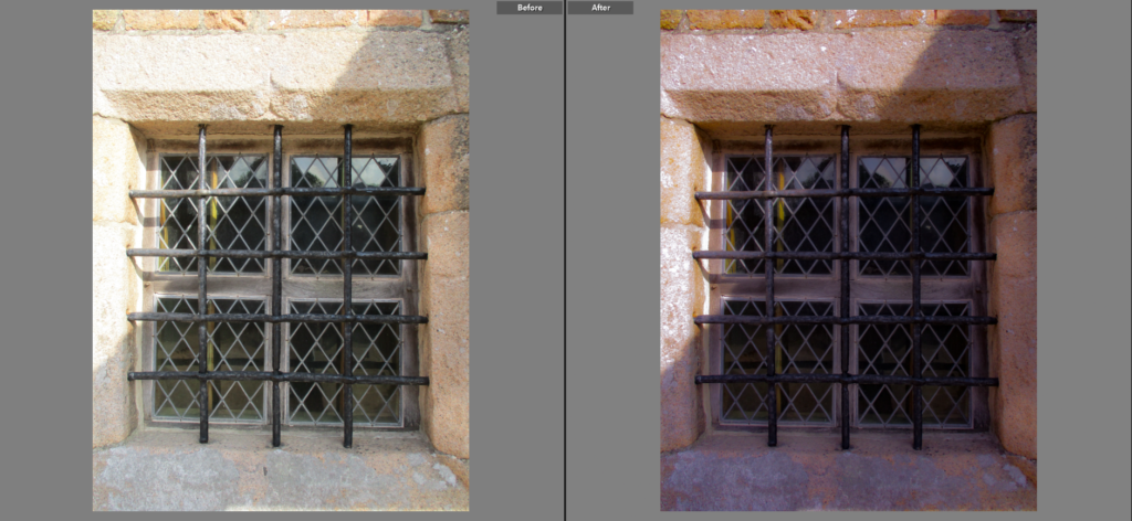
I chose this image because I like the way the window mesh/guard creates an interesting pattern, which gives the focal point (the window as it is the darkest point in the image and is central) leading lines which lead the viewer towards it, and away from it in all directions. I think the way lines are mainly straight in this image, as well as the fact that the lines from the cage are symmetrical, gives it a man-made and unnatural form. I decided to give the image a slightly pink tone to give the image slightly more colour, as well as make the contrast higher and aperture slightly lower to give the image slightly more clarity.
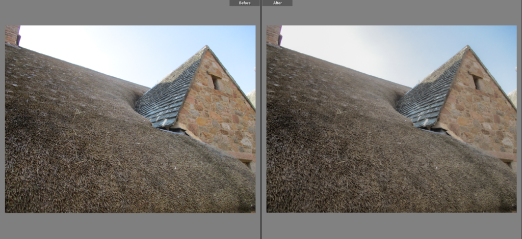
I chose this image because I like how the lines created by the building are easily noticeable, which makes the building’s form stronger and clearer. I think that the way the building towers over the viewer, taking up a very large amount of space in the image, because of the low-angled viewpoint used, is effective as it makes the building seem that more abstract than a full-body shot of it. I like the way the focal point, the triangular shape on the right, stands out as it has a different pattern, using bricks, than the thatch, which is more of an unordered array of lines, and the sky. As this part of the building is shadowed, there is no shadow seen in the image, which makes the darkest part of the image the window/gap in the bricks, which also helps make the focal point stand out.
I chose this as a Final Image because I like it’s simplicity. I like the way distance is clearly shown from the diagonal shape of the building with the left side of the building being the closest and right being the farthest to the viewer. I made the tone of the image slightly warmer as I thought it would bring out the browns and greys (which take up a large majority of the image), while also loosely making the buildings seem more rural and old-fashioned. I like the way lines from the structure of the buildings are clearly seen in the image, while the forms of the plants scattered around the image are irregular, which creates a nice contrast.
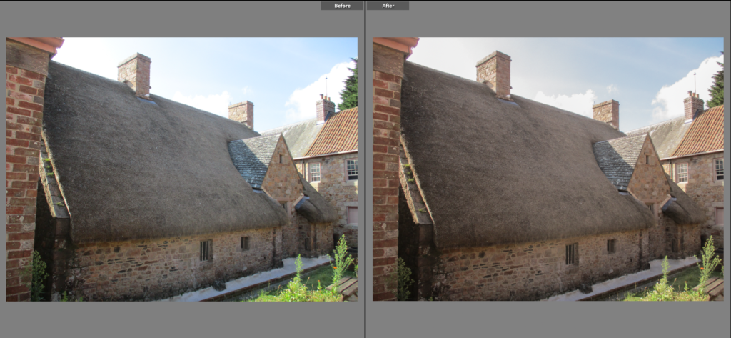
I chose this as a final image because I like its simple yet effective composition, with the building’s roof ascending diagonally creating a composition similar to a golden triangle photograph. I also think that the 60:40 ratio of building and sky is effective as it gives the building space to breath, as well as a way to create a minor contrast in tones. I chose to make the colour of the image slightly diluted as it makes the image look a little older to me, linking to my theme of Heritage. Line is also interesting in this image as it creates a contrast between the man-made lines from the buildings and natural, soft patterns from the clouds.

I chose this as a Final Image because I like how the low angle that the image was taken at creates a clear sense of distance between the top and bottom parts of the wall shown in the image. I decided to make the image black and white because I didn’t like the greenish tone on the original, I also think the black and white makes the white patches on the bricks stand out more, which gives the image a nice balance between black and white. I also like how the lines between each brick are clear, as it gives the image an organised look, while the bricks themselves are erratic with the white patterns they adorn.