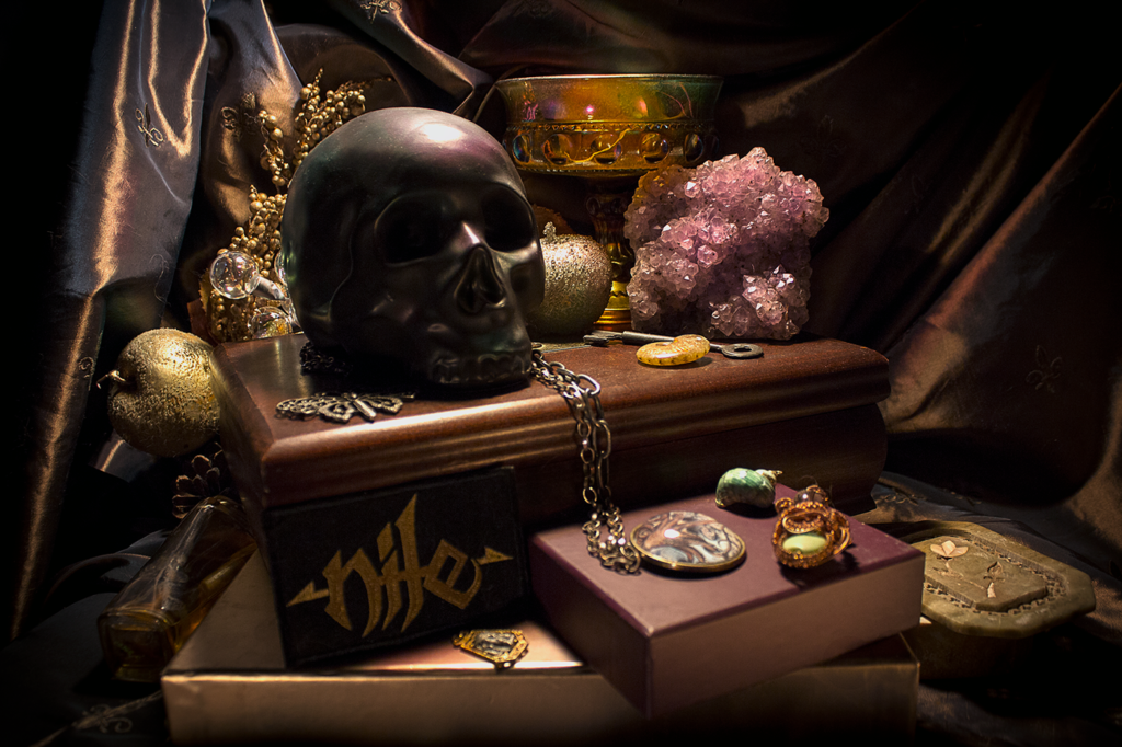
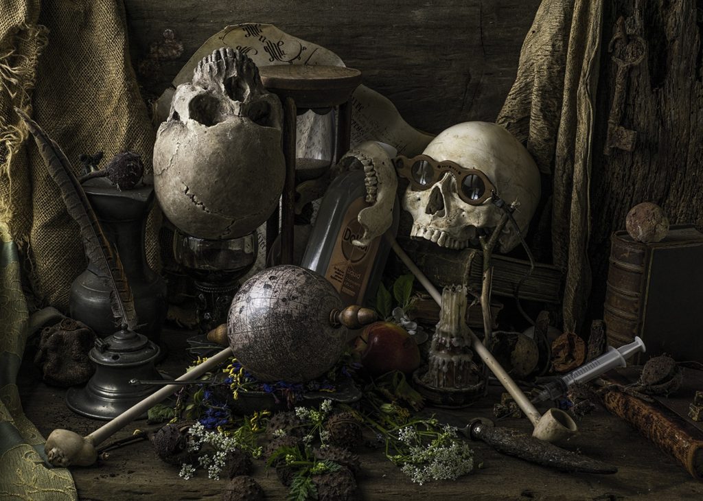
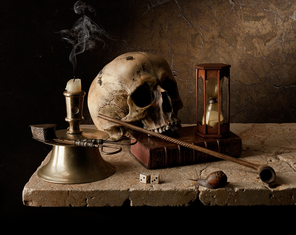
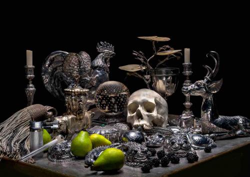
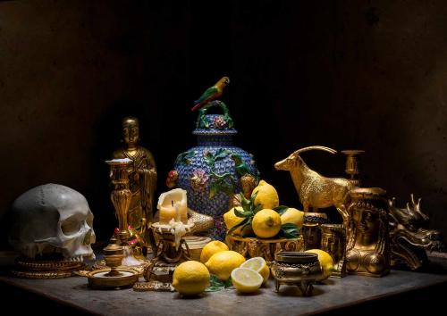
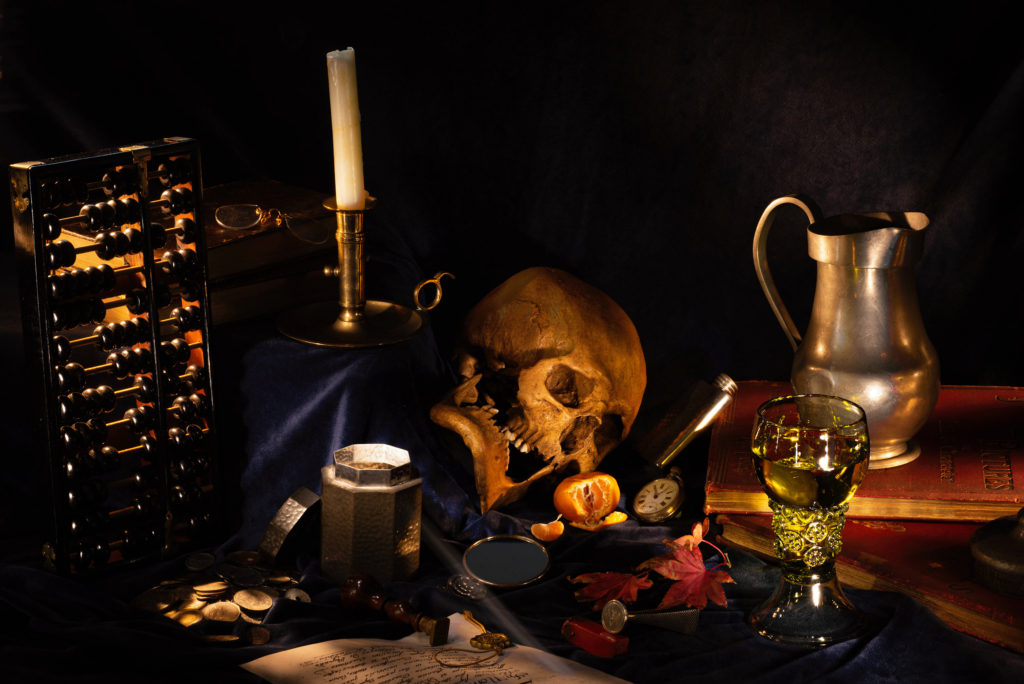
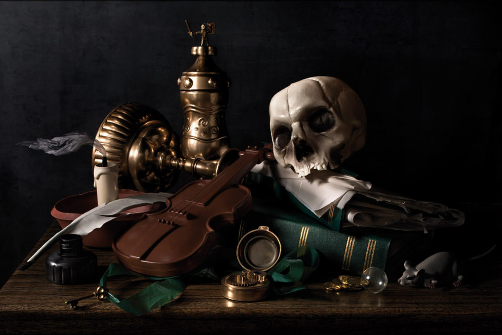
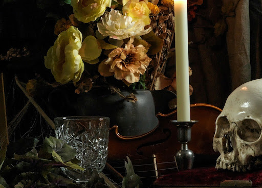
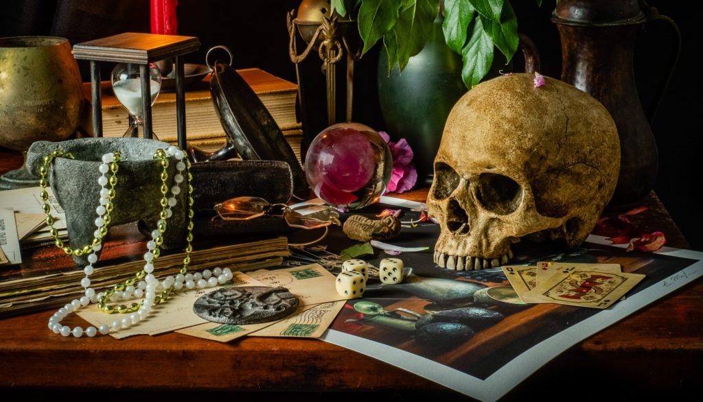
A Vanitas photograph is symbolic of the idea of the mortality of people and how time in life is short. Props used for this kind of photography (or art style as a whole) usually involve skulls and hourglasses to represent those ideas in a way in which any viewer can get an idea for the symbolism of the image.
Mood Board
Paulette Tavormina

Tavormina is a New-York based photographer who is inspired by the works of 17th Century Old Masters’ artwork, and creates a modern and almost playful twist (typically using bright flowers) on the Vanitas style. Photography had piqued her interest in the 1980’s, which motivated her to attend classes involving dark-room photography. She took several opportunities to use her skills during her career, starting as a commercial photographer, to even creating cookery books in a Vanitas-esque style. Since, she has continued to develop her ideas and style and has hosted several exhibitions of her work.
Image Analysis

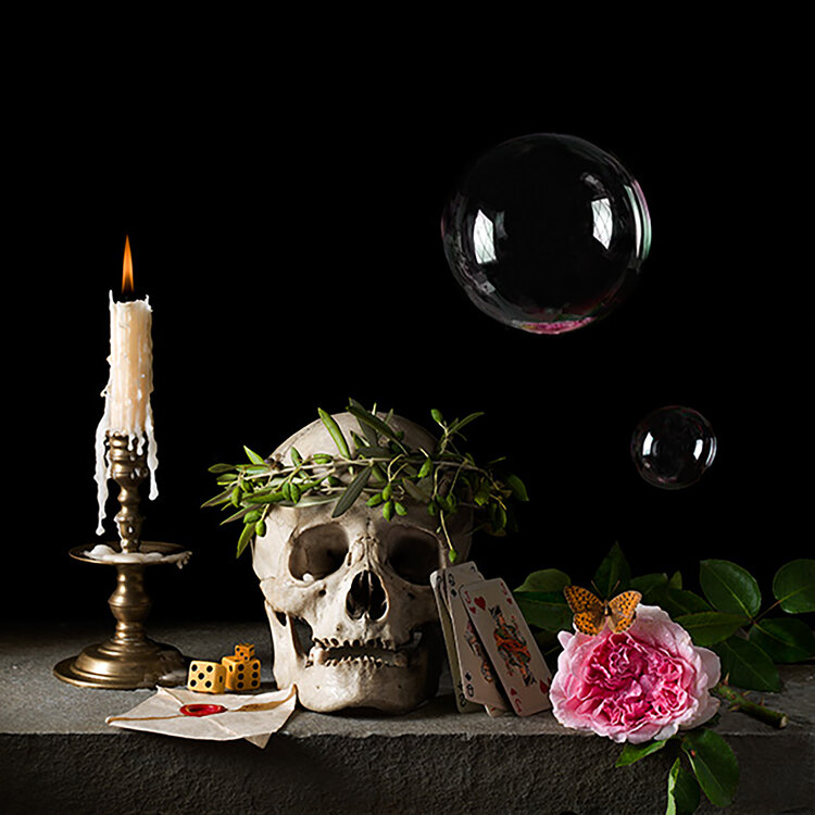
Lighting in this image is the most important part of this image, it is harsh enough to not only light up the objects effectively, but also show great detail on the objects themselves, while also not being too harsh as to create dense shadows. I like the way colour is used in this image (specifically between the left and right of it): Colour on the left side of the image is fairly limited, being mainly grey with a touch of orange and green, giving it a more formal and serious look. On the right side, colour is very much diverse and bright, with the bright pink of the flower appearing in front of a dark, yet noticeable, green. The composition of the image also looks to be divided by the left and right sides of the image, with the left side once again appearing serious, with nothing appearing above the skull and candlestick, however, space is filled not only with the leaves and flower, but also the bubbles above them, which gives the left side a more playful and energetic look. The focal point of the image is the skull, likely because it looks as if it is looking at the viewer, attracting their attention, or because it is, of course, white. It is possible that the image could have been laid out this way to show that the person that was the skull (or at least the character created by Tavormina) had both a serious side and playful side to them, and were likely praised for this, with the wreath on their head.
Vanitas Photoshoot
Contact Sheet


This most of the images in this contact sheet have a cropped and un-cropped version. (I did this because Tavormina’s work is usually square).
These are the edited versions. I edited these images by making the ones with the white background cooler and the ones with a black background warmer (I am particularly fond of the warmer images because they resemble paintings in this style)
Final Images
(*Notes* Colours behind the images do not represent a ranking or the like…
The uncropped versions of the images are on the left and cropped on the right)
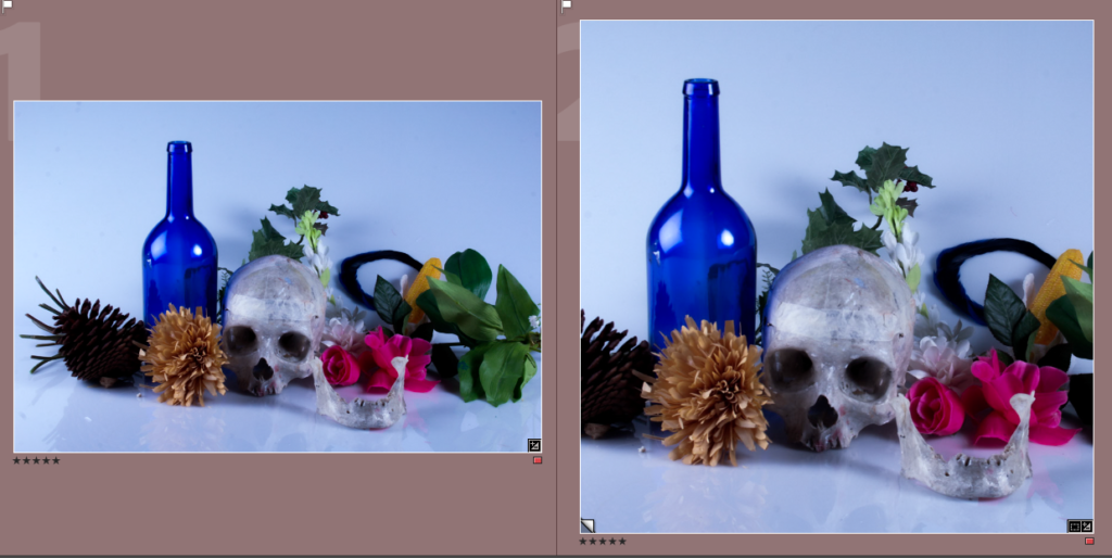
I chose this as a final image because I liked how the colour palette is diverse, and the colours themselves are bright and contrast nicely with the brownish objects on the left of the skull. The focal point of this image is either the blue bottle or the pink flower, this is because they are bright and stand out in the white background, inversely, the skull’s eyes/nose could also be seen as a focal point as they are dark, which contrasts with the white background, and central. I think the way the objects are arranged in a line is also effective, as it allows a bit of space above and below them to let the image breathe. The leaves and flowers could represent nature and how death is something natural.
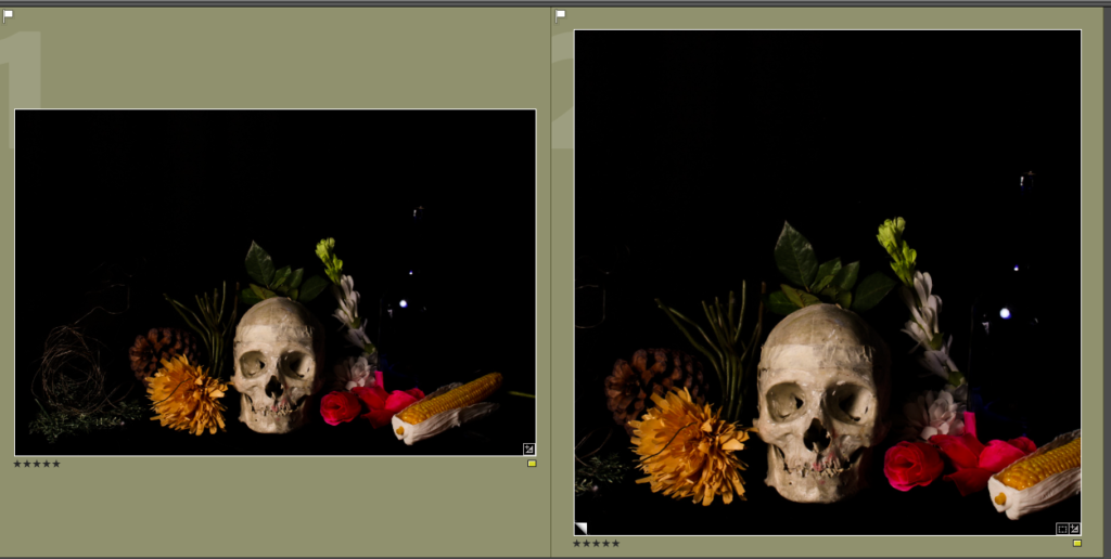
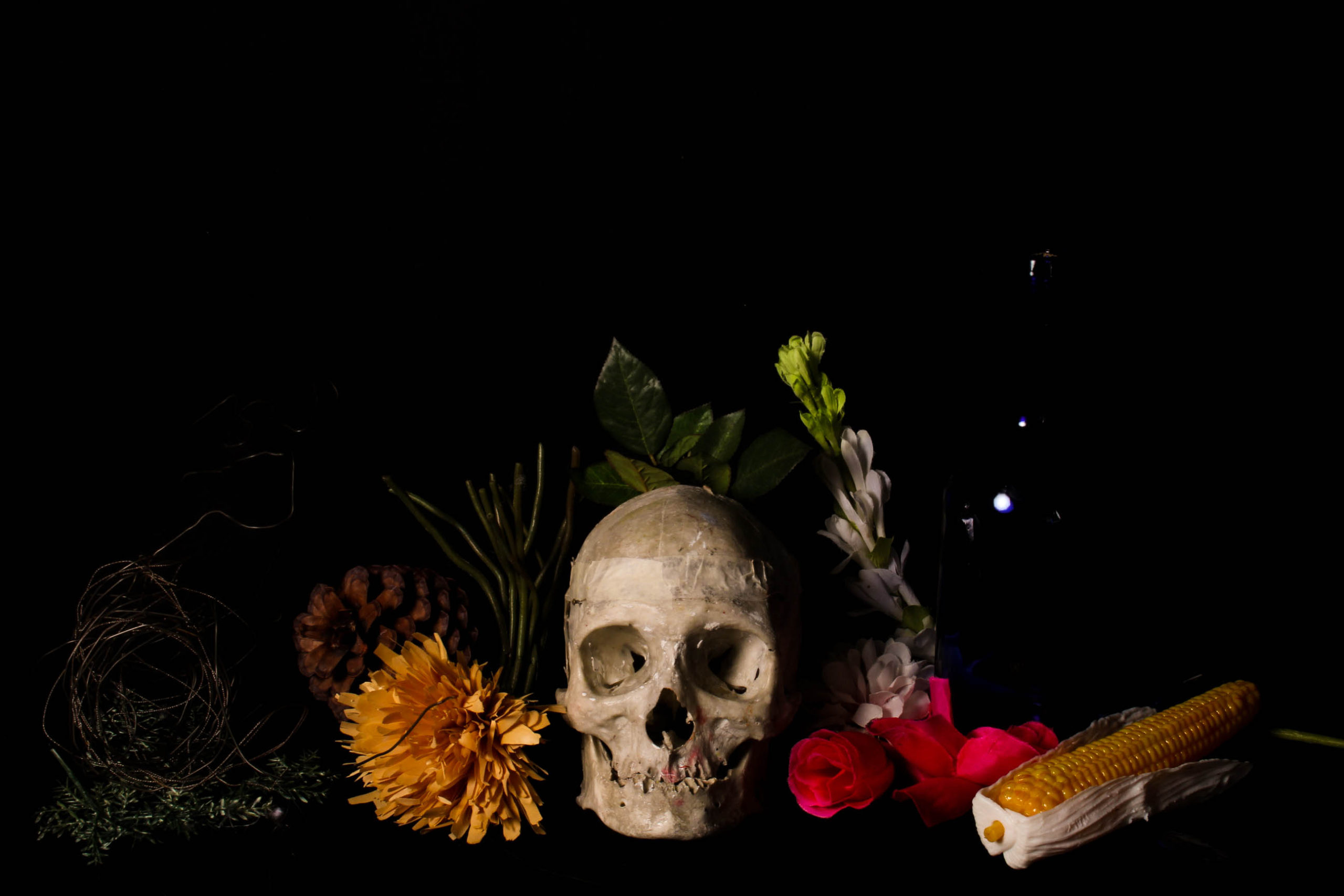
This image, to me, is the closest I got to a classic Vanitas painting/photograph (with the colours being dimmed yet noticeable and the skull being the main focal point), because of this I am very much fond of it and chose it as a final image. I also like how the bottle on the right reflects the light from the left, which reminds me of the image I have analyzed previously on this blog post, I think it gives the image an interesting look and gets the viewer to look a little closer. I think the composition of this image is very effective, the way it is laid out in a line, with a large open space above the objects that gives the image more space to breathe, but also make the objects seem small, which adds to the mysterious look vanitas art usually uses to great effect.

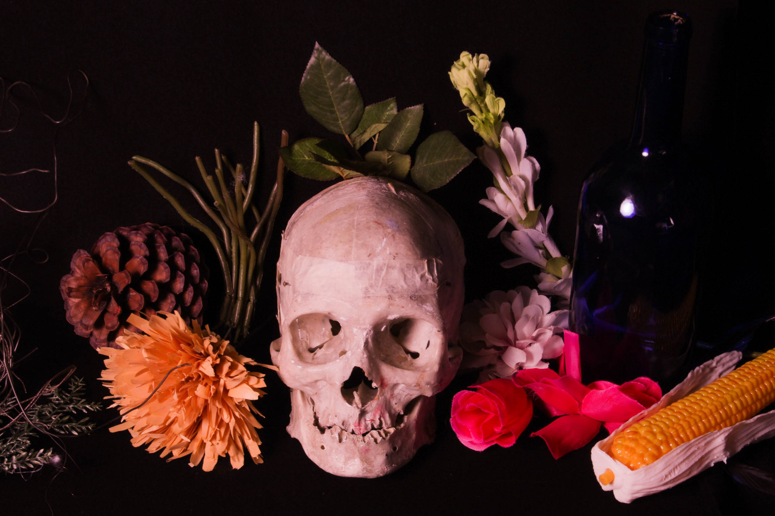
I chose this image because I liked it’s warm, pinkish tone, which gives all of the objects, even the brownish ones, an interesting and vibrant colour, which gives this image an energy the others lack. I also like how the skull is clearly the most noticeable part of the whole image, this is likely because not only does it look as if it is looking at the viewer, but also because it is the brightest part of the image, which contrasts especially with the pure black background. I angled the camera to look down on the objects to give this image a slight, yet noticeable change. Unlike the other final images I have chosen, this one doesn’t have much open space, which also helps to give it a unique and energetic look to it.
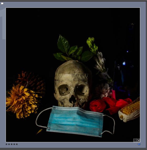
I chose this image because I liked how the mask has been positioned around the mouth of the skull and how it adds colour to the image. I decided to make this aperture of this image slightly darker because I wanted the mask and the skull to be the most noticeable part of the image and to give the shadows and darker parts of the image a greater emphasis, which I did not do as much in the other images because I felt brighter colours and highlights would better resemble Tavormina’s work, however the darker tones do remind me of the more grim tones of classic Vanitas work . I think that the way the mask is a formal shape and the other objects are rather irregular could not only create a contrast, but also be a way of clearly differentiating what is natural and what it man made.
Evaluation
Overall, I am very pleased with the way this photoshoot turned out. I think I have followed the style of the artist I studied, as well as the theme of Vanitas, effectively. I think my favorite image from this photoshoot is the 3rd Final Image shown (the pink-toned one) as it has a nice amount of colour, while still resembling the classic Vanitas style. To improve this photoshoot I could have maybe changed the colours of the background slightly (perhaps to a dark red or blue for example) and changed the objects around a bit more, but I think those would be little improvements, rather than game-changers.


