Final Photobook
Below is my final photo book complete with my essay, created in Lightroom Classic.

This is my back cover (left) and the front cover of my photobook. I decided to call my book “Pink Slippers”. This title was inspired by images in my book of my mother’s slippers – they are a special item to me, as putting my mother’s and grandmothers slipper’s is a fond childhood memory of mine, symbolising my relationship with them. I named the book specifically pink slippers due to the pink pages included in the book, but also because of the female subjects – the inclusion of a typical female colour on the cover, in the image, title and spine foreshadows the content.


The first image in this book is that of myself as a child – I have an inquisitive look on my face, which creates a simple start to the book, causing the viewer to perhaps feel the same. The pink tones of my t-shirt match the pink page of the title page previous, linking the pages together. This page was also placed at the start of my book to introduce the first subject and the different time frames used.


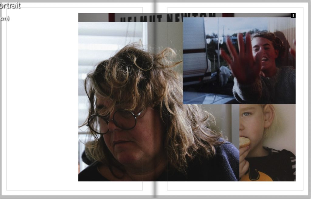
These 4 pages further introduce the subjects of my book and the inclusion of an archival image of my mother on the left spread leads well into the right, showing a passage of time in her life, including myself also.


These are two of my favourite spreads from my photobook, in sequence. The first spread is of an image from my identity project, featuring archival and new material of my mum. The collage has a reflective feel, as on the right she seems to glance at her past self – this nostalgic mood is helped by the background image of her old bedroom, and B and W colouring. The following double-page spread leads on nicely – the right image has a second reflective and sentimental feel to it, with the inclusion of the mirror picturing the subject looking wistfully at herself – I liked using a mirror for this project, as it enabled me to get lots of different perspectives from one shot, creating a multi-dimensional image.


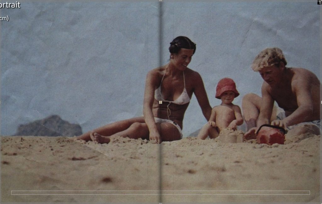
These two sequenced spreads create a display of generational identity and age when placed next to each other. The spread on the left features images of my grandmother, which creates a contrasting collage (the process of making these in my previous post) of her life and story. The double page spread to the right is of my mother, shot in the same location as the image of my nana in the collage. Both these pages feature similar tones: red, orange, and beige. On the left, the sand of the bottom image link with the colour of the wall in the right spread, and the read of an image on the left match with the red and orange of the curtains to the right.




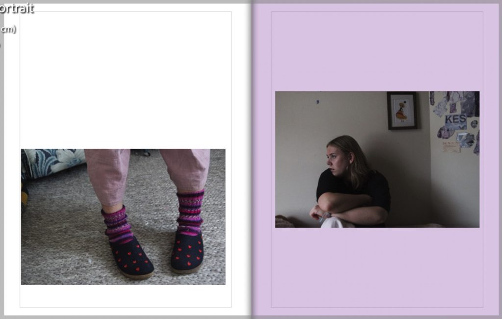
These two spreads are of my mother – the first on the left is a double-page spread taken from my identity project, possibly my favourite from the whole project. The warm tones in this spread are contrasted with the stark black and white of the next image. The right image is another of my favourites from this project. In my opinion, it gives a strong presentation of not just female identity, but identity in the home and through multiple generations. The image features objects on the table to the left that are important in my mum’s personal identity – the book and bookcase in the background to the left highlight her interest in them, as reading is and has been very important in her life. Her pose and facial expressions show her personality further, as she sits in her own house, looking unwaveringly at the camera. To me, this also represents her role in my life, as my sole caregiver and the source of knowledge and strength in my life This image paints a portrait of strong female heritage, including a photo of my great-grandmother. She was a very important role model in my mum’s life, and including her portrait felt crucial to me when documenting my home and also




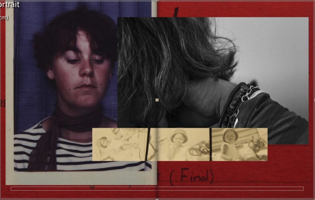


These are the final spreads of my book – they are understated, quiet images which I spoke about in my previous post, to create a natural end to my book. The left spread features an image to the right which can be seen as a symbol of age, with a faceless image of my grandma, with only parts of her skin and white hair visible – this image is much different to others in the book, more secretive and understated. This image and spread can be seen to symbolise identity due to the feature of my nana’s simple pink hair clip, which symbolises one of the most important parts of her physical identity, both to herself and others. The spread on the right has one of the few object images in my book – it is that of a broken mirror from a memory box I used photos from. This mirror links to the images above taken in the mirror of my mother and grandmother but is broken. The broken mirror could connote a sense of altered or mixed-up time or identity, or just the changing of one’s personality. This links to the jumbled look of my photobook, which mixes up time scales and eras.

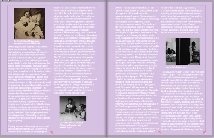
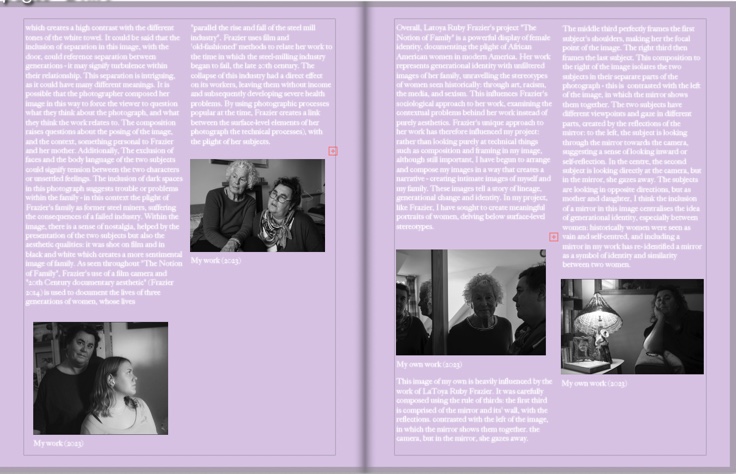


Above is the inclusion of my final essay in my photobook – I used pink pages again here to continue the theme through to the very end of my book, using the same font and text as the front cover and spine.
Final Prints
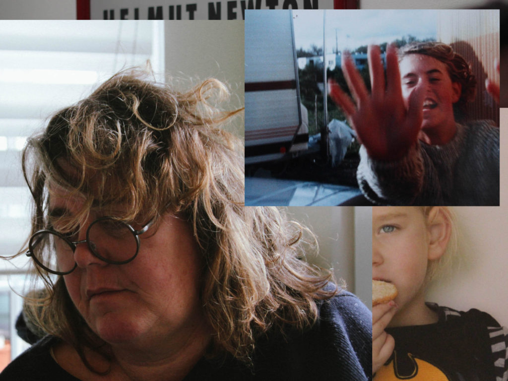
Below is a selection of my final prints – I have quite a lot for this project, due to my high volume of images. I have analysed most of them above, but there are a few images not seen in my photobook I decided to print also. I have decided to print most of them in A3, but the series of 3 self-portraits are going to be in A4, presented in a trio.




Evaluation
(Photobook evaluated throughout final presentation above)
Photoshoots
The first shoots I completed were my self-portrait shoots. I found these to be overall successful shoots, with at least 5 successful images from each set but found it quite difficult to create quality compositions. I found it difficult to envision what I was capturing as I was in front of the camera, and coming forward to press my shutter for the timer for each set of 10 images became annoying. in future, if I was to create more self-portraits I would use a more effective setup, with a lead to press a shutter from my position in front of the camera, and perhaps a camera with a flippable viewfinder. Aesthetically these images improved in quality as I moved into my second shoot, shooting in a better light after evaluating my first shoot. Overall these first shoots were a useful starting point – directing myself in front of the camera made it easier to work with my two other subjects in my later photoshoots and also helped me to cope with difficult lighting at times.
The rest of my shoots improved as I went along. I do feel that I took too many images – or that I did too many shoots, as I found it difficult working with such a large amount of images in my exam and fitting them into my book without having too many pages. When photographing my archival material, I’m glad that I used an array of types of images – this made it easier for me when experimenting with collages and layouts in my book and gave me more choice and room to experiment. I struggled a little with the compositional elements of my portraits but found I became more at ease with directing my family as the photoshoots progressed and I became more familiar with how the environments photographed. In this way, I’m glad I produced the volume of shoots I did, as it meant I had more room to improve and change my photography to match my ideas and create better outcomes.
Editing
I like to edit in black and white and also in colour, but found in this project I preferred a lot more colour images. A lot of my images had vibrant colours which matched well with the colours of my archival material. However, I still found B and W editing useful as it created nice contrasts with my other spreads.
Experimentation and Layout
I found making my photobook (analysed above and in the last post) initially difficult, but I think that as I got used to the layout and process and began to really enjoy it. I think this was also due to my previous experience of creating zines from my trip to America in September – this helped me to understand the layouts of my book more easily.
