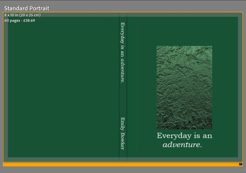
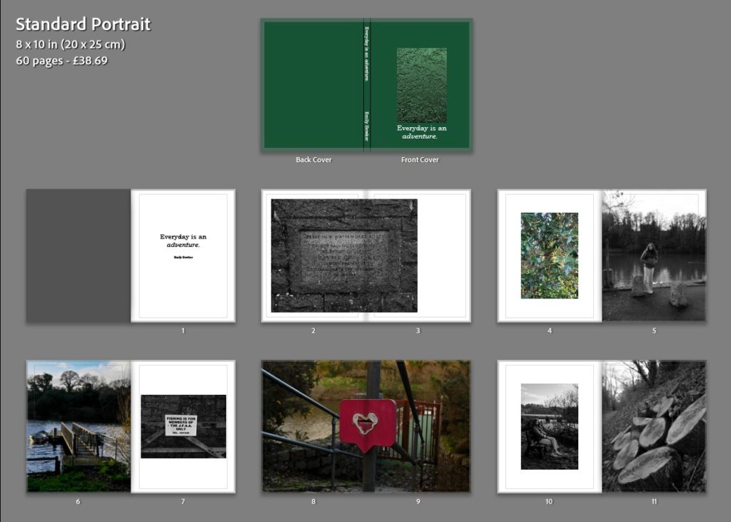
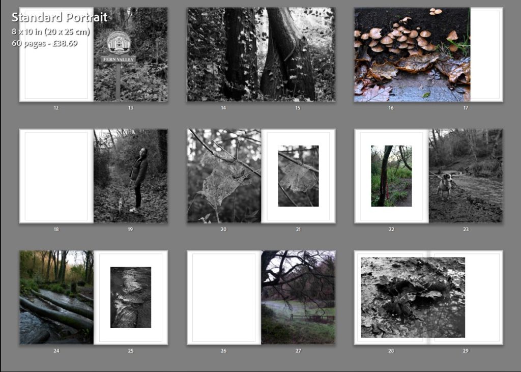
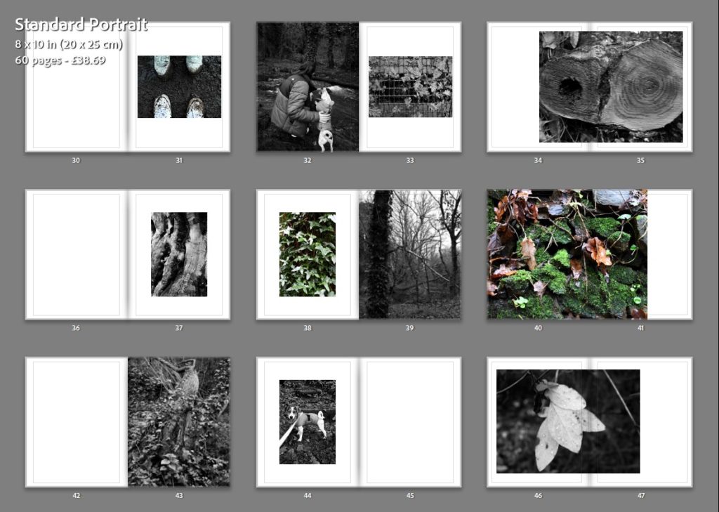
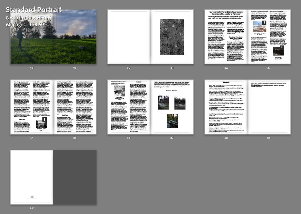
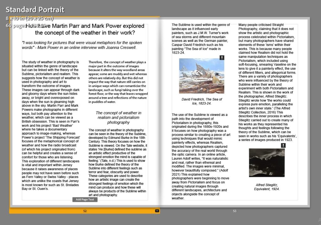
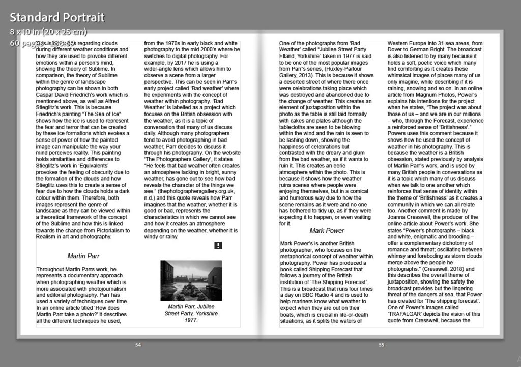
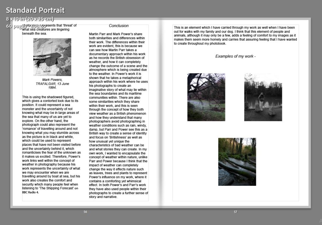
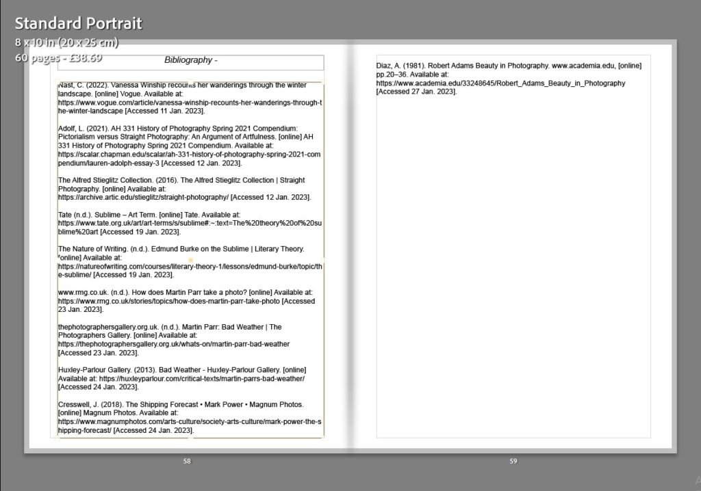
Above is the final layout that I have chosen for my photobook. This process consisted of inputting the initial photos that I wanted to use to begin with into a plain book template, where it organises a layout of the individual photos on a page each to begin with. This made it easier and quicker for me to sequence my photos and remove the ones that I thought would work well but once bringing them into Lightroom, they did not look right amongst the others. Then I began deciding on the page spreads that I wanted to use, I decided to keep a flow throughout my photobook, I should use the same 4/5 different spreads throughout and I think that this makes the photobook seem as if it is more organised and professional. Then after I had decided on the layout and what page spreads to use, I inputted my essay which I had already previously written, this is because my essay shows a creative development and link into the theme of my photobook and this is natural landscapes and how the weather can transform them. Finally I decided to add in my front cover design, which I did in photoshop and transferred over to Lightroom where I decided on the size of the image and the background colour of the front and back covers of the book, I also added the title on the front cover and spine as well as creating an opening page that included this as well along with my name. I am really happy with the outcome of my photobook because I think that it tells a visual story, without the use of text throughout which keeps it simple, and represents how the weather does transform different natural landscapes in a variety of unique ways.
