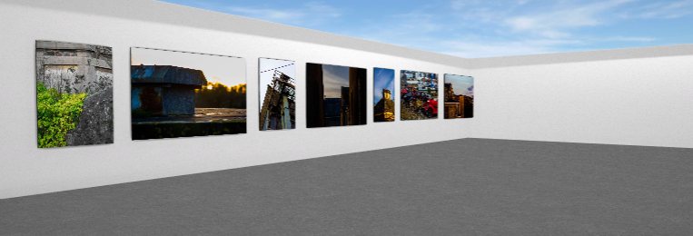
I have produced a virtual gallery of some of my best images from these shoots. I created a gallery using Artseps online website then put final images in to create the effect of seeing my work in a real exhibition.


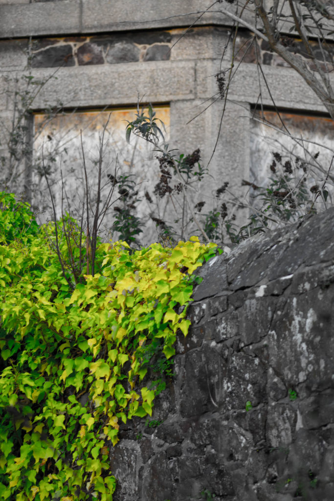
This is one of my final images that i took of a wall inside the old hospital grounds. I edited this image to reduce the saturation and increased the vibrancy to bring out the greenery climbing the wall. I like how the man made structure of the wall is much duller and darker except for the little pieces of plans growing through the cracks that will eventually completely overtake the wall and bring the granite back to nature.

this image was also taken from of a decaying out building on the old hospital site the peak of the roof really intrigued my eye and I spent along time focusing my lens on this roof. I also liked the interesting lines created by the flaking tiles and rotting wood at the top. a lot of interesting colours have been created by the moss growing on the tiles. I like the way the light has hits the roof and the edges cut of the image to break it up into section of bright warm light and darker side contrasting against the light blue sky with airy white clouds. I brought out the brightness in the sky by reducing the highlights I this image.

I like this image because I was on my way into a decaying site and i found a lost parking cone peaking through the bush. the bright yellow caught my eye through the rest of the overcrowding leaves that surrounded and encased the cone. i edited this images to best bring out the contrasting colours of the natural green leaves against the synthetic bright yellow hiding underneath. I focused my lens deep into the bush to create a slightly blurry foreground with the leaves.

this image is of the roof of the old hospital. I really liked how there are whole gardens growing in the gutters and corners on the roofs of the buildings I went up to get a good angle. The contrast between the hard lines of the roofs edges and tiles that juxtapose the soft green shapes created by the plant matter that is now trapped up on the roof 20m above the ground and yet still thriving with life and colour. I liked the perspective of this image looking up which follows the pitch of the roof. I also positioned another smaller roof in the foreground of the image to give a lot of depth to the image. i edited it to bring out the natural colours from the grass, plants and lichen.
