Final Images
These are the images I consider to be the best from this project, I will be using these images to create my final pieces that are separate from my photobook:
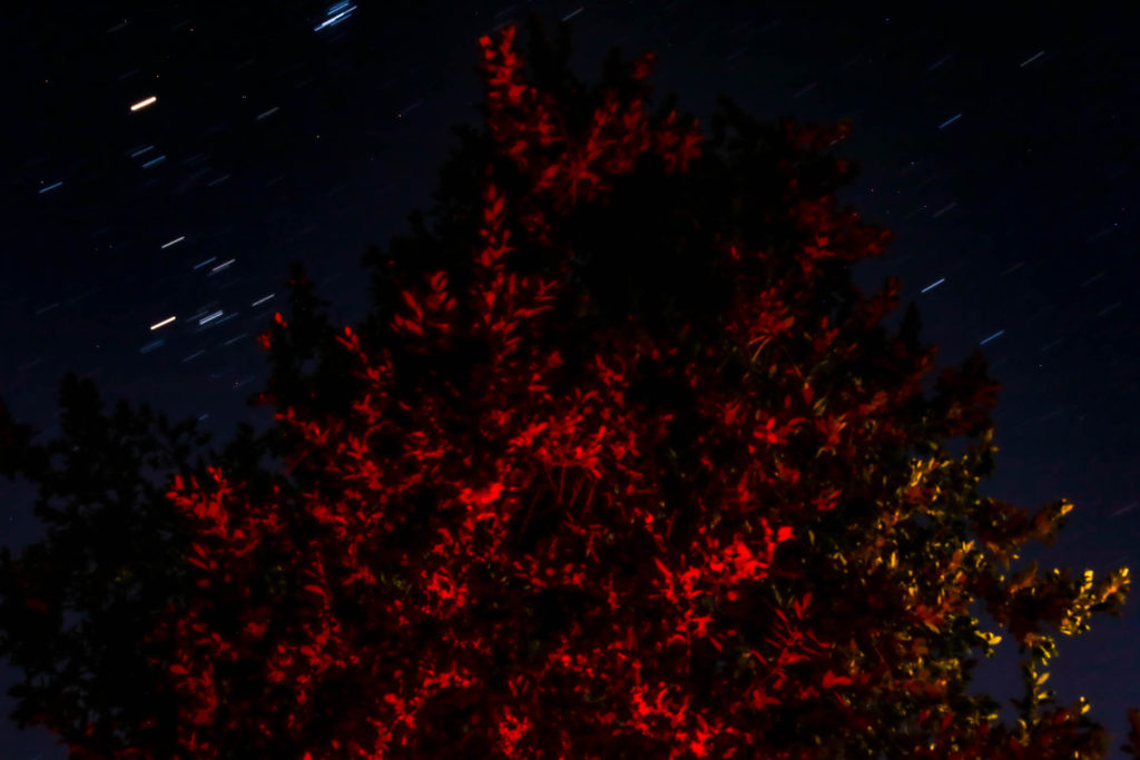
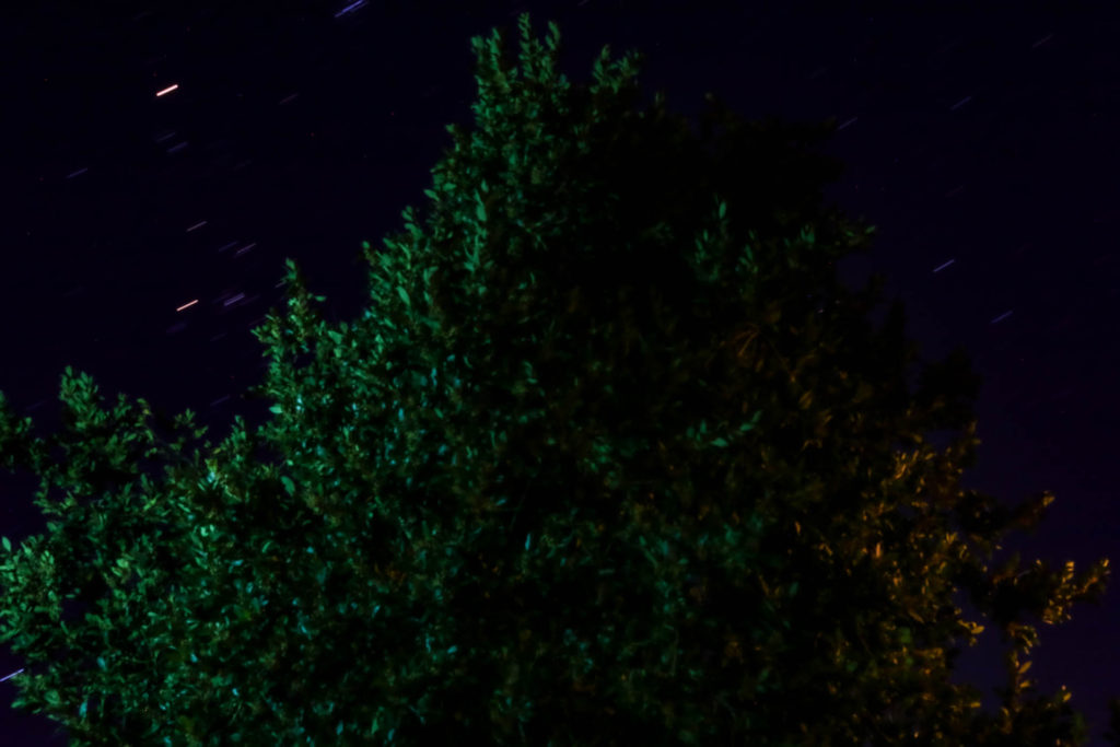
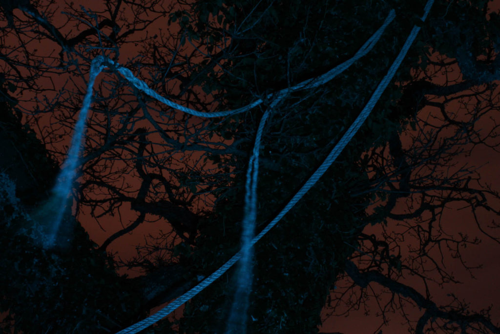
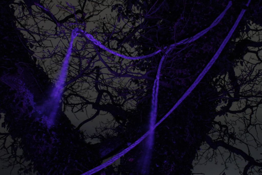

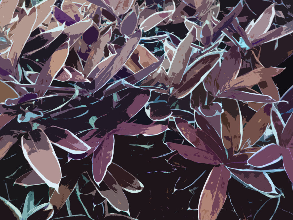

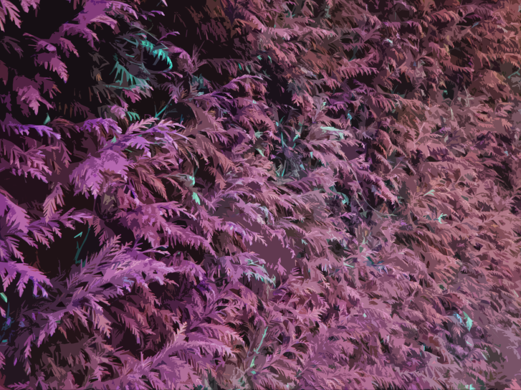
Final Pieces
I will be making three final pieces out of those images, one of them will have a sequence of four A4 images, and two will have a sequence of two A5 images, both pieces will be on a black backing.
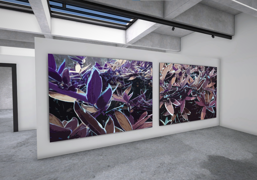
These final prints were inspired by the image on the cover of my photobook. I edited the images in the same way that I edited that image – using the ‘cutout’ filter on Photoshop and increasing the saturation to make it pop.
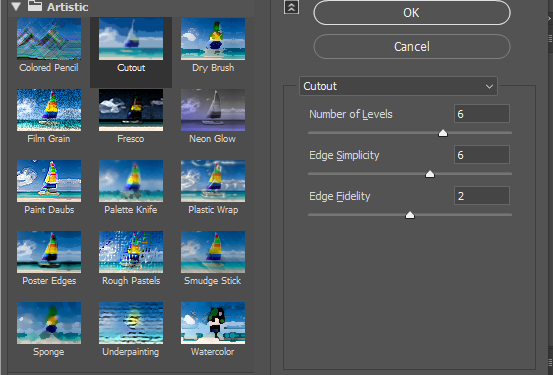
These are the images that I edited:
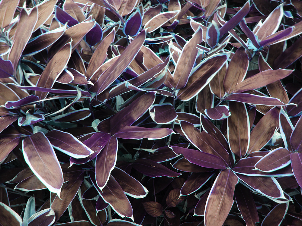
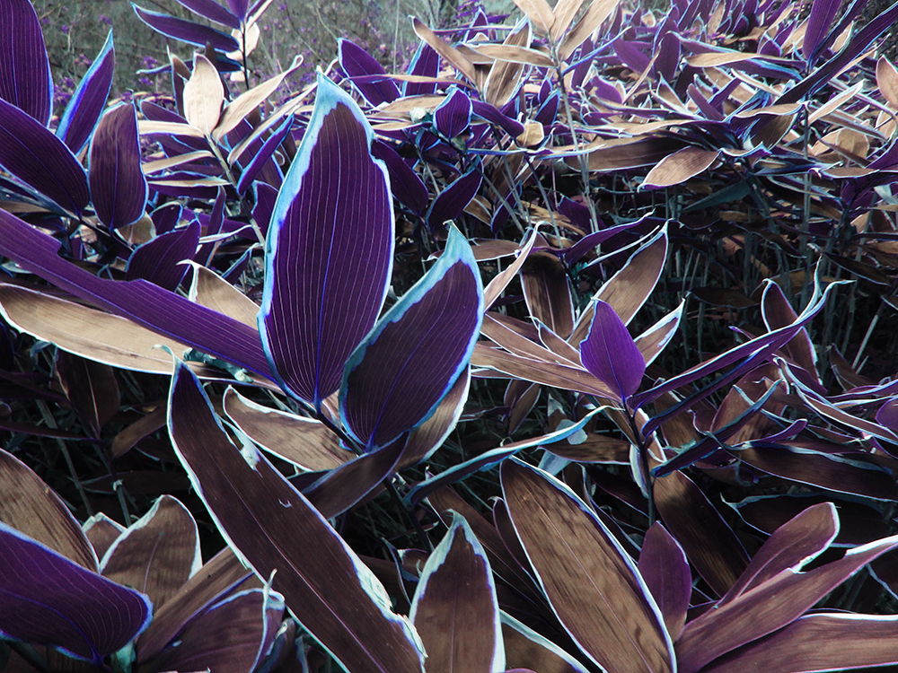
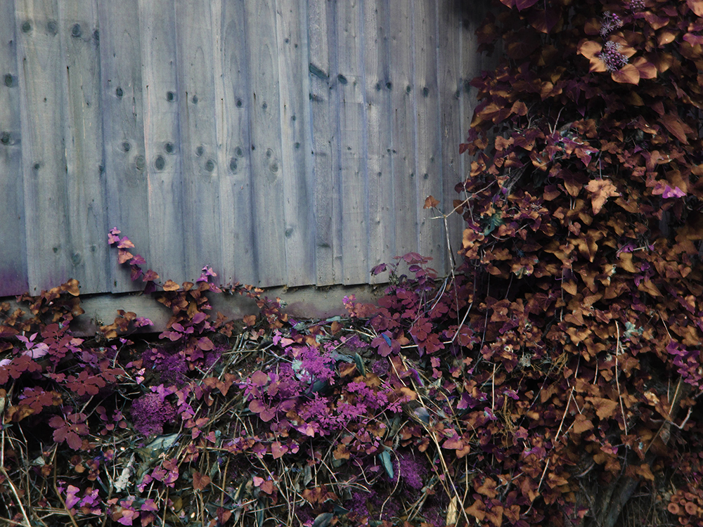
This is how they look after I have edited them (using the cutout/saturation method):
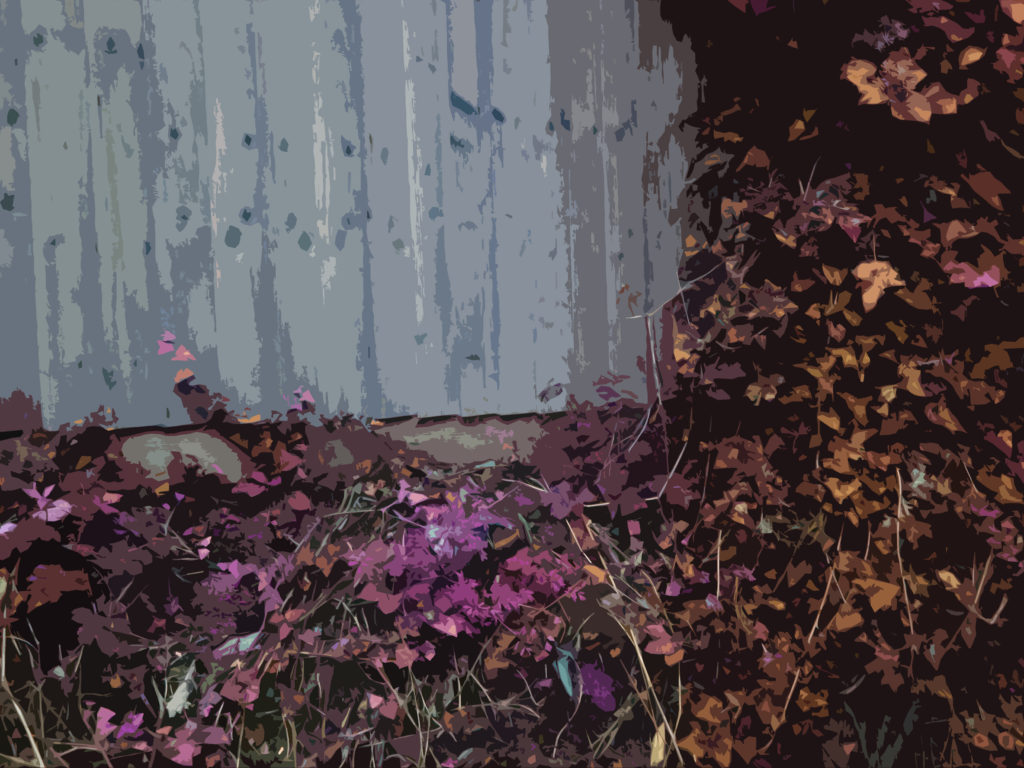

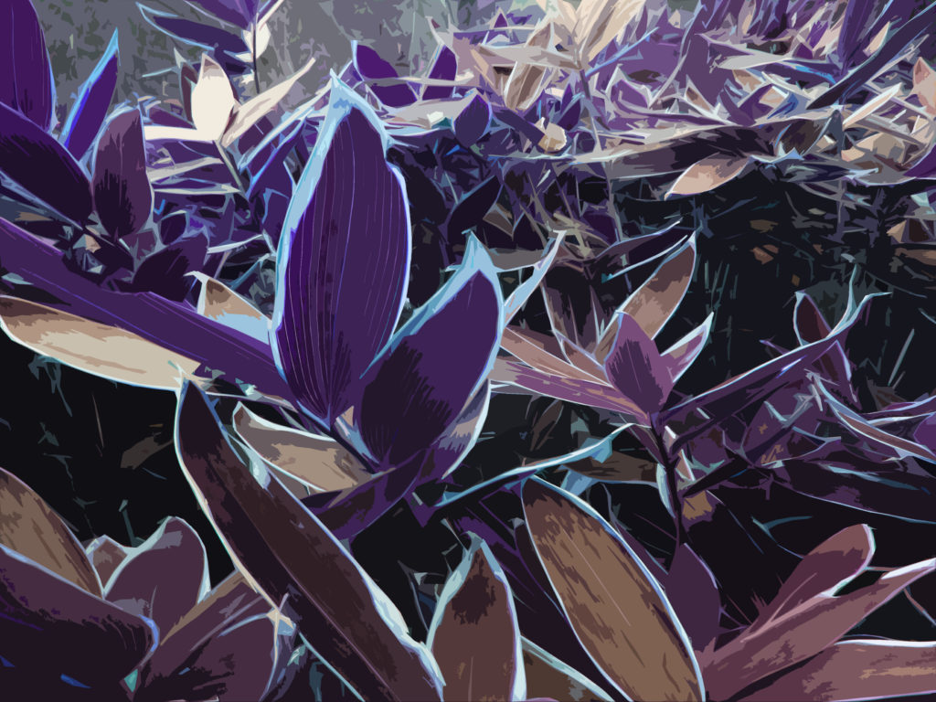
For my final piece using these images (including the image I used on the cover of my photobook) I would like to arrange them into a sequence:
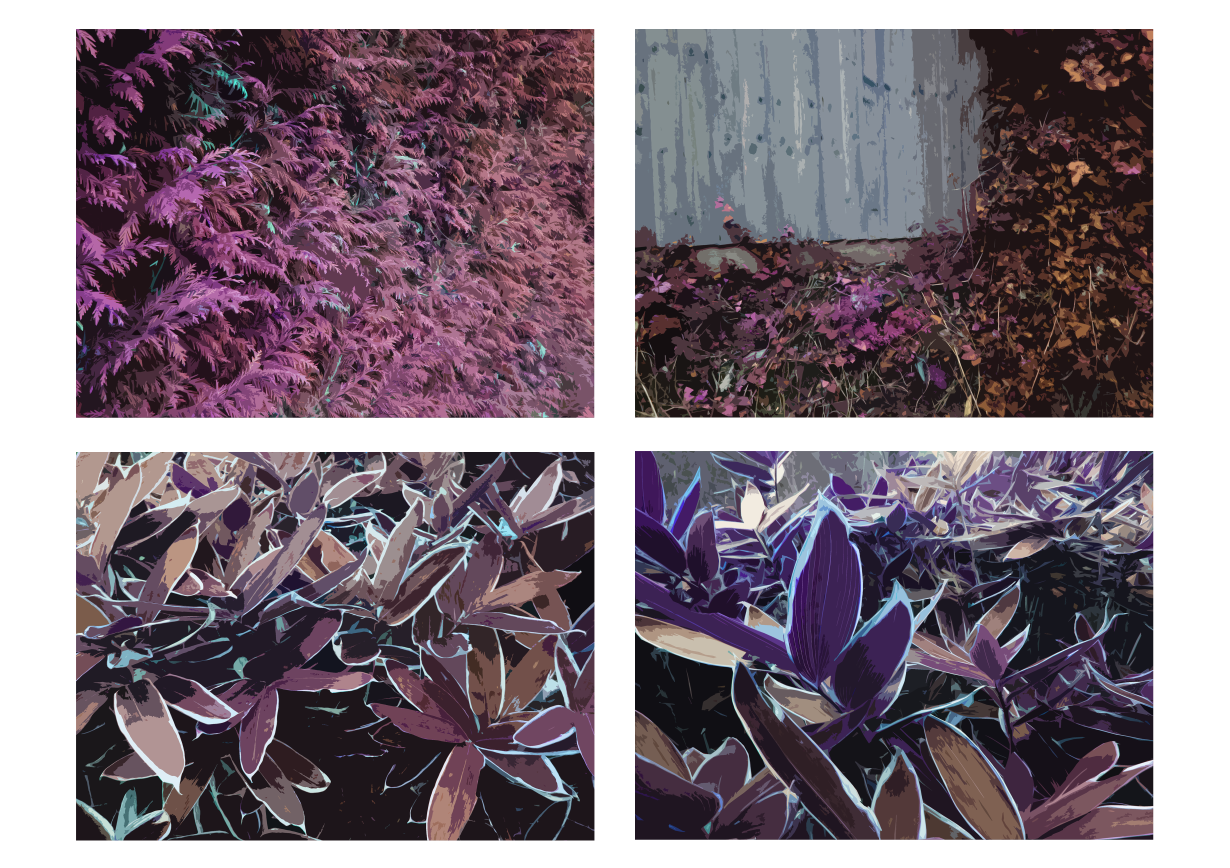
This is how I would arrange them, I think this arrangement works as the lines in each image point towards the centre of the page. I put the two similar leaf images together as I thought it would make the sequence less erratic.
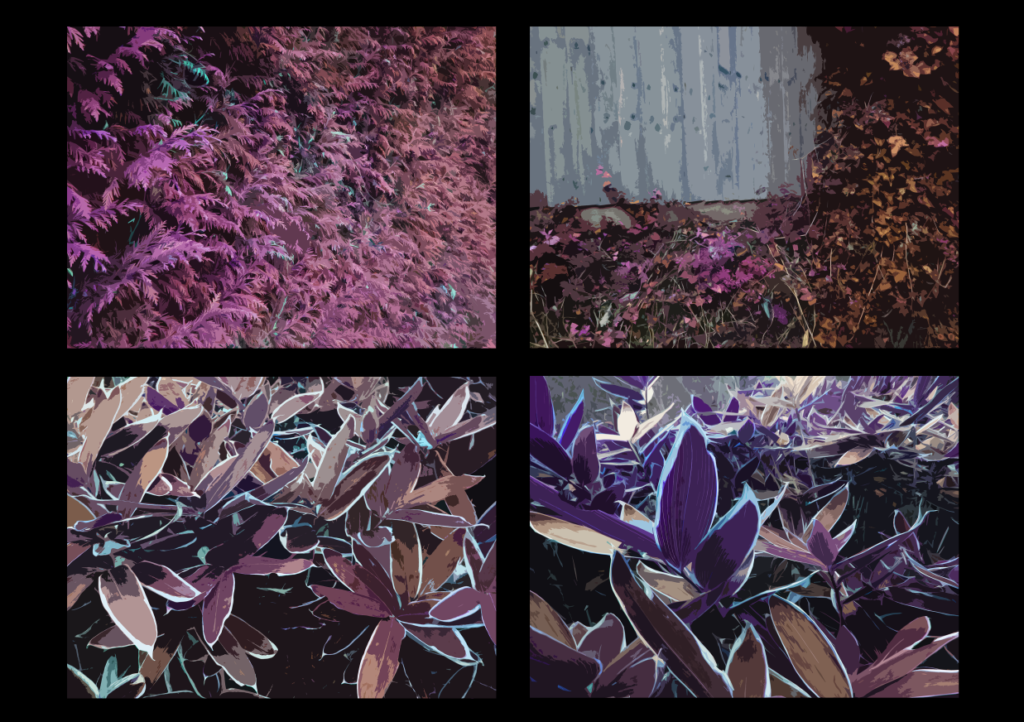
This is what the sequence would look like with a black backing, I think I will try to create something similar with my final piece. Unlike the next final piece, I don’t think using white foam board will ne necessary as these images are far brighter than the ones used in those, so it will reduce the effect of using the images with the black background to create contrast.
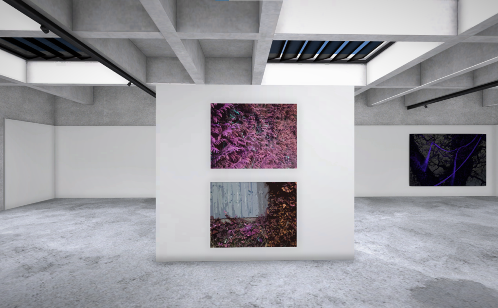
My next two final pieces will be laid out with one image above another in a sequence.
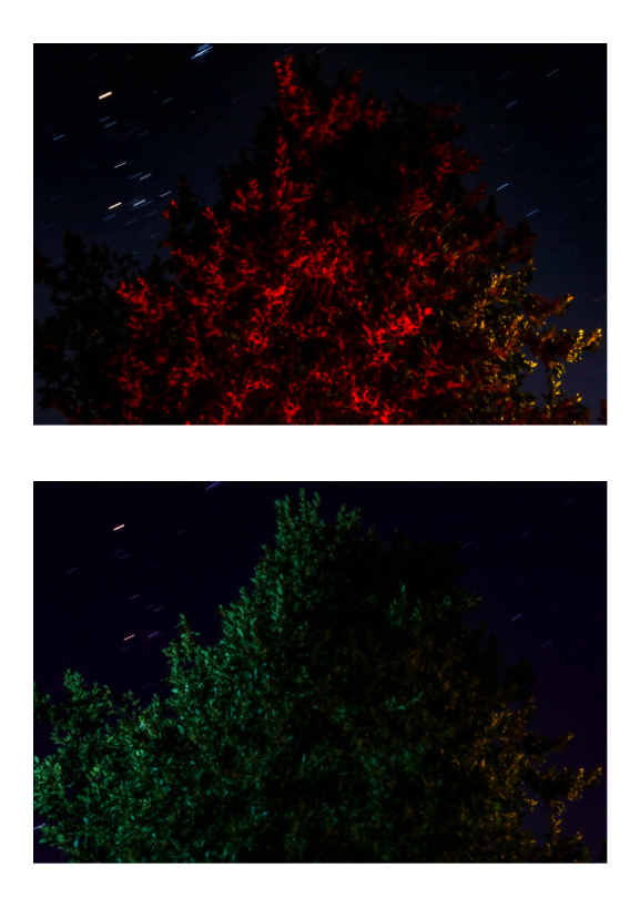
This is how this piece will be laid out
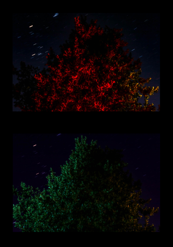
Here is what I would like the final piece to look like – I have decided to use black as it allows the bright parts of the image to stand out more.
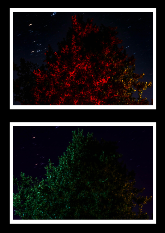
This is an example of the layout with a white boarder on the images to separate the images from the black background – I think this will make my images clearer, so I will use foam board as a primary backing for my images and then mount that on a black board to create the image.
For the third piece I will do the same as the last piece:
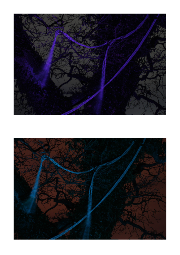
Here is the layout of the images
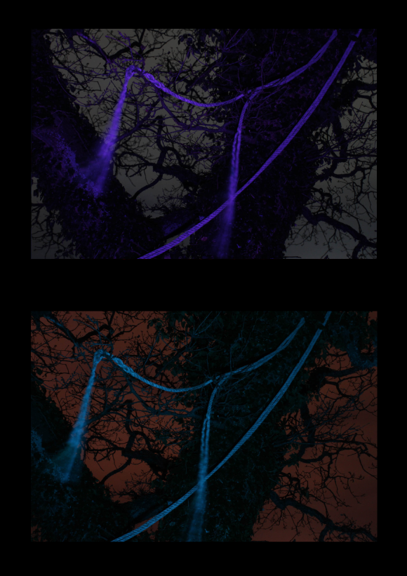
This is what the sequence looks like with a black backing
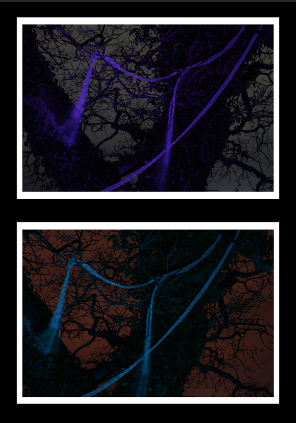
This is what the final piece will look like, once again using foam board to separate the image from the black background.
Virtual Gallery
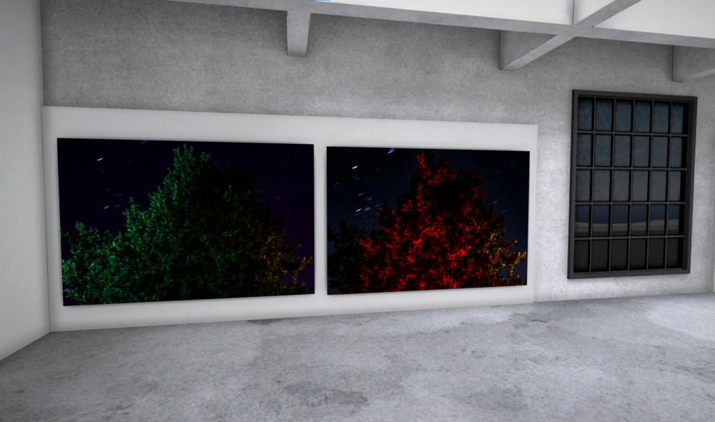
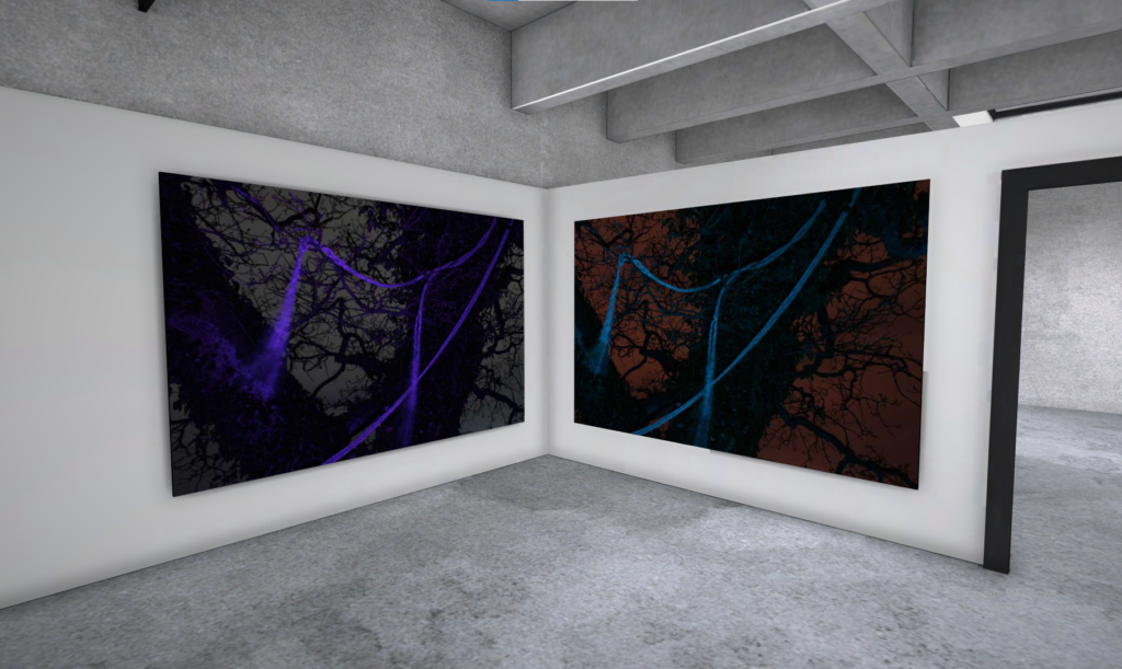
Here are some screenshots of my final image depicted in a virtual gallery setting
