To begin my photo book, I decided to further explore the topic of Islandness. I gathered up images from past and present photo shoots all containing the subject of rocks, ocean, beach and even history. Overall, I rounded up to around 500 images that could possibly be useful for my photobook.
Contact sheets:
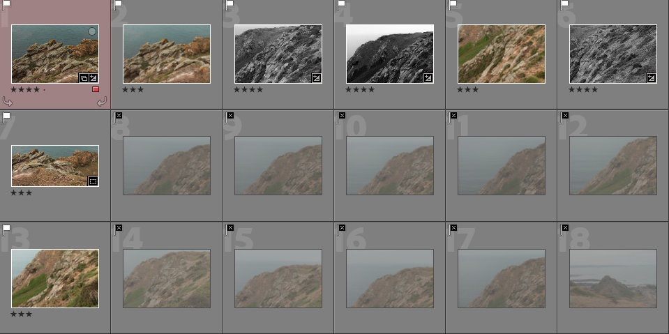
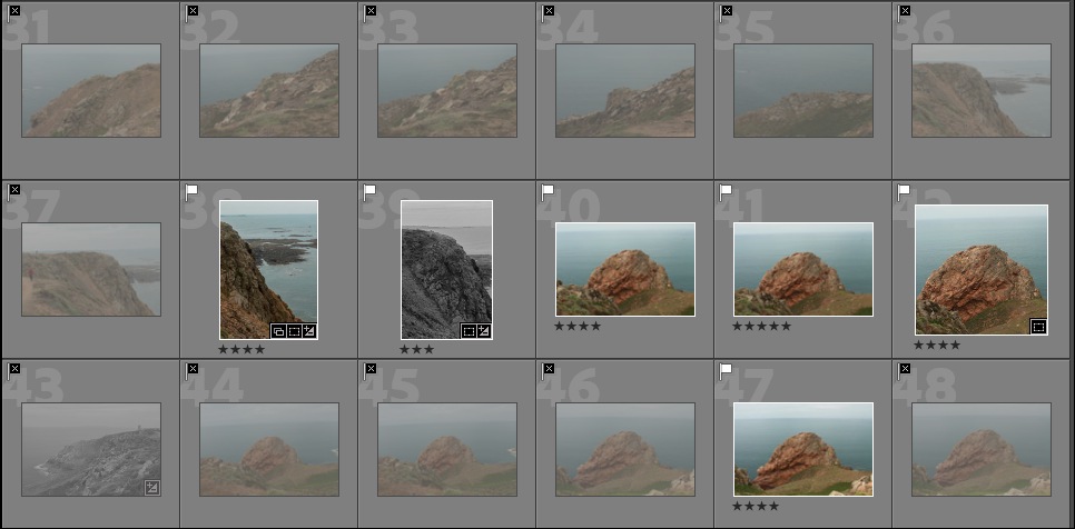
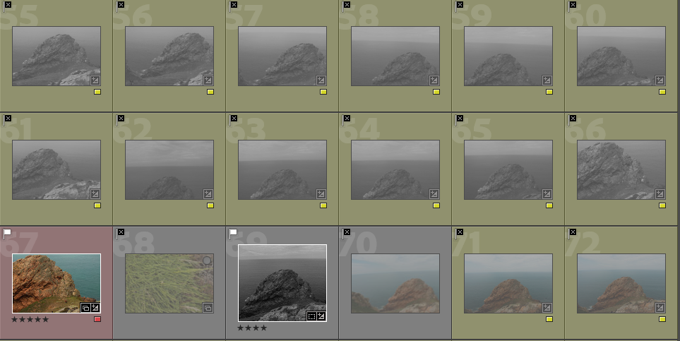
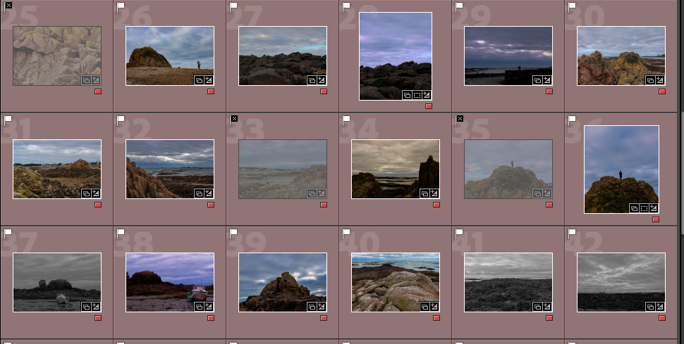
After importing my images into my lightroom collection, I organised them into colour ratings to depict which images I wanted to work with in my photobook. In the end I rounded up around 60 images that have been edited and were most likely going to end up in my book.
I then began by letting lightroom create a default book to give me an idea and a slight start for my photobook. At first, the default book looked very messy and disorganised until I played around and got an idea of producing the first half of my book with images from L’Etacq and the second half of my book being images taken at La Hocq.
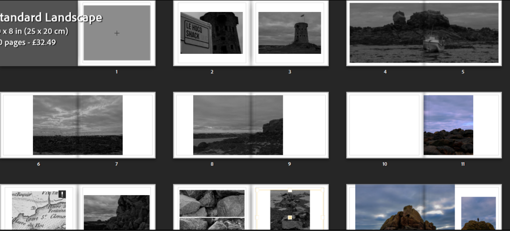
I decided I didn’t like the way this book was layered out and began my image placement again. I narrowed down my images even further and displayed them in a new layout which I much preferred.
Page experimentation:
After finding a layout I liked the most I wanted to experiment with different basic colours for the pages of the book. At first I started looking at grey and believed it wasn’t very effective.
Next, I tested out the black paper and couldn’t choose between using either white paper or black. I looked at how the book would look with all pages black and finally decided to use black.
Photobook final outcome:
First half – L’Etacq
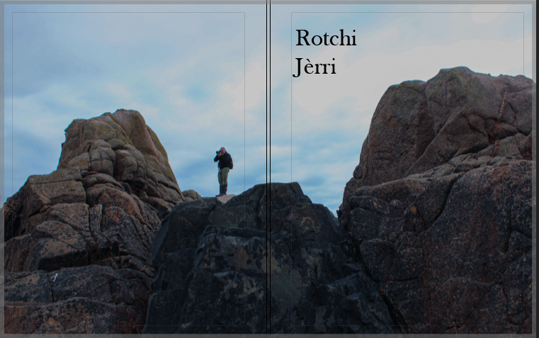
I chose the title of Rotchi Jerri because it is Jèrriais for ‘Rock Island’. My book displays rocks from our island which is a big rock. The use of rock island describes Jersey in a good way as it is surrounded by rocks and beaches. Also, Rotchi Jerri is a unique title due to the use of the Jèrriais language that I haven’t seen been used in the title of a book.
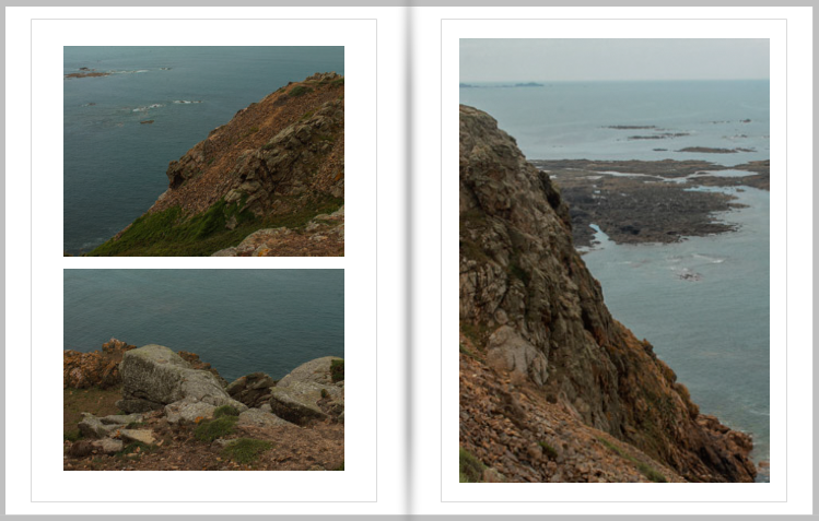
I chose to layout these page as such because they are all taken from the same position but in a different location. Also, I kept these three images together due to the very similar style and colour.
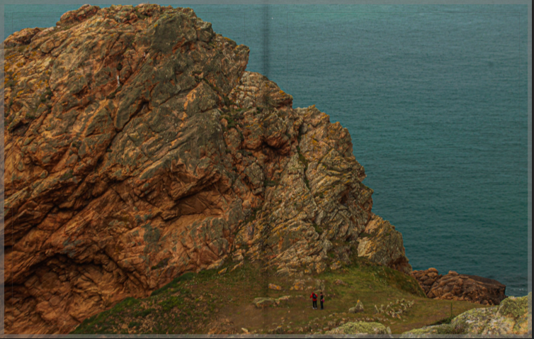
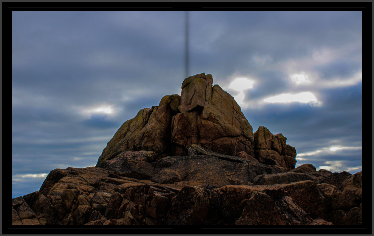
This photo is on a double page spread because it displays a massive rock compared to two people below. The use of the double page gives the viewer the full experience of seeing all the details throughout the rock.
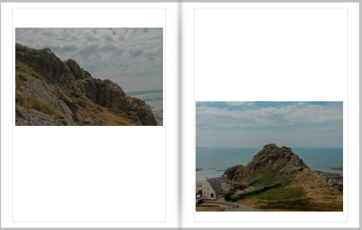
I chose to use these two images on a double page because they are the same rock but taken from different positions.
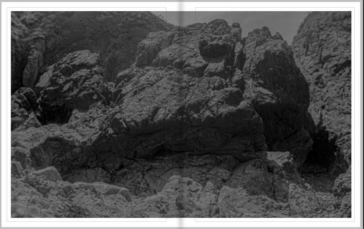
I chose this image for page 8 and 9 because of the introduction to the black and white images.
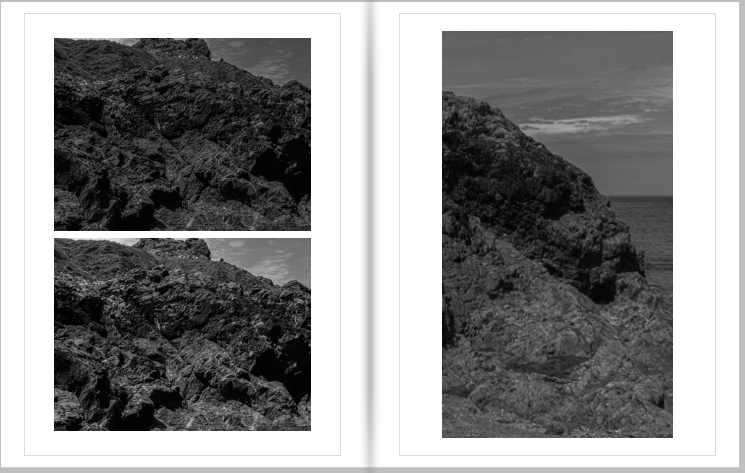
I carried on the theme of black and white to the next page to keep some sort of sequence.
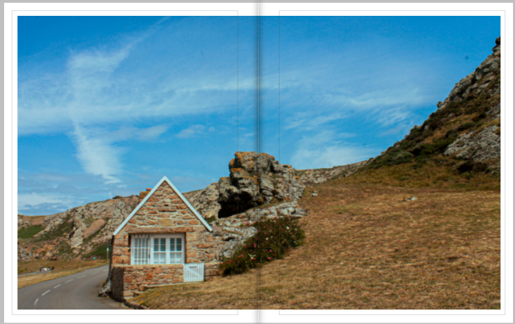
I chose to use this image on a double page spread because it can almost be seen as two different images, one of the house and one of the rock and scenery.
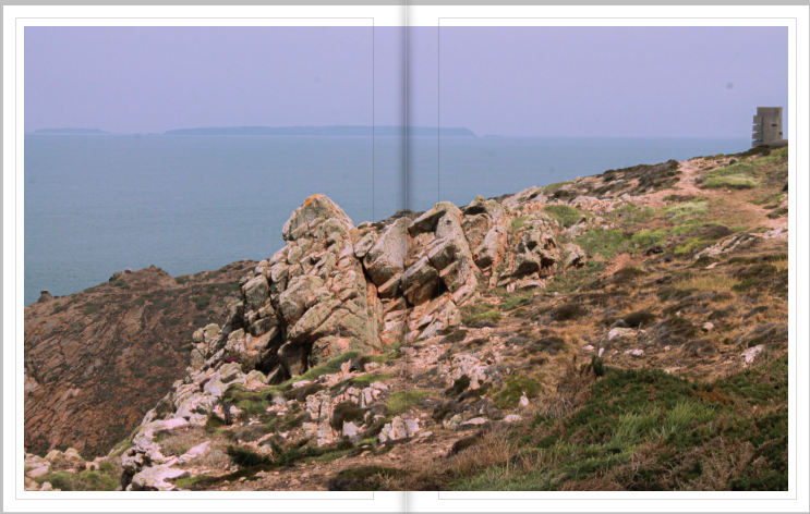
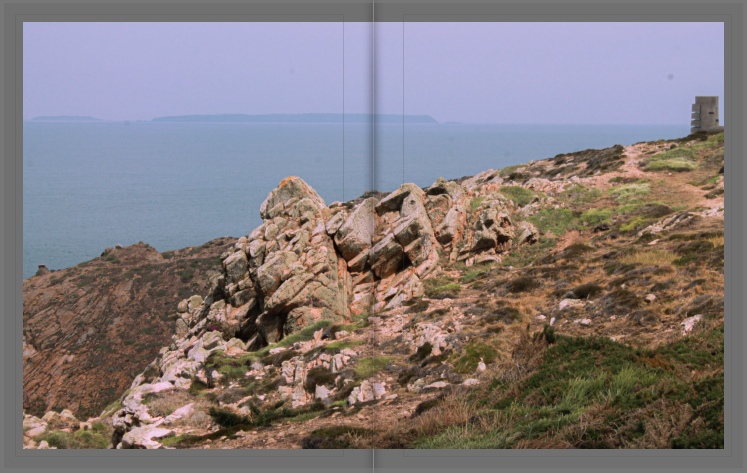
I also chose this image to be on a double page spread because of the vibrancies as it ends the topic of L’Etacq and transitions over into more black and white of La Hocq.
Second half – La Hocq
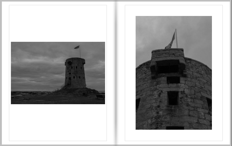
I chose these two images to be on the first pages of the La Hocq section because when we went on the trip the first area I photographed was the La Hocq towers, keeping a sequence throughout the book.
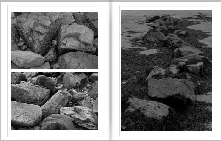
Next, I chose these three images to be together because of the black and white theme carrying on. I designed page 19 as it is because of the two similar photos of rocks juxtaposing each other.
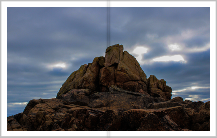
I chose this image to be presented on a double page because it is one of my favourite images and I wanted to display it to full extent.
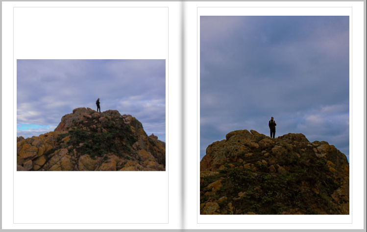
These two images are taken of the same rock, but from two different angles, showing the true size of the rock.
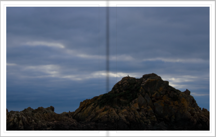
I chose to present this image on a double page spread to display how big the rock actually is compared to the bird positioned on the top.
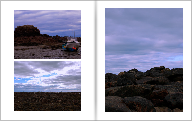
These three images were placed together due to the colour of the sky all linking. Also, they are all taken from a similar position, displaying more of the sky rather than the rocks.
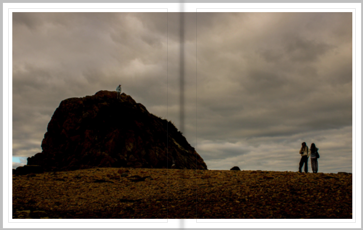
I chose this as my final 2 pages to fit the whole boulder on one page, and to show how small humans are compared to some rocks.
Evaluation:
Overall, I am very happy with how my photobook turned out. At first I was going to use the white paper, but then chose black due to the great contrast between that and the images. My photobook project could’ve progressed much further if I managed to go on more photoshoots, rather than using many past images. However, I like the topic of Islandness and I believe it is a perfect topic for when creating a photobook as it tells people a lot about the island of Jersey and what it is like living here.
