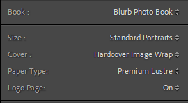

These are the settings I ended up using for my photobook, I like the feel of hardcover books and the image wrap will allow the image to appear on the front cover. I chose portrait as it fits the resolution of my images (especially on a double-page spread) better.
I started designing my photobook layout by first creating each page spread individually, without proper concern as to what went where at that point in time. However, I did take into consideration what spreads had already been made, so I could create a pattern of symbolism/motifs and the layout of the pages (for example each spread with a pigeon on it is made up of two images – the pigeon and a landscape from a Bhamra shoot, as a way to contrast them).

In this image you can see the final layout of my photobook. I tried to make my layout as symmetrical as I could (in terms of what images are placed where), which is something I have done for each zine/photobook I have created, as it allows me to visualise the sequencing of my images and ensure consistency.
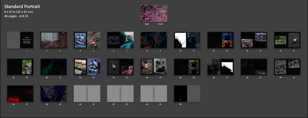
I eventually decided that black pages on my zine would be more effective than white, as it will allow the brighter points in my images (for the night images especially) to contrast better. The three grey page spreads at the end is where the essay will go (shown below).
Key Page Spreads:
Here I will explain my thought process behind the key page spreads (those which have repeating motifs/meanings – one from each).
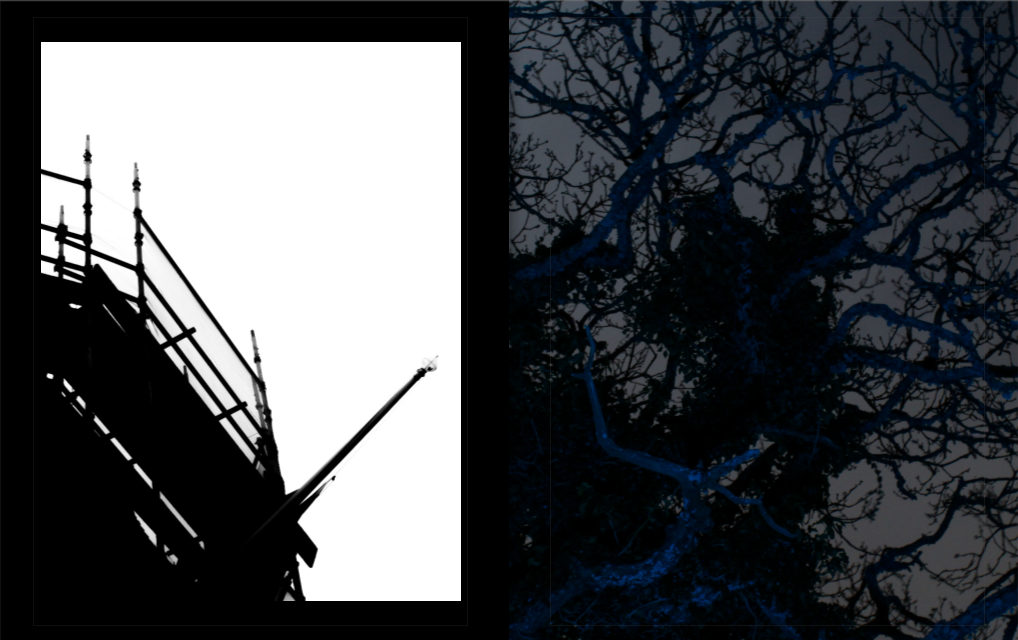
These spreads came from the symbolism with tree branches and scaffolding poles. To me they both look similar, the branches and the way they point towards the sky shares a resemblance with scaffolding. The two could also represent similar things, but in different contexts, such as growth, construction, etc., as well as support (for us scaffolding acts as a way to get to the top of buildings to help fix or build something, while a tree branch could be the location of a bird’s nest as an example). At the same time, they represent very different things, scaffolding – the growth of humanity, and a tree – something which is often destroyed to allow that growth, this dynamic was interesting to me so I decided to visualise it in my book.
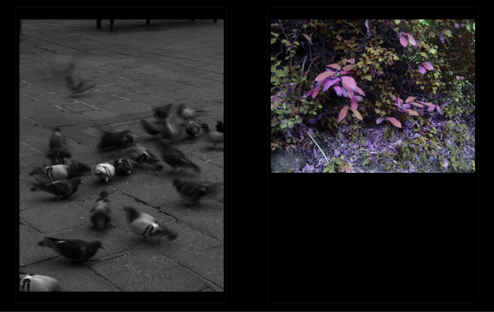
The spreads involving images of pigeons and a colourful landscape setting represent the contrast between the organic and synthetic in a nutshell. To me the pigeons represent isolation within an unwelcoming and unnatural world, as well as a dependence on humans as a result, while the image of the natural world is depicted as being free and safe from disturbances. You would expect these birds to live within the natural setting, however, as shown here that is not the case – there are no animals to be seen in that landscape. I have also used colour symbolism to represent this, the pigeons within their urban setting are black and white, while the natural world is depicted as colourful to an almost exaggerated extent.
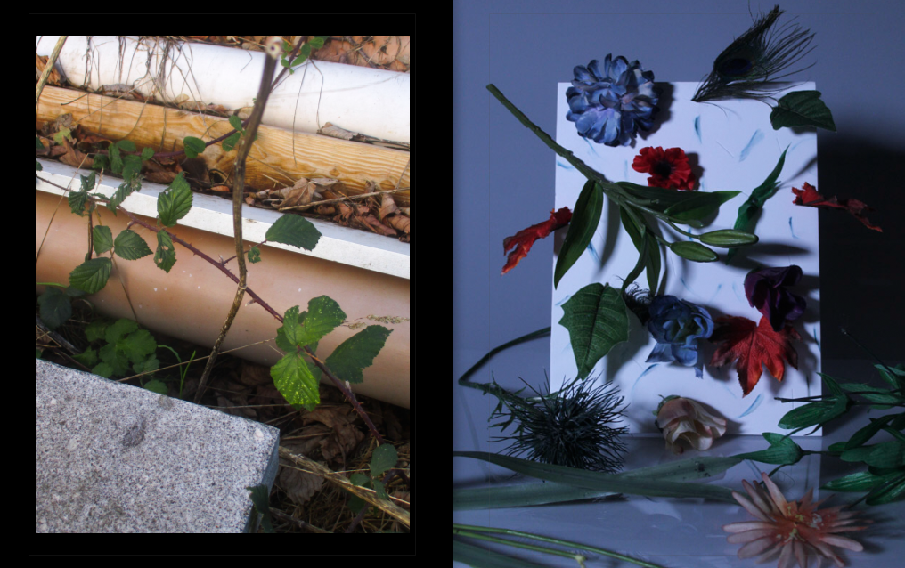
Here I have juxtaposed a scene that was not tampered with by myself (which involves elements of the natural and man-made), with an image of a scene created by me, comprised of synthetic plants and materials representing nature. Both images could represent the same thing – the contrast with the natural and synthetic, however paired together it could be taken to another level: the scene I found could represent something organic, while the scene I created could represent the synthetic.
Implementing the Essay
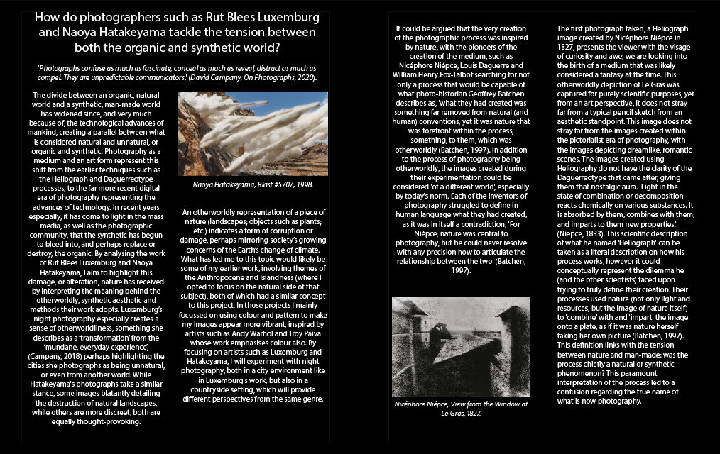
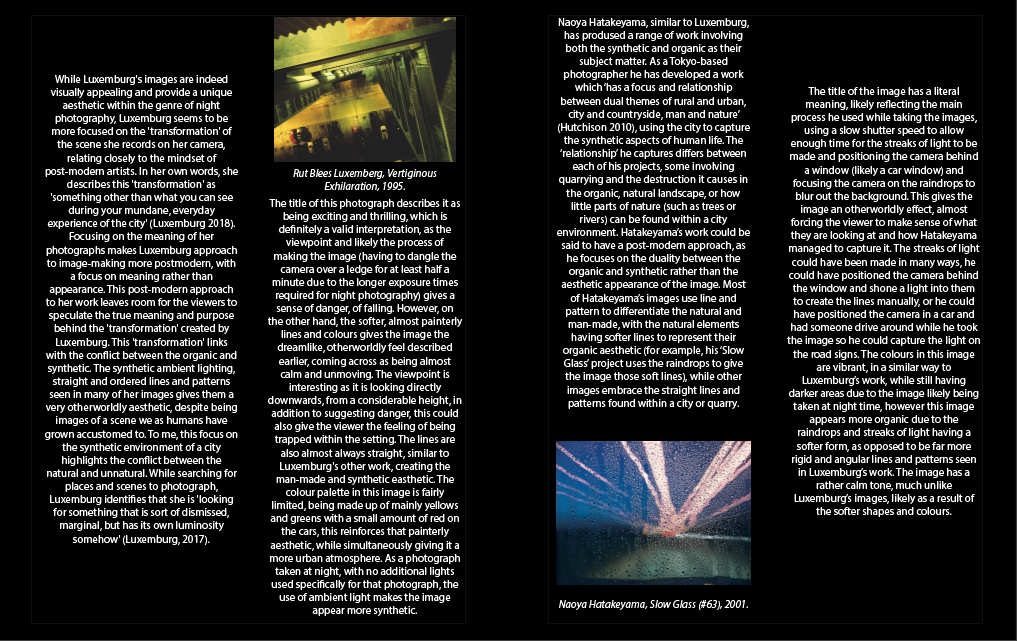
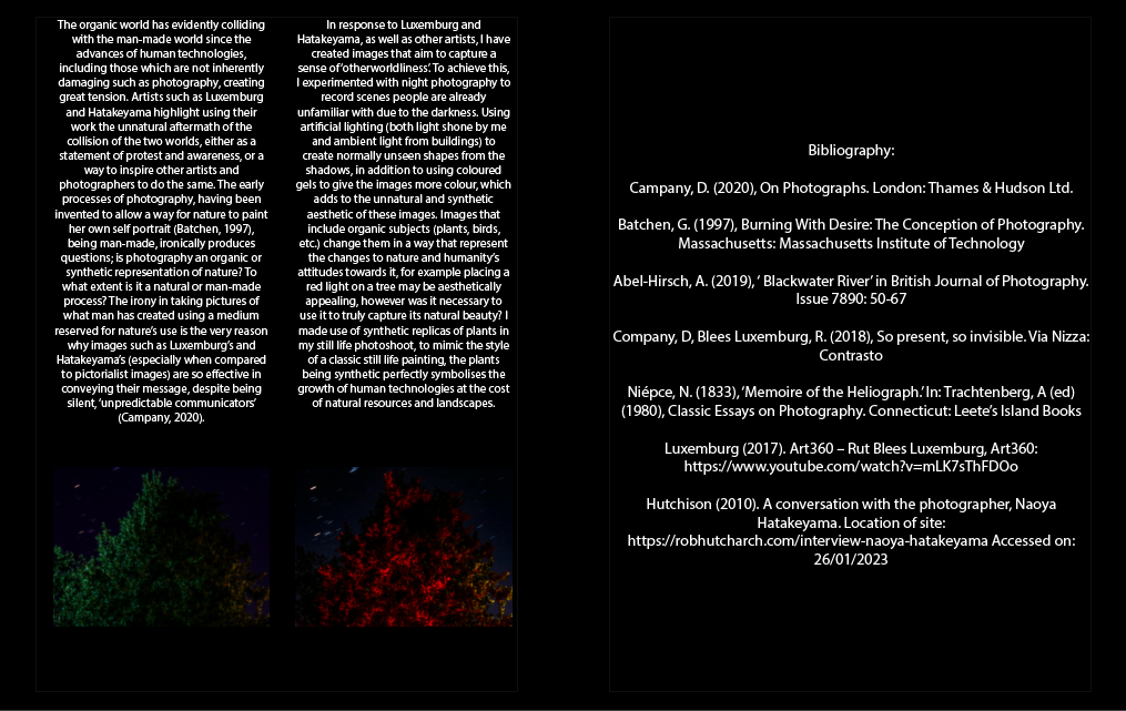
Having created the photobook, I will now put my essay into the pages at the end of the photobook, so that it does not disrupt the flow of the main photographs. The essay was separated into 3 page spreads, each page translating to one paragraph, this is how it looks in the photobook:
