
I opened a blank book and started inputting images in order to further refine my image choices and to create a structure in the book.
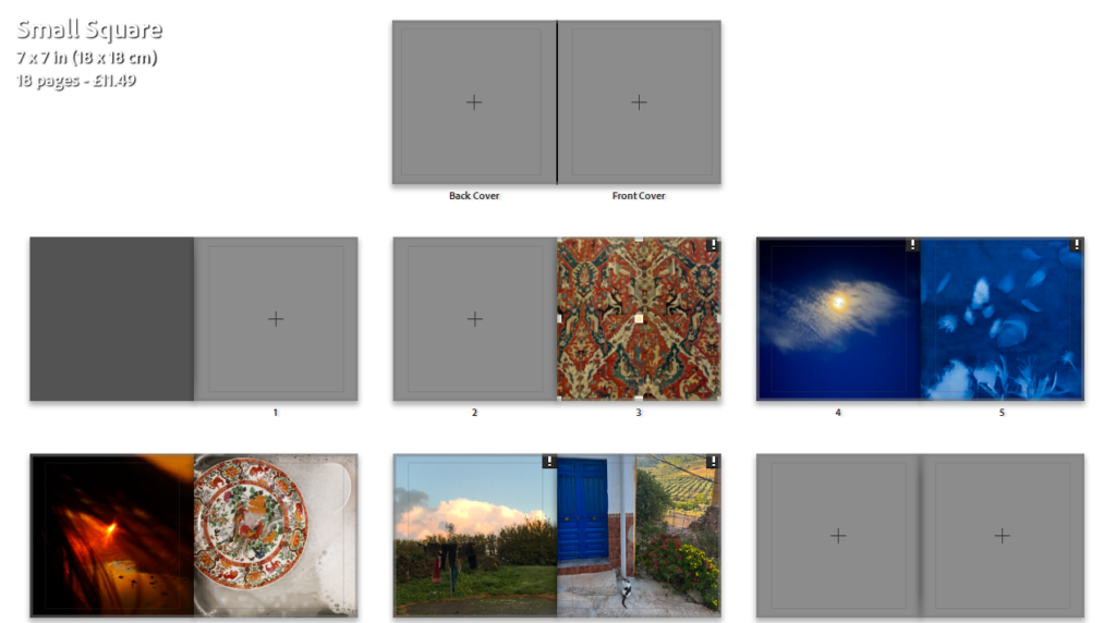

I started by just randomly inputting my final images, finding colours that are similar in tone and presenting colour contrasts such as deep blues contrasted with dark oranges.

I knew what images I definitely wanted to be in a sequence, such as the sea images which have an almost turquoise colour, then the deep blue of the sky and cyanotype then the rich colours heavily contrasted by the black and white.

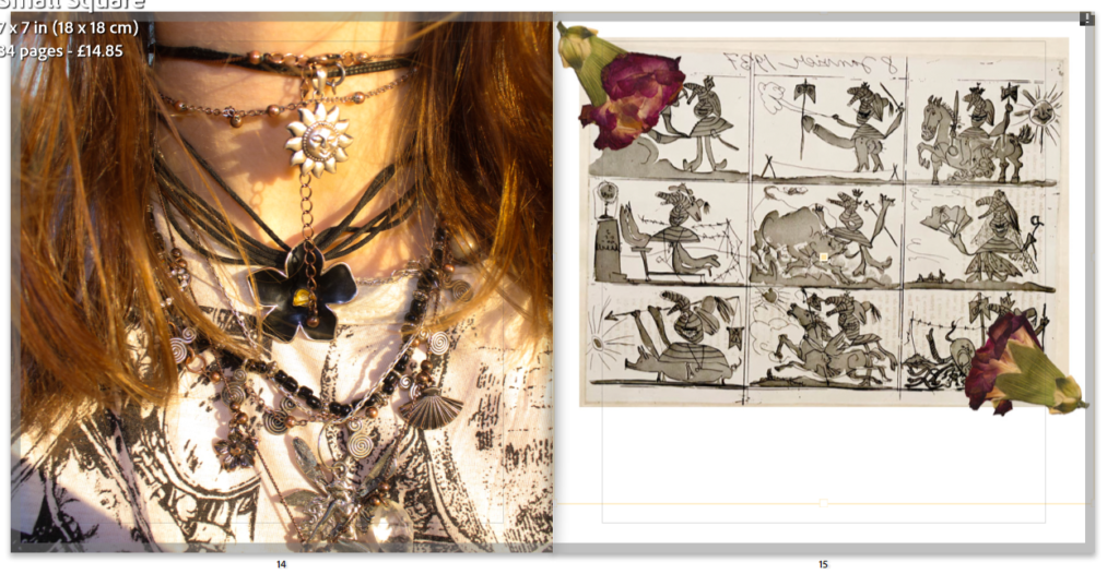
For images like the one above I have decided I am going to put the actual object in instead of editing it in, to further the sense of a diary. All the white spaces left in the book will be physically written on with a black pen once the book is printed
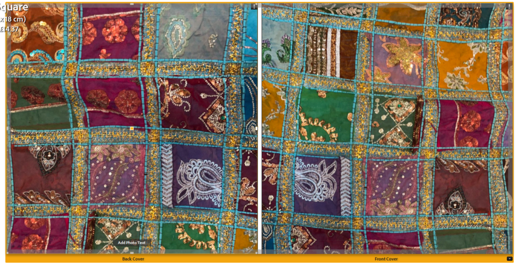
When deciding what I wanted my end and beginning pages to be I wanted to have busy, colourfully rich image so I used my textural images


I do not have much regularity in the layout of my images on a page however there is regularity in the way the images are presented- with there only being full page spreads, one two page spread and the only gaps being left to be written in either being below an image or down the side.


I had to decide some design choices such as the size, the cover and paper type- I chose for the book to be in standard square format with a hard cover including matte paper

I feel as if this design is quite successful- I like the reoccurring theme of warm colours such as the “textural” pages at the beginning and the end. I do not feel as if the images “flow” however this was not exactly what I wanted, I like how the images where green is the most prominent colour almost disrupt the flow of warm into cold colours.