LIGHTROOM EDITING
First, I separated the images I am most likely to use from the images I was least likely to use, I did this using a colour-coding system where I selected images I was most likely to use in my final project- after editing I will further narrow down these images when I am choosing the layout of photos in the book.
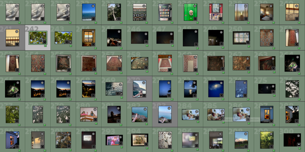
After this I did some editing on my images- bringing out contrasts, saturating colours, levelling areas with high exposure- I’ve also added grain to some images as to make them look more nostalgic. As with Sam Harris and Olivia Bee’s work I am keeping editing to a minimum however I will be putting some images into photoshop to experiment with different more abstract and distorting editing.
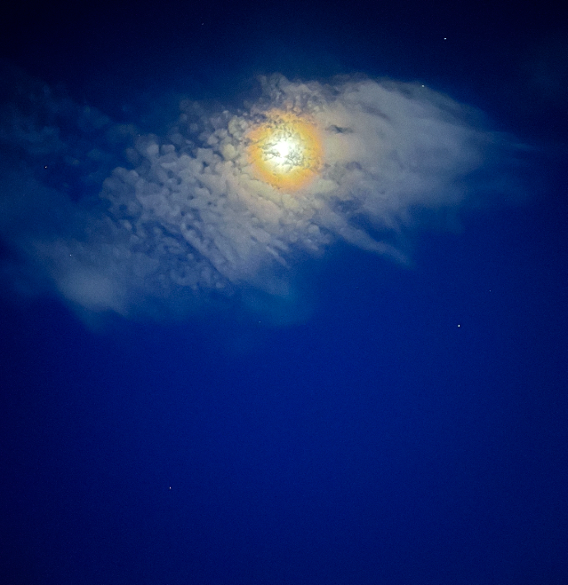
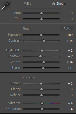
Below is the editing for the image above, I have kept it to a minimum- I have turned up the saturation and vibrancy so the blue of the night sky is more visible- along with the yellow of the moon. Lowered the exposure so the light of the moon is more prevalent. I did experiment with turning down the clarity and dehaze- however this made the image look too unnatural to the extent where it would not go well with other images in the book, especially when I have some images where detail in the image is key. Not shown in the editing was where I turned up the grain to +11 amount, +25 size, +50 roughness.

For my textural images I had to crop and resize them to focus on the parts of design I wanted to concentrate on- I then had to edit them so they were brighter (turning up the exposure, whites and highlights) as the environment that the pictures were taken in was dark as to preserve the colours of the rugs.
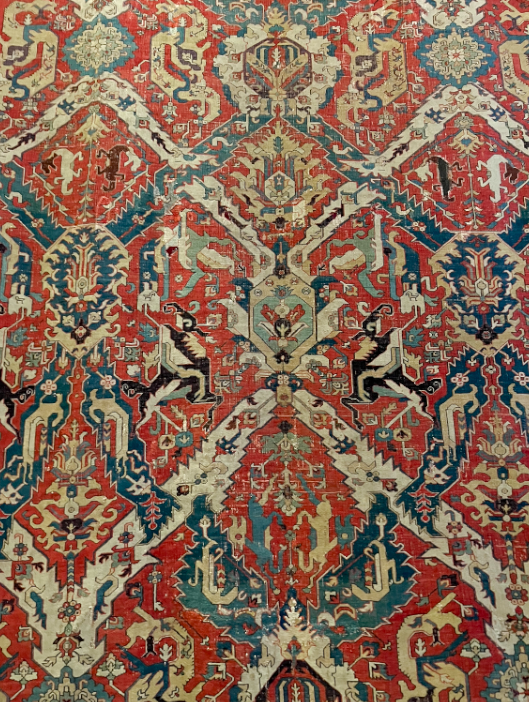
Above is an image that was successful when editing- clearly it is not perfectly straight, I have decided to keep this effect as it adds to the more homemade, imperfect aspect of the book. When editing some of these images I realised that cropping and resizing them make the quality of the image worse- so I have decided not to use images where this was noticed.
I then separated my images into categories concerning the main focus of the image; including nature, textural, person and abstract. I did this using a star rating scale- 1 star being nature, 2 being textural, 3 being person and 4 being abstract.
PHOTOSHOP EXPERIMENTATION
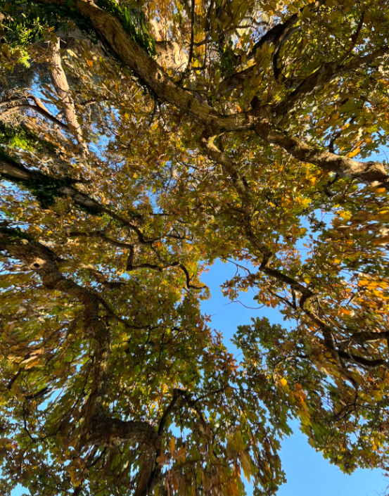
I wanted to create a fisheye effect on my nature images- specifically of pictures where I was photographing looking up through trees to see the crowns.
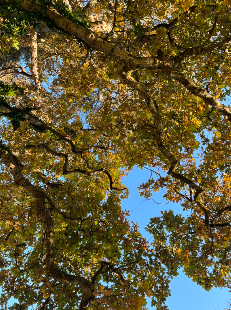
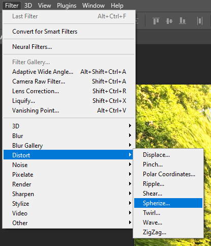
First I edited this image in Lightroom, then exported it to photoshop. I then followed the below options for editing and chose to spherize to -34
Below is the image after editing, I do not really like how it turned out, personally it gives me a headache, and further editing on photoshop has made the quality of the image diminish.
PHOTOBOOK EDITING
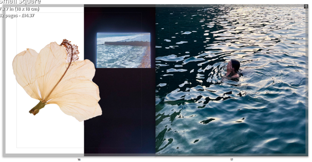
I then started “cutting out” the subject in my studio images to overlay on my photos in the book, I did this by using the object selection tool and then removing the background and importing the image I wanted the item to be over. I had to change the sizes of the images so they would look realistic and get rid of any white areas let on the image after selecting it.
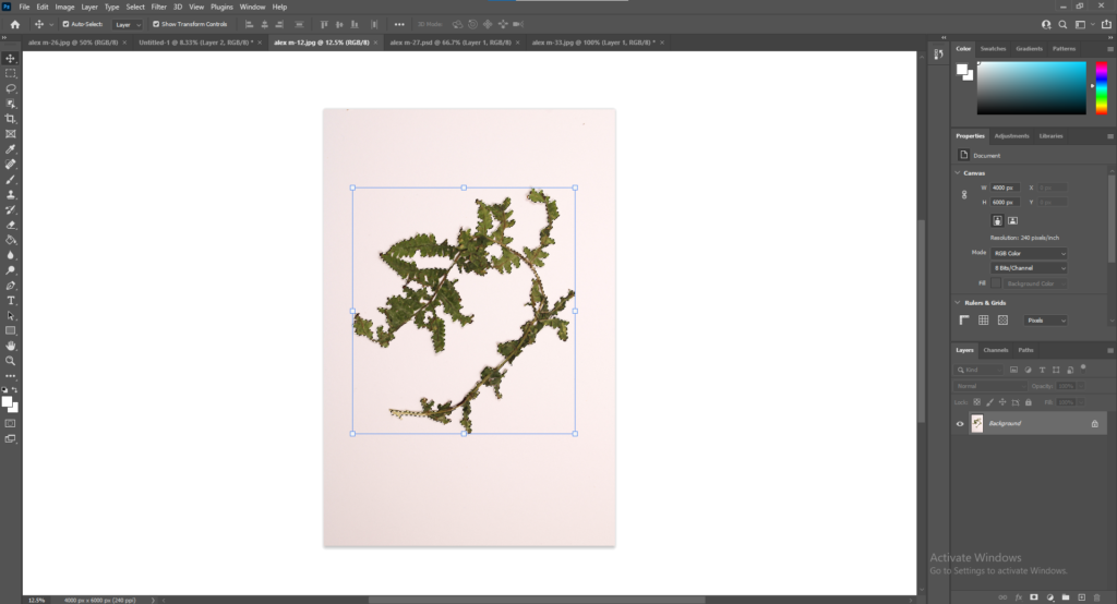
By cutting out these images I created images like the one below- looking natural and homemade with pressed flowers in a book.
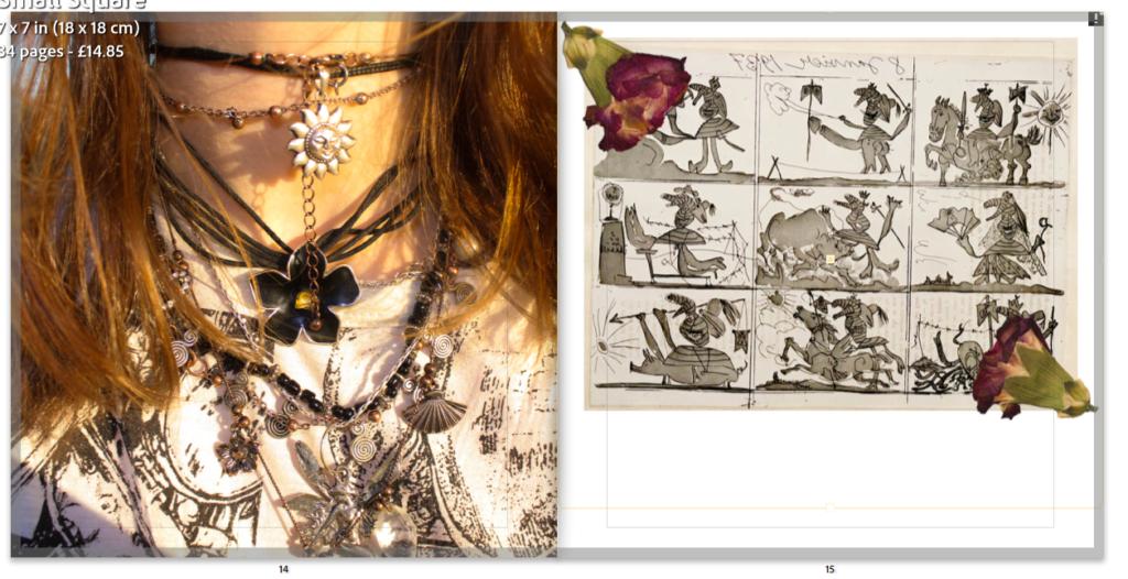
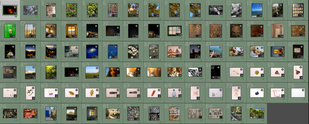
I went through my images further, changing duplicates and images which I was struggling to edit- i.e. overexposure tainting part of image, blur, struggling to make it level. To further make selections I am combining some of my nature images on photoshop (seen below)
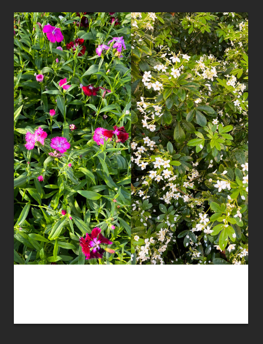
To do this I exported the images from Lightroom onto photoshop and simply opened then dragged them onto one portrait page, making sure they are dead centre and aligned with each other. I am leaving the bottom blank white as when my photobook is printed I am going to handwrite text into it (i.e. poetry, notes, diary entries etc). I am unsure if I will use this image yet as the colours do not match any of my other colours- I may use the white flower image individually.
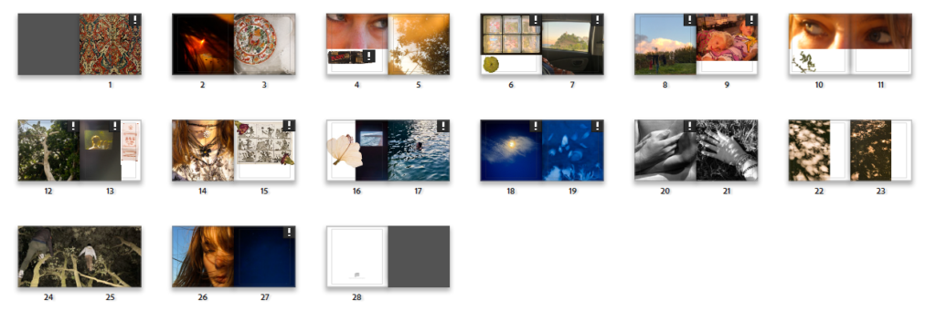
After I put the edited overlays on the image, some of them were not as effective as others, for the ones where it was not effective I took out the item and left the area blank so when the book is printed I can physically write and stick in the objects themselves or print the pictures onto transparent paper then stick them in.
After doing all this I did not need to edit anymore- so I concentrated purely on photobook design, click the link to view design blogpost.
