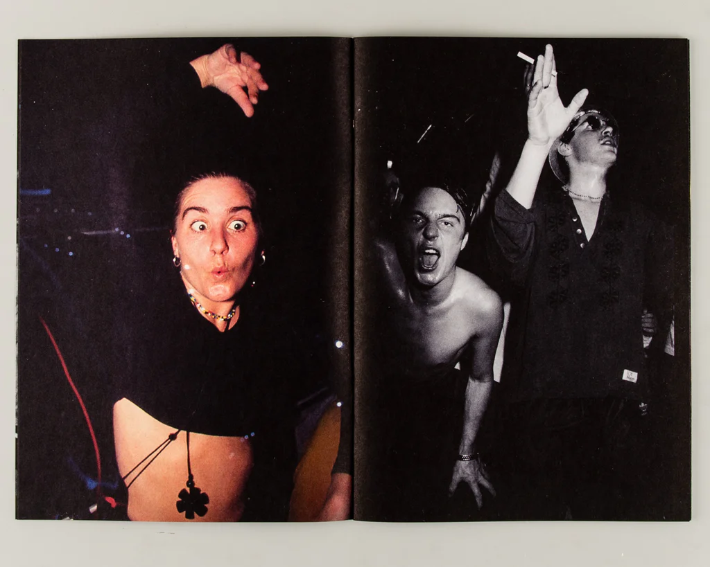
Photography zines are a tool that photographers can use to tell a visual story, inform an audience about a specific topic or issue, showcase and advertise a new idea or just create a preview of an ongoing project. Zines were originally called fanzines, alluding to the fans who made them but not to be confused with magazines as photo-zines don’t include nearly as much text- if any). Zines often have specific yet simple layouts in order to take the viewer on a journey or portray a story through the photos within. Images will be thoughtfully and specifically laid out in order to anticipate and or guide the path your vision takes when you first view the page.
Example – Time Only Moves In One Direction,
By Chris Black
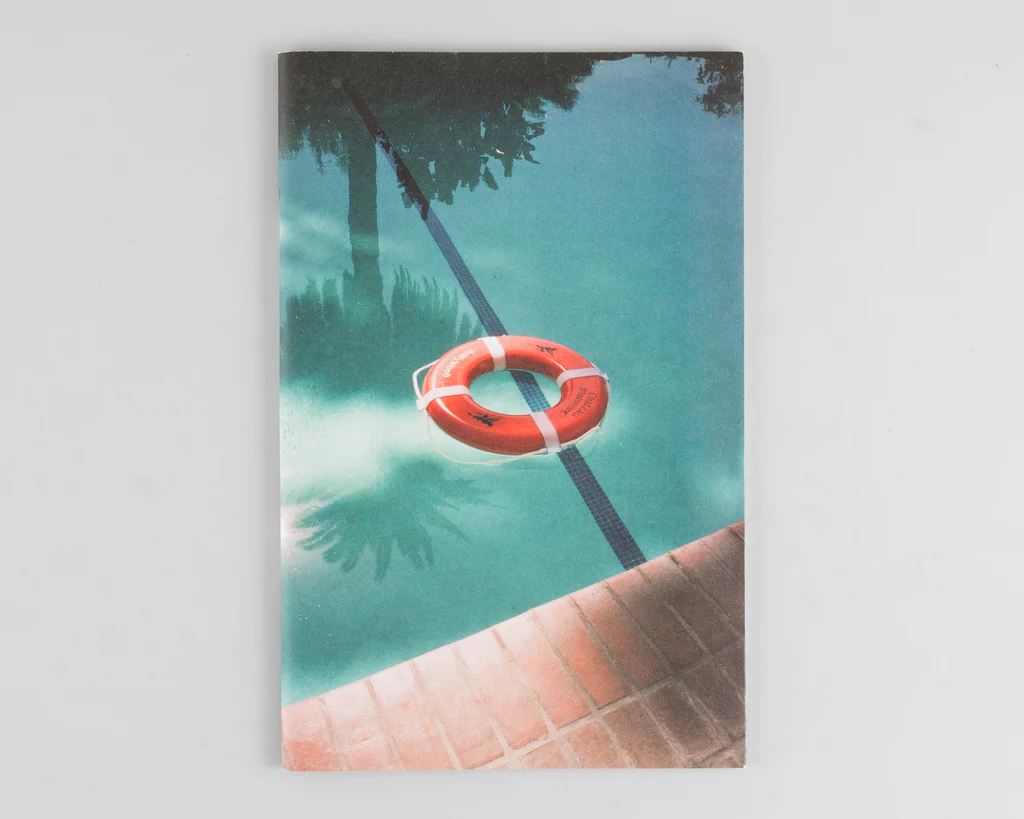
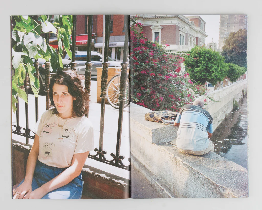
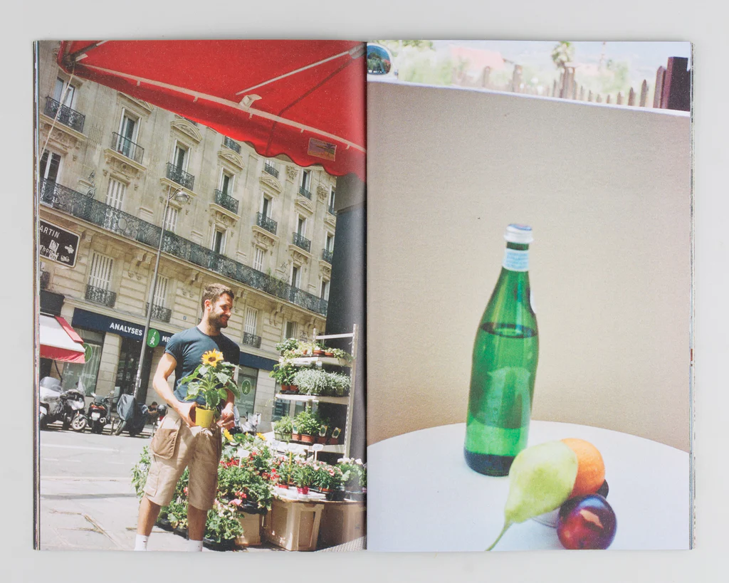
This specific zine was published by Village bookshop and Gallery (a small independent Leeds-based organisation) which source self-published and small-press zines from artists around the world. This is an example of how zines are an example of a sort of rebellion from smaller artists against big publishing/ printing companies as zines require significantly fewer resources to make – giving the power back to smaller artists.
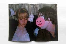
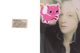
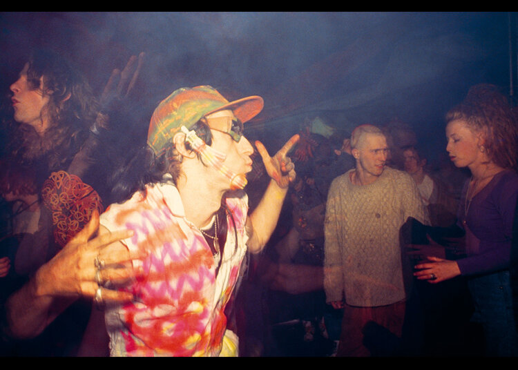
Photo-Zine Moodboard



My Zine
Based on the zines I have viewed through my research, I am planning to keep the main precipice of my zine simple- featuring mainly bold landscape shots. However, I will be altering the images slightly to create a more abstract theme throughout as personally I found a lot of the zines I came across to be slightly boring upon first look. I will be using techniques such as warping, color splash, and duplication along with adding borders/frames to certain images.
