Final decision explanation
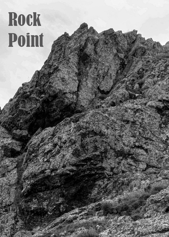
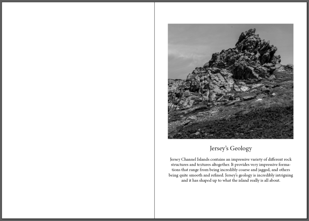
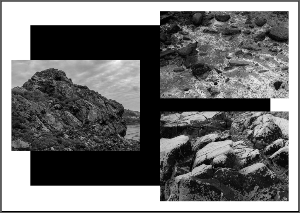
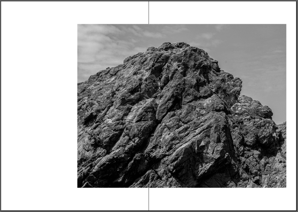
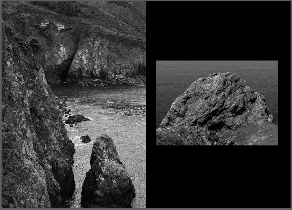
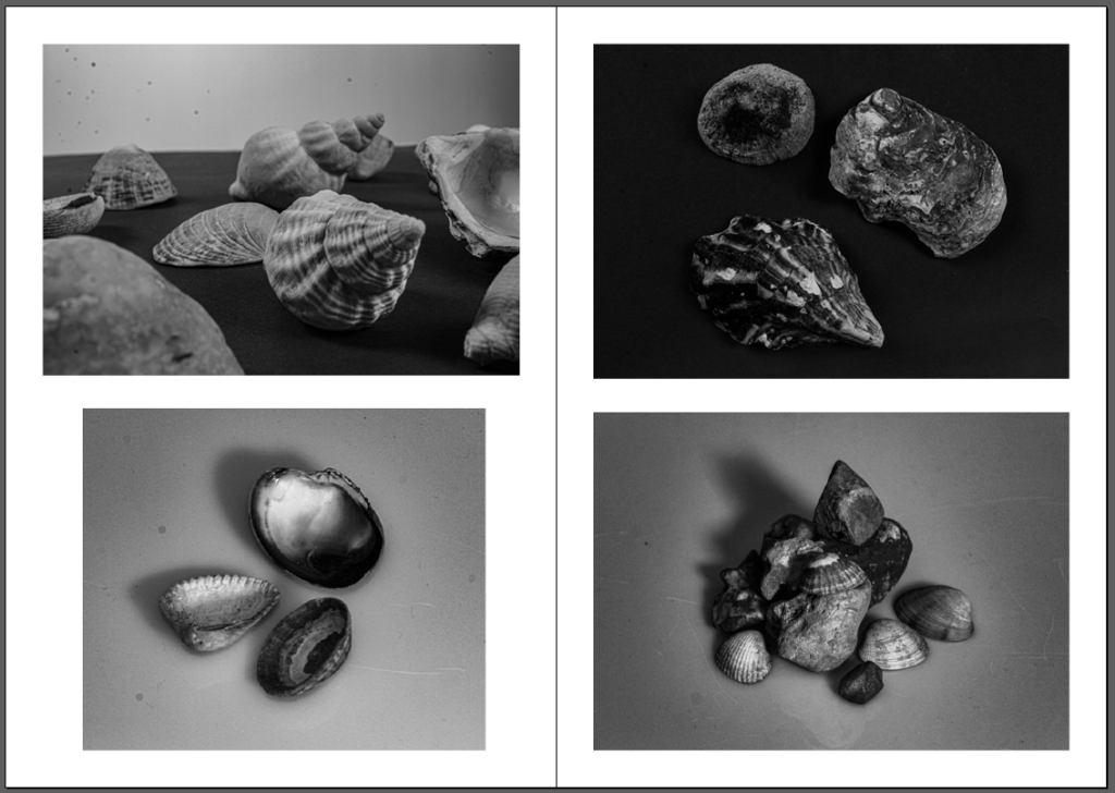
I decided to chose the first draft of my zine for my final product as I preferred that overall layout and the composition. The first draft contained a few more experimental page layouts such as the one with a black rectangle in the centre of the pages with the photos on top. I wanted to really experiment more with this zine compared to my first ever zine that I made on the topic ‘Anthropocene’.
Analysis
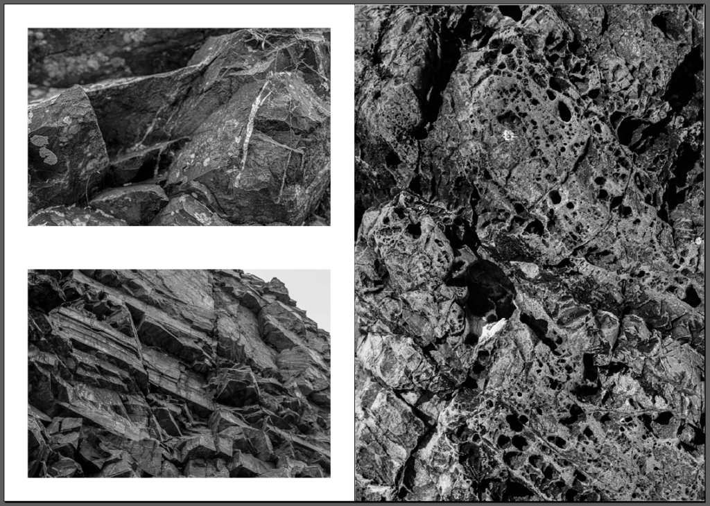
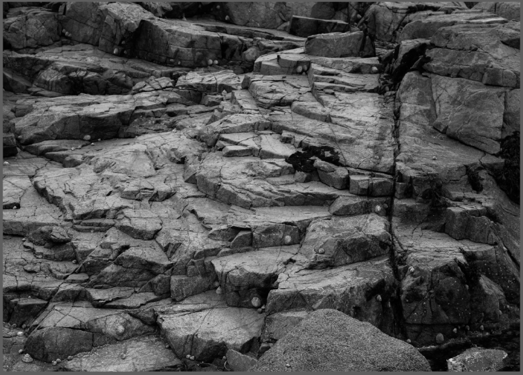
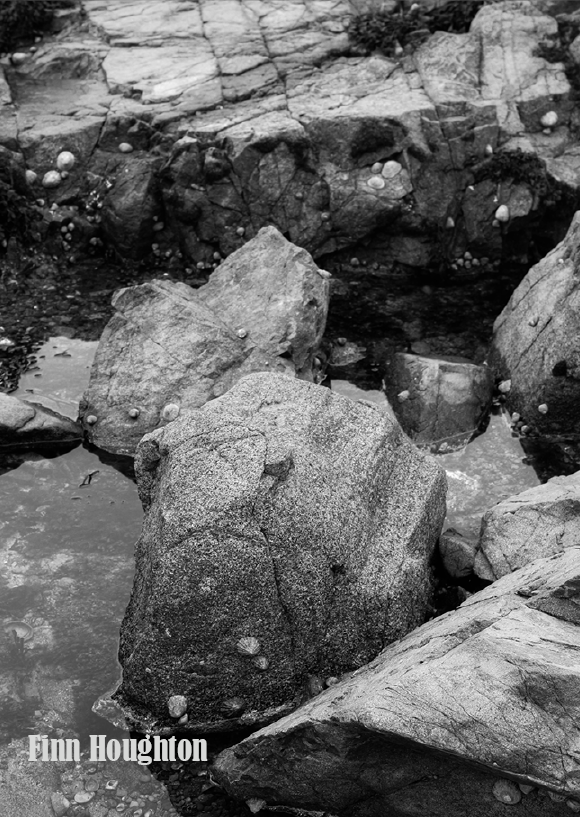
What went well: With my zine, I was overall very happy with the result as I believe I was able to capture the true essence of what Jersey’s geology is all about. I wanted my zine to be very dramatic, so that is why I chose the approach of making every image black and white so that I could enhance the structures and formations that are made among the rocks. I wanted to state the importance of its structures and make it easier for people to notice areas that are hard to see at first glance.
Critique
What to consider next time: Overall, I really like how my zine turned out, but next time I make a zine, I would like to have experimented a bit more with the layouts of the pages. I have included some experiments, including the black background and expanding the images over both pages, but I would have maybe included a wider range of photoshopped layouts so that the zine would appear a bit more intriguing. Other than that, I am very happy with how my zine ended up turning out.
