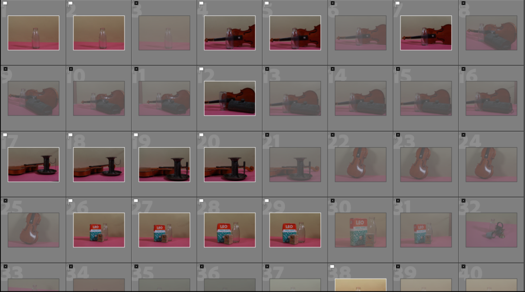
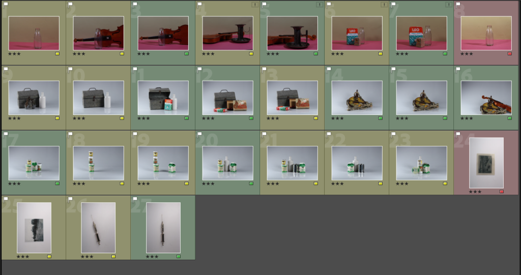
Selecting Pictures Process
Editing An Image
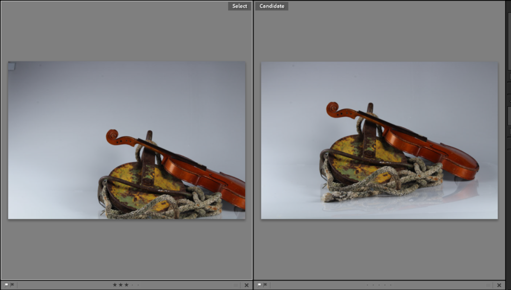
I decide to edit this photograph because I though the lighting was quite good and I liked the way I placed the item. This is because the rope is clearly visible and you can see all the small details on it which I thing looks interesting. I also liked the colours in the image because they compliment each other. The metal thing with the paint on reminded me of a paint palette.
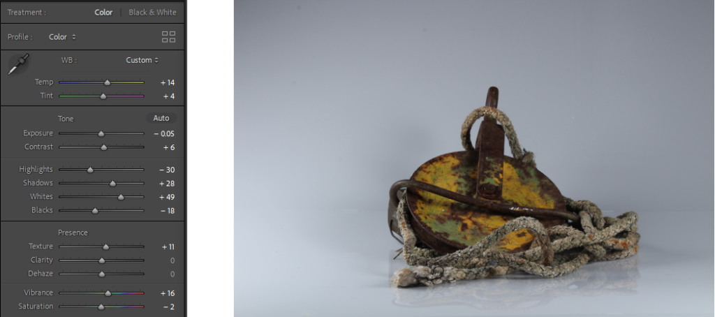
I started by cropping the image because I wanted the object to be more visible to the viewer. I increased the temperature by a little bit because I wanted to give it a warmer tone and make it softer (the studio lights were a bit too harsh in my opinion). Increasing the whites and shadows made the whole image brighter and I liked that because the details became more visible.
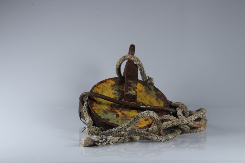
before 
after
Final Edits
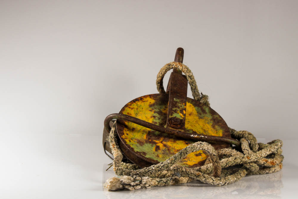
favourite edit because the colours and details stand out 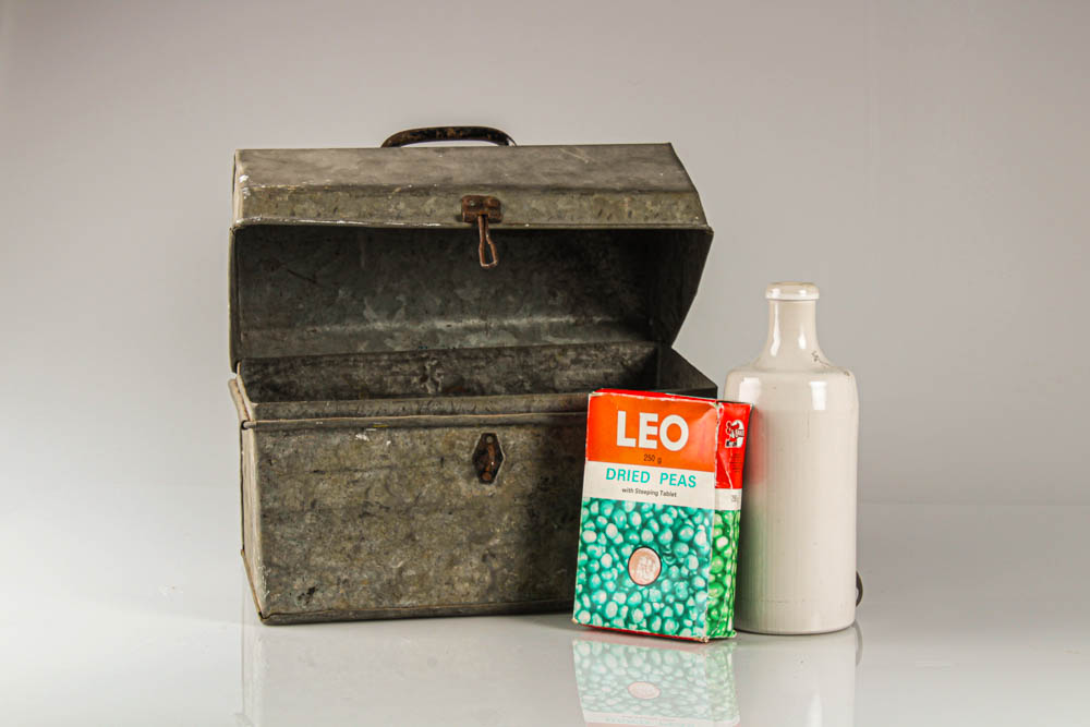
It’s nice how the objects are in the middle however, they don’t look good together and some things are not in focus. I like how the edit looks a bit old because of the colours though 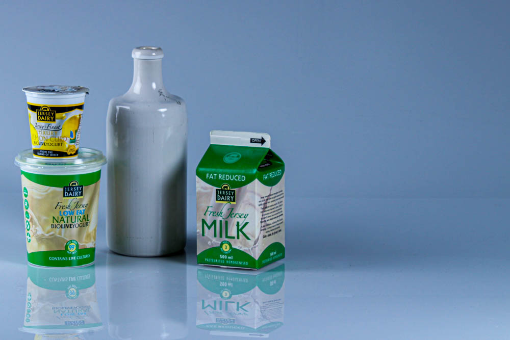
I cropped the image and made the reflection of the objects more visible because I thought they looked interesting 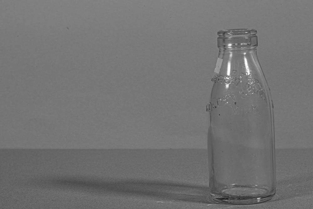
I like the composition and how the bottle is on the left and the rest is empty. It’s in black and white because I wanted to make it look old and I turned the texture up to give it almost a grain effect 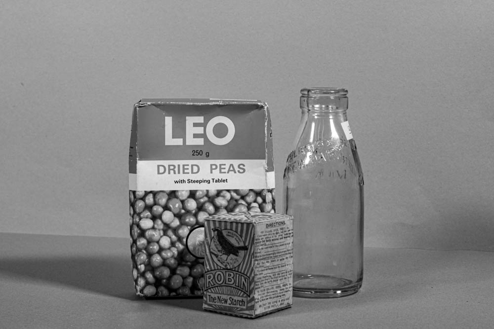
I turned it black and white, cropped it so that the objects were in the middle and increased the texture to make it look older and more detailed 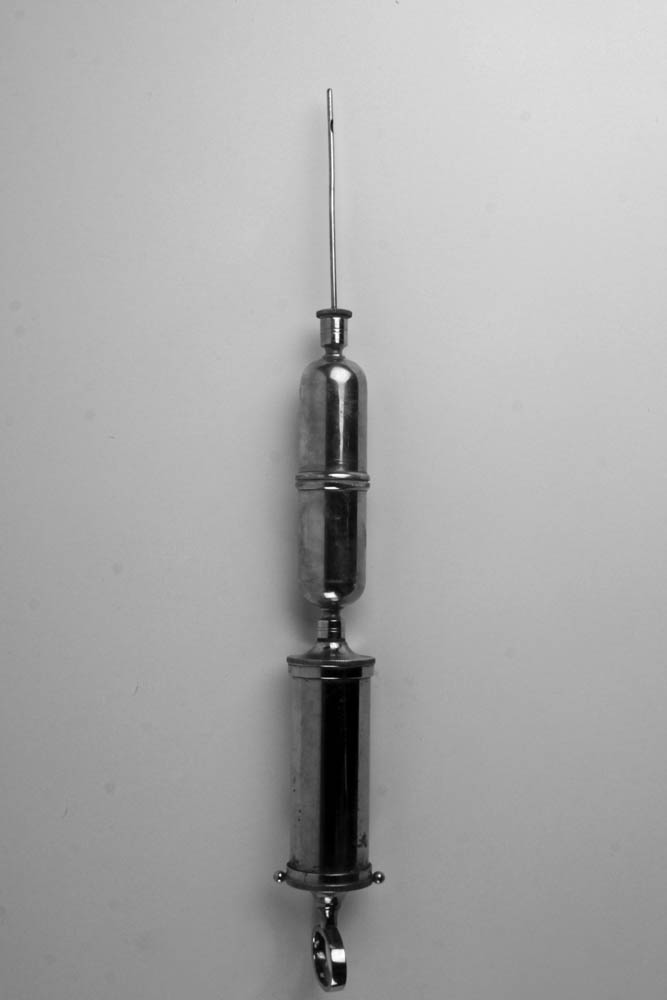
I was aiming to get a picture similar to Walker Evan’s work. Some of the things I did: turned it black and white, increased the exposure and texture
