What is a crown dependency?
A Crown Dependency means being apart of the British Isles which is made up of the Bailiwicks of Jersey and Guernsey and the Isle of Man but having their own forms of government and laws, meaning that they are not represented in the UK Parliament. Within the Bailiwick of Guernsey, it is compromised of the islands of Alderney, Sark and Herm which are islands apart of the Channel Islands. Although, there are parts such as defence and foreign affairs which the UK Government is responsible for and the monarchy’s relationship with the Crown Dependencies is reflected by the titles the monarchy holds within them, as well as being represented by the Lieutenant Governor who relays communication between the Sovereign and Channel Islands governments. The crown acts through the Privy Council when fulfilling responsibilities to the Islands as the Secretary of State for Justice and the Lord Chancellor is the Privy Counsellor, who is responsible for the ministry of affairs in the Channel Islands.
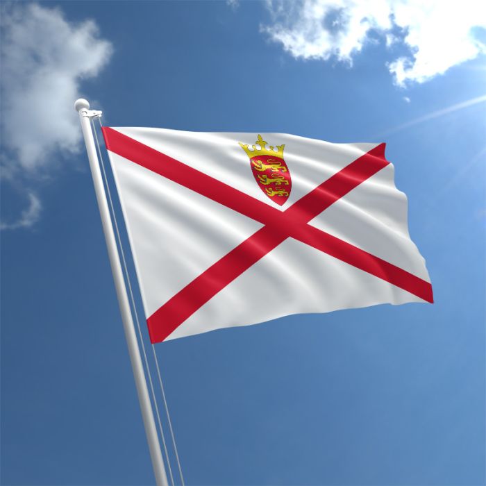
Jersey flag 
Guernsey flag 
Isle of Man flag
Jersey’s history as a crown dependency –
The Channel Islands began as a part of the Duchy of Normandy in 1066 through Duke Williams conquest of England and by 1106, Williams youngest son Henry I seized the Duchy of Normandy from his brother and since then the British Sovereign has held the title of Duke of Normandy towards the Channel Islands, representing their relationship. Although, by 1205 England has lost most of its French islands, including Normandy, the Channel Islands remained as a self-governing island of the English Crown which is still continued today. The Royal Courts creation was granted by the King where islanders selected their 12 best men to become Jurats, who sit with the Bailiff, to govern the Island and later on a Warden was shortly appointed, who became known as the Lieutenant Governor, who is responsible to organise the defence of the island by the monarchy.
What are ‘Binary opposites’?
‘The theory of Binaries’ is a term which is used to define binary opposites, where ‘One of the two terms governs the other’, which was developed by a French philosopher called Jacques Derrida and then further shown by a French anthropologist and ethnologist, Claude Levi-Strauss. Binary opposites can be seen as good or bad, and this theory was further be defined by Antonyms, the opposite meaning of a word, and Synonyms, showing that a word means the same or nearly the same thing as another.
Examples of binary opposites:
- Inwards vs outward
- Negative vs positive
- Closure vs openness
- Isolation vs connectedness
- Autonomy vs dependence
Claude Levi-Strauss – Developed the theory of structuralism and structural anthropology, his theory on binary opposites discusses how narratives (in a story to crate conflict, becoming the central climax) can be split into two opposites, such as man and woman or rich and poor which he further discusses here.

Least successful shots –
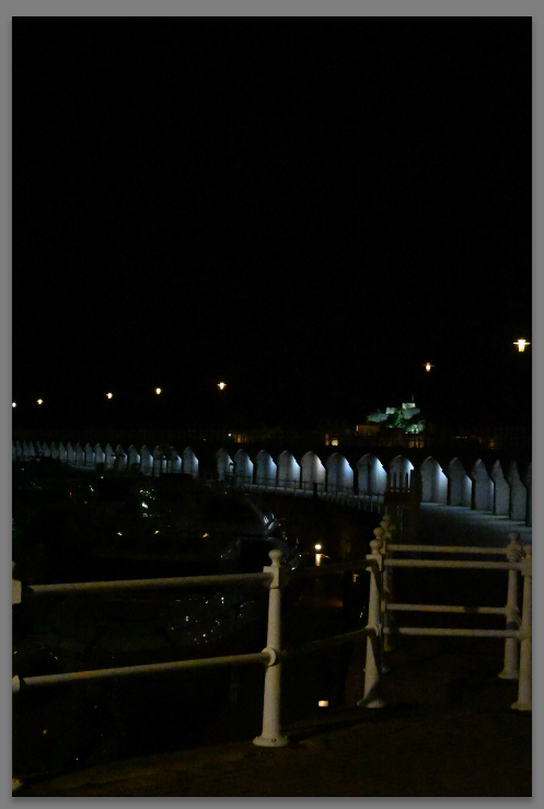
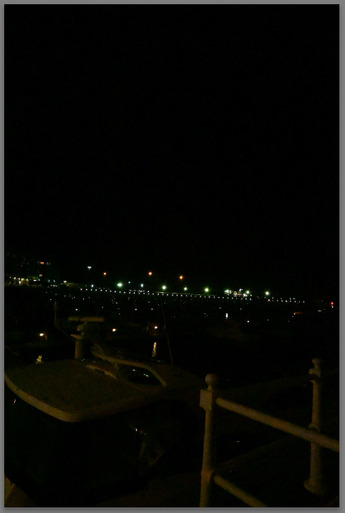
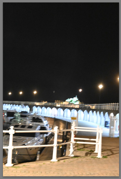
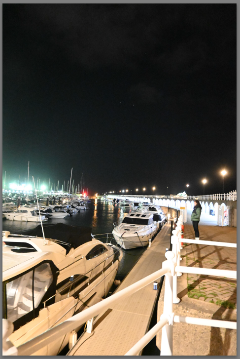
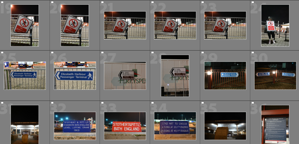
At the beginning of this photoshoot, I was experimenting with different settings to photograph during the night as the photos could be too dark or too exposed due to the amount of light being let into the camera. In the top 2 photos, they are shown to appear really dark in exposure, this is due to the Aperture being too low then in the photos below it is too high. I found that using F11 or F16 was better, depending on the amount of natural light from lights around as well. In the bottom 2 photos, I began by experimenting with the ISO and the ISO which I used was at 200 for most of my photos. This is because it made them appear crisp and colourful whereas if I used 100 ISO instead, it would make them appear grainy which doesn’t capture the intensity and vibrancy of the colours.
Contact sheets of most successful shots –
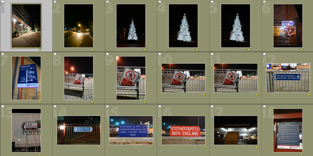
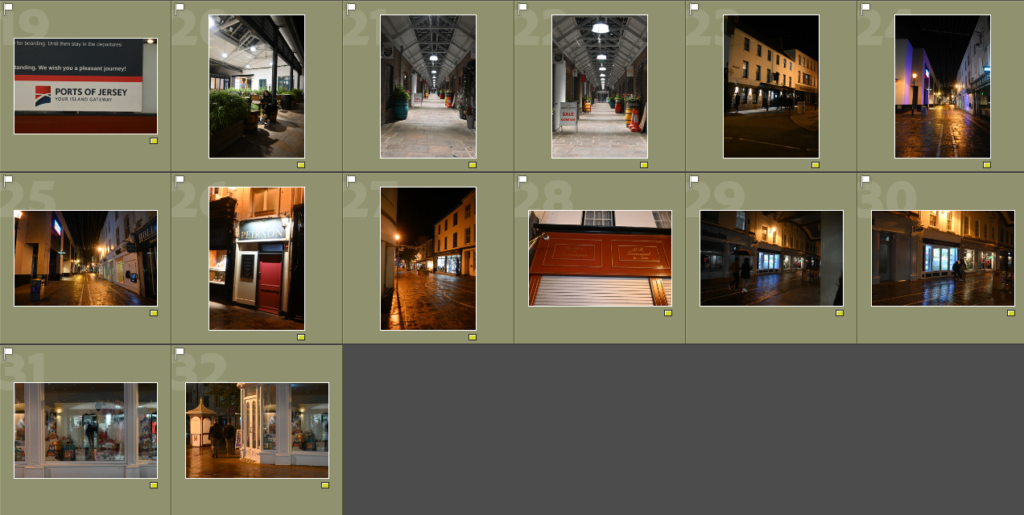
These were the images which I went through on Adobe Lightroom and chose as my best shots by using (P) then for the photos which I thought weren’t that successful I used (X) which would reject them. I chose a variety of photos for my best shots as I thought that they were successful in showing the different experimentations of light, whether it be darker or lighter due to the light sources which were near. I chose a variety f photos which I thought fit the ‘binary opposites’ term of ‘Isolation vs connectedness’ as I visited 2 different locations where I thought that this term could be answered. This was down in the harbour, which is a vital link of travelling in and out of Jersey, and in town, where the streets are small and everything is close together with people who are going about their own plans. I chose to do this photoshoot at night because I thought that having a darker atmosphere in the photos which is illuminated by the street lights, shop lights, etc would create a gloomier feel to the photo, linking to that feeling of isolation and then the illumination by light sources shows how even though the Island may be small, there is always light and connectedness around, which connects us together and to the wider world.
Colour sorting –
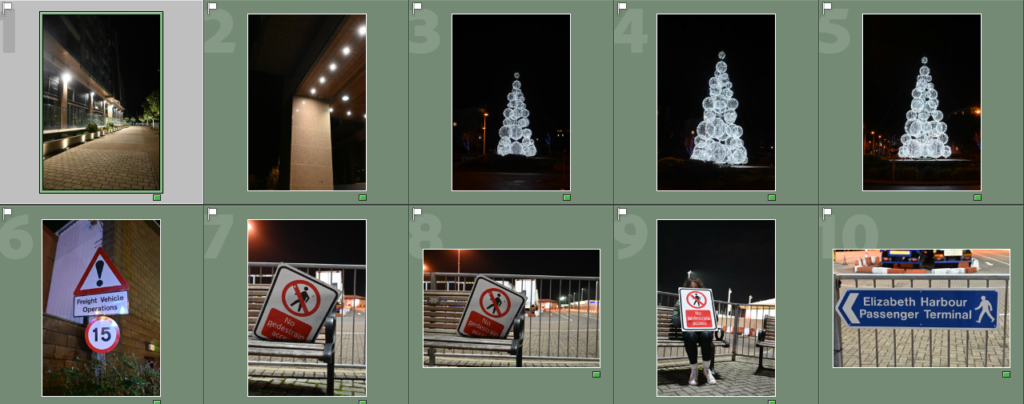
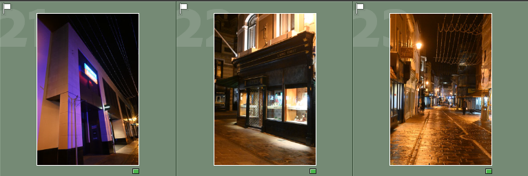
To further decide on what photos I wanted to chose as my 4 best shots which I could develop through editing on Adobe Lightroom, I went through a process of sorting them into different colours which would make it easier to organise them from photos which had further potential to ones which I didn’t want to use. This began by deciding what photos I thought were red, which were ones I didn’t want to use as they could be slightly blurry, too bright/dark or repeated photos , then the next colour was yellow, these were photos which I thought could be used but they could be a little bit wonky in the way which I took them or I just didn’t think were that good to use to represent binary opposites, then the last colour was green, these were the photos which I thought were the most successful in showing the binary opposites of ‘Isolation vs connectedness’ by what has been photographed in the photos or the use of the light.
Selecting 4 best shots –

I chose this to represent how isolated Jersey can feel due tot he sign bring on a public bench then saying how there is ‘No pedestrian access’, creating a contrast and mixed message. 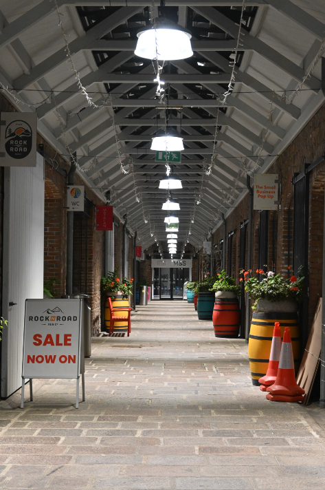
I chose this photo as it shows the desertedness of the streets/places in town which are usually busy and bustling with life. 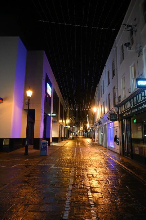
I chose this photo because I liked the reflection of the lights on the ground and the buildings, due to the rain on the ground, as there is a mixture of warm and cold tones which have been created. It can represent the isolation we can feel in the small streets of Jersey. 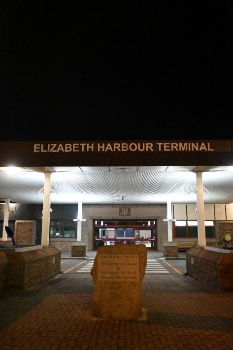
I chose this photo because I liked the way that the name ‘Elizabeth Harbour Terminal’ has been illuminated by the lights underneath as it catches your attention, showing the connectedness to the rest of the world.
Basic editing experiments –
Editing #1 –

I really liked the way the editing turned out on this photo because I knew that I wanted to focus on the warmer tones which were already present in the photo to begin with, and bring them to life. I also repositioned the photo slightly so that it was more centred and focussed on cropping it so that the main subject of the photo, the contrast between the public bench and ‘No pedestrian access’ sign, as it creates a message of why that sign is there and how it ended up there.

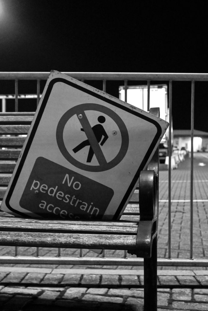
I didn’t like turning this photo into black and white in Lightroom because I think that it takes away the warmer hues and tones of the initial photograph which have been created by the natural light. This is because I think that it drains the life out of the photo and doesn’t give the photo the effect of it a sign that says ‘No pedestrian access’ being placed on a public bench, showing the contrast between isolation and connectedness, as it is also in a harbour which is used as a way to travel out of the island.
Editing #2 –

For this edit, I began by bringing up the white/colder tones because I wanted to use them to illuminate the ‘Elizabeth Harbour Terminal’ writng which is seen above the lights, this is due to the fact that I think that this would show that this is one of the ways where Jersey is connected to the rest of world, showing one of the binary opposites of connectedness. To amplify this message I also cropped the photo so that the writing was the main subject that is being illuminated in the photo, I really like the way that this edit has turned out.
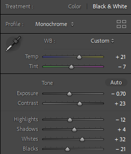
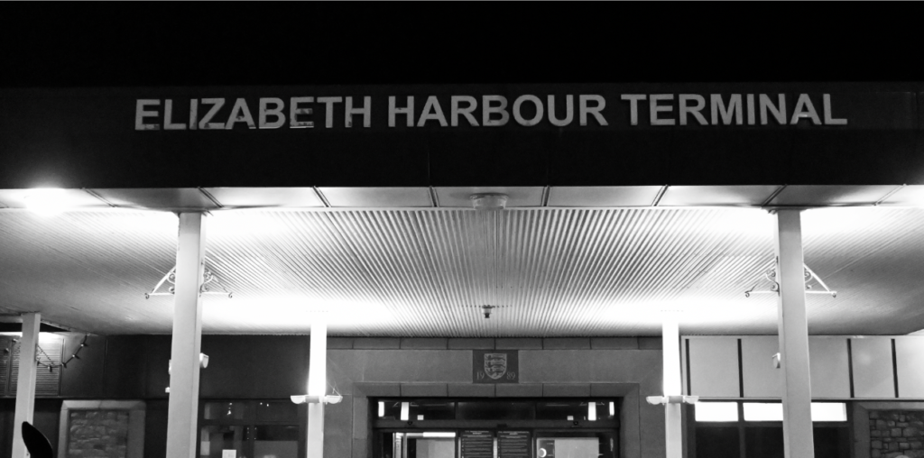
I also experimented turning this edit into black and white on Lightroom, I was unsure of the outcome. This is because I thought that the lights from the building below the name of the harbour would overexpose the image due to their being too much light, but this didn’t happen. I was surprised by the outcome of this edit because I like the contrast between the darker and lighter tones as it creates a gloomy atmosphere which links into the binary opposite of connectedness but shows how even though we can leave the island it is harder too as it costs a lot more money than if you lived somewhere else.
Editing #3 –
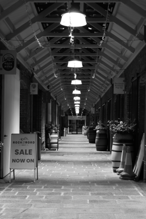
I preferred using the black and white filter for this photo ss I decided to experiment with it in Adobe Lightroom. Therefore, I really liked how this edit turned out because the dark tones which have been created as I adjusted the exposure and shadows created parts of the photo that look gloomy and dark, which I really like as they are still distinct. Therefore this creates the effect of the life being drained from the photo because it is taken in the evening, when it isn’t normally busy.
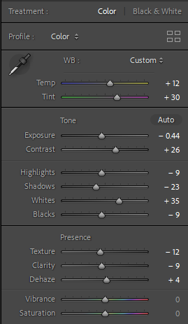

For this edit, I experimented with moving away from creating a warmer atmosphere in the photos with yellow tones, which are created through the use of the light. Instead, I decided to try and create some colder tones where the lights are darker though editing the highlights and shadows as well as using the existing light in the photo and editing the whites, temperature and tint off the photo which makes it appear colder in colour as their isn’t much warm tones in the photo which are being brought in. I also like how the image is looking down through a part of town, in liberty wharf, which is usually full of life where in this photo it isn’t busy yet the lights create a sense of life still within the photo.
Editing #4 –

For this edit, I knew that there was a warm atmosphere already created due to the use of the streetlights already throughout town and I wanted to bring this to life and I did this through using the whites and temperature of the photo which made the brighter effect of the lights shine through and then to calm this, I used the temperature and moved it towards the warmer side of the scale a little bit as it neutralises the brightness of the lights. I also like how there is a contrast between the purple/blue lights on the building which create a colder atmosphere for the photo, and the warmer tones which are being brought to life through the use of the pavement which is wet due to the rain as it makes it appear shiny and the light bounces off of it.
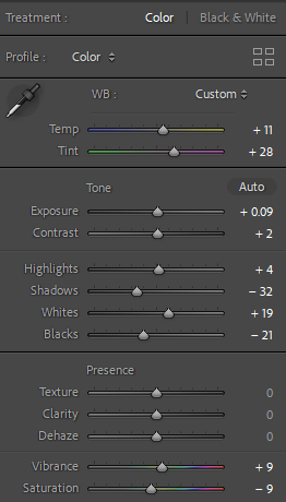

For this edit, which I turned into black and white within Adobe Lightroom, I didn’t like the outcome of this edit. This is because I feel as if the lights, which create a source of light in the photos, are too overexposed and do9nt work well within the photo. I also don’t like how the darkness of the sky loses the lights which are hanging above, get lost within the photo because I think that they are a good way to add dimension to the photo because they are a different texture. I also think that the floor, which is wet due to the rain, doesn’t have the same effect as the previous photo where it creates a reflection of the light from the building of the purple/blue light on the left of the photograph, instead it just gets lost within it.

