Final Images
Below I have included a range of my final outcomes, including photographs and a vital gallery. This is good to show as it includes images from all of different photoshoots, including some images and then the virtual gallery to show just some of my final images in an arrangement.
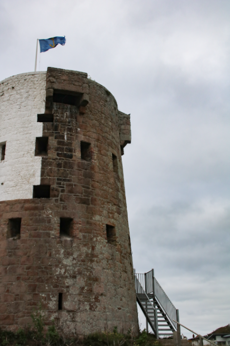
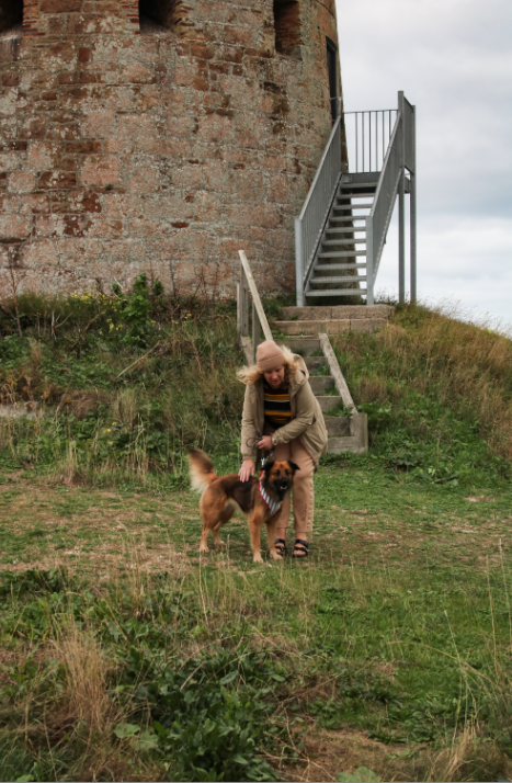
These final pieces have been placed together as I think that they would compliment each other well together as they tell a mini story within only two photographs. With the first being a lot more zoomed in, focusing on one thing that happened outside of this castle, the lady with the dog is just one example of something that has occurred here, maybe making us think about what else may had happened here, such as war and conflict. The second image is placed here in order to put the first one into perspective as its a different point of view from the first. I think that the second photograph is of very high quality because of the clarity of it, with the bricks and grass being filled with texture and depth because of the clarity of the original image. However, in my opinion, this piece could be improved by adding more images to the sequence, as this would make the mini story more detailed and vivid.
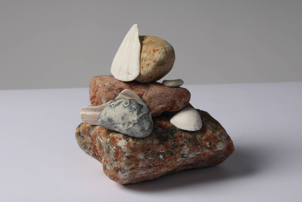
I think this is my strongest final image as it many different visual components to it, this makes it more successful as the whole image is more eye-catching. The composition of the image means that there is many layers filled with different colours, the white shells have been placed so that they break up the colours in the composition so its not too busy. Furthermore, the textures in the image mean that the plain white matches with the arrangement of the rocks. To achieve this image we had to keep changing the angle of the camera on the tripod and this meant that some came out more blurry, however I think this image turned out to be high quality. The weaknesses of this piece include the fact that it could be viewed as a composition which is too simple, making this still life piece slightly boring, however I think that it links really well to the theme of ‘islandness’.
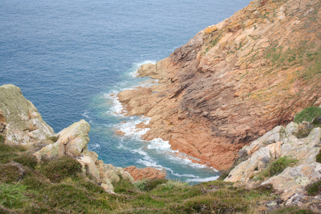
I have selected this as my first final image as I think that the composition of this photograph is it’s strongest point. Additionally there is lots of contrast within this piece, firstly with the warm tones of red and orange amongst the rocks in contrast with the blues in the sea. Also, there is a difference in texture between the smooth sea and the rough rocks, this means that the photograph is more eye-catching and there is more depth within the image. In my opinion this is my strongest out of all of my final images and this is mostly because of the clarity of the original image, meaning not much drastic editing was needed in order to make it successful.
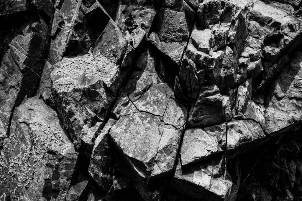
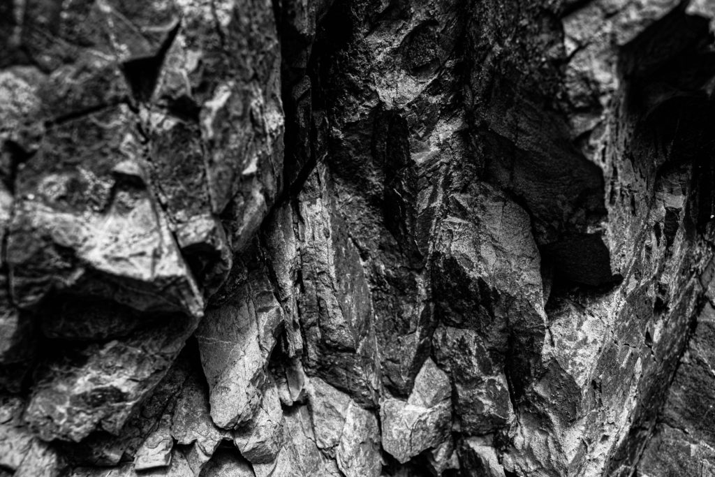
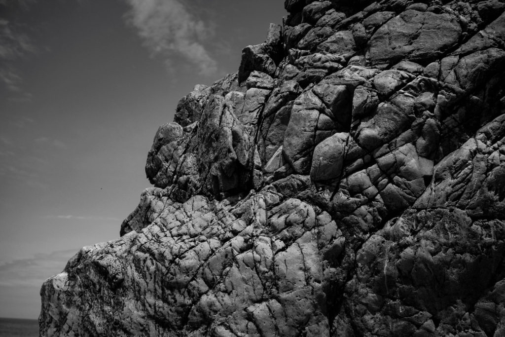
I have put all three of these final pieces together, arranged in this order as I think that if they were printed out onto materials such as foamboard they would look best this way. The most prominent feature of all of these images is the high contrast and increased clarity. They have all been edited to black and white so that this is more obvious, and I think that these are my most successful three images as they all link well, with the bottom one being slightly different yet still being linked through the ‘My Rock’ project. Furthermore, its important the note that the perceptive all of these images makes them more unique and I think this adds to the successfulness of these pieces. Alternatively, they could be viewed as more boring or generic as they are monochromatic, however, I think this reminds us of how old these rocks are.
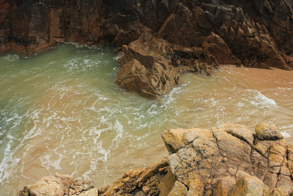
I have selected this as a final image as I think that the colours of this image are very aesthetic, this is captured by the original composition of the photograph as the yellow rocks in the foreground and the green and blues tones in the background, captured in the sea compliment each other well. Additionally, I like that the perceptive of this image is quite unique, this along with other features such as the rule of thirds, created by the outlines of the rocks all make this final piece successful. Alternatively, the weakness within this image is that the piece isn’t filled with interesting components, so they could be seen as boring or uncreative.

