Analysis
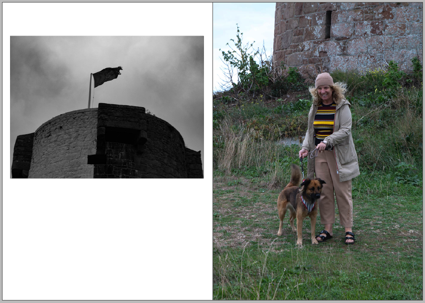
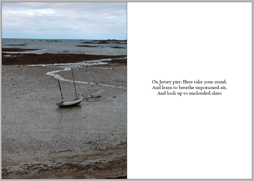
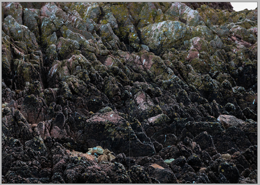
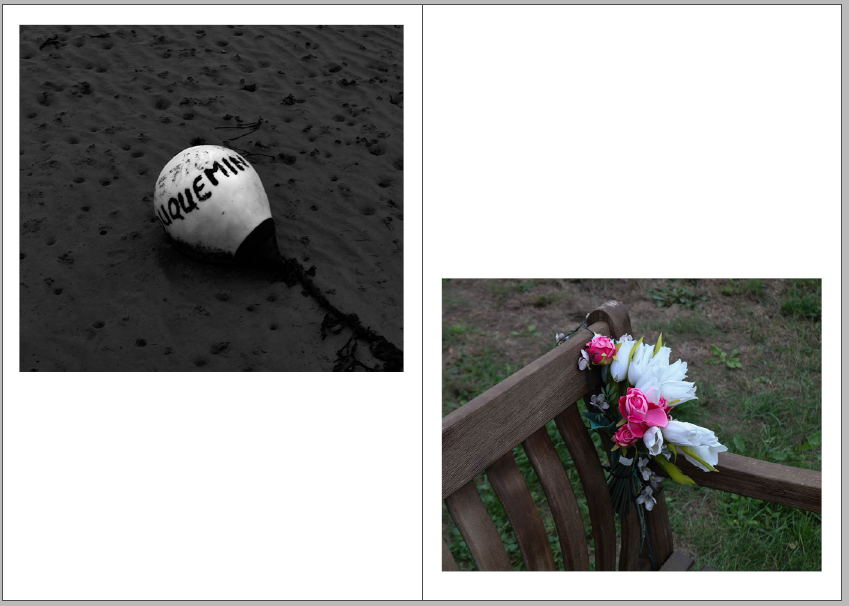
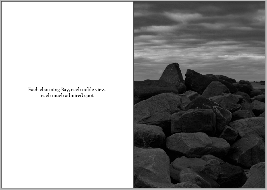
Overall, I think that my zine was a successful project, as it has an aesthetic flow throughout the magazine which makes people want to carry on looking through it. I believe that this is the strongest point in my zine as I believe that composition is important when it comes down to a project that involves a zine. I like how my zine included both coloured and black-and-white photos which keep the zine interesting, the monochromatic look of the black and white images contacts nicely with the vibrant colours that they are placed next to them. Furthermore, I think that adding quotes was a very successful idea as it adds further details into the story of my zine. I also think its a nice way to break up some of the photos and gives the view a deeper understanding of Jersey and what my zine is about. In my opinion I also think that the quotes balances out the zine which helps to create an aesthetic composition throughout the pages, I also tried to put images with the quotes that will help views to expand on the story in their mind.
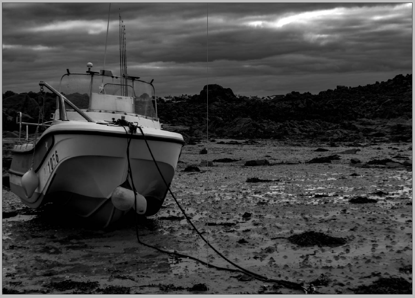
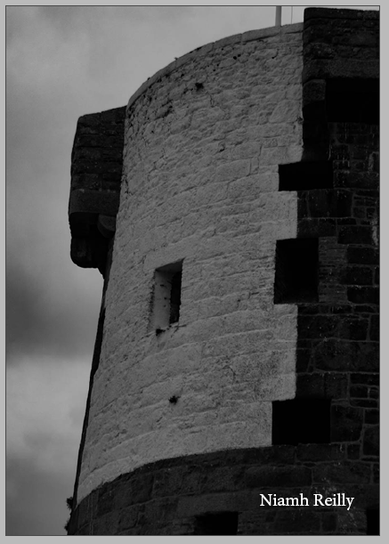
I believe that one of my most successful pages was 10 and 11 as I think that they photos fit really well with each other but are vastly different. On the right is one of my favourite black and white images from my La Hoqc photoshoot, as I believe that it has many eye-catching features and o the left is also one of my favourite photos as I think that very vibrant colours are intriguing and contrasts well against the black and white of the opposite page.
Critique
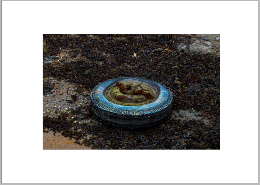
One of the weaknesses in my zine is the placement of some of the images, I wish I had been more creative with how I did the layout as I believe that having an interesting composition will help the view to tell the story in their head, it will also help to keep concentrated and drawn to the zine. I also think the colour placement of my images could be seen as one of the weaknesses as I didn’t put a lot of thought into how the black and white images would look as the zine was being looed through, this could been see has the images having no links between each other as the warm and cool tone photos were not strategically places on some of the pages.
