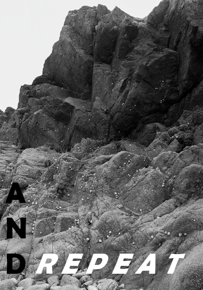
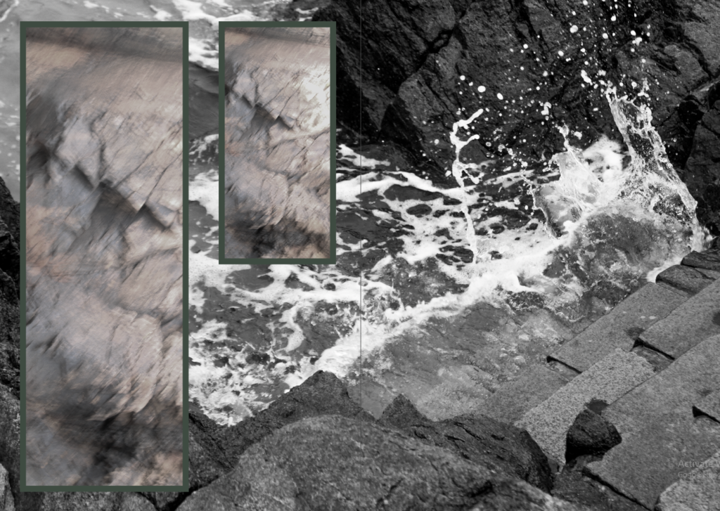
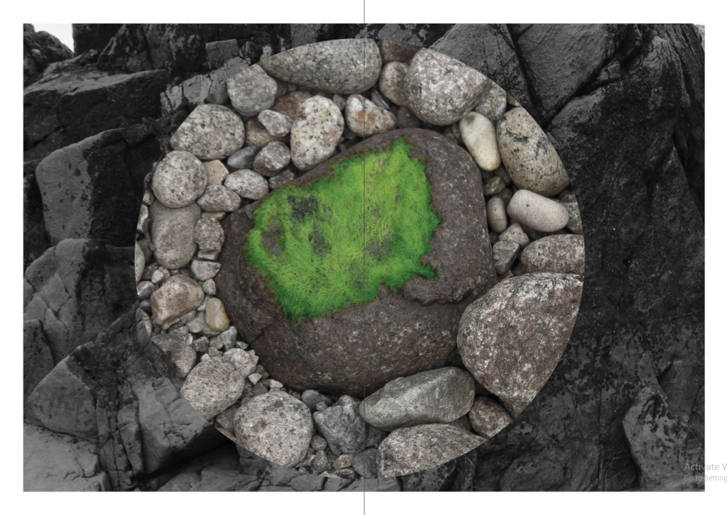
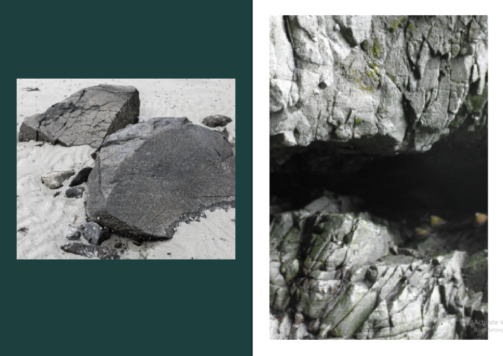
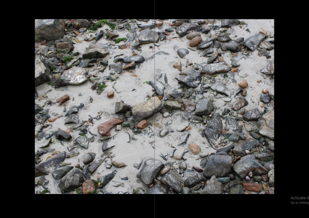
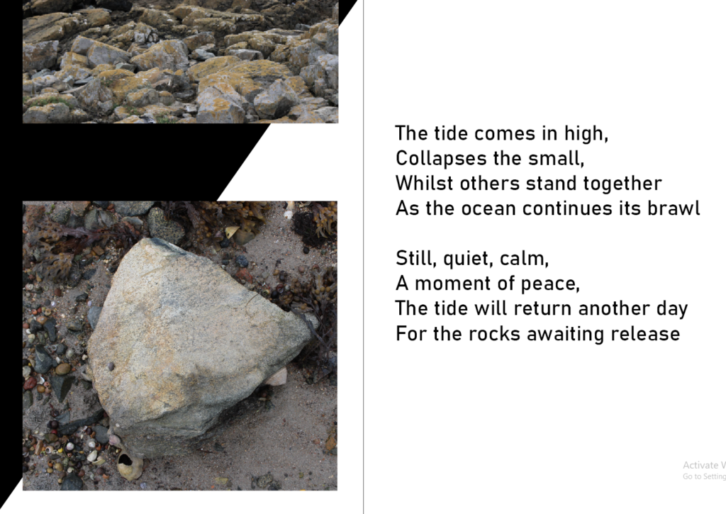
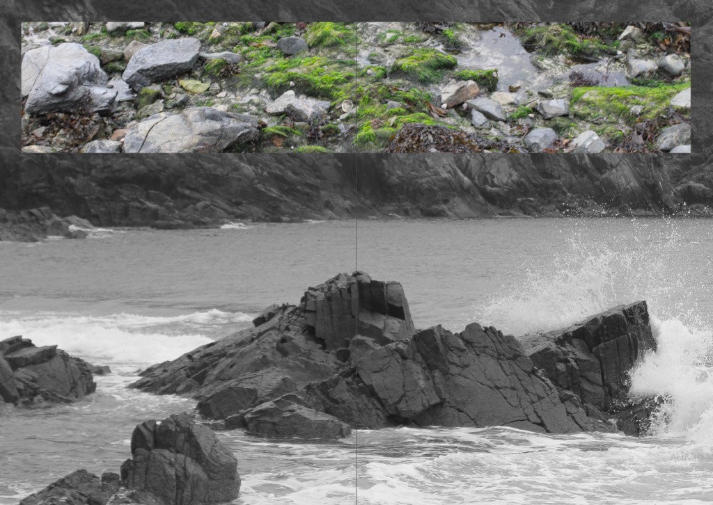
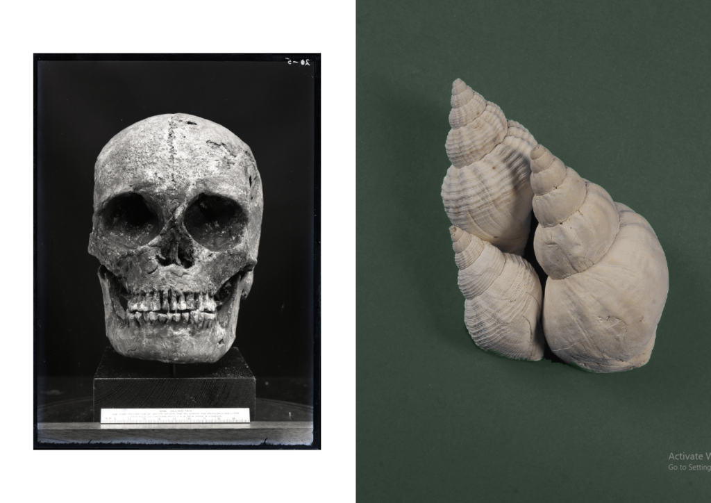
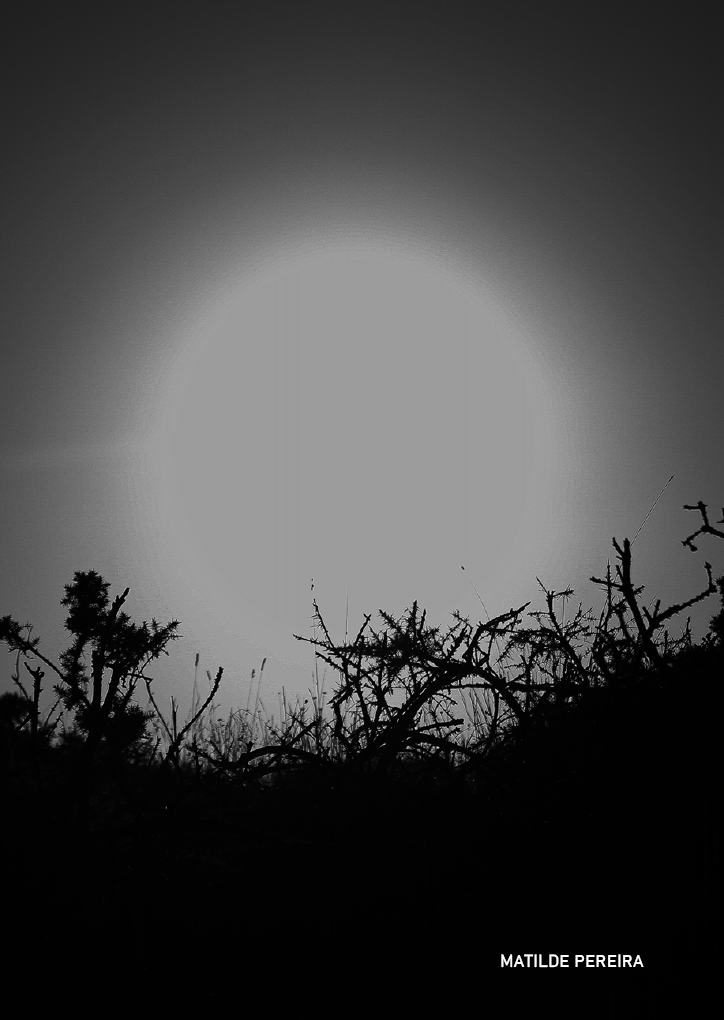
Overall, I think my zine was successful as each page flows from one to the next despite the fact the each spread is so different [although it did take a lot of trial and error to make it that way], mostly due to the pops of green on every other page which helped to tie everything together to create a small narrative. Along with that, I like how my choice in images make my zine dynamic, especially in the first spread, making my zine come to life. I do, however, think that I could’ve spent some time editing some of my images so they were of a better quality, making my work look more professional.
My Final Zine:
