https://www.artsteps.com/view/6364da4f84fb1fe866c22cc1/?currentUser


Evaluation:
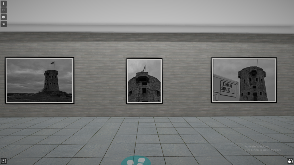
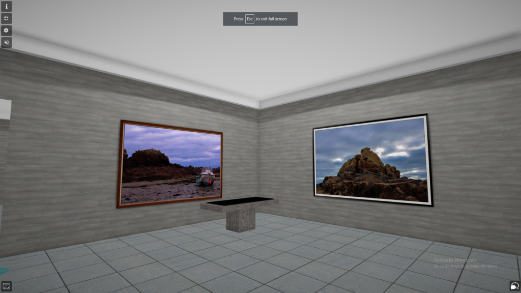
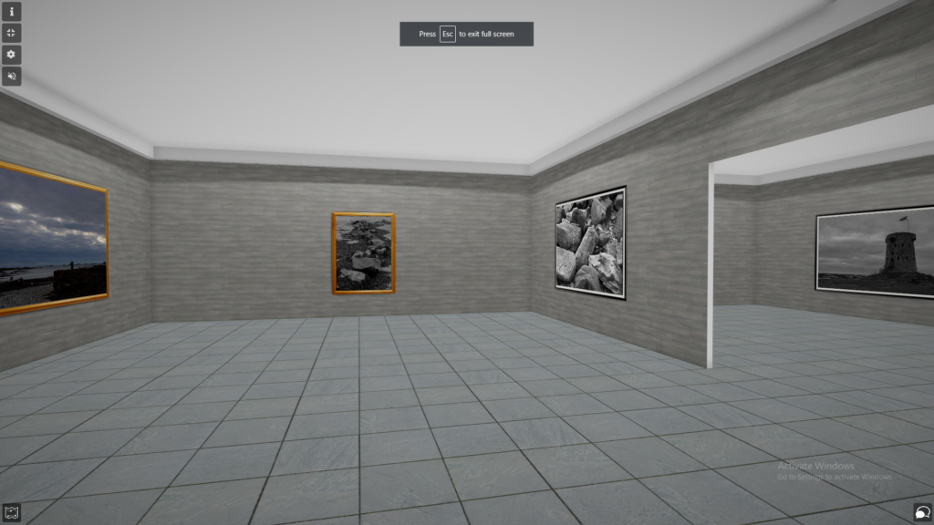
Overall, I am impressed with how my virtual gallery turned out. The gallery displays all my best images from the Le Hocq photoshoot. Throughout the gallery, all the images are used in my Le Hocq photo-zine booklet. I used frames around each of my images involved in the gallery to try and create some sort of contrast between the image and frame. I feel as if the black and white frame outlining most of my images gives the best effect towards the black and white images due to them being the same colours. I tried to place my images together if they had similar features such as the three photos of Le Hocq tower because it keeps the gallery some what organised. Also, the wall and floor textures display my monochrome images in an effective way by keeping a similar colour scheme throughout the virtual gallery.
