The process to create a virtual gallery in photoshop –
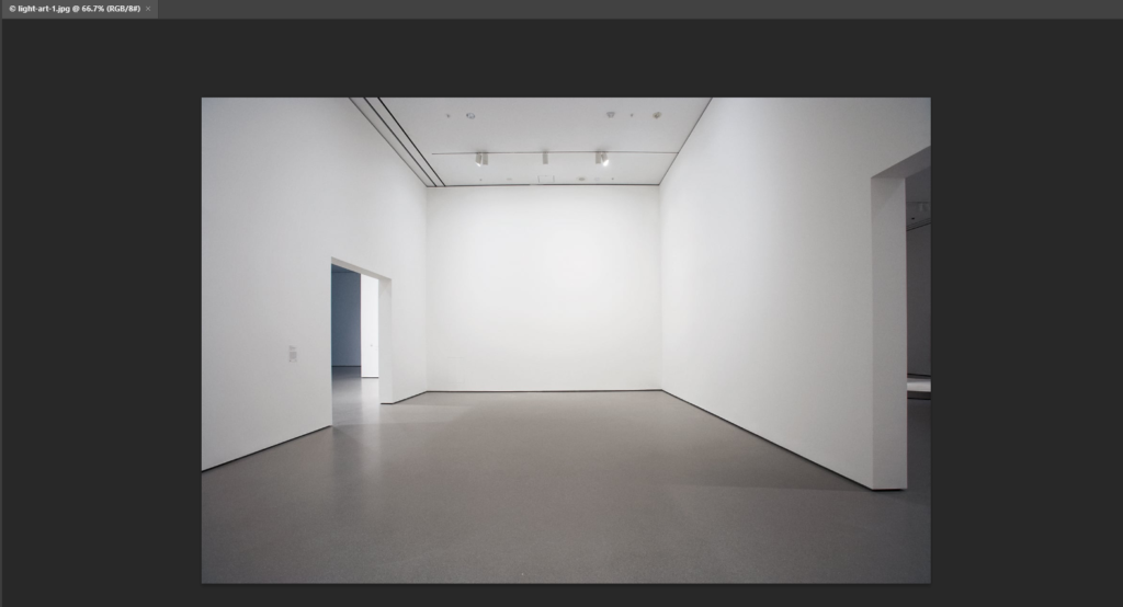
To begin the process of creating a virtual gallery to present my work, I found an empty gallery photo on google which I saved to my computer and then I opened it up in photoshop, this let me see the image clearly to make sure there was nothing within the photo that was out of place or blurry. I decided to use this gallery because I liked the perspective which this was originally taken from because where you are stood it looks as if you are looking down into the gallery. This emphasises the importance of the photos directly at the bottom as they are able to grab your attention, but then also allow you to explore the other photos on either wall.
Photo selection and placement –
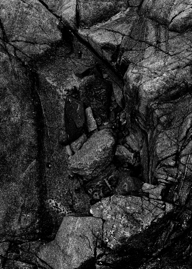
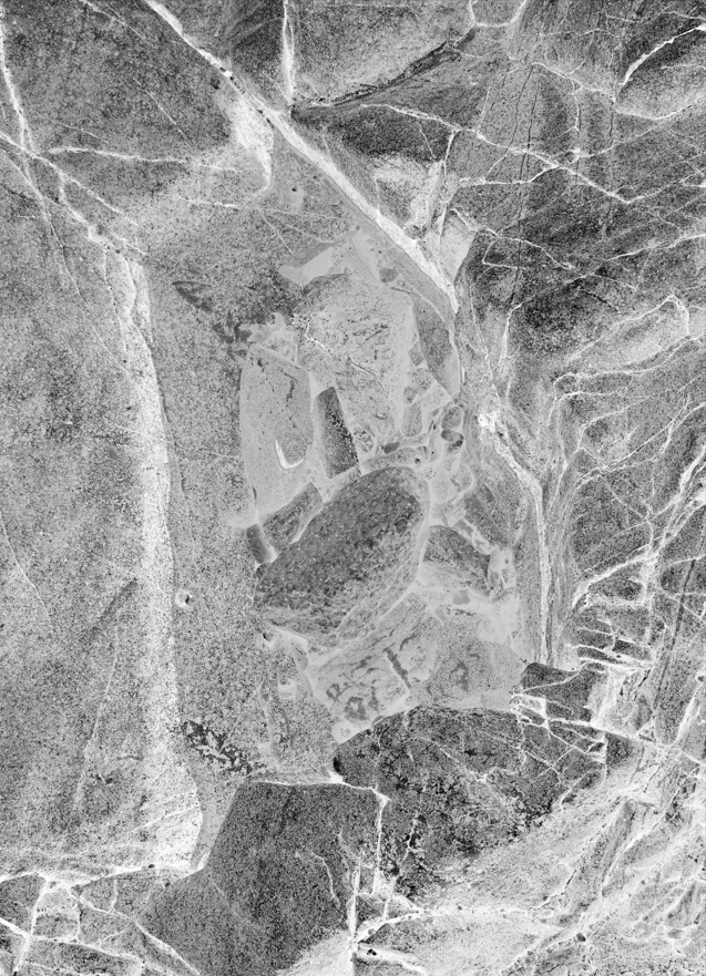
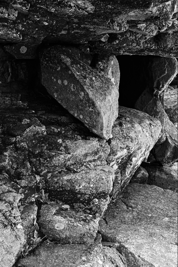
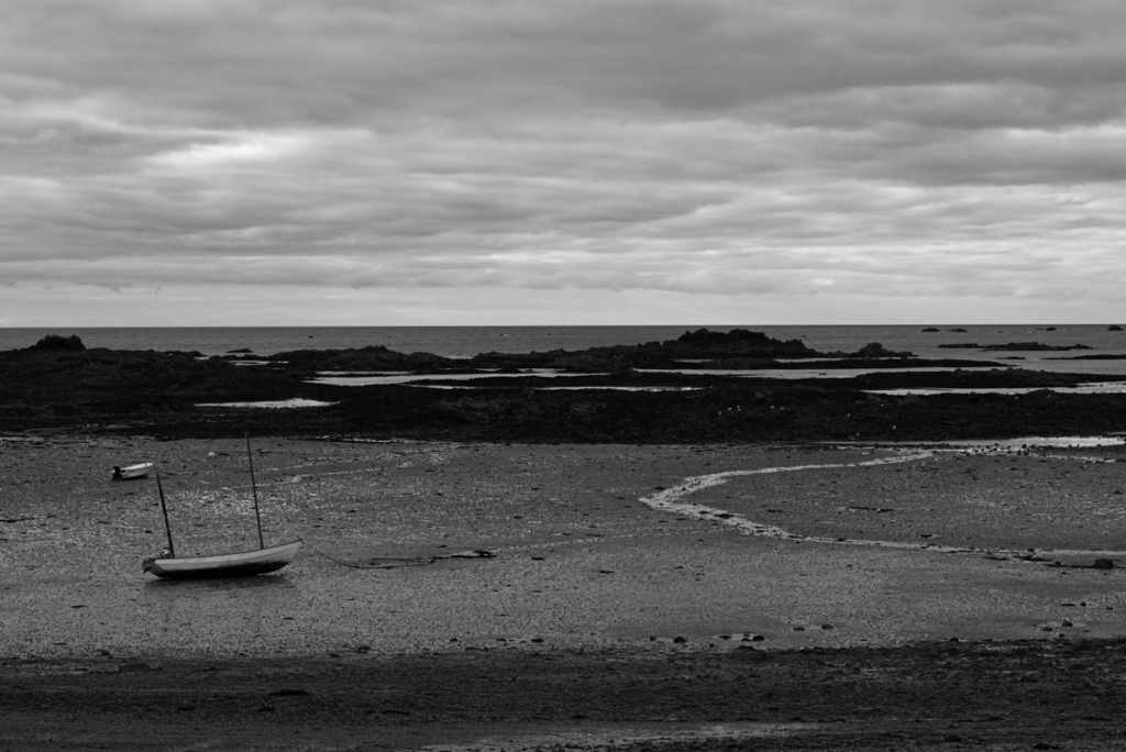
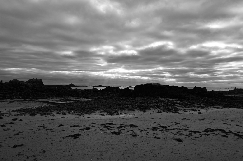
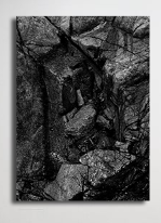
These 5 images are the ones which I have selected, which were also used in my zine, to insert into my virtual gallery. I decided to choose these ones as I thought that they all worked well together with the dark grey/black/white tones which are within them. I especially like the photos which I used for my front and back covers as the image is the same yet inverted but they work well alongside each other as you are able to see the relationship of similarity between them yet they both hold a unique feel to them. I also decided that I wanted to include 2 photos of the scenery because it shows a journey and exploration which was taken when this photoshoot happened. I really liked the bottom left photo as the little boat which is in the corner is small yet very effective as it is solitary which adds a emotional feeling of solitude and sadness to the photo as it is quite dark and dreary, making you wonder where all the other boats have gone and why it is by itself. I also decided to use the bottom right photo because of how dramatic the sky is within it contrasted against the black of the rocks as it makes the bright colours which push through in between the clouds above stand out immensely well, which I really like. For the last photo, I really liked the formation and layout of the rocks within the photo as it looks quite abstract due to how there are dark pits of black which contrast heavily against the brighter grey/white tones which are found on the rocks which also create a geometric pattern on them due to their texture.
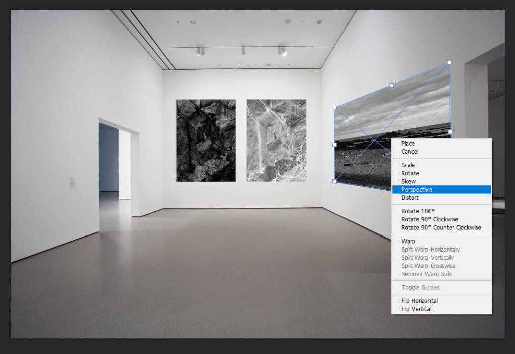
Once I began to bring my photos into the virtual gallery, I decided that it would be easier to adjust their perspective as I put each one in. This would make it easier to organise where I wanted them to be and if they flow well together, instead of doing it when all images have been imported. To do this I began by bringing an image in, which would create its own layer, and using ‘CtrlT’ to activate free transform where I was able to move the image freely as well as change it shape. Then I used the ‘fx’ button which is located on the bottom right of the screen and right clicked on the image which allowed me to select the option of ‘perspective’. This gave me the freedom of being able to manipulate the photos to look like they are framed and mounted on the wall as you could drag the sides up or down, or from one side to another which would alter its placement. I repeated this another 2 times for the other photos I have chosen to use and I think that they turned out successfully with the way that they are placed on to the wall as they give the illusion of mounted photos, as well as flowing nicely together.
Adding a drop shadow –
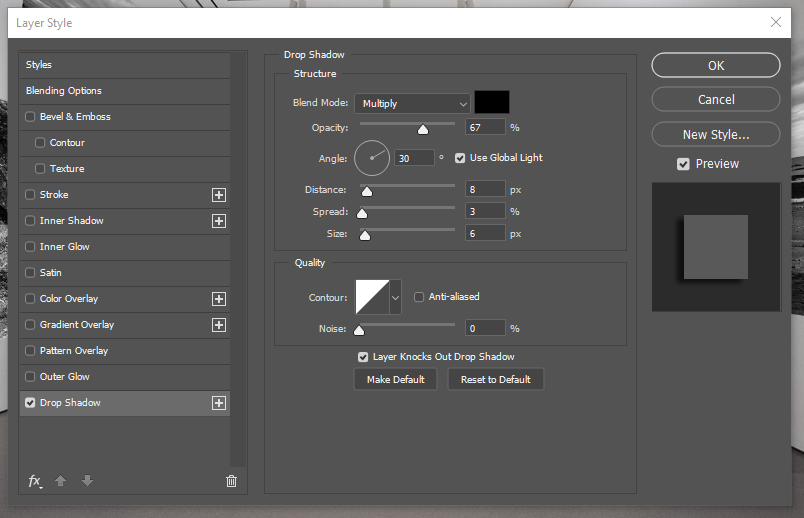
To complete the creation of my virtual gallery, I decided that I will add a drop shadow to each of my photos. I did this through using the ‘fx’ button once again and selecting ‘drop shadow’ from the box then altering the angle, position, size, etc of the shadow, then repeating it for the rest of the photos as I could set a baseline of settings to apply as a drop shadow to each one which I found to be easier then I went back through each one and altered it if needed. This gave the photos the illusion of the light creating a shadow from where it is falling on to the frame of the photo. I really liked adding this element into my work in the virtual gallery, as I think that it made it look more realistic and unique instead of quite uniformed and as if the photos are stuck against the wall, because the drop shadow adds a level of dimension to each photo.
Final outcome –
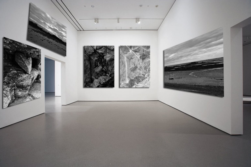
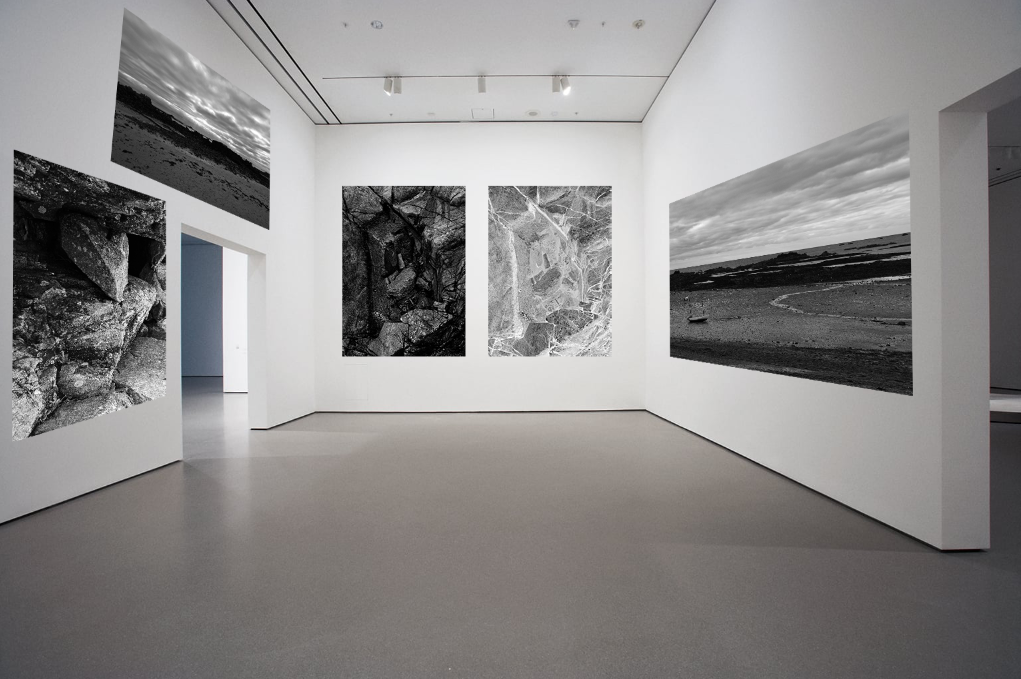
Here is my final outcome of the virtual gallery which I have created in photoshop, I think that this is a really successful presentation of my work and I enjoyed creating this as I was able to freely decide where I wanted my images and which ones I wanted to use. I like how I have a nice balance of scenery to images of rocks because it shows the in-depth surroundings of where I was while on my journey through the intricacies and details of the rocks, yet the scenery provides a way to visualise where I was and the path that I was taking. I also like how well the photos work together due to the fact that they are in black and white as it shows a continuation in my work as they are the same images which I have used from my zine, which I really like as it makes it look organised and not messy as I don’t have a mix of colour and black and white photos which I don’t like. I also like how the photo that I chose to use as my gallery is looking straight down at the two images at the bottom, I think that this is successful in drawing you eyes and attention to what they could be and why I have 2 of the same images yet one has been inverted because they are able to show the finer details and lines which have been formed within the rocks which I really like as it shows how each rock is different and unique and nothing defines them as a rock or a photo. Therefore, if I were to create this again to improve the final outcome of my virtual gallery even more, I would go into photoshop individually with each photo and add a slight border around each photo because I think that it would give the realistic illusion that they are framed which would make them look mounted directly to the wall and be able to highlight and draw your attention to each photo even more when studying it.

