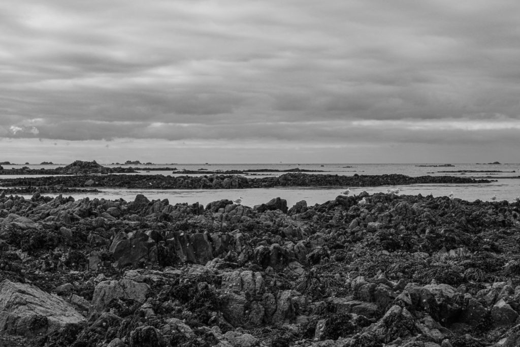
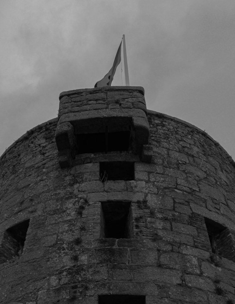
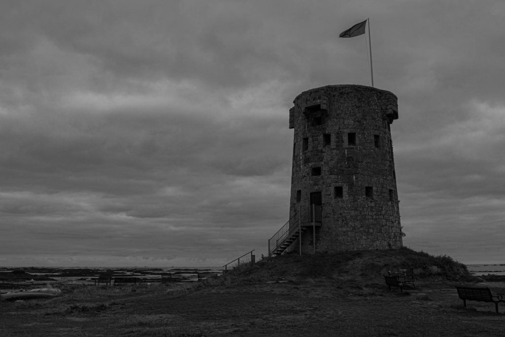
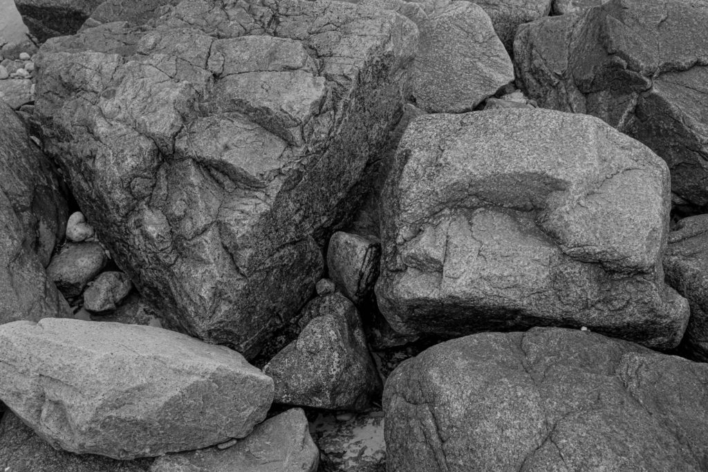
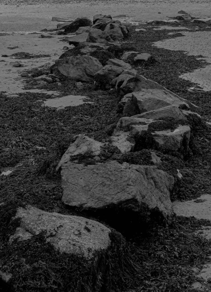
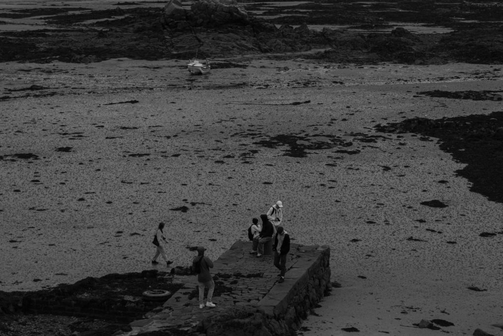
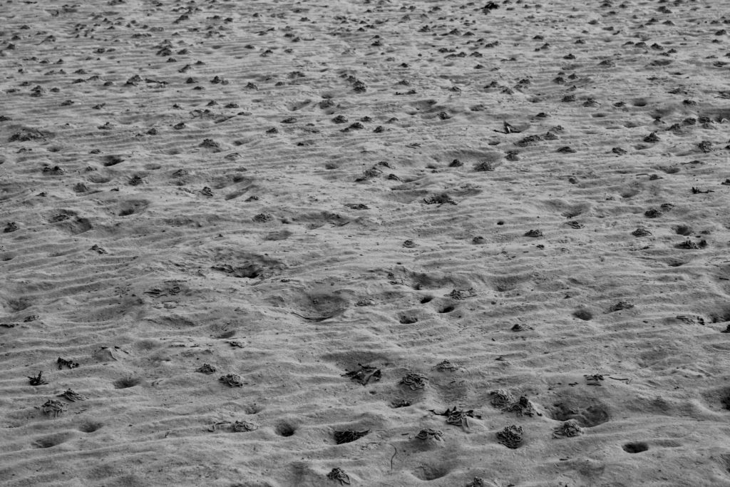
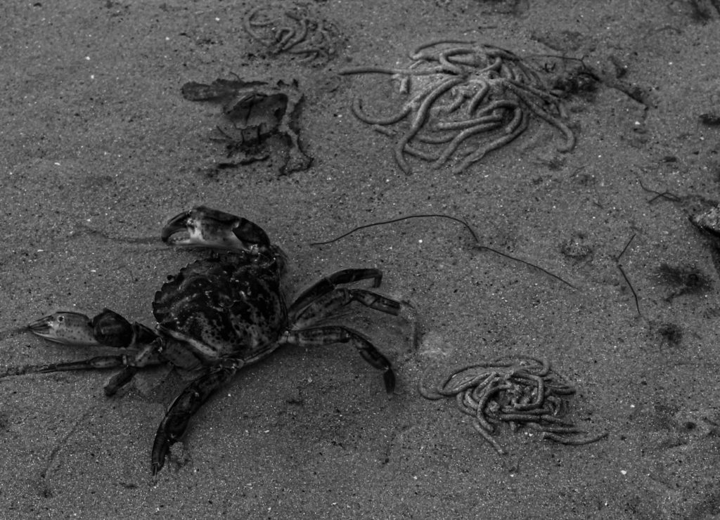
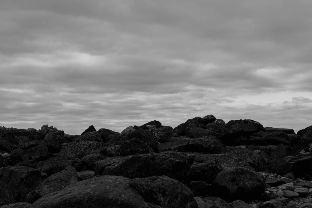
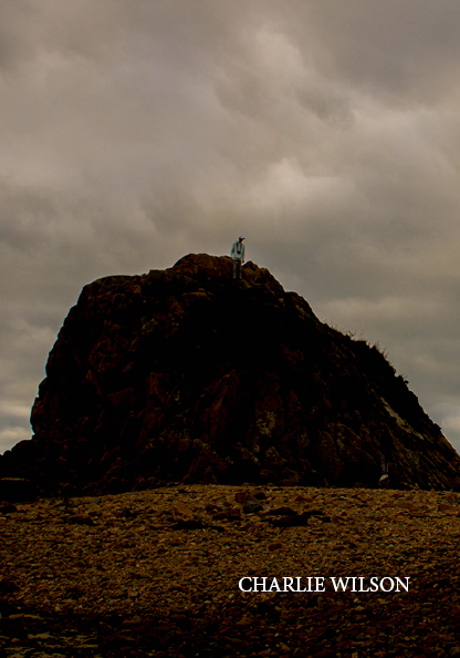
To begin creating this photo-zine I needed to take a range of images from one location. I used images from my La Hocq photo shoot to try and keep a similar theme throughout the whole zine. After editing all my images I then needed to decide which images to use in my photo-zine. I wanted to try and make all the images in the zine to be displayed in black and white other than the front and back cover.
Image Selection:
The images below are all the images contained throughout my 16 page photo-zine.
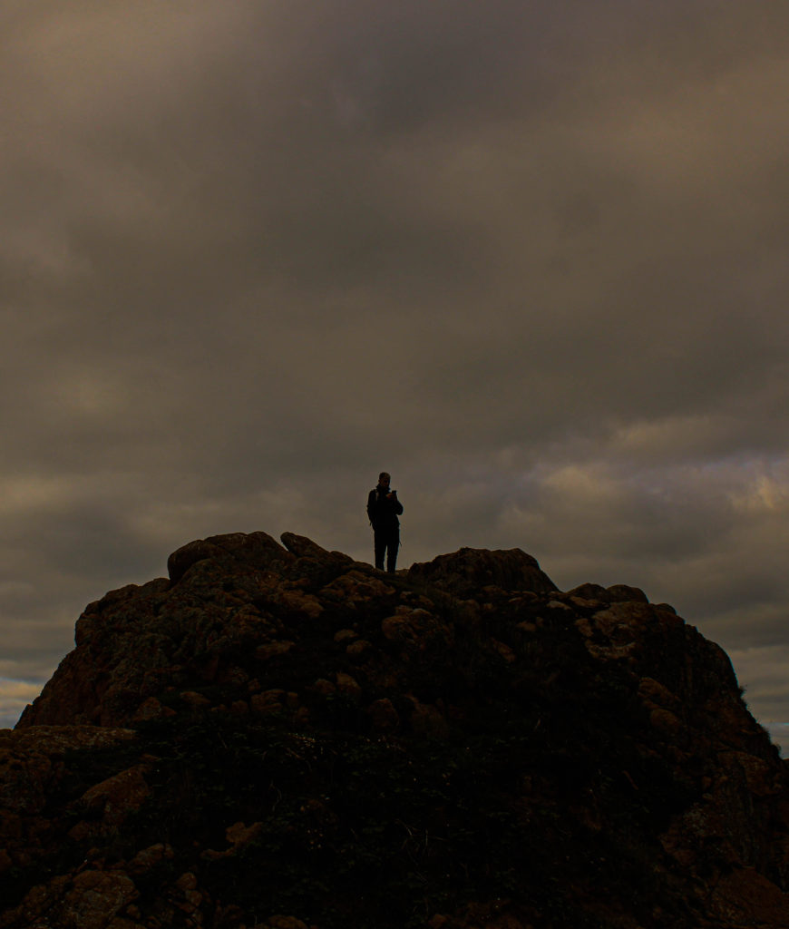
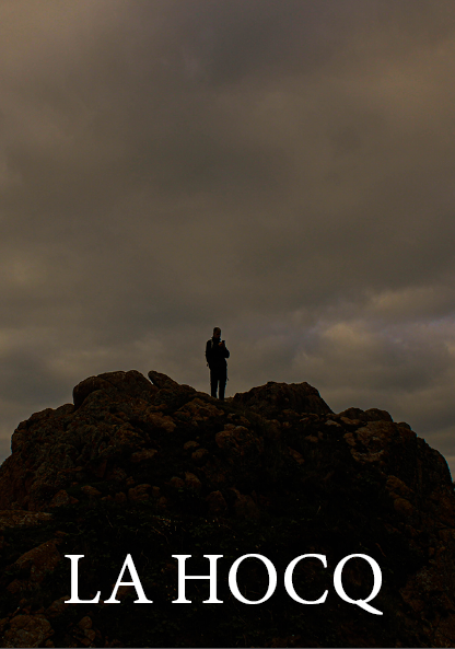
Front cover 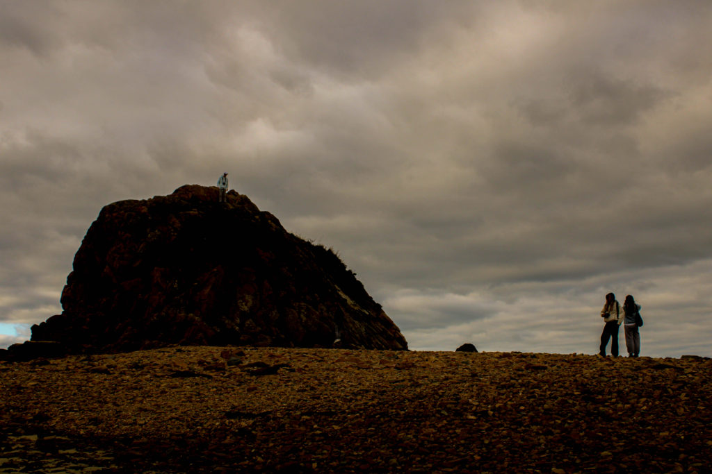
Back cover
Photo-zine creation:
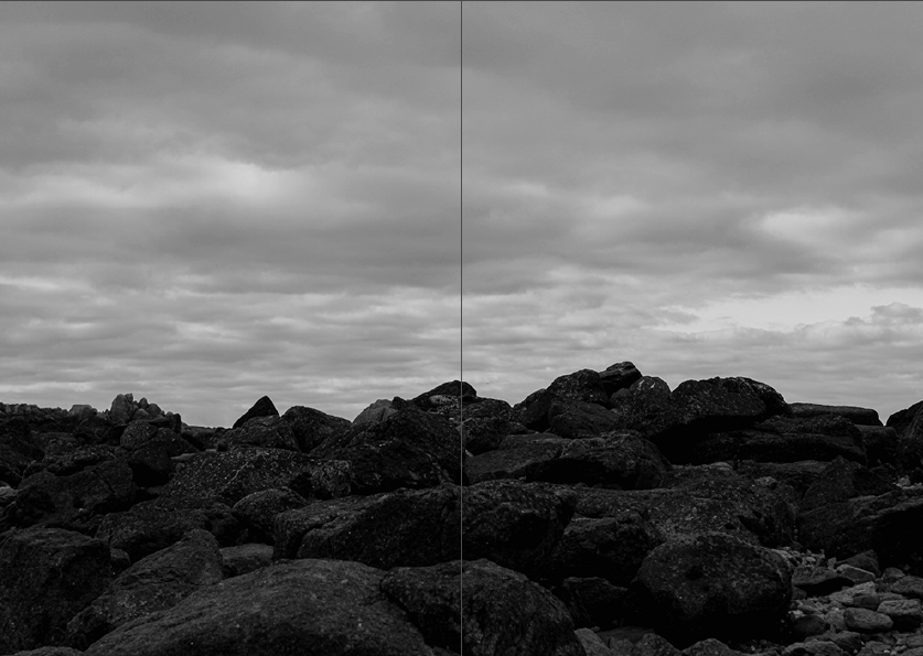
For my first zine draft I wanted to present this image in a double page spread.
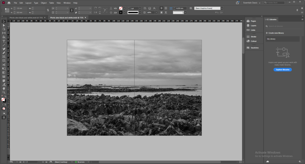
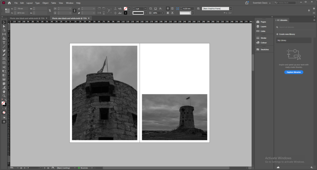
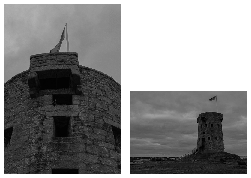
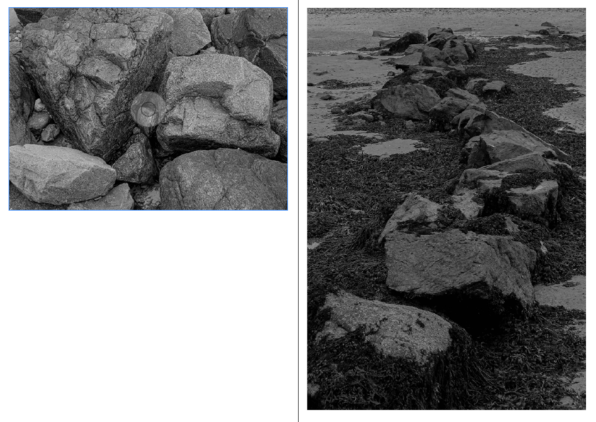
For the next 2 pages I wanted to display my images of La Hocq with a close-up and a long distance.
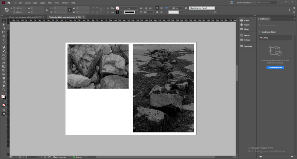
I wanted to slightly replicate the previous pages with close up images of rocks by using a similar layout of image placement.
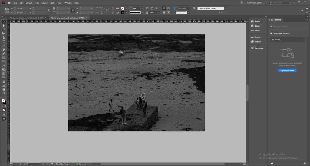
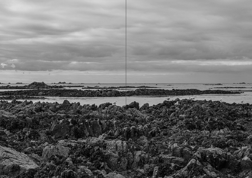
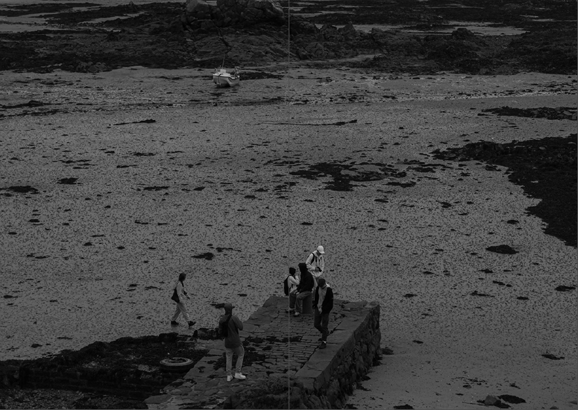
For my next two pages I wanted to keep it basic and use a double page spread for a simple black and white image.
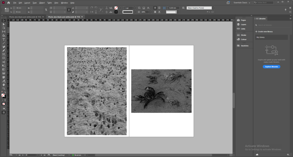
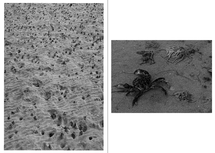
Next, I wanted to include the image of a crab I took because it changes up the theme slightly and include some wildlife next to a close up photo of sand
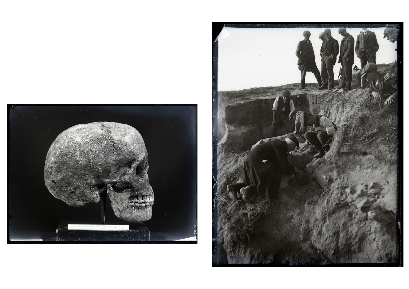
Then, I wanted to include some photos from La Societe archive of bones and human remains that were discovered on Green Island and around La Hocq
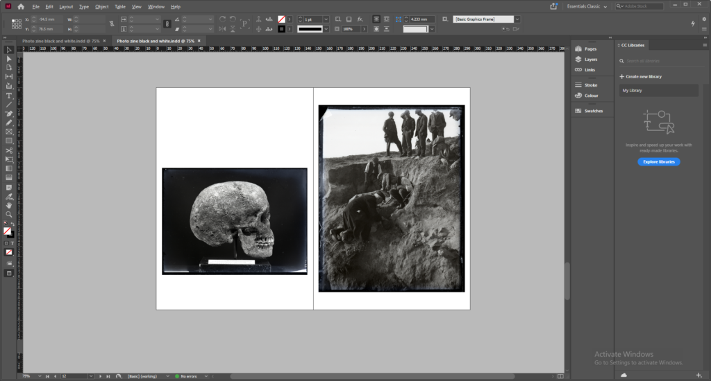
For my final 2 pages, I wanted to include 1 more double page spread of another basic, black and white rock image.
Final photo-zine:
Evaluation:
Overall, I am very happy with how my final zine turned out. I kept a similar theme throughout the pages of the zine with every picture inside being presented in black and white. The name of my zine, La Hocq, is named after the location that all the images included were taken. I really like the layout of the images with some pages having a white border to create more contrast. I used juxtaposition on some pages to change up the style and layout.

