I had a lack of inspiration for my Zine, I created a Pinterest board displaying natural forms (containing images of rock pools, stone formations, plants growing) and I realised that colour is a major part of nature so I decided to highlight colour in simple abstract images of rock pools.
EDITING AND DESIGN
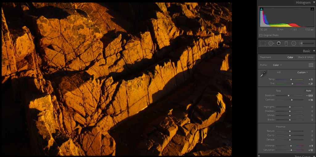
Following my photoshoot at Green Island, I went through my photos which were in my green category (images I have previously decided I like- process shown in this blog post) and edited them, separating more images into possibly final decisions for my Zine.

The editing I did for my images was minimal, I only wanted to highlight contrasts and accentuate colours to show a key theme of my Zine.

After editing my images I ended up with 46 images which I wanted to put in my zine -with some flexibility if I feel some do not fit with the theme.

On Adobe Indesign I created an A3 document with the measurements; width: 148mm, height: 210, pages: 16, orientation: portrait, columns:2, column gutter: 5mm, margins: top, bottom, inside, outside: 10mm, bleed: top, bottom, inside, outside: 3mm as to create my zine.

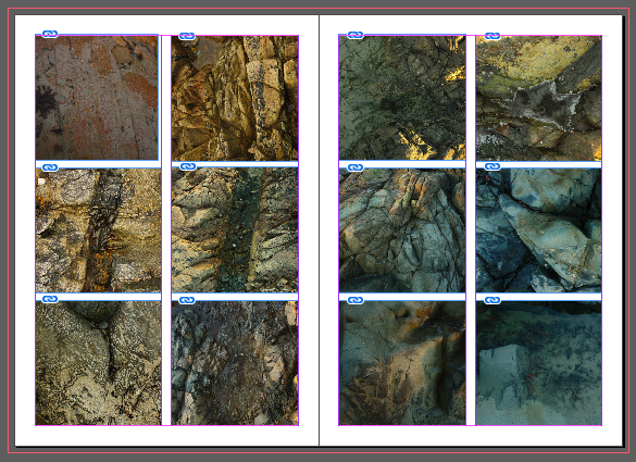
I started inserting my images by dragging my saved edited images from my ‘rockpools’ folder on my documents. I cropped and positioned my images on the page then made sure they fit the frame proportionally so the whole image was shown.

As my main concentration in my Zine was colour shown through abstract images, I decided to have a gradient theme running through my zine where the tones in the images go from warm to cold. Quite quickly I realised I had too many images for a 16 page zine so I added 4 more pages. Throughout my zine I played with designs such as full page spreads, single images and grids- I kept these experimentations as they provide some visual interest through slight irregularity.

I struggled with deciding a title for my Zine, after trying various names such as “Tidal Pools” and “Heaven is a rockpool” I decided to put a haiku on the front and back as to make clear the Zine can be read from either cover as it displays a gradient of colours which display the day changing and the colours in the rockpool becoming colder (or warmer)
