Images Used in my Zine
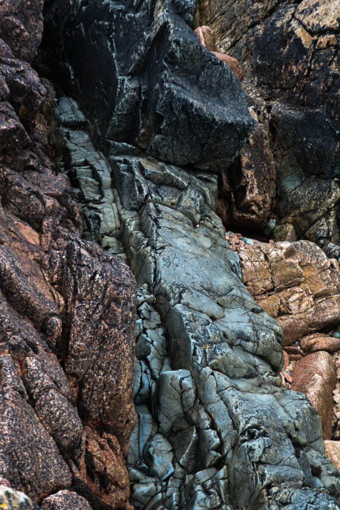
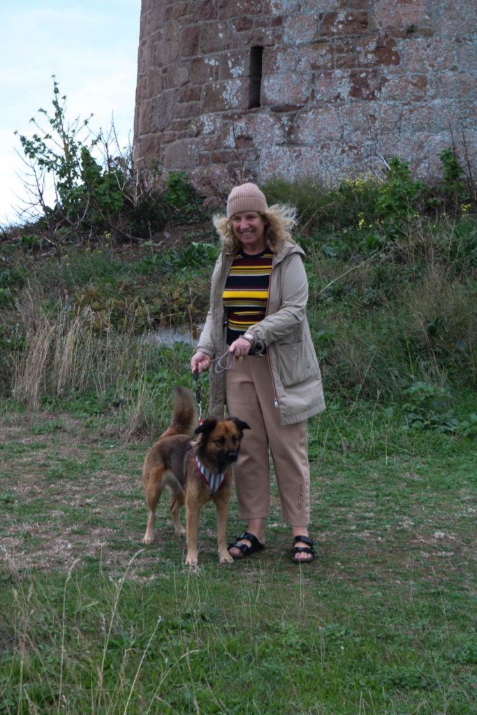
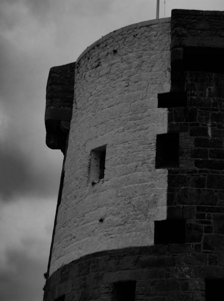
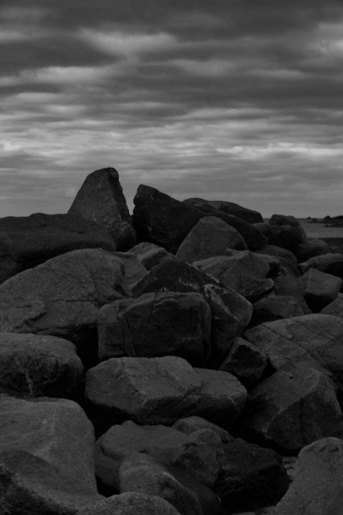
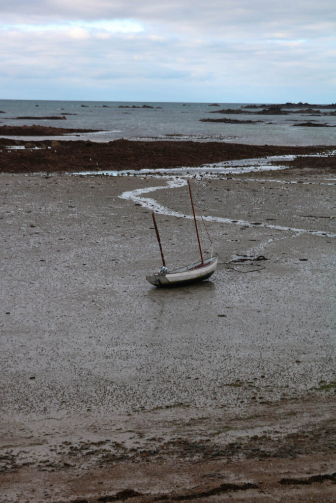
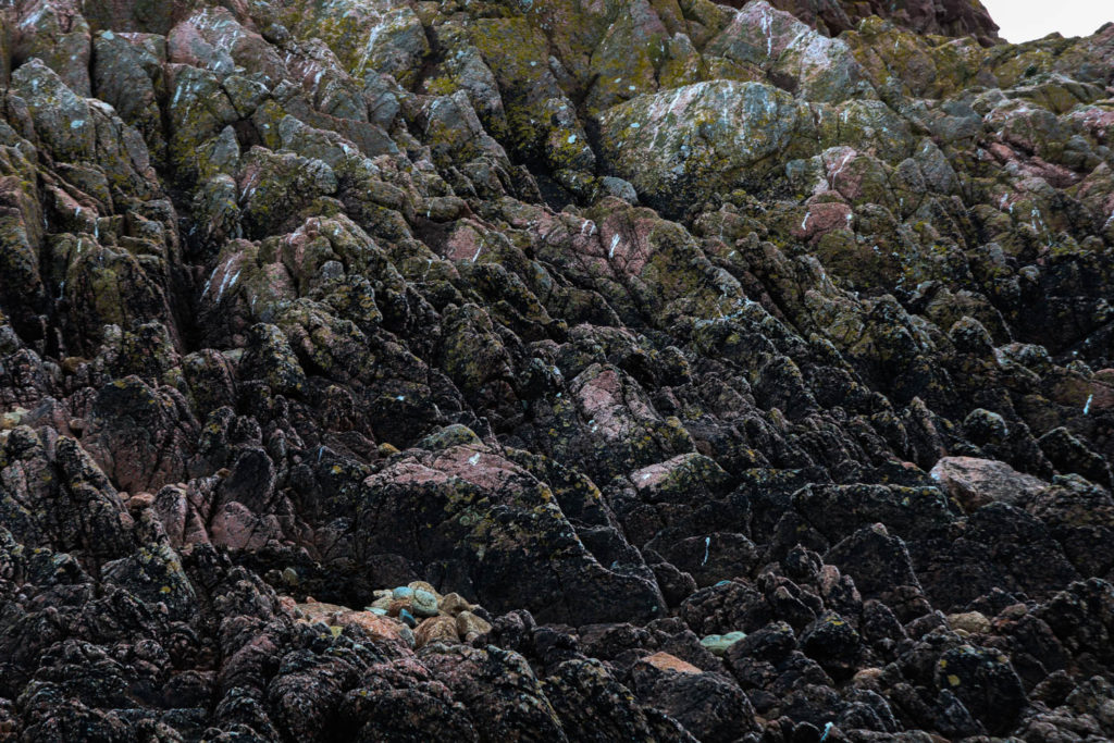
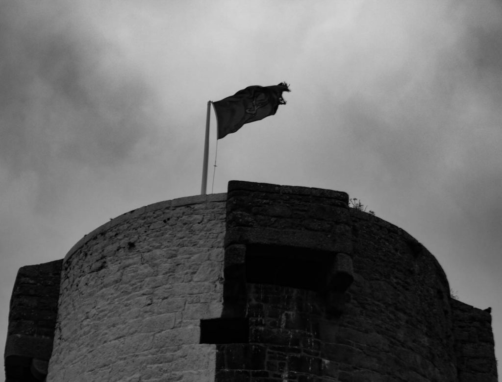
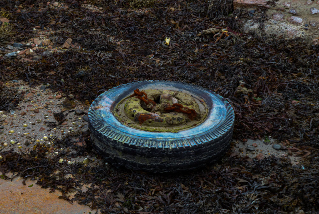
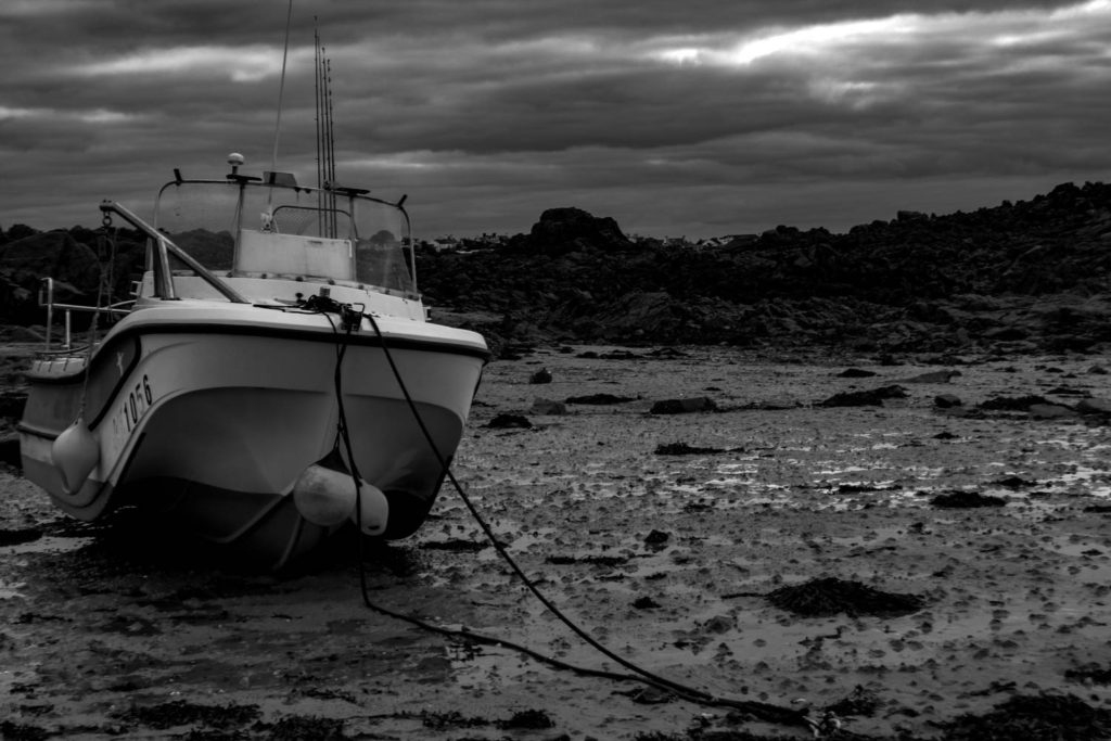
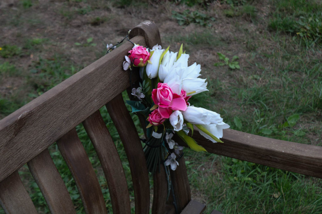
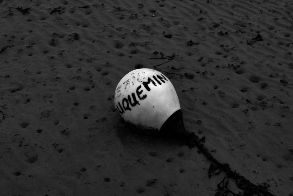
Here I have two galleries of the photos I have used in my zine, this allows me to see how the images work together and which I should place on the same page. This also helped to pick the photos that I liked the most out of my selection of final images and which will go with the story of my zine. Furthermore, seeing the bigger versions of my pictures allows me to think about the order and placement of my images on the pages.
Creating a Zine
Below I have included the first draft of my zine, this is during the editing process in InDesign. Being able to edit the placements of my images on each page made it easier to come to the final decision on which images I wanted to use and how I wanted to view them on the pages. InDesign is a software created by Adobe, to create the zine template we had to input the settings to get the correct size and page numbers. After editing the final images in Lightroom we used Ctrl+ D to place each of the photos into the blank zine.
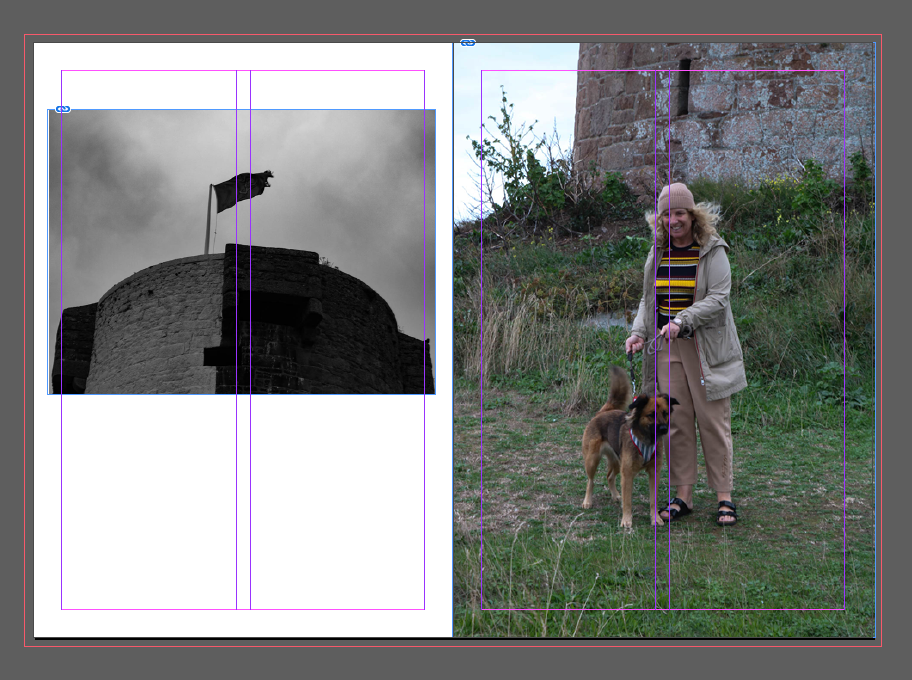
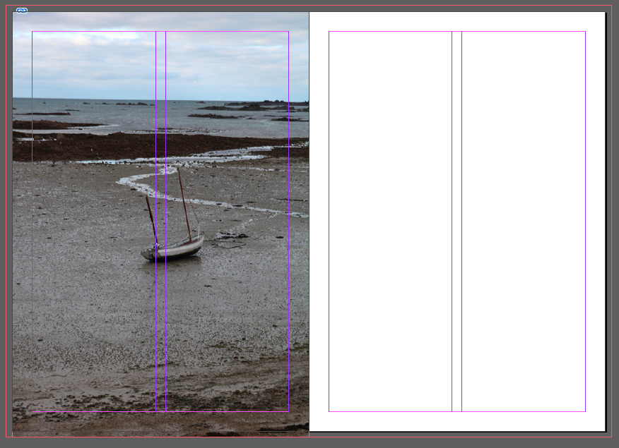
Above I have attached the first two pages of my zine, on the left side I have included one of my photos of La Hocq tower, as I couldn’t fit the photo correctly on one page as it is the landscape I decided to use half the page, I have taken the photo past the original bleep the was input, which was 3mm as I wanted the image to take up a bigger amount of the page. On the right I have included another one of my La Hocq photos, here I have extended the image all the way to the edges of the page as I felt the full page covered complimented the white borders on the page beside it.
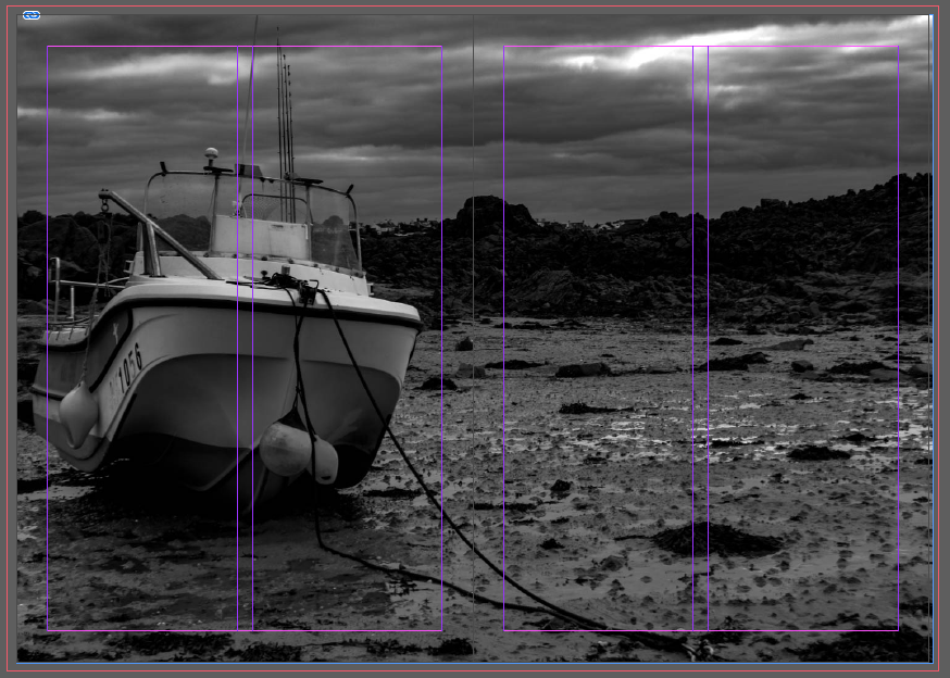
I have chosen to use one image which has been spread over both my third and fourth pages as I wanted this single image to be displayed on a bigger as I found that it was one of the better images that I had taken and edited. I like how the black and white helps me to use different tones and shades throughout my zine as I will be swapping between colour and black and white. Furthermore, I like how the boat which is one of the biggest features of the image fits perfectly onto one page which can give the effect of two images.
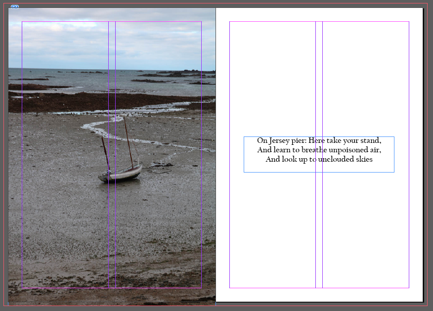
Here, on my fifth and sixth pages, I have inserted one of my images for La Hocq which I have taken to the edges of the page, and I have also included a quote on the right side. I like the contrast between the fully covered page with the photo compared with the blank white background with a quote. I also feel the quote helps to tell the story of my zine and also adds a break between the photos.
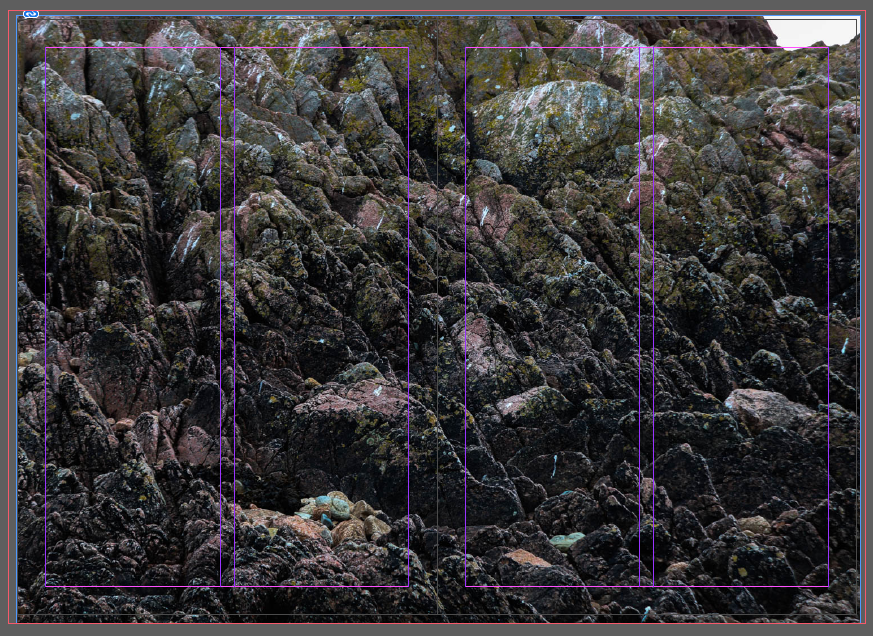
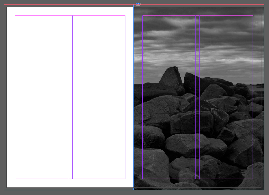
Above I have another image that I decided to cover both my seventh and eighth pages with. I have chosen to do this as I wanted as much detail to be seen and didn’t feel as though that would have been achieved if I had chosen to present the image smaller. I also feel by doing this, breaks up the colours from the white backgrounds which are on most of my pages.
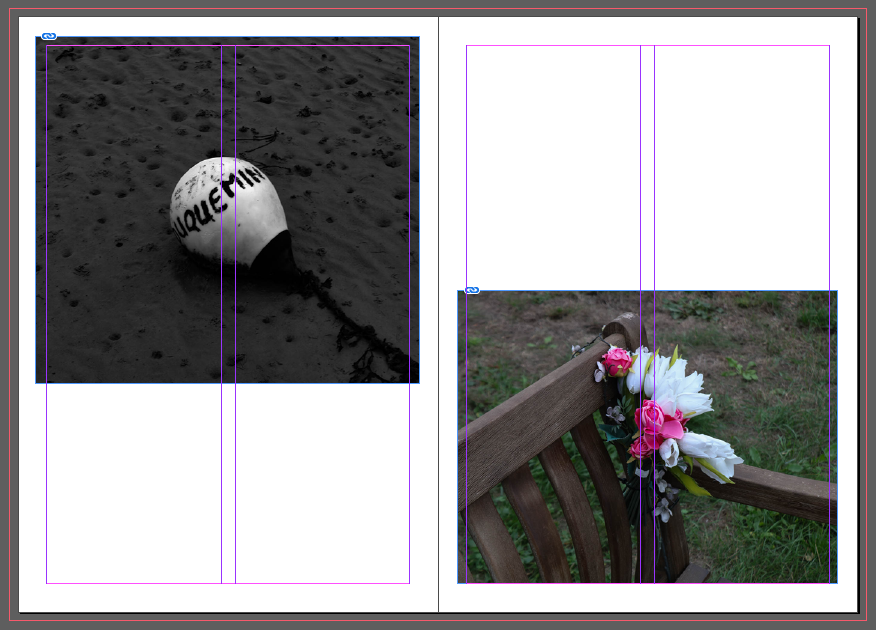
Above, is my ninth and tenth pages which are personally my favourite out of the whole zine, I like the contrast between the black and white tones on the left and the intense colours on the right. Furthermore, the difference between the objects also can help tell the story of my zine and La Hocq as there can be two sides, which can display extremely different features. I think that the composition of the pages with opposing placement of the images helps to bring the final pages of the zine together.
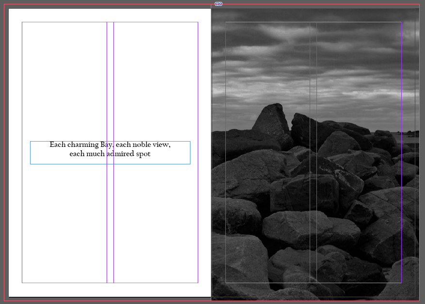
Here, I have presented my eleventh and twelfth pages, which are similar to my fifth and sixth pages but have swapped around the layout with the photo now being on the right with the quote on the left. I like this type of composition as it gives the viewer something else to think about, other than the many photos that they would have seen. Having a quote can also help provide insight into the story and give the viewer time to digest what they have been looking at.
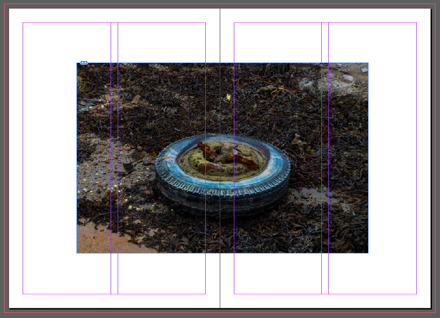
Finally, I have my thirteenth and fourteenth pages, I have gone with the same concept I have before, spreading one photo over two pages, but I have slightly changed it on my last page. I have decided to leave a white border around the photo as I wanted to try a new composition, which I believed worked well with the photo. A feature that I like about this page is the contrast between the colours from the oil on the wheel together with the which as it switched from bold and eye-catching to plain.
Title Experimentation
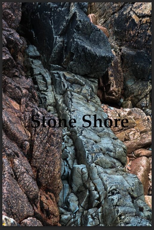
1st 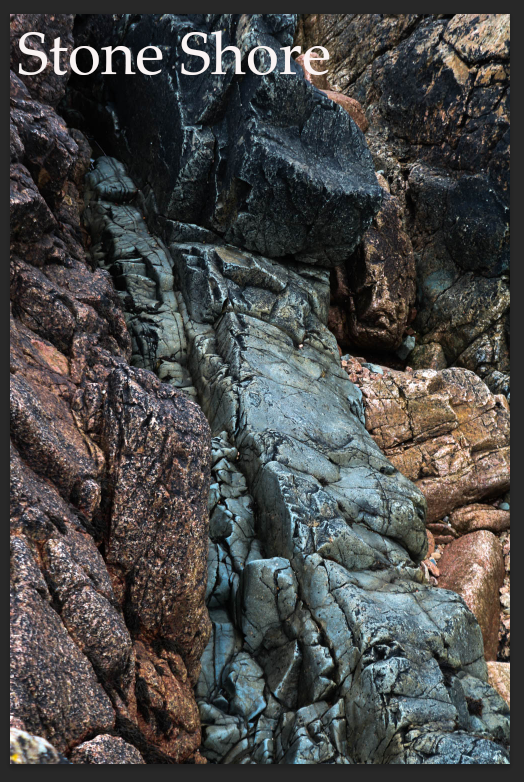
2nd 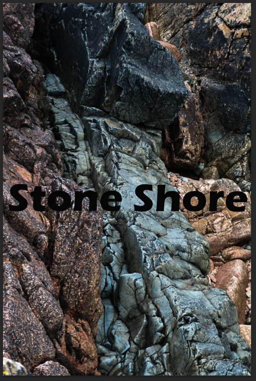
3rd 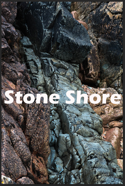
4th
Above I have four different edits for my title, I first started off by choosing that title for my zine ‘Stone Shore’, I took inspiration from one of the poems I was reading for the quotes in my zine. I then started to experiment with different fonts I settled with the fonts that are displayed in the 3rd and 4th examples. Once I found the font that I liked and thought fit well with the title I moved on to the colour. I had already decided it was either going to be black or white so I decided to play around with the placement and where the title would fit best. I moved on the placement before picking the colour so places on the title page looked better with black writing whereas other placements looked better with white. Finally, I had chosen to place the tile in the centre of the page and I had gone with white as my title colour as I found it stood out more against the background as it is darker toned.
Front/Back Cover
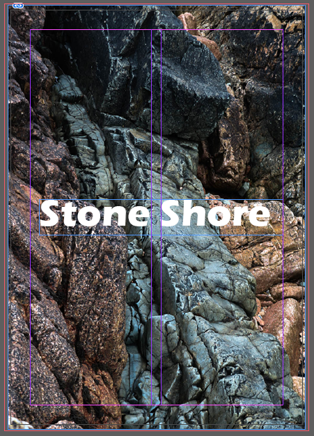
I have displayed the final edit of my front cover, compared to the 4 edits above I have only made a few small changes, I still kept the same placement, font and colour but I have changed the sizing. I have made the title smaller as once the zine is printed out I would need to cut some of the edges, so I downsized the title to stop from anything getting cut off.
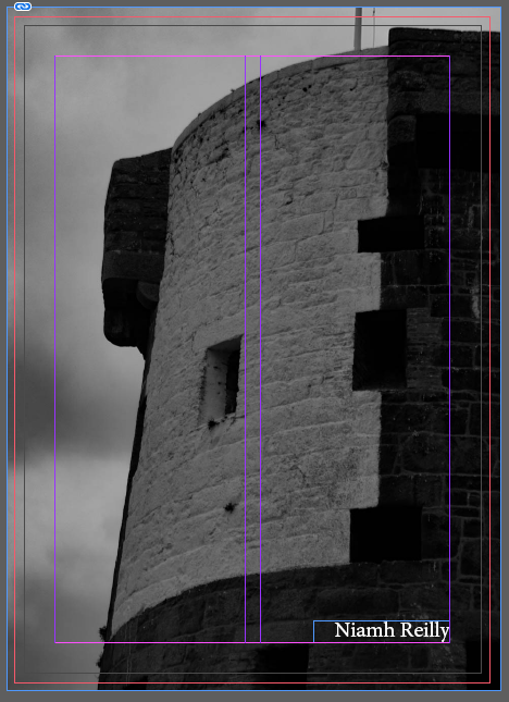
Below is my back cover which is a black and white photo of La Hocq tower. I think this is a good photo to end on as it compliments the colours of the front cover but is a great photo in itself. I have also added my name to the bottom of the page, I have also experimented with the font, colour and placement, but eventually came to the conclusion to keep it simple with a neat font with white lettering.
