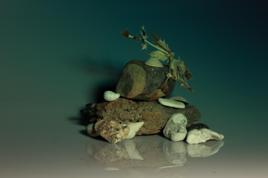
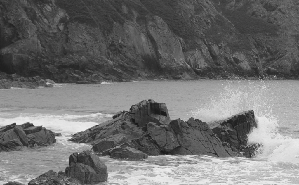
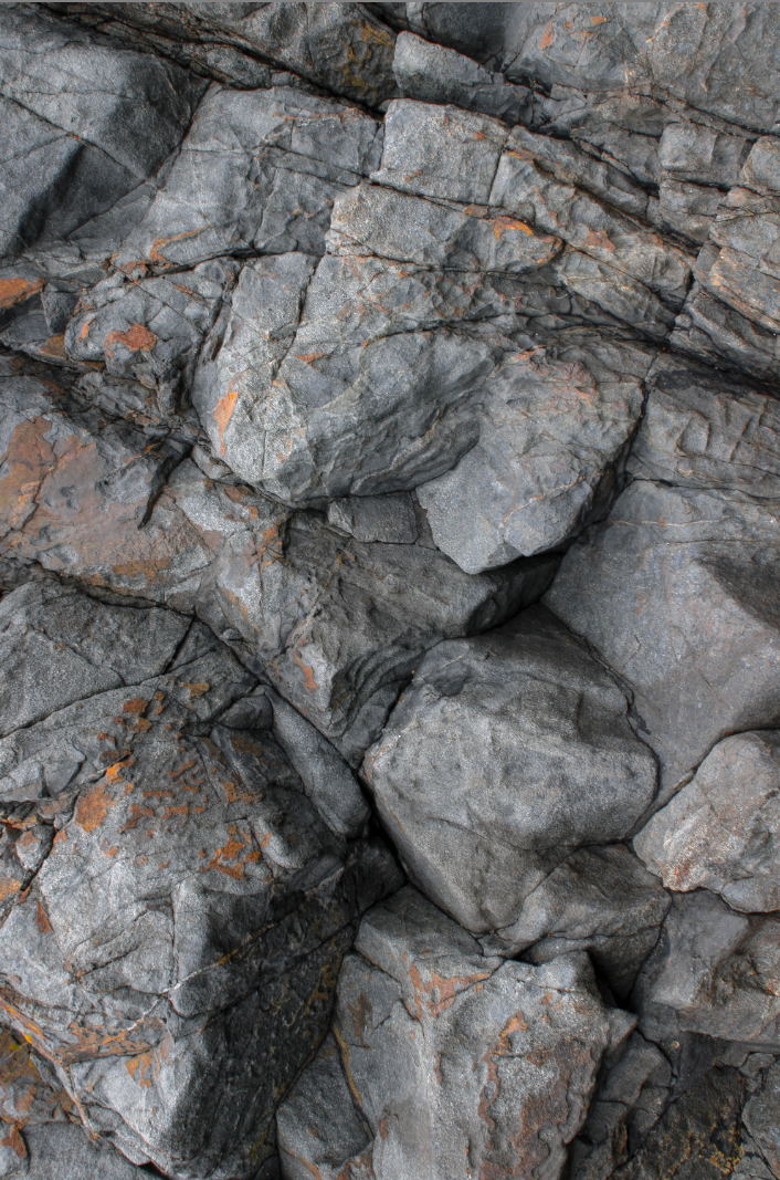
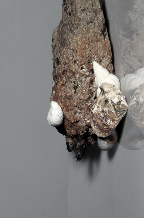
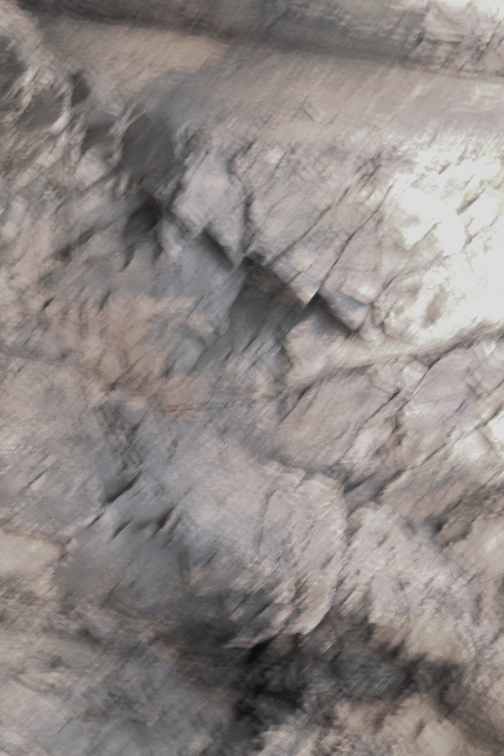
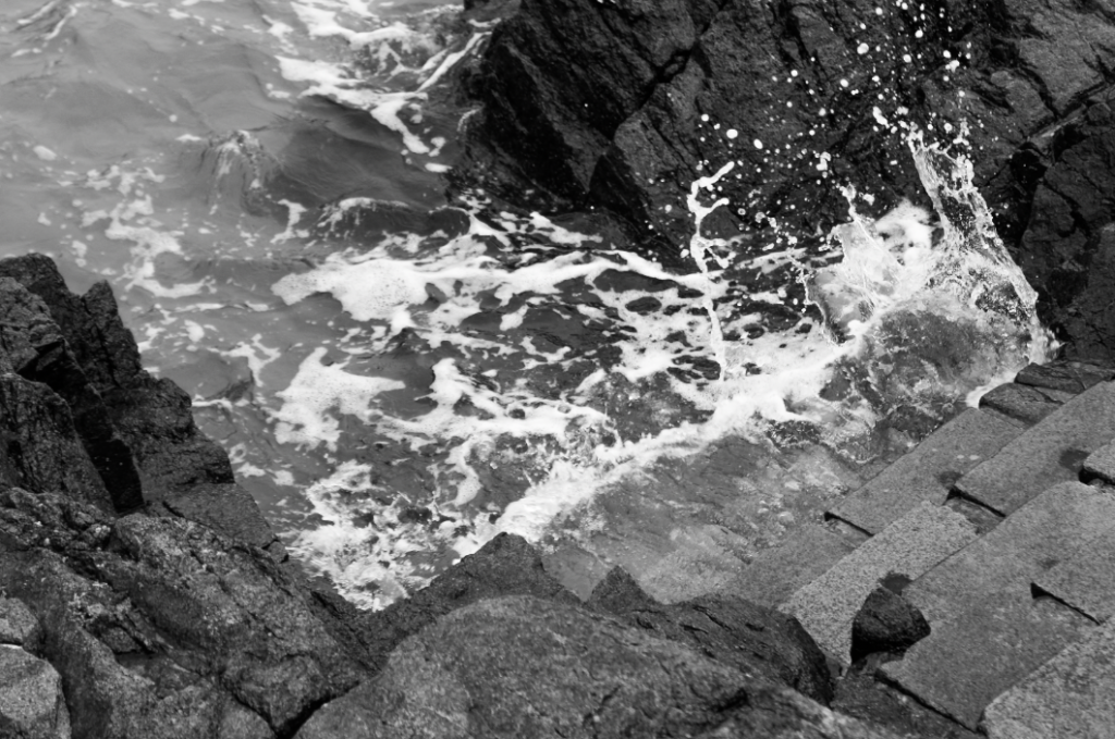
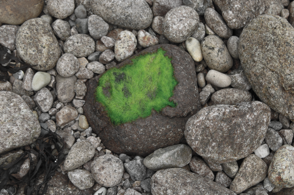
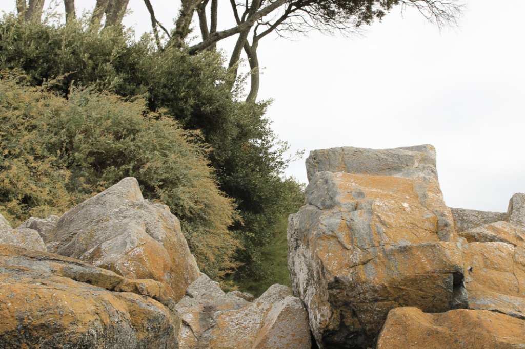
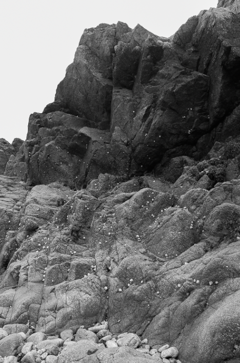
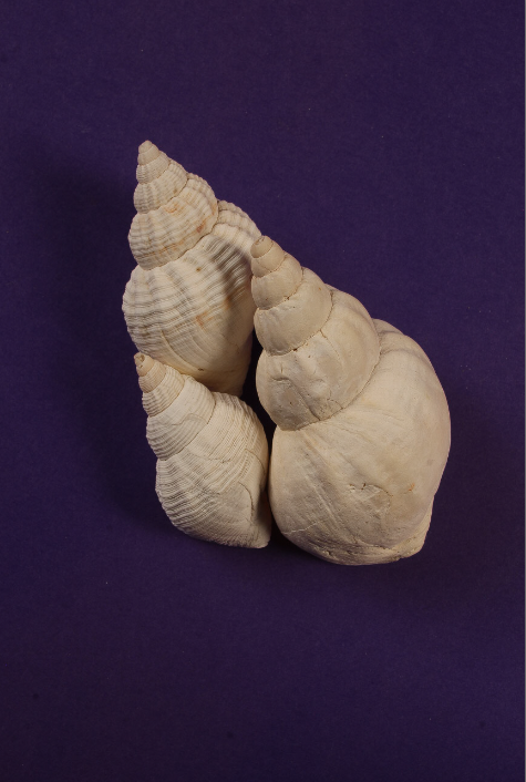
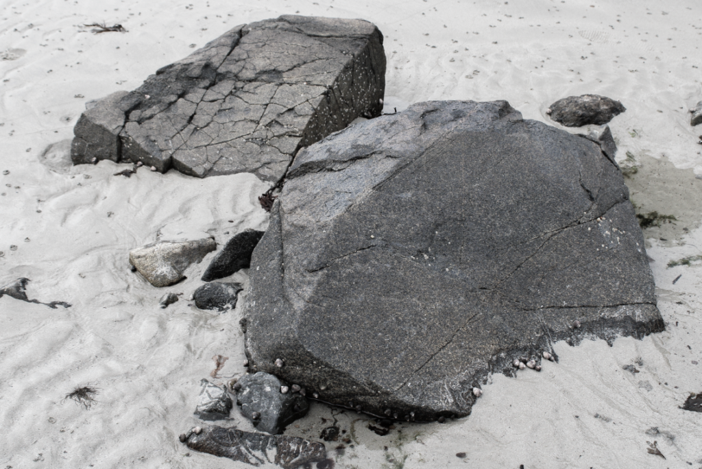
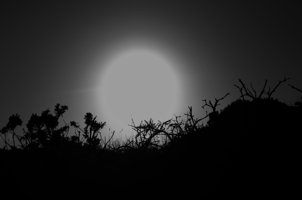
In order to start making my zine, I had to carefully select images that I wanted to use that I thought would make an engaging narrative without looking like a bunch of rocks. To help me decide what images went where, I experimented in Adobe InDesign, changing the sizes of my images so I’d begin to understand what worked well and what I’d discard.
My Chosen Images:
I chose these images as I thought they were all quite detailed and well taken images which would allow me to create a well made zine. I tried to pick various types of images from still life photos I took in the studio and some images I took in naturally rocky areas. This would allow me to create contrasting spreads making my zine look more intriguing, especially if I were to use colour to further enhance aspects of each spread.
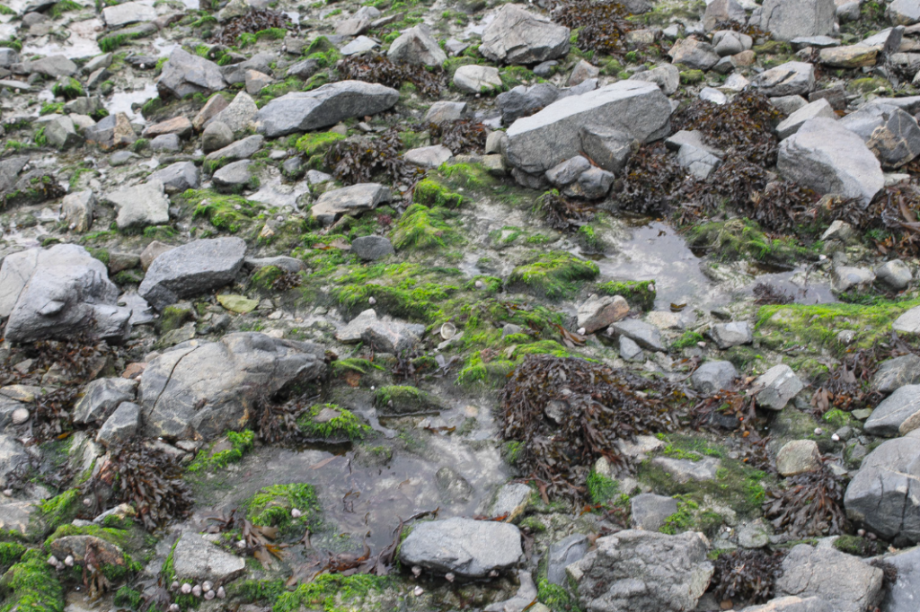
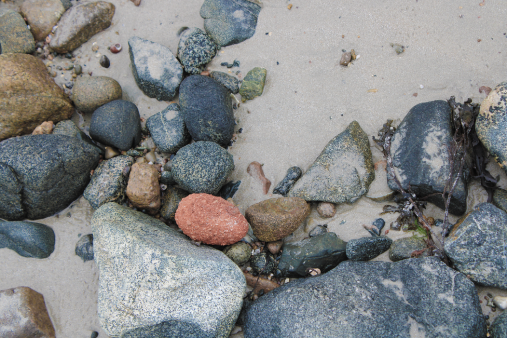
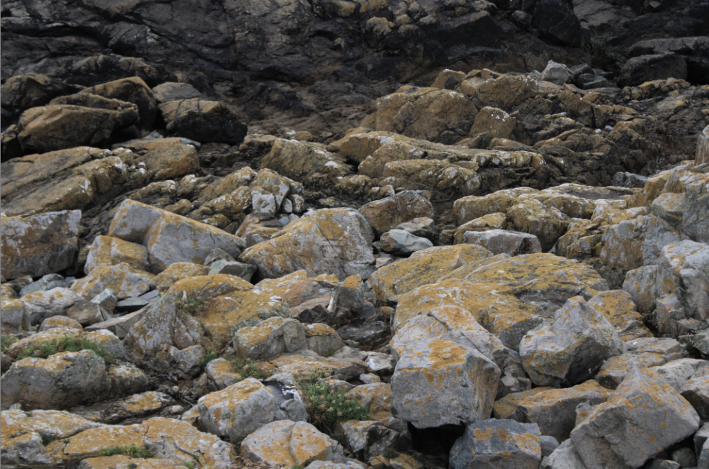
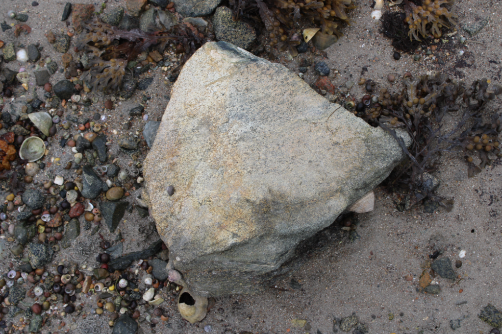
Process of Making My Zine:
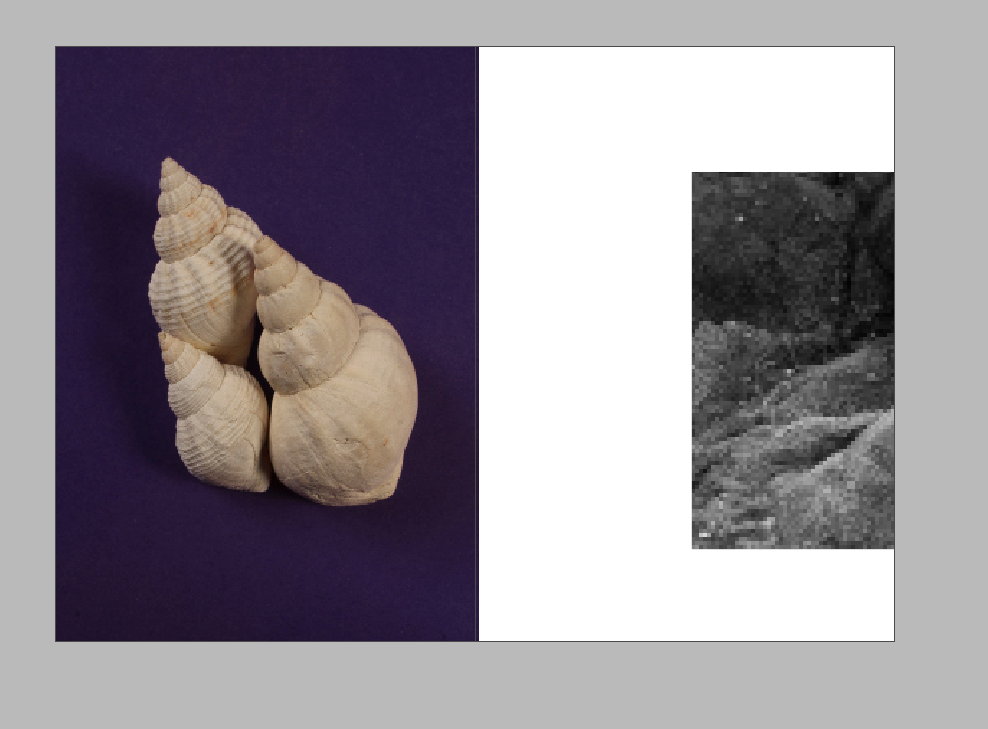
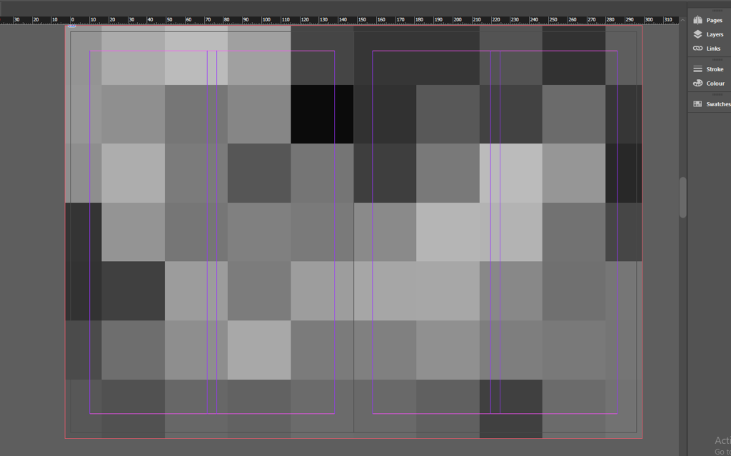
At first, I was having a hard time as my photos kept importing into InDesign really pixilated, sometimes to the point where the images were unrecognisable which made making my zine quite difficult. I managed to fix this after some time by re-exporting my images as tiff files and setting the display performance in InDesign to high performance which allowed me to see my images clearly.
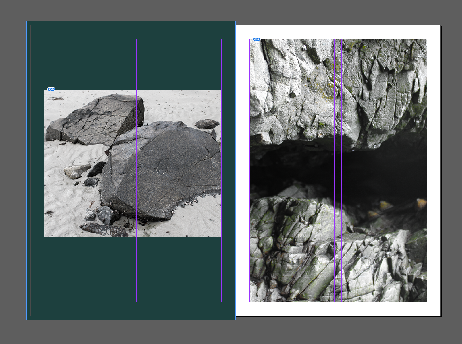
Next, I began combining my images together and thinking of ideas for spreads. I made sure to take my time and reorder the pages when I thought it was necessary in order to make sure the images all flowed together from one to the next in a linear form as I wanted to experiment with a variety of different ideas in attempt to make every spread look different which took a lot of trial and error as some of the spreads looked randomly placed. I solved this issue, however, through the use of shapes and colours as I noticed a few of my images had the colour green. From there, I decided to incorporate the colour throughout the background of most spreads whilst occasionally using black or white to stop the green from taking over the zine.
When choosing a title, I knew I wanted something short that wouldn’t take over the front cover yet could help to tie the whole zine together whilst still being slightly ambiguous. I decided upon ‘and repeat’ as I felt that it would encourage the viewer to look through the zine multiple times whilst also implying how the process of erosion is a never ending process, causing rocks to reshape or dissolve away. This process is only worsening due to global warming [which is causing the tide to rise higher and higher], leading the process to repeat quicker than before and release more and more carbon dioxide into the atmosphere which is having a detrimental effect on the planet. Read more here: Link.springer.com
Some Alternative Layouts:
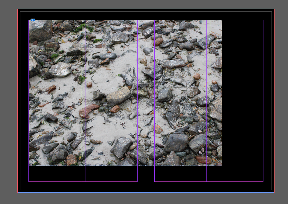
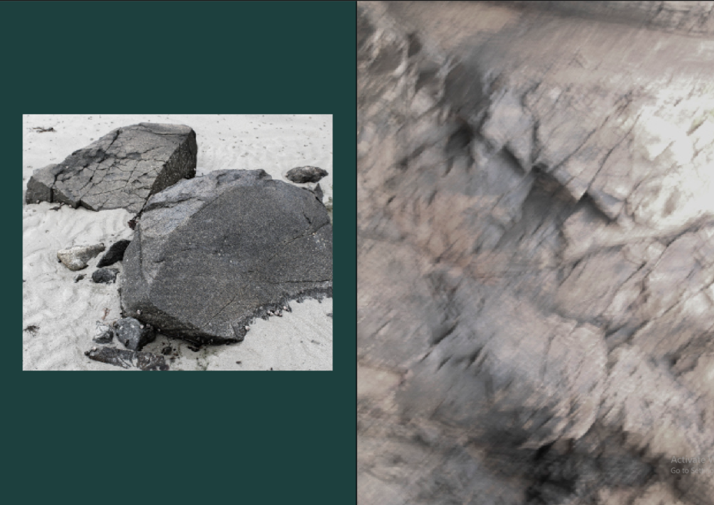
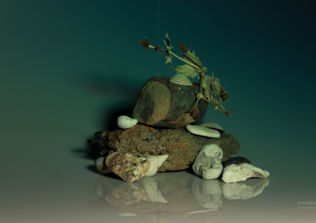
These are some layouts I considered using but ultimately scrapped as I either developed it into something different or cut the images/layout all together.

PAHAGHSGAJHA THE PIXELS L