Hamptonne: Objects

Editing One Image

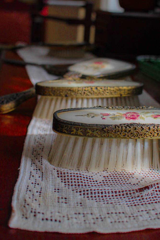
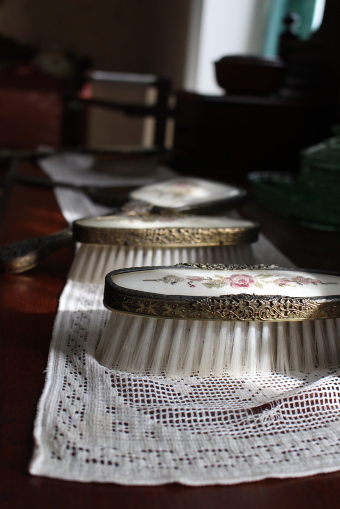
I decided to edit this picture because I really like the composition and the way the light hits the brushes. I thought the detail on the brush looked very interesting and I wanted to make them stand out more by turning up the contrast and texture. I turned the hue down and saturation up for the colour red in order to make the table cloth more visible and the embroidered rose stand out. I also played around with the other colours until I could something I liked. I cropped the image because I think its looks better close up due to the details of the brush.
Final Edits

This image has an empty alt attribute; its file name is Hamptonne-5-1.jpg
I really like this picture because at the beginning it was very dull and I managed to make the colours pop up.
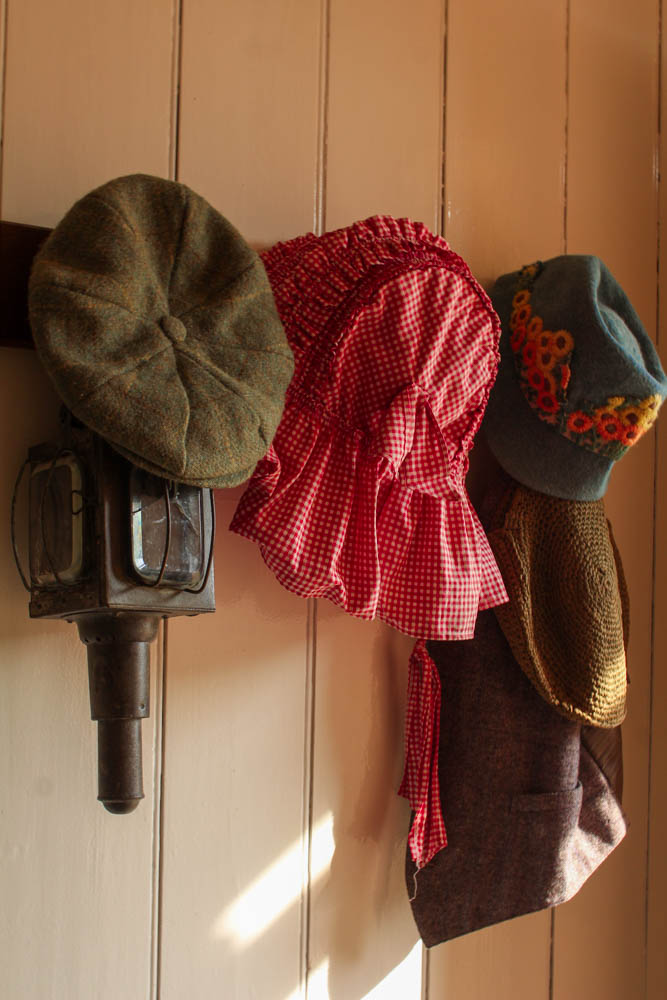
This is one of my favourite edits because I like the composition and the way the light is hitting the objects on the right. The original image was quite dull so I managed to make the colours stand out by playing around with the highlights and shadows, as well as with the colour red.
This image has an empty alt attribute; its file name is Hamptonne-BW-2-1.jpg
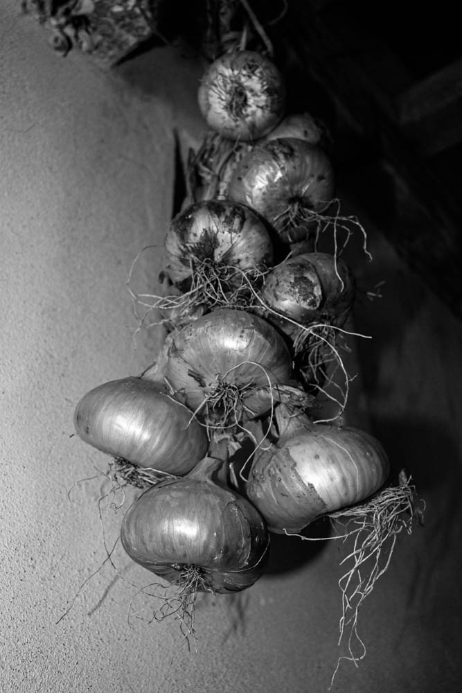
I think the angle I took this picture at is quite interesting because you can see the onions close up and also far away at the top. I like how I turned the contrast and texture up so you can details more clearly.

Leave a Reply