Hamptonne: Portraits

Editing One Picture

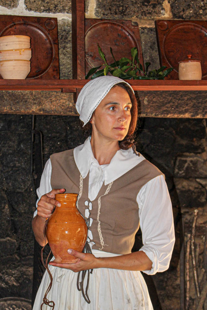
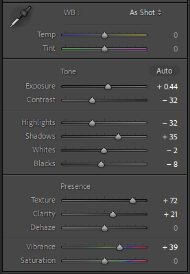
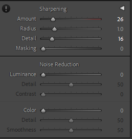
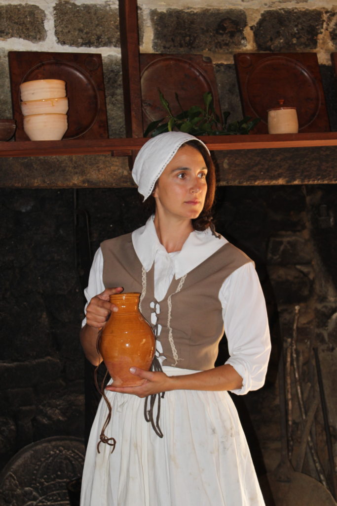
I decided to edit this picture because I liked the composition. I think the way the model was in the centre of the image and looking to her right whilst holding a vase could tell a story to the viewer. I cropped the photo first to bring more attention to her instead of the background. I then sharpened the picture and increased the texture to make the details stand out. I also increased the vibrance to make it livelier.
Final Edits

I like how it turned out because the colours pop out more and she is in her natural environment. I also think that her looking in the distance looks interesting.
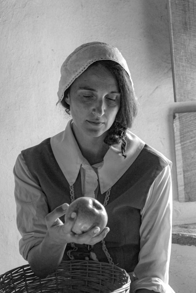
I like this picture because I think the way she’s holding the basket and the apple look interesting to the viewer. I also like the way the light hits her face from the window and how you can see the little details on her clothes.
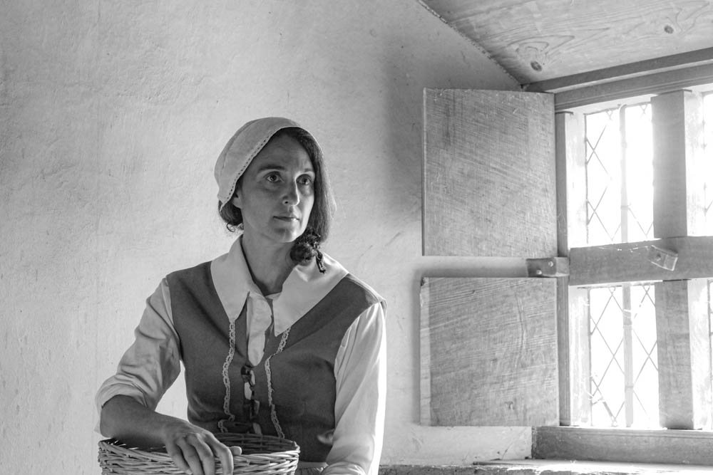
I turned this picture black and white in order to make it look more old fashioned I like the way this is framed with my model being slightly off centre and her looking in the distance. This could help tell a story and make the viewer more interested in the image.
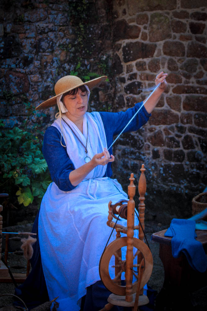
I like how this picture had the model in the centre and tells you a little bit about the character’s life. I tried making it look more saturated and full of life, but it turned out too blue so I think next time I will be a little bit more careful with the editing.

Leave a Reply