What is your story?
Describe in:
3 words: Rock, Seaweed, Bay
A sentence: A journey through the bay with sights of rocks and seaweed.
A paragraph: Mirroring my own photographic ‘journey’ through Le Hocq, my story will (somewhat) follow the path I took through Le Hocq. The story will start out with wider landscape photographs and slowly zoom in towards the finer details, until it will zoom back out again to resemble the end of a journey.
Points to Consider for my Zine
How you want your design to look and feel – I want to put a focus on the rocks and seaweed found on the bay. I also want to make my images appear more vibrant, as opposed to a more documentary-like aesthetic, however I may include some black and white images as well.
Format, size and orientation – I will experiment with page spreads and how big the images are in comparison to the page (1/2, 2/3, Boarder Single, Single No-boarder, etc…).
Narrative and visual concept – I want my zine to be a journey of Green Island and the bays around it, including both close up and landscape images to show the wider scale, to the smaller details one might miss.
Design and layout – I will aim to make my zine ‘symmetrical’ in the sense that the first page spread (page 2 and 3) will mirror the eighth page spread (page 14 and 15) in terms of layout and aesthetic. I think this will give a structure to my zine that will help it tie into itself.
Rhythm and sequencing – As stated above I want the rhythm of my zine to be ordered (symmetrical) so that the rhythm, sequence and narrative of the zine is displayed by the arrangement of the images.
Images and text – My images will be mainly landscape images of the bay at Le Motte, including close-ups of stones.
Title and captions – I want my zine’s title (and captions if I decide to include them) to involve the idea of a bay/rocks/seaweed in some way, perhaps a description of all three at once.
Moodboard
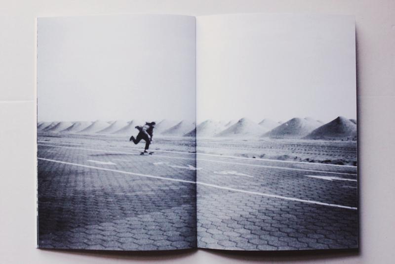
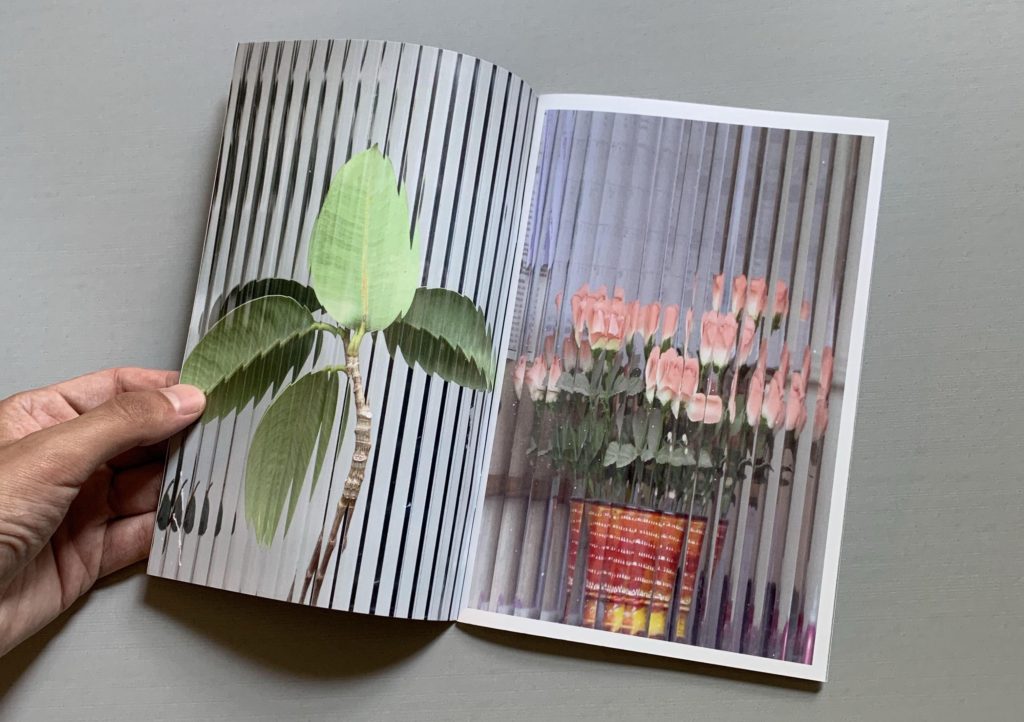
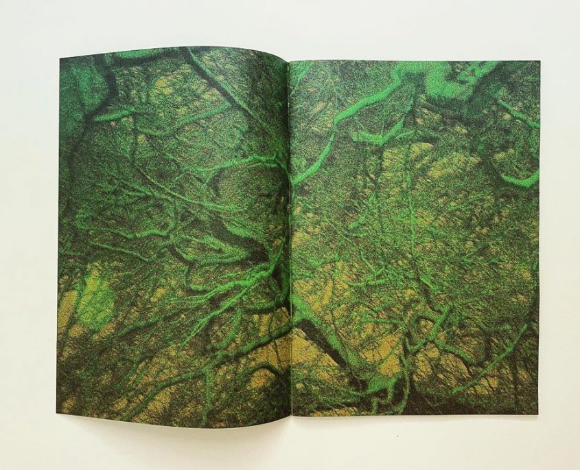
As stated above, I want my Zine to be on the vibrant side, so these are zines that I found that match that description. I will also use some black and white images to create a contrast with the more vibrant ones. The bottom image (largest) in the moodboard fits what I am going for, however this may change during the experimentation/creation stage.
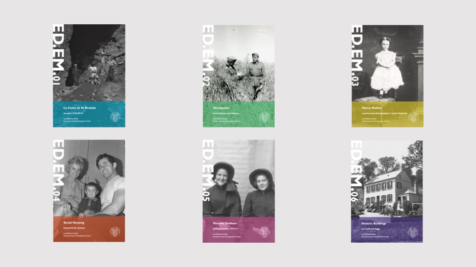
These are some examples of published zines created by the Société Jersiaise: Éditions Emile, which was named after Emile Guiton whom I have written about before. These zines are produced twice a year, each with links to the archive and the history they have recorded. The zines include images stored in the archive (some perhaps taken by Guiton), and some images are created in the modern age for the zine.
Image Selection
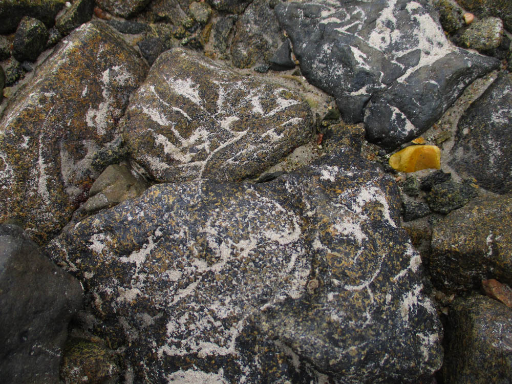
These are the images I will be using to create my Zine (all of the images are edited, some with black and white or cropped versions).

