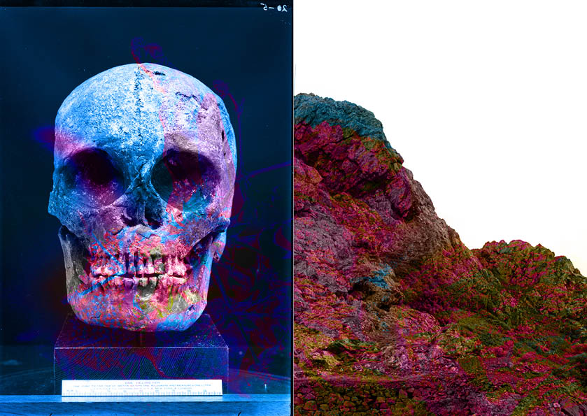
My first draft:
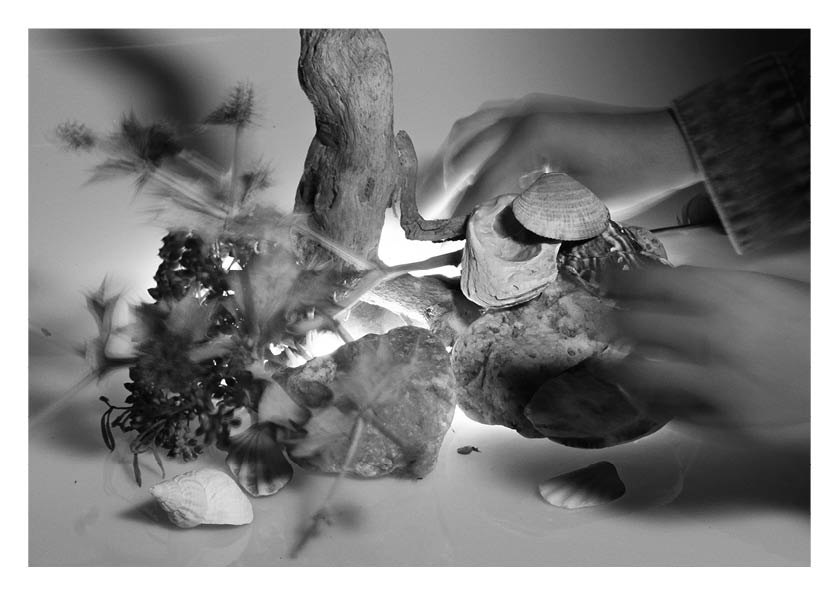
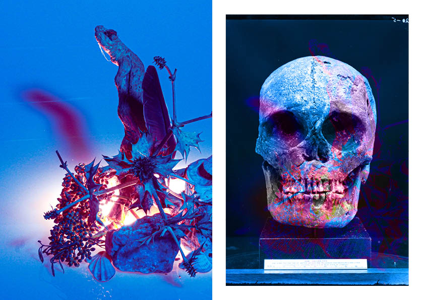
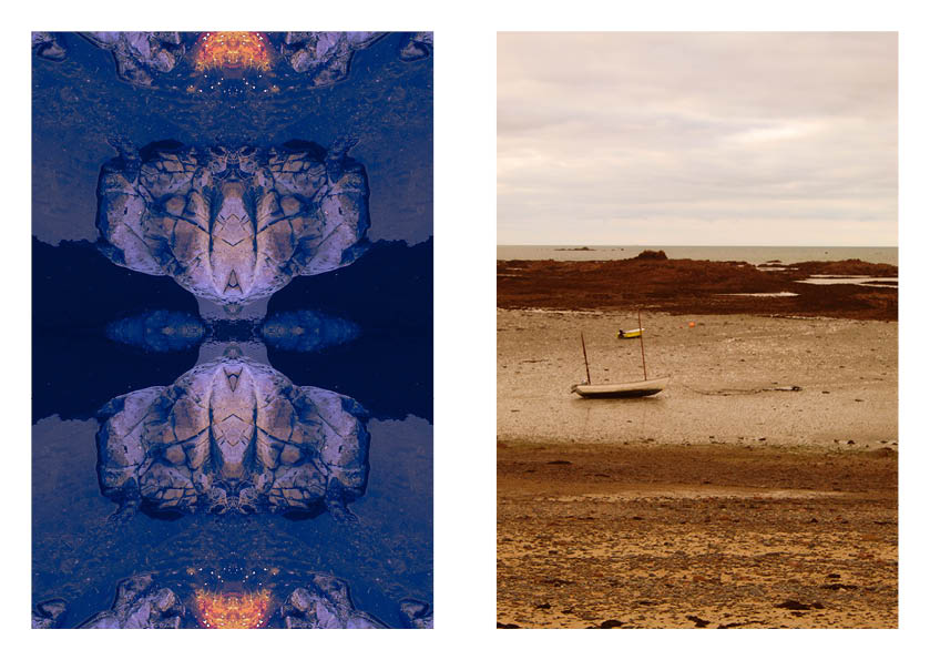
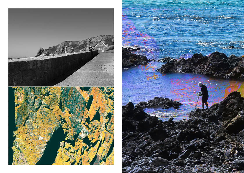
I decided not to use this layout because I chose the images pretty randomly so there was not much connection between them and anything else in the zine. I decided to make another zine, focusing on using images to do with nature along Jersey’s coast.
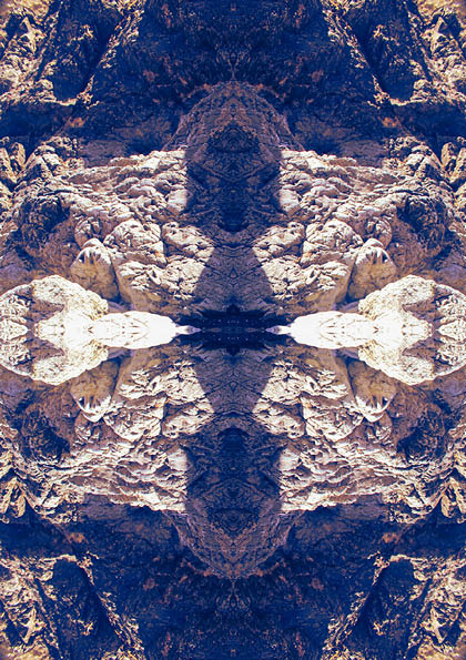
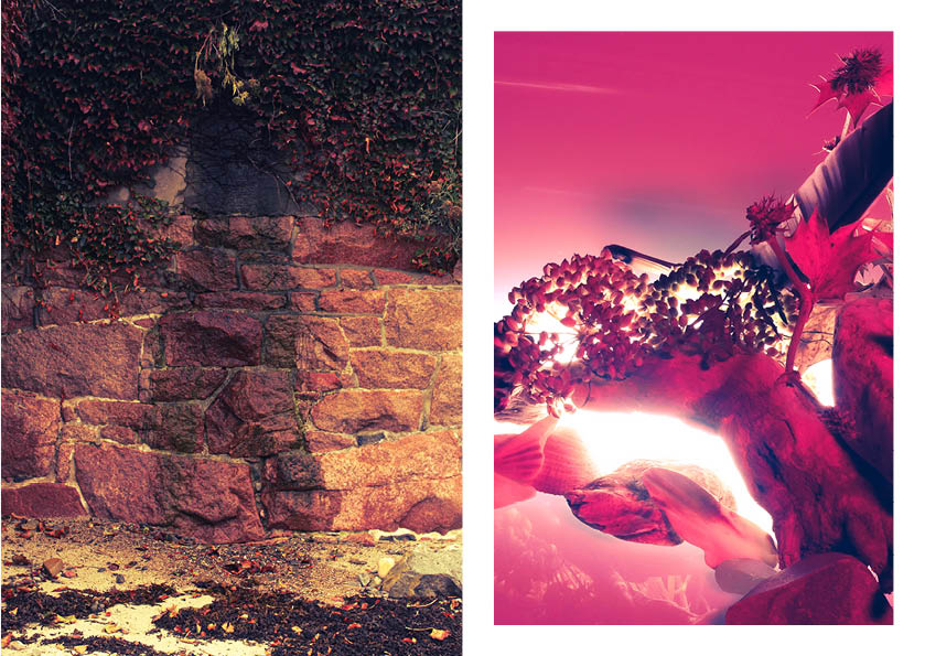
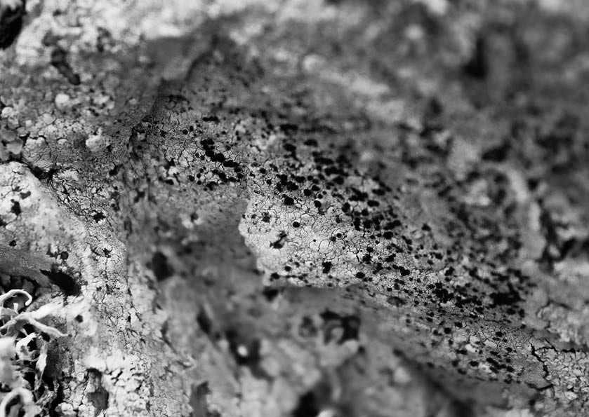
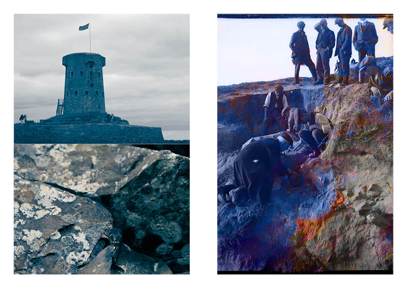
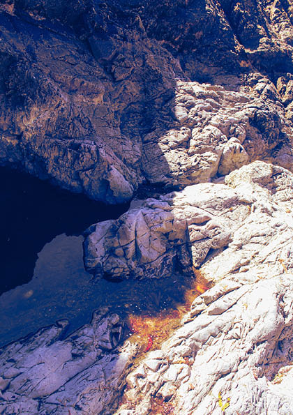
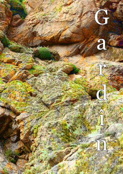
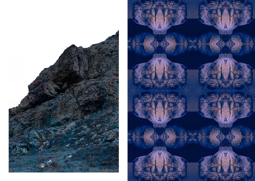
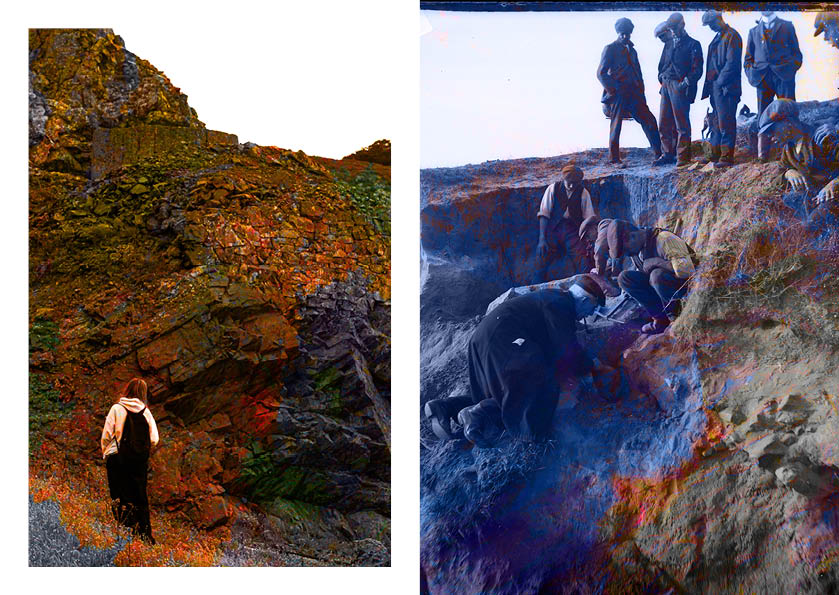
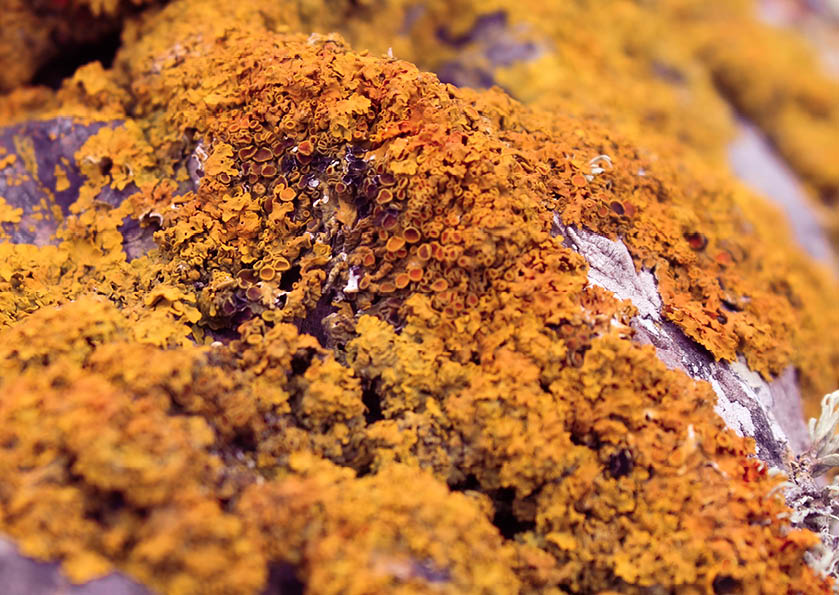
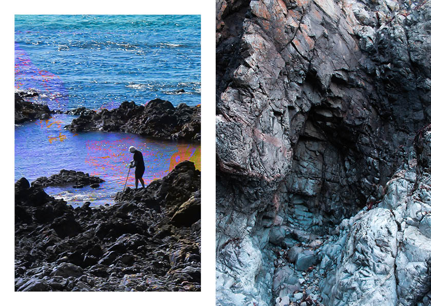
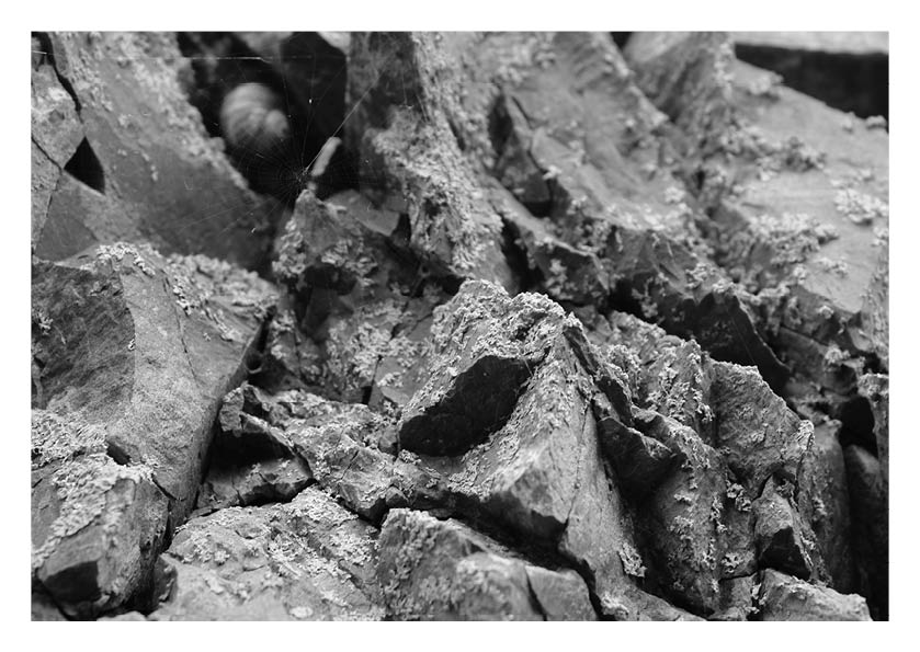
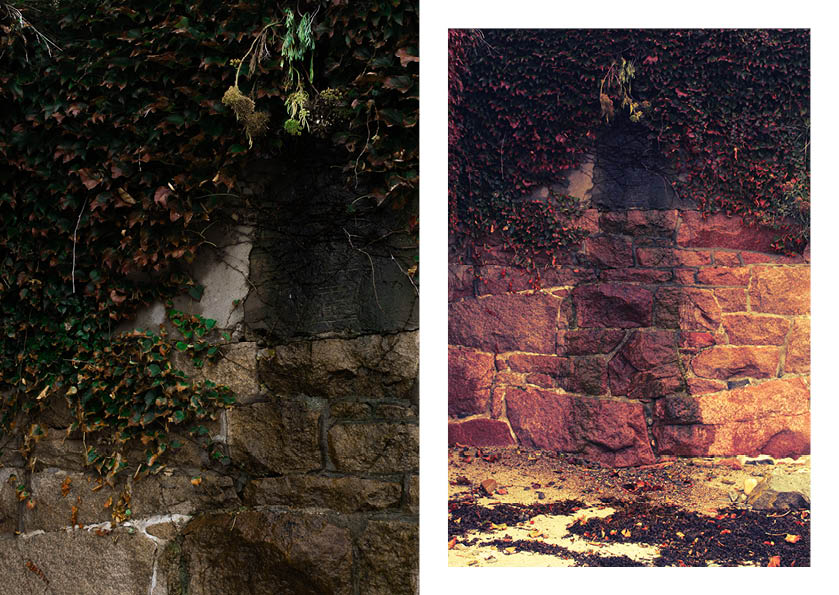
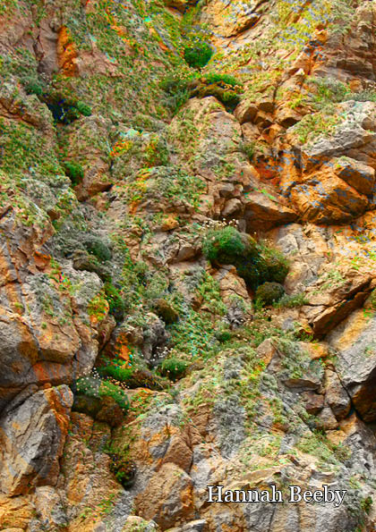
I prefer this layout a lot more, with a specific focus on nature and rocks, and with a connection through the bright colours overlaid on top of some of the images, creating a much more unified zine. I decided to alternate between images with a white border and ones with a full bleed. There is also a bit of variation between images with low saturation and ones with incredibly high saturation, hopefully creating more visual interest. In both drafts I decided to use edited versions of Emile Guiton’s images from the Société Jersiaise photo-archives, to add some historic value to my zine and to contrast my work with that which belongs to a photographer in history.
I chose the title “Gardín”, which means “Garden” in Jèrriais, because Jersey’s coastline is like a garden to a variety of native plants and animals of all kinds.

