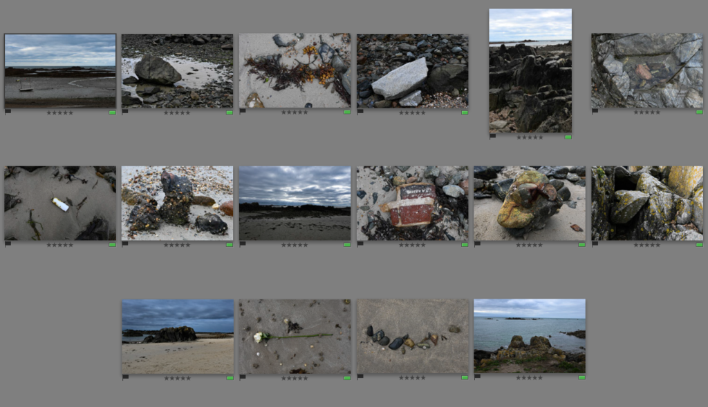
The 16 photos that I have selected to edit further in Lightroom will be the photos which I will use later on to create my zine. Throughout these experiments, I will creatively manipulate my photos in to black and white, change the contrasts/lighting, etc. Then I will print the photos out and use them to make a paper mock-up in class so I have an idea on how I want to lay my zine out as I think that it will be more helpful to help me understand what I want to do and the experience I want to create for the people who will view my book.
Experimenting with editing –


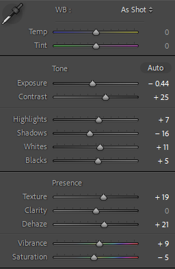
For these photos, I began by doing simple edits which can be seen above which I then synced to all of the others. This acted as a baseline to work with which I thought was better as they would all have the same settings that I can expand with further along the line.

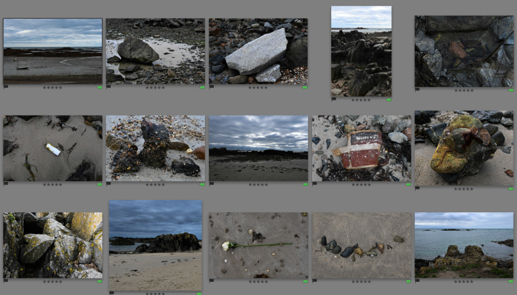
Then I went further into editing for these photos, I started cropping which can be seen in #3, #5, #10 and #12 because I felt as if there was too much negative space and I wanted to create a more focussed point of the photo. I also went through other photos which were slightly wonky and needed to be straightened in the horizon lines because I think that it makes the photos look neater and work better together. I also decided to get rid of one photo which I thought didn’t really work well with the rest of my photos because of the way it was taken and the different textures within it.

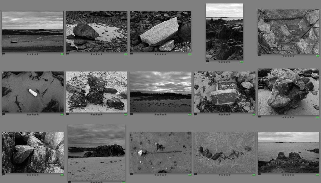
I then decided that I wanted to turn these photos into black and white in Adobe Lightroom. I really liked the way that they turned out in black and white as it adds more control into the photo because they have all synced in how they appear which I like as it provides a uniformed look instead. I think that I will use the photos in black and white for my final prints that I will use to create my zine.
