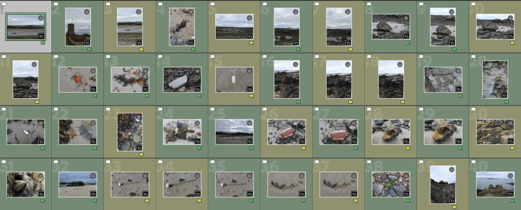
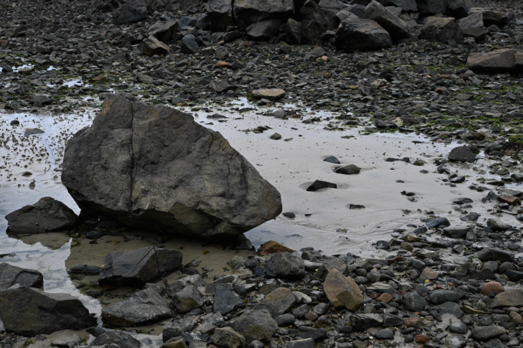
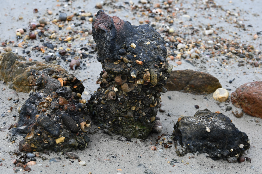
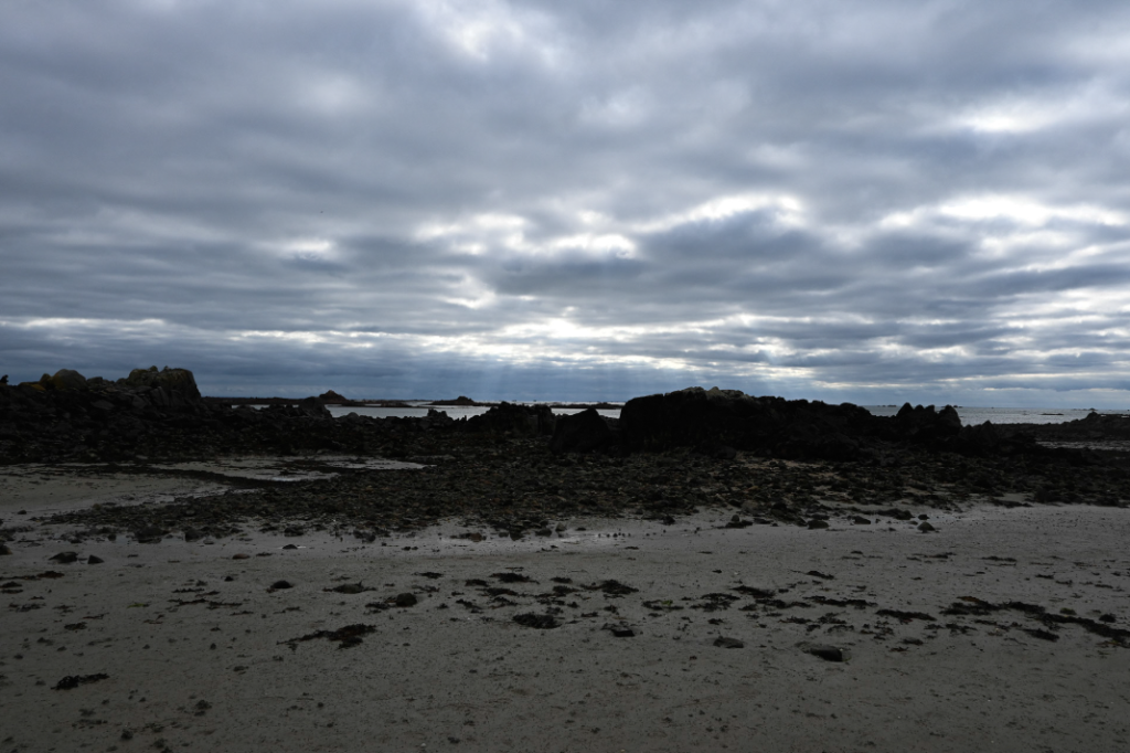
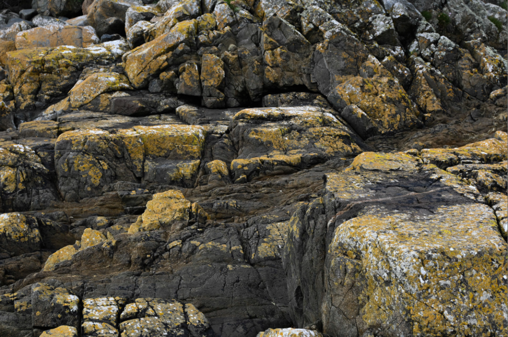
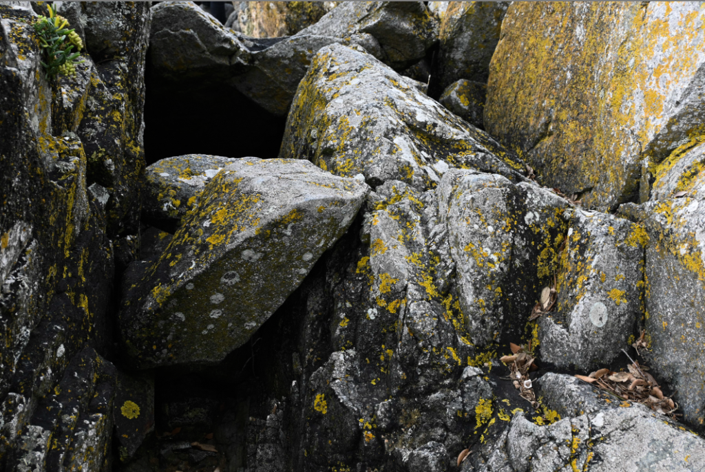
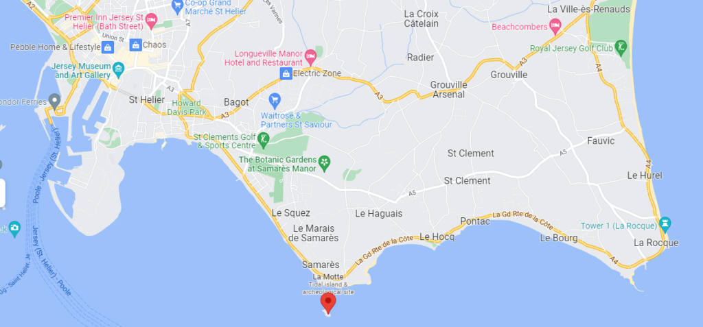
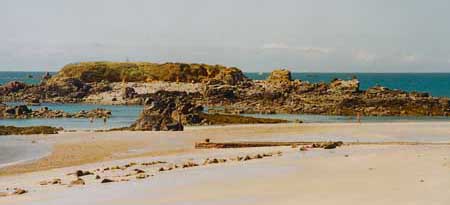
For this photoshoot, we visited Green Island where we walked along the seafront taking various pictures of items we found along the way and other views which we could see. The weather for this trip worked well with the pictures in my opinion because it was overcast, which can be seen in many photos, this makes it easier when taking photos as the glare from the sun isn’t able to overexpose the images although the blue sky did do this in a few of the photos. I really liked visiting Green island because it got me to look across the seabed at different rocks/objects/etc to see what can be found on our journey and I found a few different things which I think that I could use in the future for my zine to tell a story of what we saw.
Most successful –
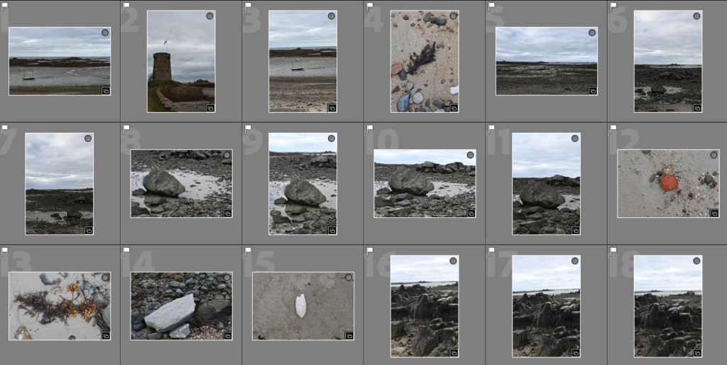
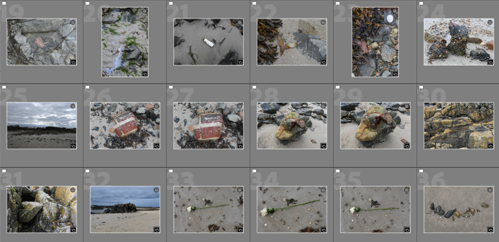

To begin my selection process from my photoshoot at Green Island, I began by going through and selecting my best photos on Adobe Lightroom by flagging the ones which I thought were successfully due to not being blurry/not in focus or overexposed from the sunlight. I was able to gather around 40 photos which I decided to start with as a basis for doing my colour selection below and I think that a few of these photos already have started to work well together with the way they are able to flow and tell a story within them. I really liked the ones where I am looking down at an object on the sand because it shows me following a path and what I could see, which is different to what others could have seen, therefore I think that those photos will be ones which I use commonly throughout the creation of my zine.
Colour sorting –
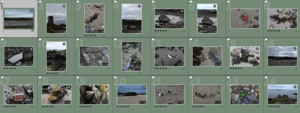
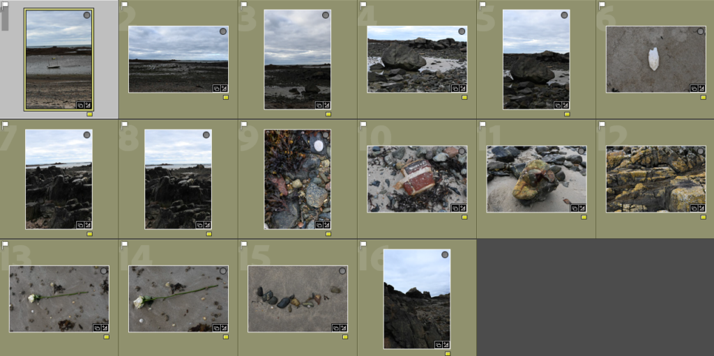
For my colour sorting, I highlighted the photos in green which I thought would work together in a zine and had the most potential and could be further edited to create my zine. Then I would apply basic editing, shown below, which would help me to further analyse the photos which I want to incorporate into my work. For the photos which I was unsure of I used the yellow filter, I went through these numerous times analysing how effective and well positioned the camera angle/focus is and if it has something distinct in it creatively which would create a story. Most of the photos were repeats of ones I had liked or generic views which I didn’t want to include a lot through out my zine because I felt as if it would be quite boring whereas zooming in on specific objects could be more interesting. Then I used the rating system in Adobe Lightroom, this was where I went through the photos which I had previously highlighted in green and I rated the photos which I was certain and confident to further edit so that they could be used in my zine. This technique made it easier for my to quickly select the images I want or don’t want to see as I could choose which colour I highlighted in and then be able to also select the rating to see how many photos I had already decided to use for my zine creation, it also helped me to see the flow of the pictures together which I found helpful.
Basic editing and examples –
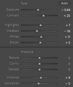
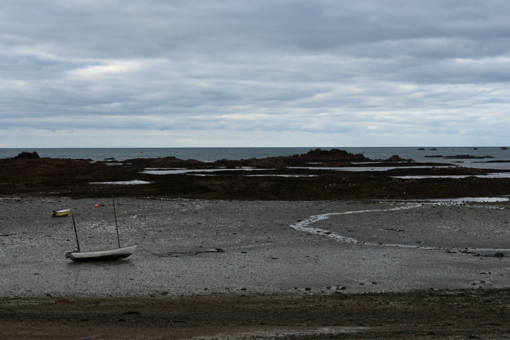
For the basic editing, I began by selecting the photos which I had chosen in green and choosing one to begin with to start my editing process. I chose the first image of a scenic view with a small boat included in it. For this photo, I wanted to make it quite overcast and yet still have some colour in it. I achieved this through bringing the exposure down slightly and brining the contrast up so the details of the rocks and the blue of the sky which is peering through the clouds could be seen as the same time. I also brought down the shadows to give the photo a gloomier look which made it slightly overcast, which I wanted. As I wanted to keep the finer details of the rocks to be seen I made sure that the white tones in the photos, which are used to highlight these finer details, was brought up to enhance and work with the highlights and creates a contrast against the black meaning that they work opposite one another. To make sure the colour of the blue sky was apparent in the back of the photos and the sea’s darker green/blue colour was also emphasised I adjusted the vibrancy and brought down the saturation, to make sure the colour wasn’t too overpowering, this then enhanced these through the blue/green tones on the photo, which can be seen to be happening on the scale.
16 best photos –
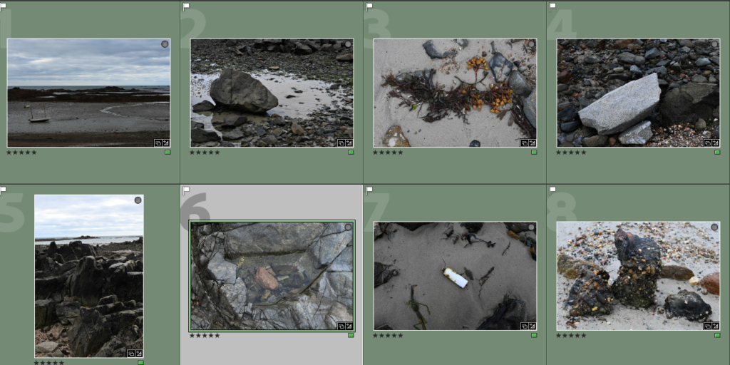
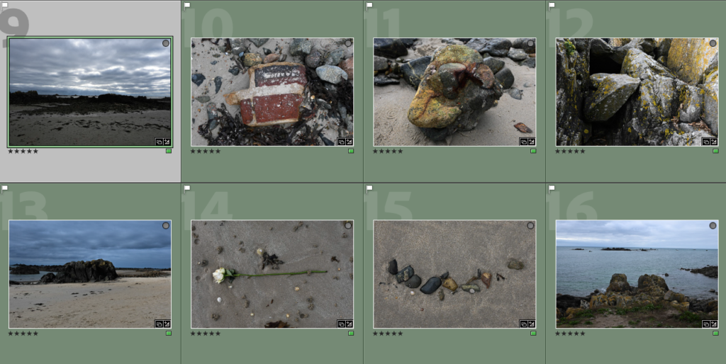
Why I chose these photos for my 16 best photos which I will experiment with further in Adobe Lightroom to create a story through my zine. This is because I think that they create a good way to show the path that I followed throughout our visit to Green Island showing the different objects and debris that I found along the way and it makes you wonder how it got there, therefore with further editing I think that it will turn our quite well when creating my zine.

