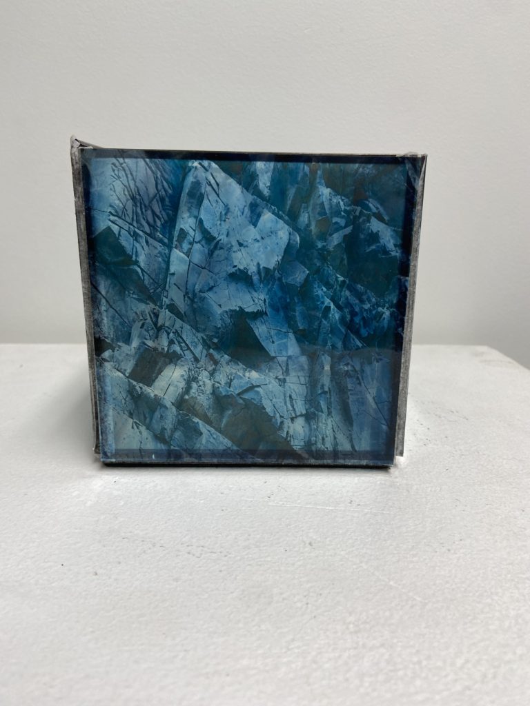
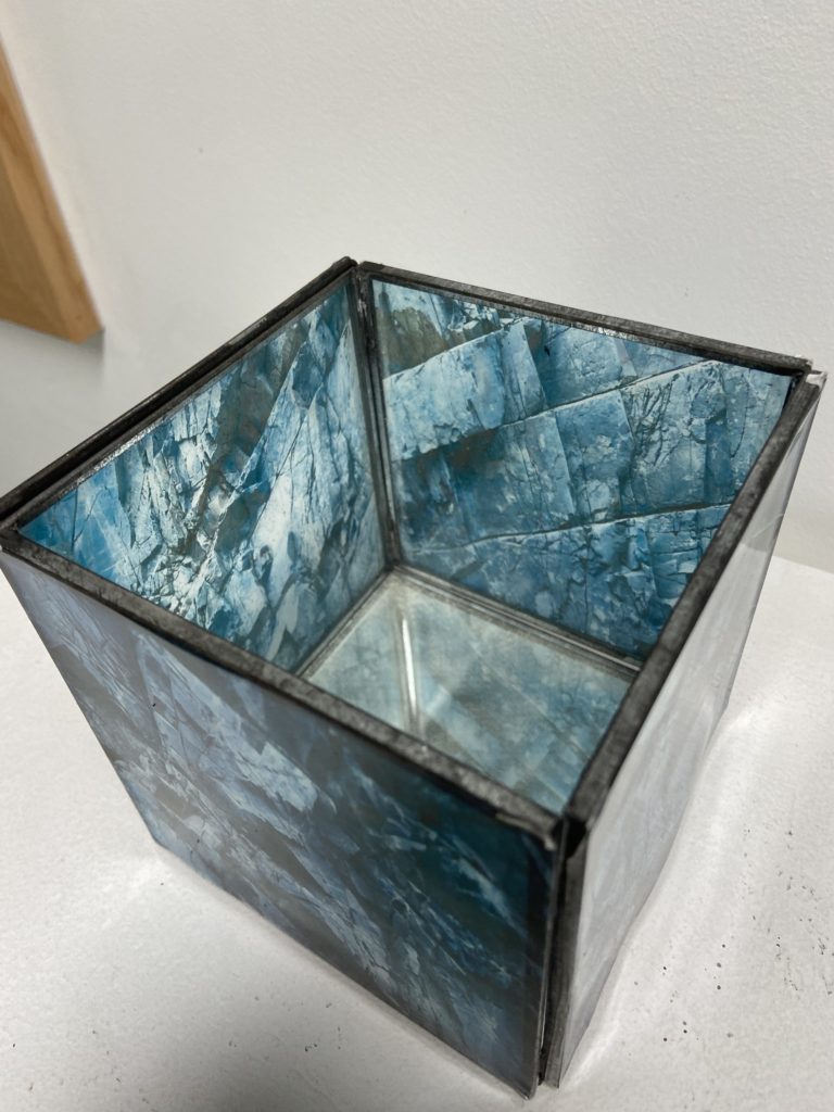
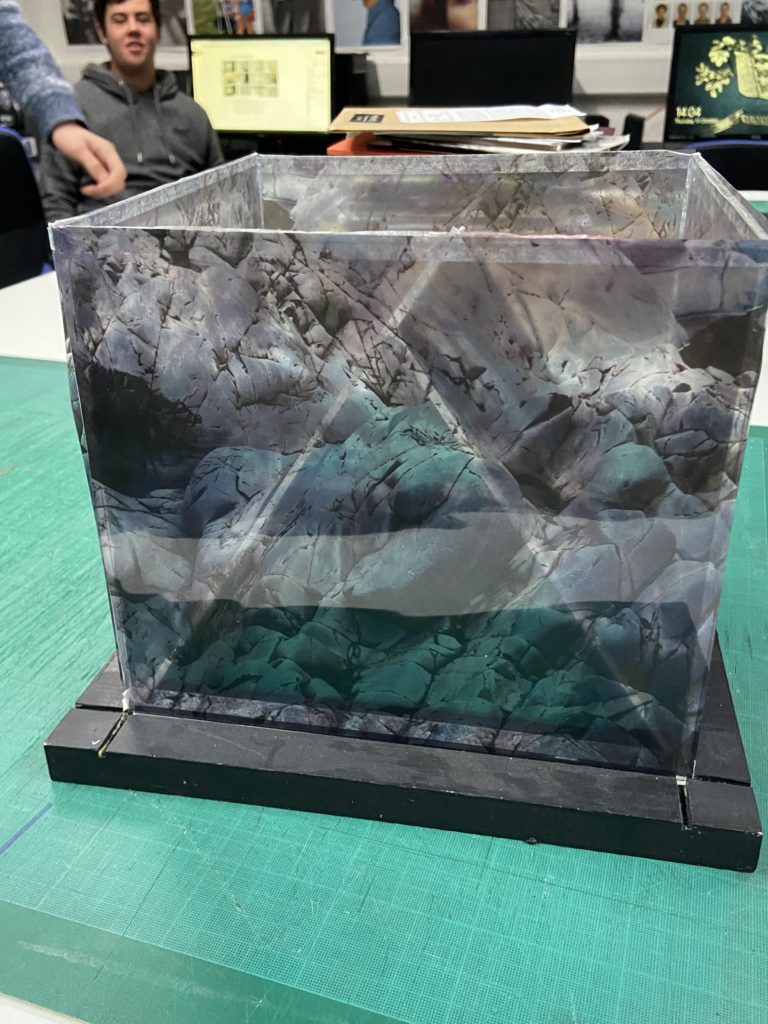
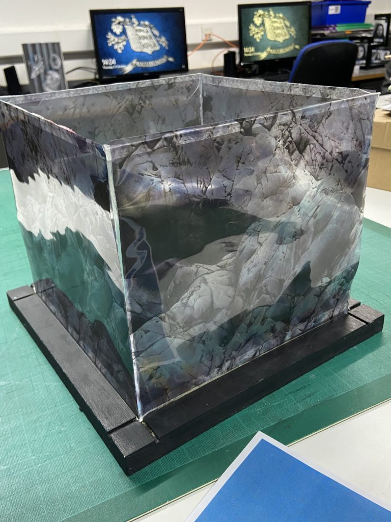
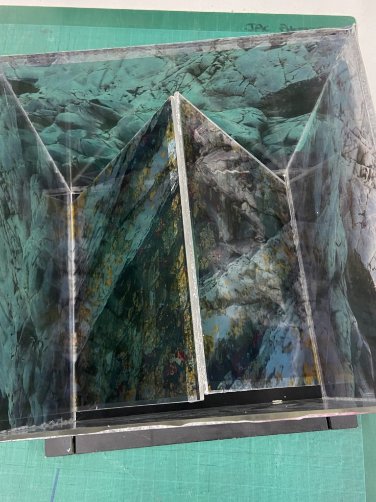
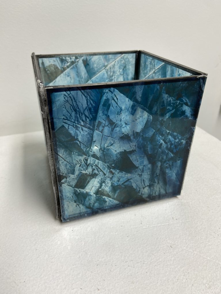
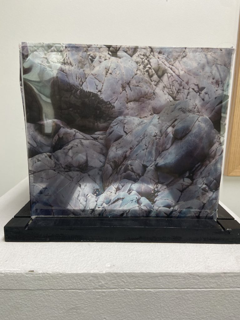
In response to our Site of Special Interest photoshoot, we made sculptures using the images taken from that photoshoot, in order to explore the natural formations of the landscapes in those sites. In particular, we looked to mimic the jagged formations of the rocks found in those sites.
Early Set of Experiments
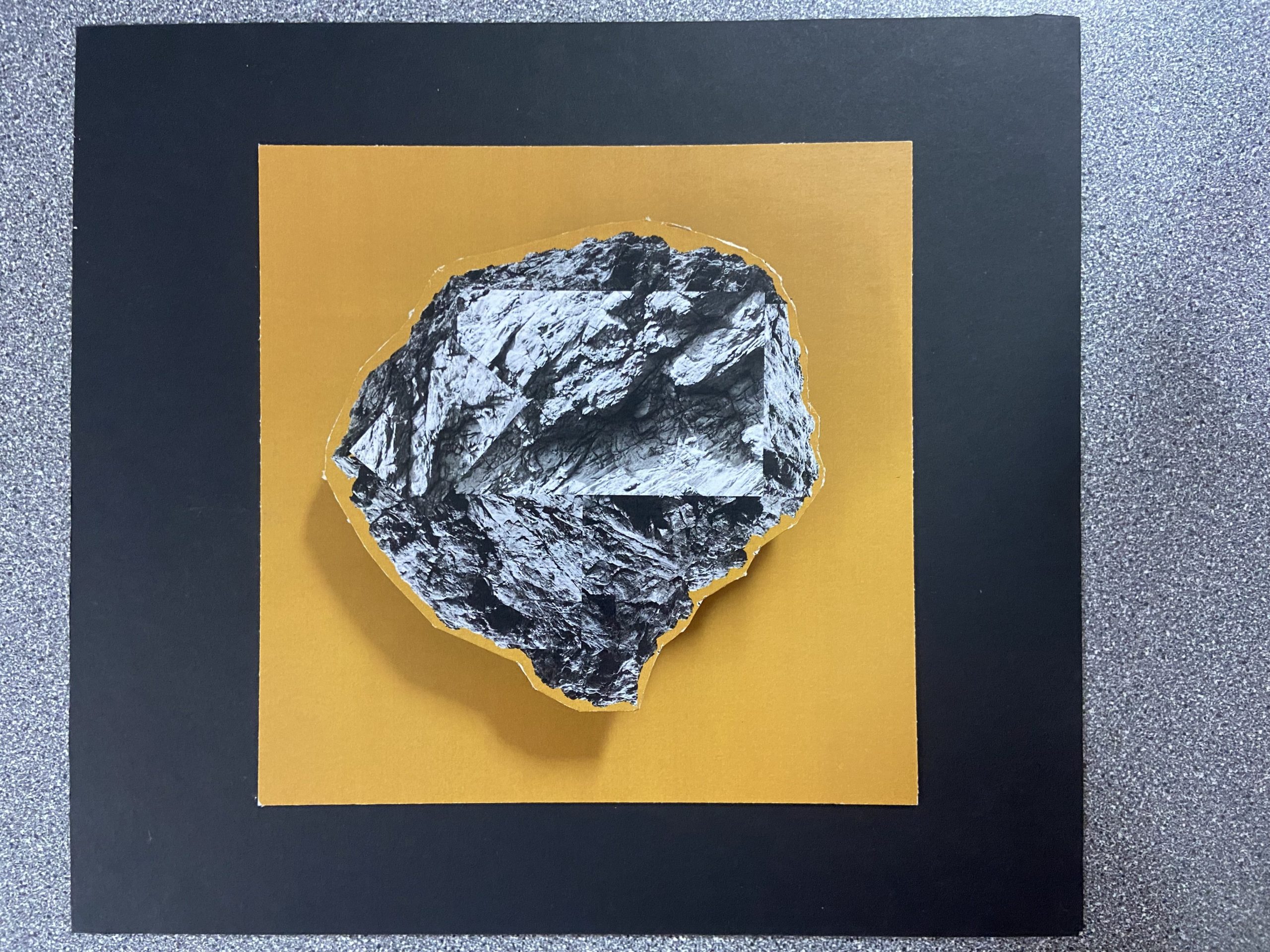
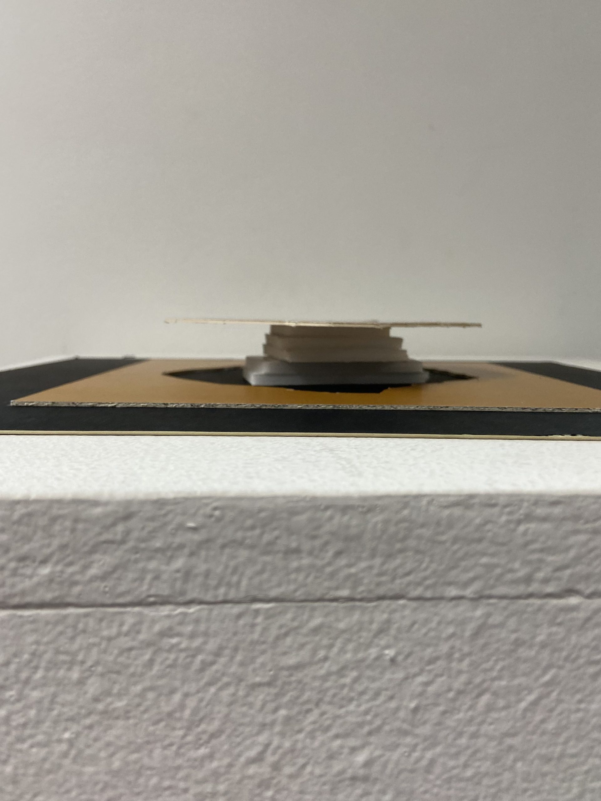
These are some of my early experiments, in these, I took the main object of the image out by putting the image on foam board and cutting it out using a Stanley knife, once I separated the rock from the background, I raised the rock up using smaller pieces of foam board and stacking them up. On my second one, I cut out the rocks like the first, but raised the background instead to create a different effect.
Experiment #1
This was my first idea, since I already had the original image made, I wondered how the rock would look elevated above the background. By stacking it on top of multiple pieces of foam board I was able to create this effect. As this was an experiment I was not too worried about the method of stacking the foam boards, however if I was to do this as a final sculpture I would likely use another, more secure method.
Experiment #2
This was the second experiment. This experiment was far more rough than the last, but the premise was pretty much the same, to separate the background and subject by elevating one, in this case I elevated the background (by using stacked pieces of foam board like the last experiment). My cutting in particular here was not the most successful, which made me look into more photographers, such as Koh Myung Keun, for another idea.
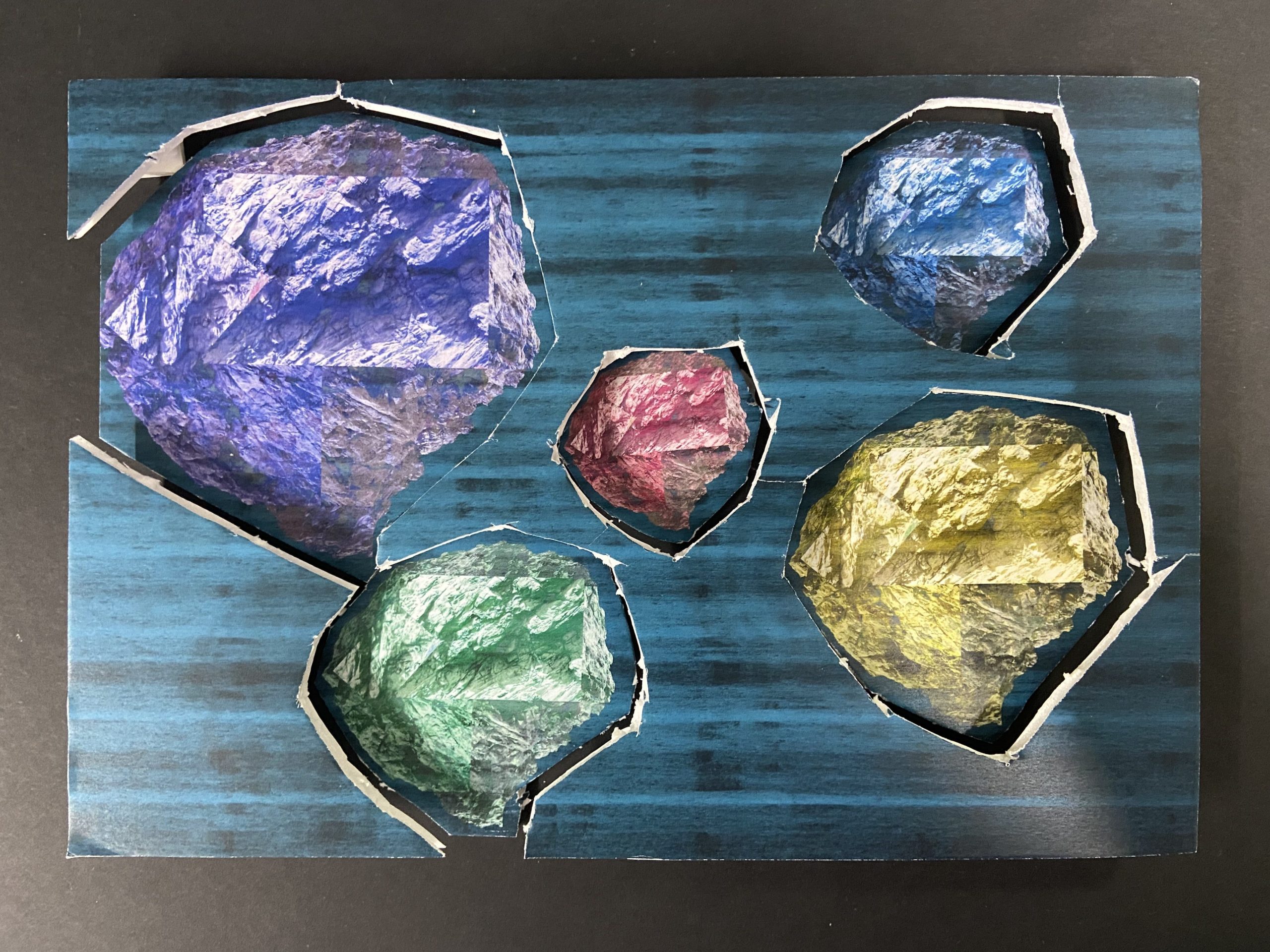
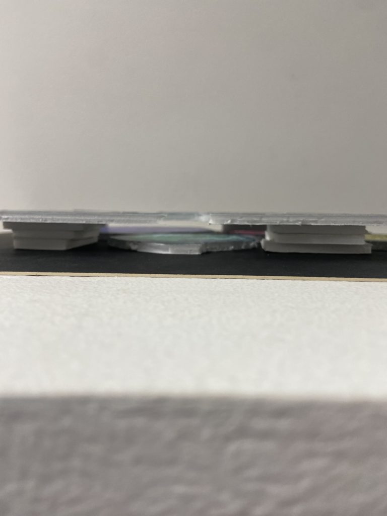
These sculptures were early ideas that I could use to get a better idea of how I could approach this task. While I am a fan of the first experiment piece in particular, I don’t think I will be taking this idea into the next stage.
Next Set of Experiments
After researching Koh Myung Keun and his body of work, I found this image/sculpture that I found to be interesting due to it’s simple form, yet complex use of semi-transparent planes to display the images in an almost surreal way.

Finding the Materials
To try to recreate the semi-transparent look of Koh Myung Keun’s images, I tried two different materials: sketching paper and acetate. The sketching paper turned out to be slightly too cloudy, which would have made it hard to see through, removing the illusion that Koh Myung Keun’s sculptures have. In addition, it seemed to darken the colour and remove some detail, which was not ideal.
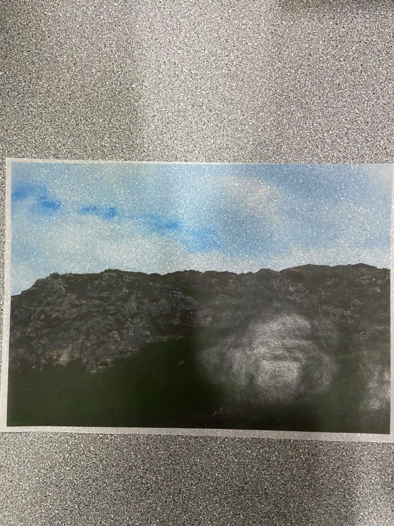
Sketching Paper
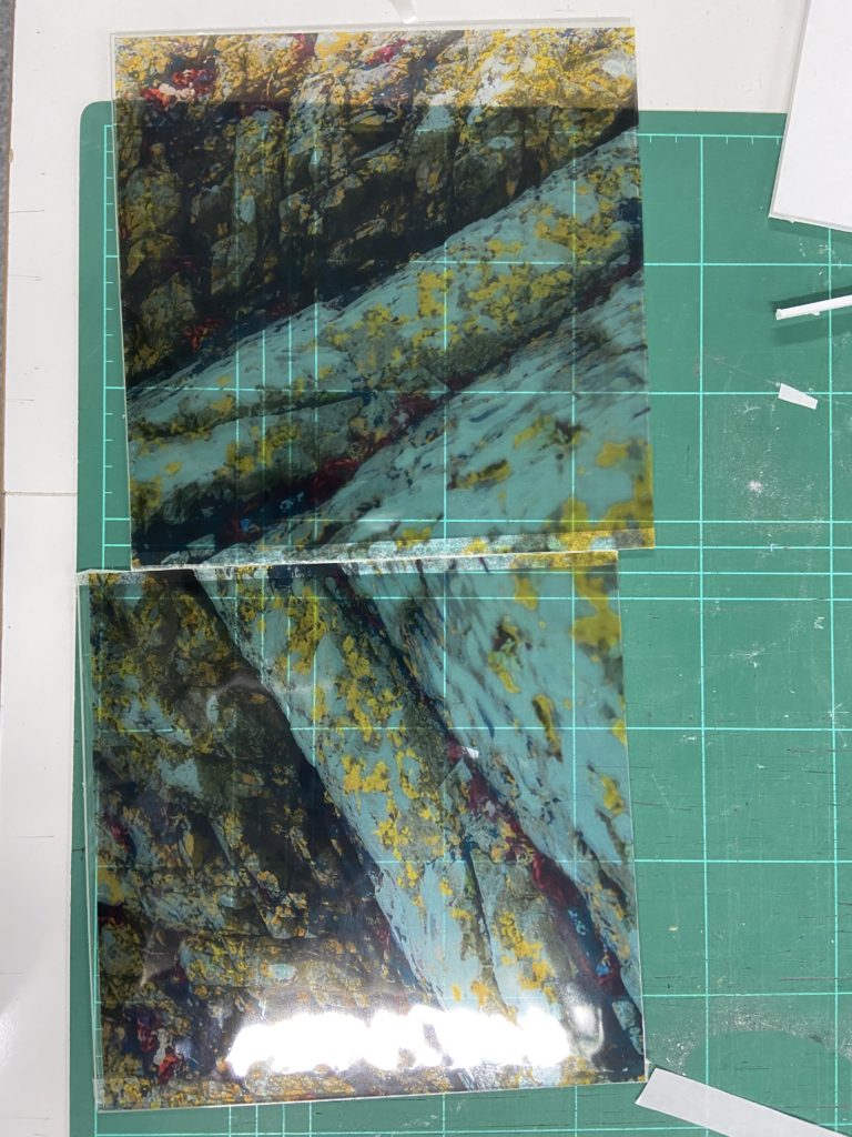
Next I used acetate, which turned out to be more effective than sketching paper, as it was fully see-through, and retained the detail and colour of the original images. In order to give the images more of a vibrant look on the acetate, I edited the images on Lightroom slightly to be more colourful.
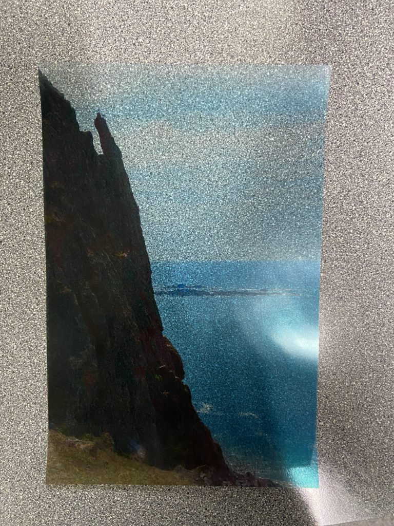
Acetate
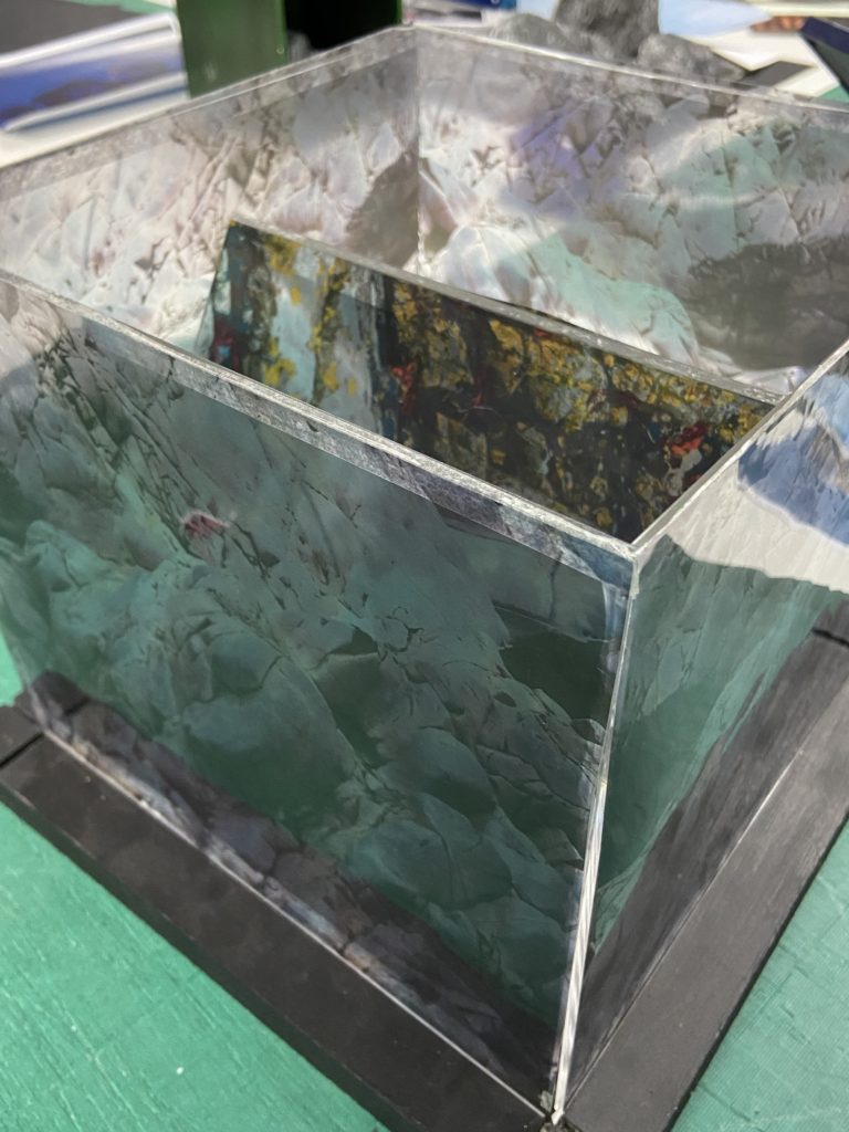
My next problem I had to solve was how I was going to sculpt the images in a similar way to Koh Myung Keun (in a school setting). To do this I found two boxes (one large and one small) made of planes of plastic that I can mount the acetate on and see through to the images on the other planes. I also found individual planes that I could put the acetate on and perhaps add to the sculpture in some way.
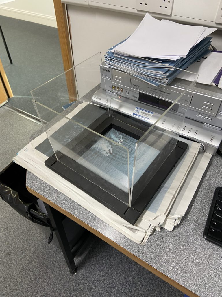
Large 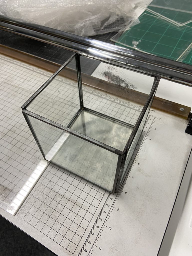
Small
Here is what the smaller box looks like after I had placed the acetate prints onto the sides of it. To join the acetate to the box I used double-sided tape as there was no permanent spray mount on-hand.
I did the same with the two individual planes, as well as the larger box
Later on in the project, I thought it would be a good idea to see how the boxes would look if I put the smaller one inside the bigger one and placed the two planes leaning against the smaller one inside.
Final Sculpture(s)
Evaluation
Overall I am happy with my sculptures as they resemble the style of Koh Myung Keun’s work fairly closely. I think being able to use acetate for the first time in years was a good way to not only remind myself on how to use it, but to also add some diversity to my final outcomes. I think using brighter colours for the sculptures was a good idea because it made my images aesthetic slightly different to Koh Myung Keun’s, giving mine a bit of originality. The colours also help make the sculpture stand out more, as the acetate would have likely removed some details if the images weren’t edited to adhere to it. I think my decision of using acetate over sketching paper was a good choice, as it made the sculpture much more alike Koh Myung Keun’s, however the cloudier properties of sketching paper might be able to be used in later projects.
If I was to do this project again, I would probably use a permanent spray mount to attach the acetate to the planes without leaving any marks (I don’t think the double-sided tape isn’t that noticeable but it would be a definite improvement). I also think it would be interesting to experiment with different shapes of the sculptures, this would have been difficult in a school setting but it would open more possibilities.

