I like the perspective of this image because it is taken from a very low angle looking up at a small bolder. the perspective make sit look like it is towering above the surrounding landscape. I also like the depth of the image the grass in the foreground the bolder min the mid ground and the background of the cliff edge.

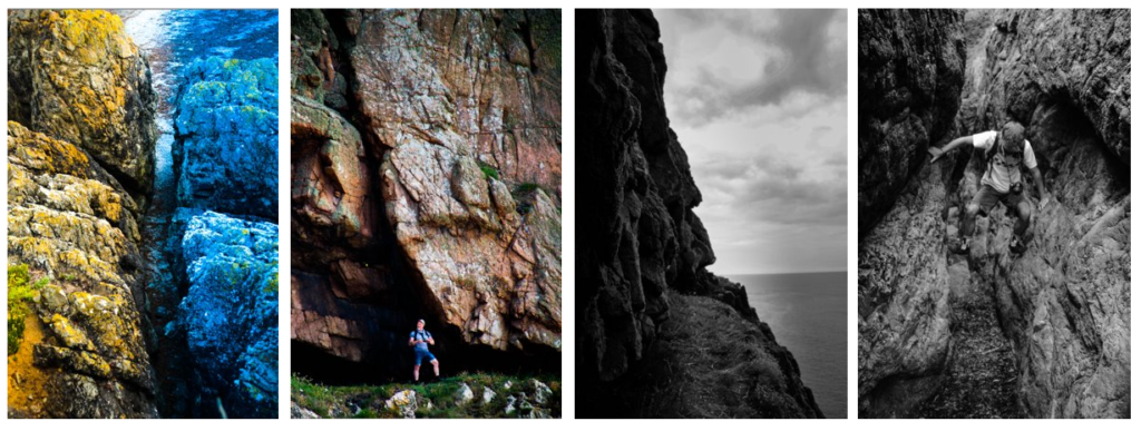
I experimented with this image a lot to bring gout the contrasting colours in this image I tried to increase the divide in the image created by the gap in the stone created by coastal erosion.

I chose to change this image into black and white because I like the reflections on the water in more contrast I chose to position the bird in the centre of the frame.

I put this image in black and white to create contrast between the dark divide in the rock I made the middle darker and the edges lighter to show it gets darker the deeper you go in.

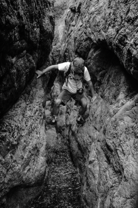
I took this photo of luca trying to cross the wet sea weed i tried to position him in the middle of the image. it creates the effect that he is levitating above the floor because he has wedged himself between the two rocks.

I like this photo because I didn’t realise into editing it that there was a sail boat positioned above the peak of the pinnacle this gives a lot of contrast between the dark rock and ocean and the bright white sail and boat.

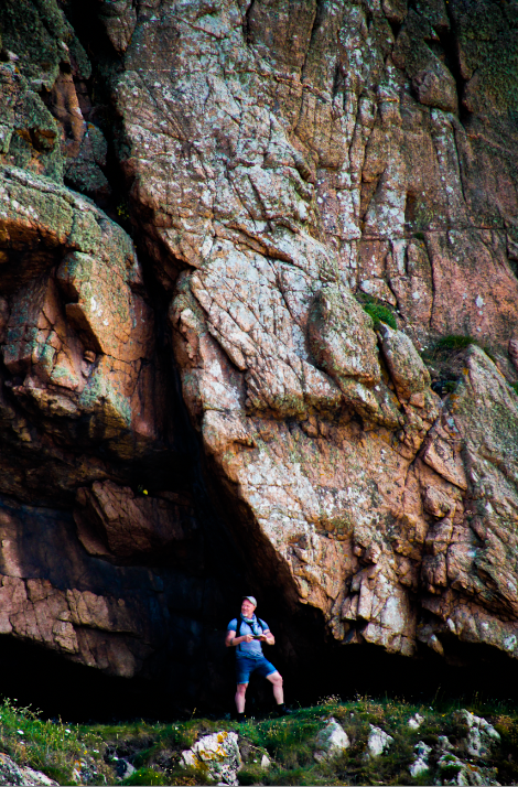
I like this image because it shows how big the rock is in comparison to Mr toft. the way the overhang slopes down cresting a darker background for him to stand out in front of .

i like the way this image is divide into light and dark. it is almost a diagonal line separating the light sky and water to the darker rock and grass i made the rock darker but tried to keep some texture in the rock I think I did this well.

I have chosen these as my best images from that field trip.

Hi Jack, Make sure that you are staying on task and publish work in the blog. You need to make more effort overall to make sure that each piece of work that you produce represents the best of your abilities – we know you can do it well!