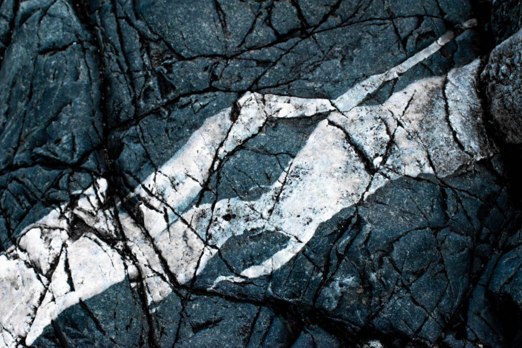
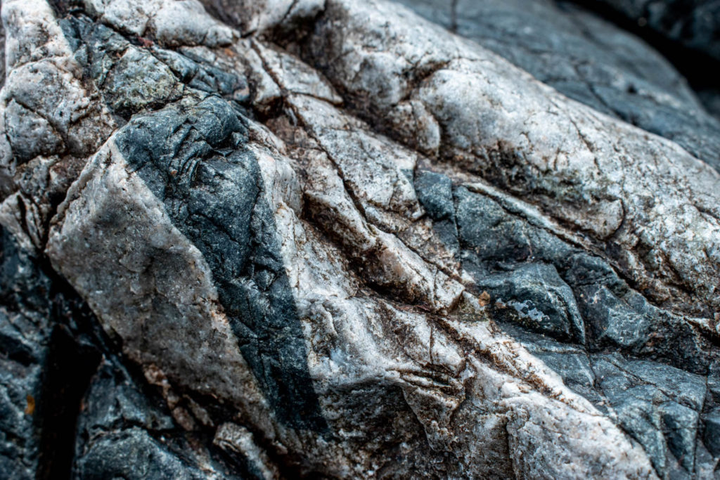
Contact Sheet

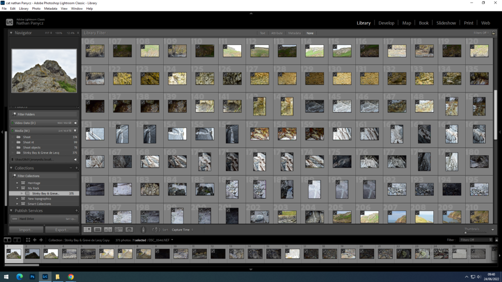


All those were taken in the same shoot


Those are the images I flagged as usable after evaluating exposure, sharpness and overall aesthetic.
Experimentation
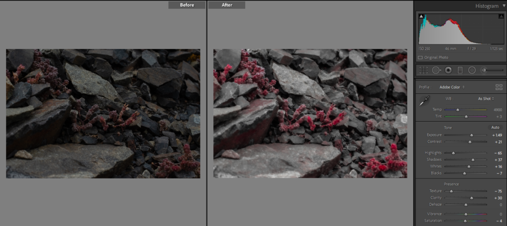
Firstly I increased the exposure as the ISO was too small and the picture was a bit under exposed, increased the contrast because the shadows and the darks became greyish and I needed to add some depth, for this reason I also decided to increase the shadows. As the photo was a bit too dark I decided to increase the whites as well. I wanted to picture to be a bit more mellow so i decreased the texture because adjusting the balance and increasing the contrast made it a bit to gritty. I also decreased all the other colours and increased the red and pink as I felt like the monochrome format would also help keep it simple and mellow.

First I turned it into a black and white image to eliminate the distraction of colour, then I increased the contrast and the texture options to make the textures even more prominent as well as increases the highlights and the blacks. I had to turn down the shadows as they spread too much and took over some of the textures.

Firstly, I increased the contrast to make the imperfections stand out more as well as increase the shadow and the whites, i turned downs the blacks so that the picture wasn’t too dark. I decreased the texture setting so that it didn’t look so gritty. I turned the temperature down to make it colder.

Increased the exposure as the picture came out a bit dull, increased the contrast and increased the shadows to make the picture more dramatic and turned down the temperature to give it a more cold colour and turned up the texture to make it sharp
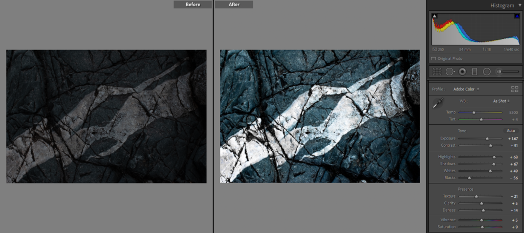
This photo was very underexposed so i turned up the exposure and increased the contrast, highlights and shadows to make it less dull and add tonal range.
Final Outcomes

The photograph is rather mellow as the textures are smooth and the colour pink adds to the calmness and joyfulness of the photograph, in addition I think pink represents a certain kind of gentle feminine power almost as a good mother. This creates a nice contrast to reality as rocks are usually rigged with more bluish and earthy undertones. In this photograph we can see a variety of rock sizes as well as flowers growing from underneath. Through this I wanted to show that rocks aren’t just rough, dull, lifeless objects but rather a strong but gentle foundation for life to strive and a crucial part of our mother earth.

In this photograph we can see a few types of plants and fungus growing on a rock which makes it full of different, interesting textures. The photograph is monochrome as colours would be too much considering the amount of textures, and would definitely be distracting. The grey colours also convey the neutrality and the balance of the natural world. The rough textures attract the eye and intrigue the viewer, giving them loads to look at. In addition I think rough textures convey the inconsistencies and imperfections of nature well. Strong, hard textures also represent the masculinity of nature, evoking the feelings of stability and conveying the longevity and resilience of the sublime which is able to withstand the test of time.
Evaluation: Overall I enjoy the detail and the texture of the photographs. I could improve on adjusting the camera settings and sharpness next time maybe by taking a few pilot shoots.

