Contact Sheets and Selections
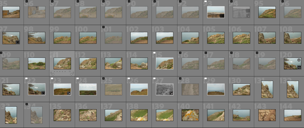
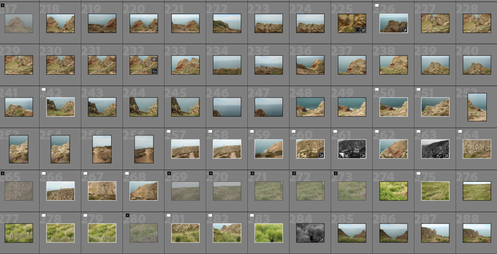
Below are contact sheets from the class trip to L’etacq. After importing them into lightroom, I used the P and X tools to filter out images that I didn’t think were as successful.

I found, when taking images inside a cave at low tide, my images were overexposed. This was because the light was streaming into the cave from above, which caused very bright images.

When selecting images, especially in this shoot, I was looking for clear and well composed images. This was especially important with the rural landscapes in this shoot, as I wanted different elements of rock to be included well in each image.

Here I have selected in yellow and red my images for my joiners, in order to separate these from my normal photos.

Best Images
Below are my best images, edited using Abode Lightroom.

I chose this image as one of my best images due to the strong leading lines and balanced composition. The leading lines take the eye from the middle of the image upwards to the left middle and top of the hill. I also like the different textures and tones within this image (enhanced by my editing), such as the different green tones of grass and vegetation, and different types of rock.

I chose this image as one of my final images due to the different textures and shadows on the rock face. I think editing in black and white helped to enhance these features was very effective, as the added contrast helped to increase the darker tones in the crevices of the rocks.

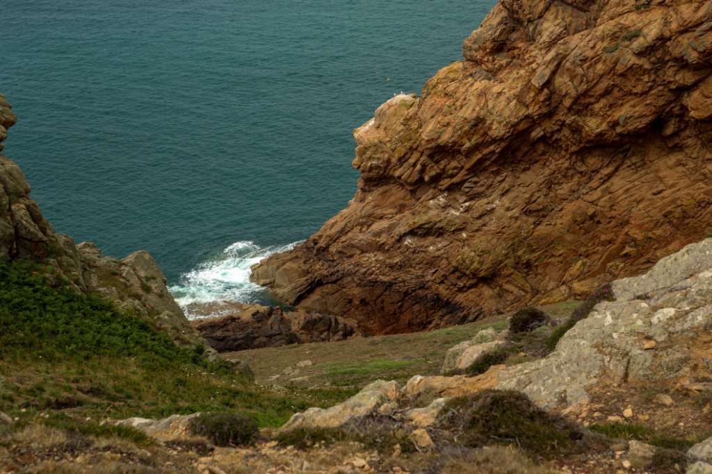
I like the interesting composition in this image, as well as the deep and moody tones. I like the composition in this image because of the three parts that are each distinctly different – to the left there is a small rock with vegetation, the right a more intense, orange rock, and finally to the right in the foreground a grey rock with little vegetation. These parts act as a frame for the other parts of the image, for example the whitewash at the bottom of the cliffs, which becomes a natural focal point.

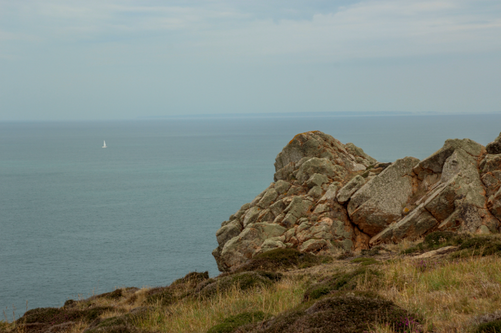
Here I produced two different versions of one image – a black and white edit and one in colour. I think that producing two edits for this image was a good idea as in black and white, the crevices and details of the rock are more prominent than in colour, due to the high levels of contrast and texture. However, in colour (below) I think this image works well as it shows the different variations of colour and texture in the whole image – the grass, the rock, the sky, and the sea. Whereas, in the black and white image, the darkness of the rock kind of takes over the whole image more, making the other parts more insignificant.

Evaluation
What went well: In this shoot, I think I produced some well composed images. I didn’t deal with much over exposure, except when shooting in the caves. I changed my settings especially for the location before I started my shoot which really helped with this.
What I could do better: If I was to do this shoot again, I would maybe shoot the caves on a darker day, to ensure the exposure was balanced in those images. Furthermore, I would make sure to hold my camera steady, or even use a tripod like David Hockney, to take my joiner images, as quite a few of them came out blurry. This was because I was taking so many images so quickly. Next time I take joiners, I will take my time more when taking the images to achieve clearer, more successful images for my joiner.
