Nicholas Nixon
Nicholas Nixon is an American photographer, one of the pioneers in new topographic. He began his career in 1970s as a photography student. He shot his first major series, City views, in Boston and New York, these were included in the New Topographic exhibition in 1975. One of Nixon’s key themes is time. From the beginning he worked on series that show the interaction between humanity and time passing, one of them being The Brown sisters series. Nixon approaches his subjects with great intimacy, showing parts of life the viewer can connect to.


Nixon’s style is very much defined by the large format cameras he uses (4 x 5, 8 x 10 and 11 x 14). Although it is a very slow way of working, the sharpness and clarity of the resulting photographs lets the viewer see the details otherwise unclear to a naked eye.
Image analysis

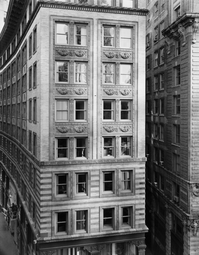
Nicholas Nixon first photographed Boston in the mid 1970s, as the city was in a process of transforming itself. His earlier photographs were taken from a distance, showing the unfamiliarity and disconnect from the city as he viewed it from an outsider’s perspective. This photograph was taken a quarter of a century later, from up close. The View of Washington Street, Boston, not only shows a few story building but also represents Nixon’s journey, from introduction to intimacy, in photography. Close up shots help the viewer feel the same familiarity and connection to the subject, the photographer felt at a time of the shoot. It draws in the viewer, highlighting the importance of what is being conveyed, and adds to the message by focusing on the details. New Topographics is all about how urban landscape photography reflects the presence of humanity in nature, as a part of nature. Just like buildings, humans also have walls. Nixon often likes to frame his photographs in a way so that the building is cut off from it surroundings or the rest of itself. This conveys that no matter how intimate and familiar we are with a person or a thing, there will always be a part of it that we can’t see. The light and dark windows also portray this idea. The dark windows are the focal point in this photograph due to the high contrast they pose compared to the rest of the image. They represent all that happens “behind the close doors”, all the thoughts we do not have the access to. The intense black creates a state of curiosity within the viewer. The bright windows really catch the viewers eyes and symbolise the insight we have into another person. The windows reflect the surroundings, emphasising how humans are a product of our environment and how what we are allowed to see by others isn’t necessarily what they actually identify with. The Windows gradually getting brighter show the transition from curiosity to enlightenment. Black and white photography strips away any colours that may distract the viewer from the meaning of the photograph. It also brings out the contrast, focusing on the details such as textures, shapes and patterns. Black and white photographs have a detaching effect as by strongly contrasting two colours we create a sense of distance which conveys struggle for connection. Especially in a big city like Boston, it’s difficult to identify with others and nature which as a result can make us feel empty, a void, just like the dark windows. The general tone of this image is on the darker side. However, this photograph is a mixture of low key, dramatic, deep, dark tomes at the bottom and some clear, high key, bright gray, almost white tones at the top. This really makes the photograph feel three dimensional as dark tones give depth and light tones make objects appear more closely. In addition, this makes the textures defined. Considering this photograph was taken outside, natural light was used. The camera was positioned in such way so that the top windows reflect the light, creating a brighter focal point as compared to the shaded windows at the bottom. Although the photograph is a bit on the darker side, I think it’s due to post editing choices rather than an unbalanced exposure as there is no loss of detail in neither the dark nor the lighter areas of the photograph. In this picture you we have a few lines. One of them is the, bright column in between the top windows. It gives a sense of movement and leads the viewers eye from the bottom to the lop of the building. This flows well with the two parallel columns on either side and juxtaposes strongly with the darker, perpendicular cordon. The overall mood of the photograph is serious, melancholic, and actually quite daunting as it might be hard for some to deal with the changes caused by modernisation of landscapes.
Lewis Baltz
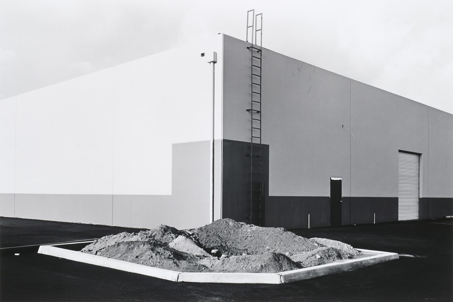
Lewis Boltz, known for taking black and white photographs of parking lots, office parks was a young photographer who has come to influence a new movement in American photography during the time of urban expansion, The New Topographics. Baltz produced geometric, minimalistic and aesthetic photographs, mostly portraying bleakness of the man-made landscape of Southern California, where he grew up. His most known photographs do not include people, as if humanity ceased to exist, reflecting the power of humanity in architecture and pointing out the effects of urban architecture on humanity.


Image analysis

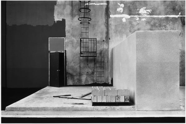
Claremont, 1973 represents the reflection of humanity’s relationship with nature through a man made object. Like most of his older photographs, this one is also in black and white. At an interview for the Smithsonian Archives of American Art Baltz said “I used photography to distance myself from a world that I loathed and was powerless to improve.” By using the black and white format he conveyed a sense of distance, hopelessness and melancholy deeply. The type light used seem to be natural light on a cloudy day as we can see the clouds in the reflection, coming from behind and slightly to the left of the photographer because the shadows casted fall below and on the right side of the window. The ISO is most likely to be around 400 because we can start to see grain in the darker part of the image, it was probably chosen as it seems the day wasn’t too bright. The aperture used was most likely f/5.6 – f/8 because we can still see the poster and the inside of the house on the right ride of the window even though the photograph was taken from a far enough distance to capture the window and the wall. Considering the aperture I would say the shutter speed was around 1/60 as it’s not super sharp, we can see the tree in the background blur as its moved by wind. 1/60 is a speed at which you can still shoot hand held without blurring, hence the rest of the picture seems to be sharp enough. In addition I think this photograph might have been overexposed for creative effect, emphasising the emotion of desolation and sorrow. The tonal range in the reflection isn’t too wide as the darkest parts are only dark grey shadows without blacks. This means low contrast, low detail and texture. We can see some texture in the walls; it’s not very refined and feels fluffy rather than gritty. This can be seen as a result of the lower shutter speed whilst hand shooting and the big aperture in relation to distance. The window frame is the brightest part of the photograph making it a good leading line, bringing the viewers attention towards the reflection. The horizontal lines represent stability and vertical lines communicate strength, power and hierarchy, by moving the viewers eyes up and down the photograph. The bottom line is emphasised to create a starting point, and dynamics that take the viewers eye from the bottom left to the right which help transition into the scene behind the reflection. The leading lines connecting back together also creates a feeling of restriction as it separates nature and man. In this context it might be a response to environmentalists wanting to impede the urban expansion that was occurring. The frame being square helps convey human presence because geometric shapes are generally man-made. In addition, squares evoke feelings of stability. There is a lot of negative space around the window meanwhile the window itself is busy, providing us with more to focus on, making it the focal point. Negative space conveys the emotion of calm, peace, isolation and emptiness as opposed to positive space which induces the emotions of strength, intensity, chaos, power and movement. This results in good balance, highlighting the intention behind the photograph. No shadows, very little shapes, textures and low contrast makes the photograph very two dimensional. This creates detachment as humans are used to perceiving the world in 3D. In addition, the scene behind the window gives us an out look into human presence, however, the reflection of nature and human activity are overlapping. Overall the photograph conveys that human and nature should not be separated as it is futile.
