This idea was heavily inspired by Laura Romero and her topic ‘Intervals’ which is a combined image of multiple buildings/ structures to create one main building. I chose to use her ideas because of how aesthetically pleasing all of her work turns out. Also, the buildings she uses presents the idea of Anthropocene through the man made structures all being combined together. For my image I am going to try to accurately replicate one of her images with my own photos of buildings by using photoshop.

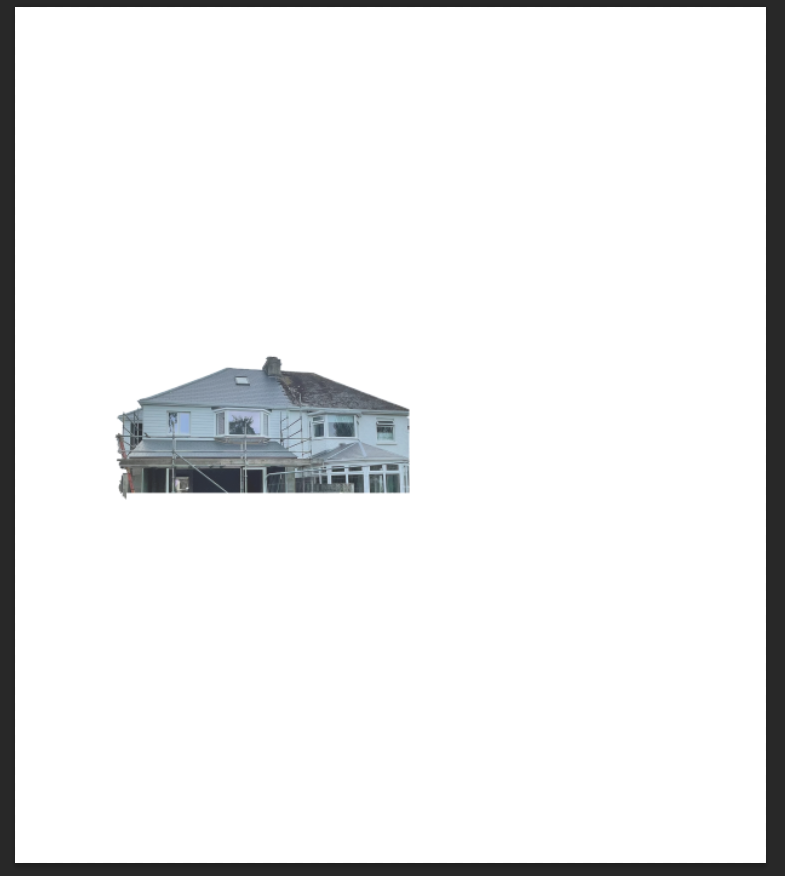
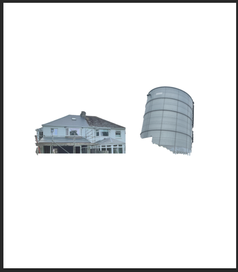
To begin I chose out 7 images that involved some sort of building linked to the topic of Anthropocene and made sure they would fit well within this edit.
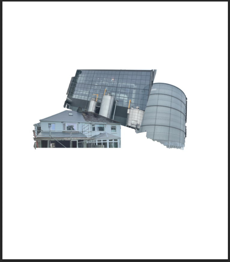
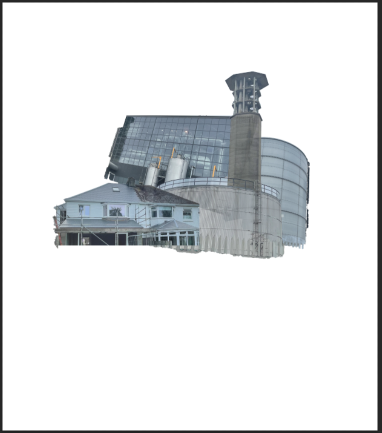
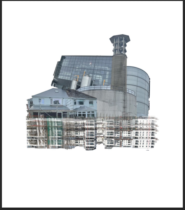
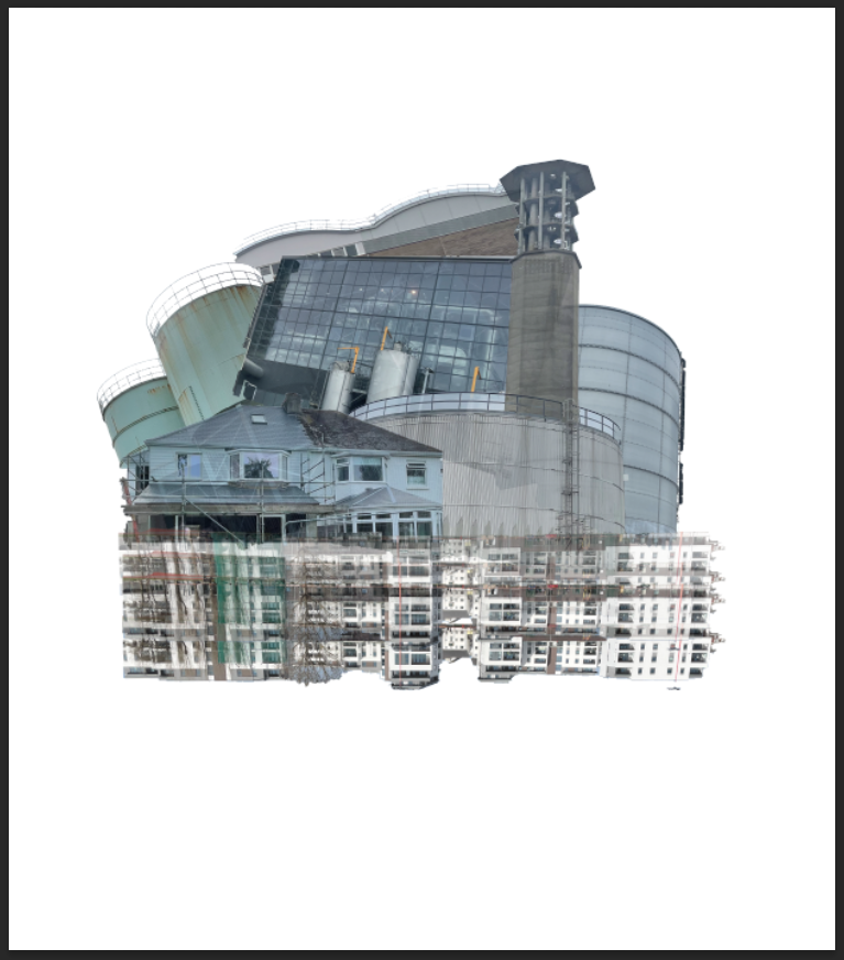
After correctly positioning my images I changed the opacity of each layer to try and seem as if each building slightly fades into one another. The use of changing the opacity helped the overall product really come together and link well. I put most layer opacity to 85-90% except for the building that are positioned upside down where I put the opacity lower as the buildings travel down.

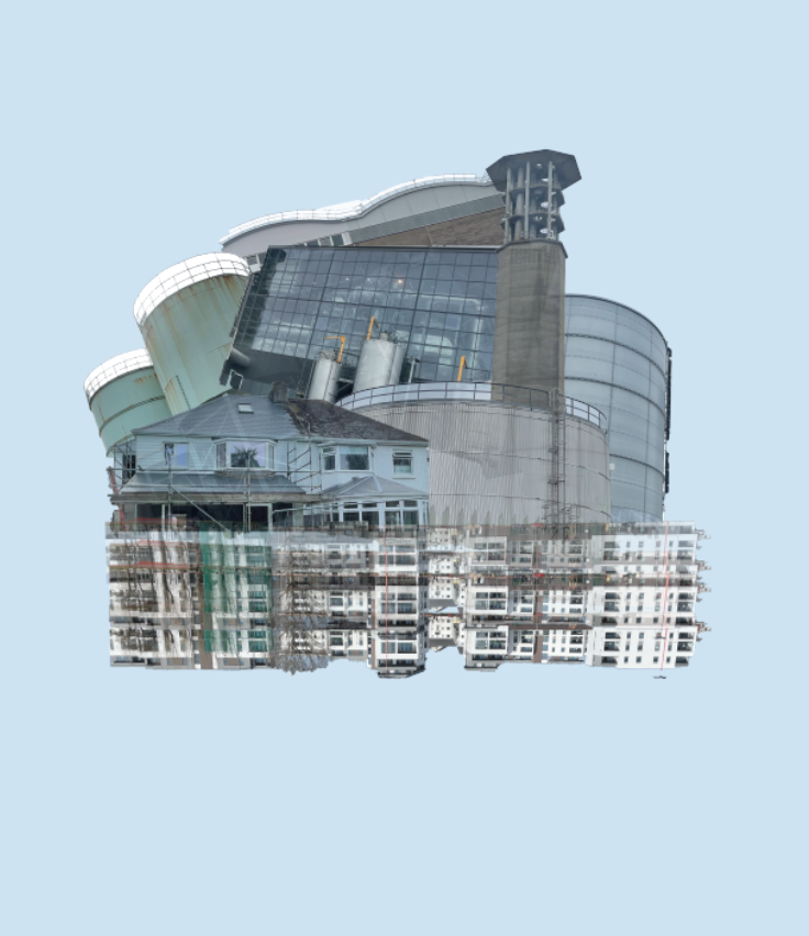
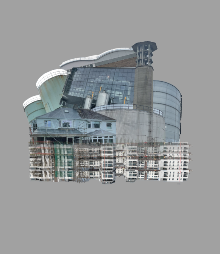
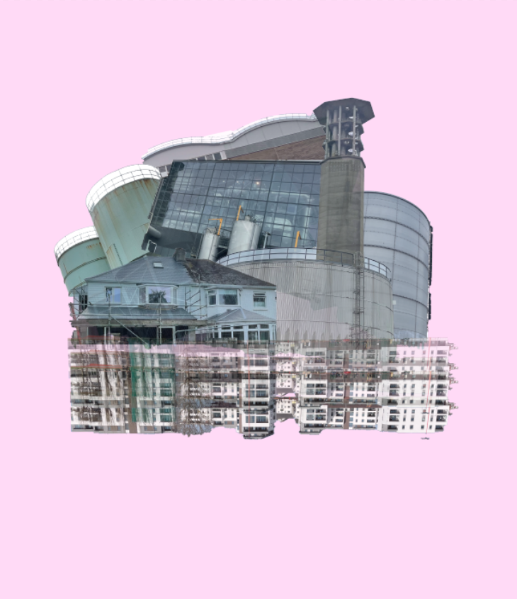
I then tried to experiment with different colour backgrounds to try and see if it would make it more effective. Here’s how some turned out:
After seeing the results I quite liked the background colour being a light blue but still didn’t think it was as effective as the previous white background. Also, I think the pink background creates a vibrant and eye appealing effect towards the viewer due to the pink being the only vibrant colour displayed. I decided to keep the white background because of the blend it creates towards the structures.
Final outcome:
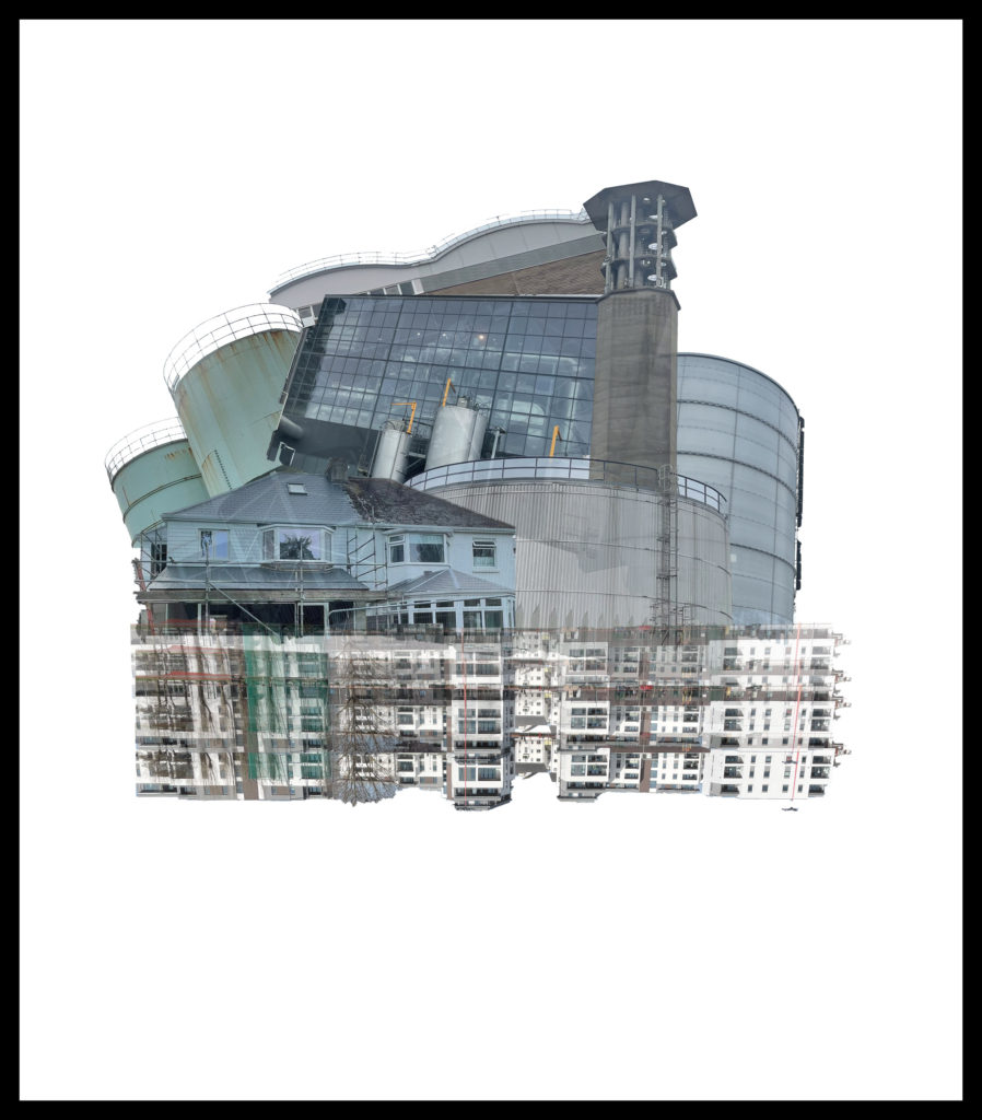
I really like the way my image has turned out through the inspiration of Laura Romero as I think it looks pretty similar to her style of work. I decided to add a black border around the image because it contrasts a great effect onto the main image focus.
Image comparison:

My final outcome 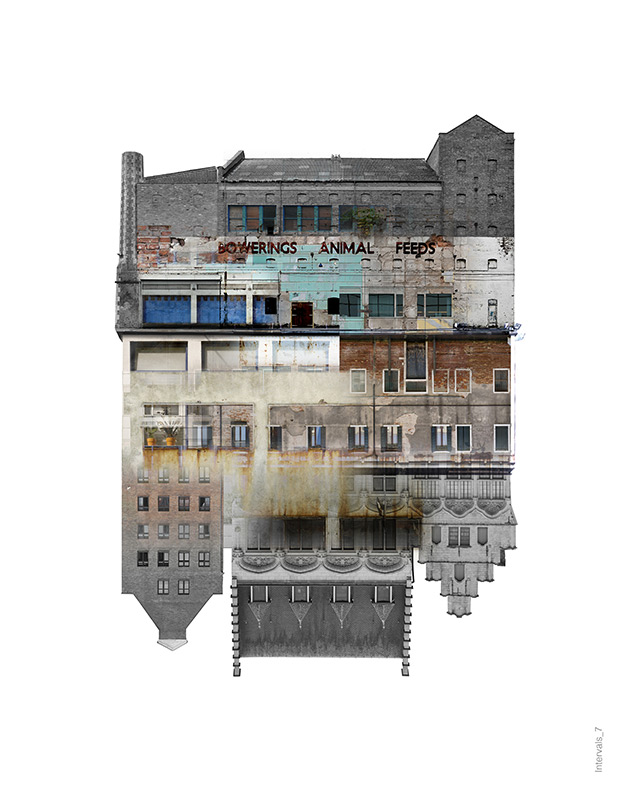
Laura Romero image
As you can see, mine and Lauras image have some similar features and some differences. In my image I added a black border around the image (side border has been cut-off by the blog) because it makes the image stand out more compared to Lauras. Also, Lauras image seems to have smooth edges with a slight fixed shape without many rough edges, however mine hasn’t been positioned together the same and has rough and uneven edges. Lauras image has buildings that are faded together nicely with mine only having buildings that overlay each other with a decreased opacity. My image has buildings that are industrial and cause harm to the world and Lauras has buildings that seem to be derelict on unused which can be noticed through the boarded up windows and the state of the buildings.

