PHOTOSHOOT #1
For this photoshoot i experimented with my images one by one because I wanted to present these ones as a whole to really bring the focus on the architecture. I also put all of them in black and white to replicate my artist reference Hilla and Bernd Becher’s work.
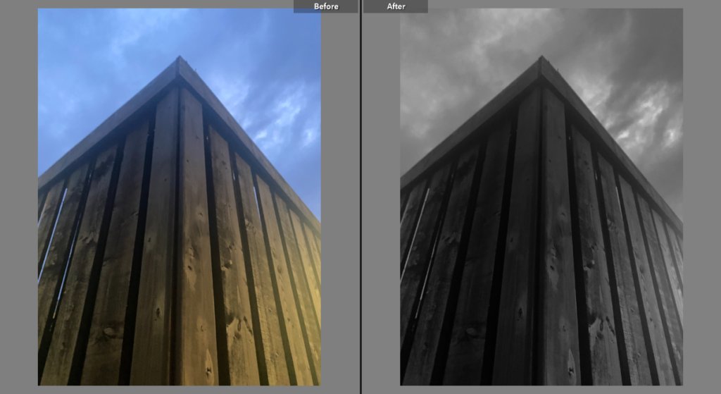
EXPERIMENTATION #1
For this photo i not only lowered the saturation but also the exposure. The black and white effect creates a dark atmosphere which i think highlights the harm mankind are doing to the environment.
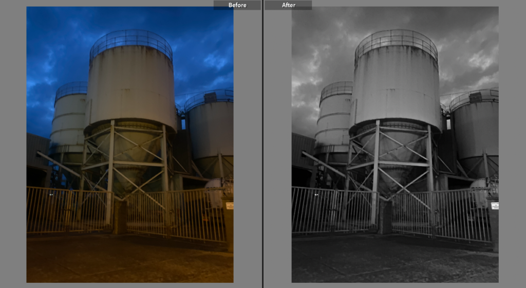
EXPERIMENTATION #2
I did the same for this image except added highlights to capture the clouds in the sky as it heightens the tower making it appear as if it is looming over the camera.
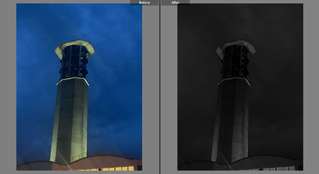
EXPERIMENTATION #3
For my last photo, I turned down the exposure and saturation to create a chaotic atmosphere and show that power stations essentially symbolize destruction. I lowered the highlights to make the sky one colour and blend in with the gradient of the tower.
PHOTOSHOOT #2
Unlike my first photoshoot ideas, for this one I wanted to showcase mine in three different layouts, presenting a different emotion in each collection.
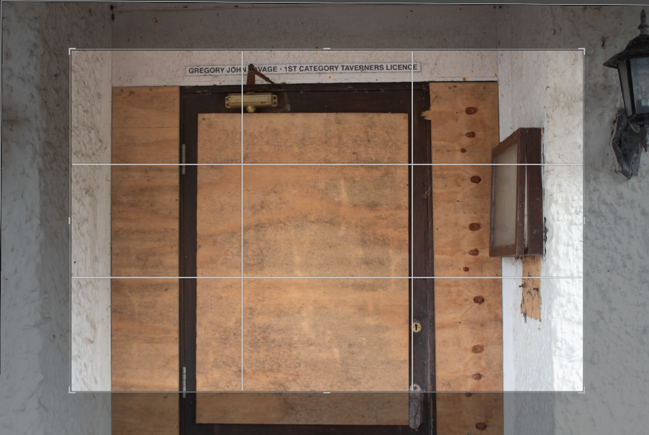

EXPERIMENTATION #1
I found four of my photos that had distinctive square or rectangle shapes and grouped them together to create an abstract display in reference to one of my case studies, Paul Talling, who presents some of his works in layouts according to shape on his website. I had to edit and adjust some of the photos so that they weren’t off balance, for example the one above which was slightly tilted.

I also experimented with the same set of photos in black and white, but preferred the original layout as it had more bold and defined shapes plus the black and white made the images look devoid of emotion when that is the opposite of my goal for this theme.

EXPERIMENTATION #2
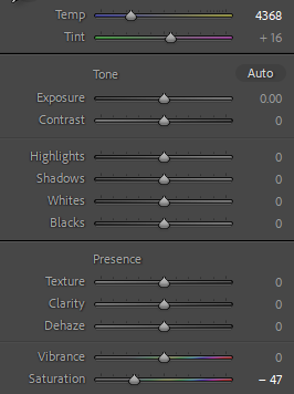
For my second experimentation, i took photos of parts of the hotel i felt were in the worst state which to me were the most interesting photos because they told a story. On Lightroom i edited them by turning down the saturation and lowering the temperature to give the images a faded blue undertone.


EXPERIMENTATION #3
For my last experimentation of this photoshoot i took photos of vandalism and graffiti to try and replicate Paul Talling’s work as he has many projects centered around street art & graffiti. I experimented with a few different sets of images before choosing the one I felt looked the best. These photos were originally in colour but i switched them to black and white because I felt in colour they clashed and looked messy.
