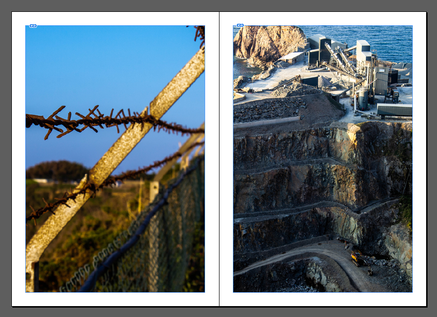
Design decision 1: I chose the first page to create a juxtaposition between the quarry and the barbed fence separating the world.

Annotate design :2 I experimented with making the right page a full bleed to represent the quarry being larger impact than the fence on the environment. I chose this option over the pervious for my final zine.
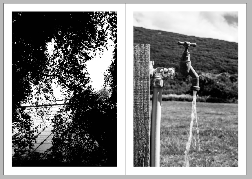
Annotate design 3: I chose these two black and white images to oppose each other in the zine.
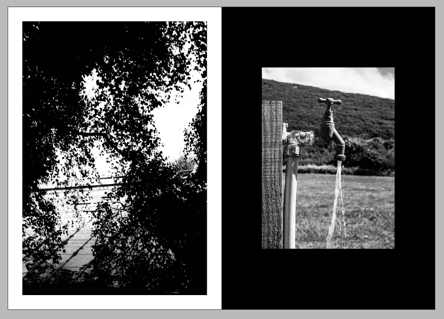
Annotate design 4: I made the right image smaller because the image its self is so close up I thin filled the background using the rectangle tool to give more contrast to the image as it is lighter than the left image. these two white and black images oppose each other by a black photo on a white background opposing a lighter lighter image on a darker background.
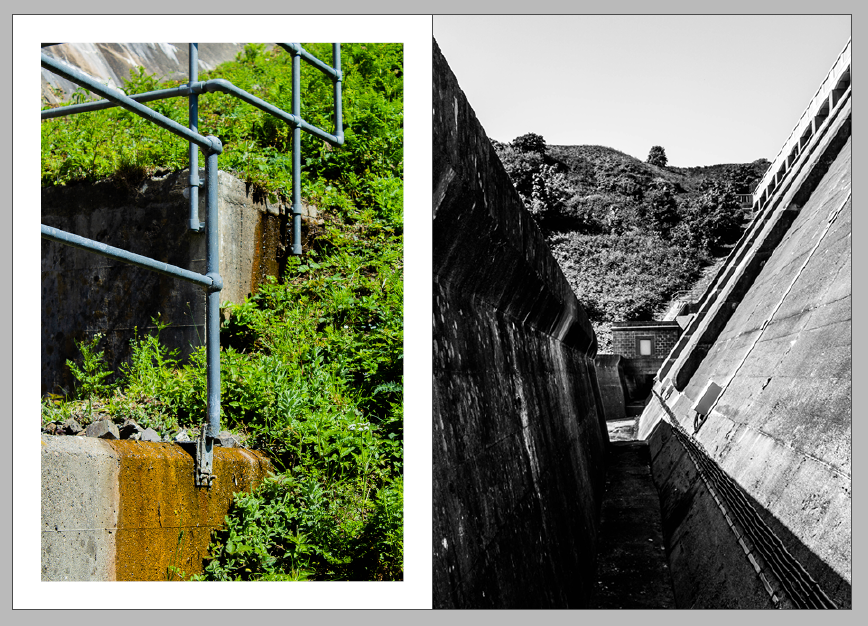
Annotate design 5: for these pages I decided to juxtapose a bright image and a dark image. the vibrant greens in the left image on a white background. to make the images even more separate from each other the right image I changed to be a full bleed.

Annotate design 6 I experimented with a double page spread for this image but I then decided I liked the juxtaposition next to the image.

Annotate design 7: I first put these two images together but I didn’t like how they looked together.
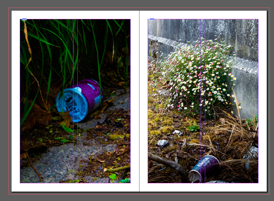
Annotate design 8: I then changed the pictures and i liked these two because they both match colour and cylindrical objects.

Annotate design 9: but then I changed the right image to a full bleed and I settled on this.

Annotate design 10: I experimented with another double page spread, I then decided against it because the subject of the photo would be lost in the fold of the zine.

Annotate design 11: the I put that image next to this image i like the link between the shine of the different materials.
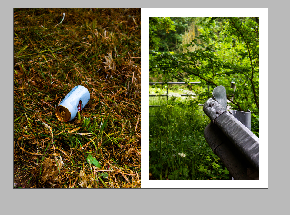
Annotate design 12: I then made the left image a full bleed to give more distinction between the images.
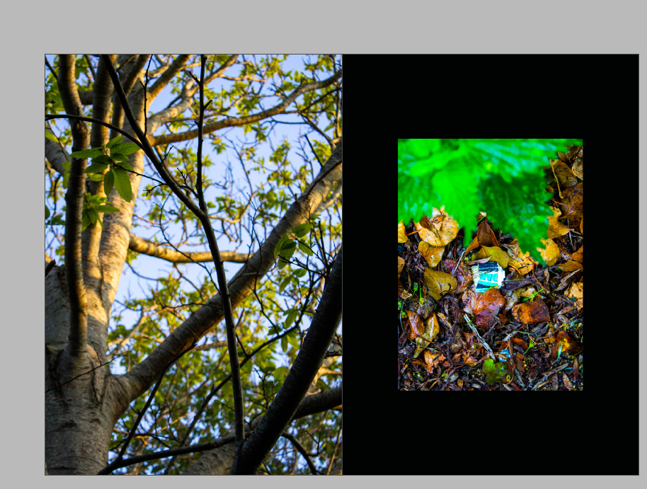
Annotate design 13: I decided to make another black background to fill the space between two colourful images to give more contrast to the page. I used the same smaller size image as the last black background.
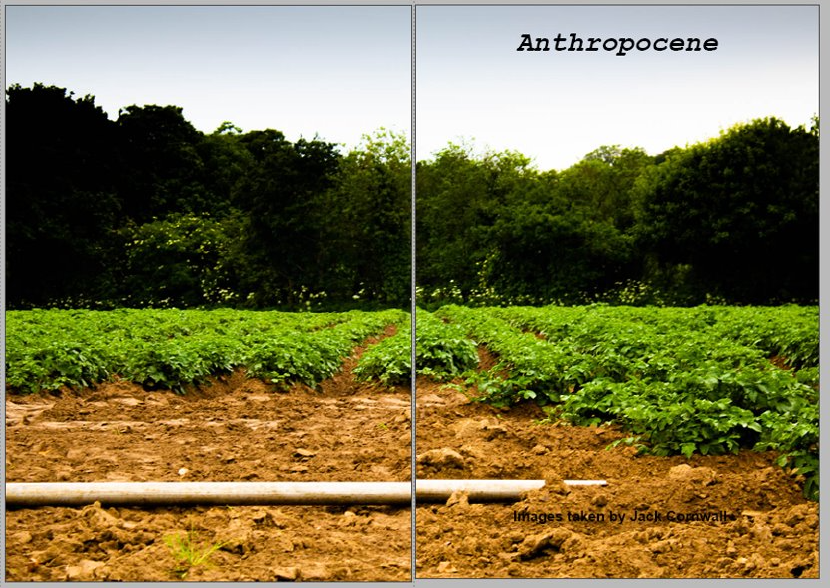
Annotate design 14: to use a double page spread of using a land scape image of farm land as the front an back page of my zine
My final Zine
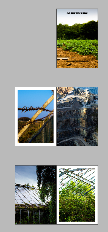


This is how I will lay out my final zine. I Chose to have a alternating full bleed on either side of each page to give a coherent design to the whole design. it when through many iterations to come to this final layout.
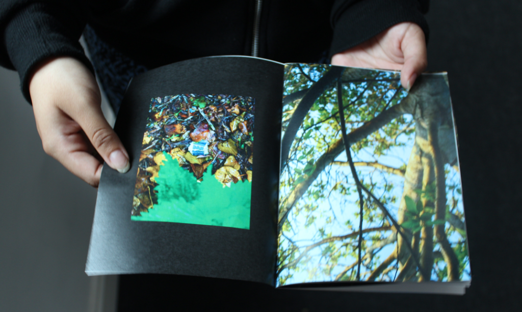
I printed my zine folded it stapled it then trimmed the edges to create the final product.
