I decided to make a zine in order to display my final images from my Anthropocene project. I used Adobe InDesign software to create the layout and sizes for my images. My zine will have 16 pages that will display my photos which will in turn show a story of Anthropocene in jersey.
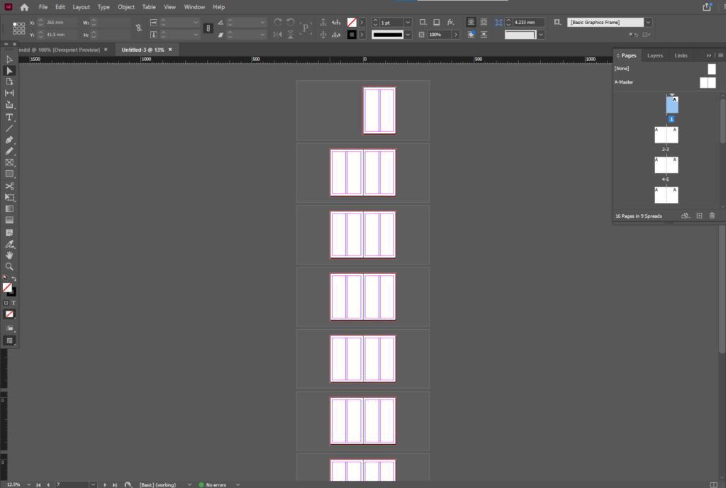
I began with a blank template with 16 pages where i went on to place my best images from both of my La Collette photoshoots.
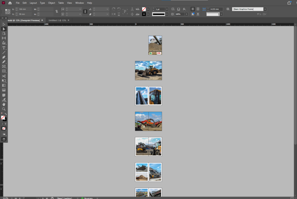
My Zine first attempt
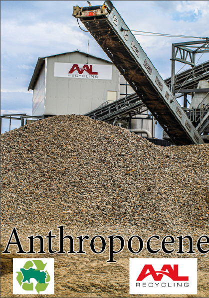
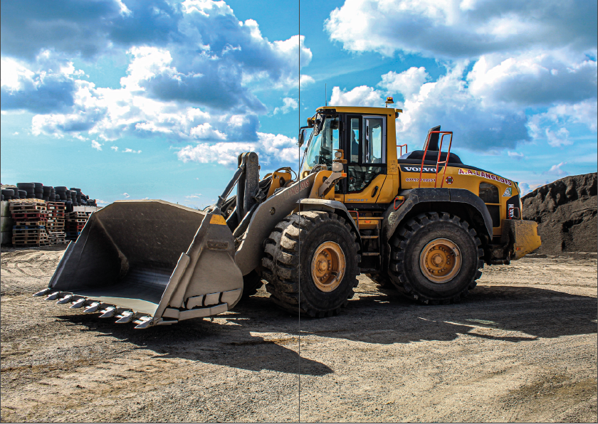
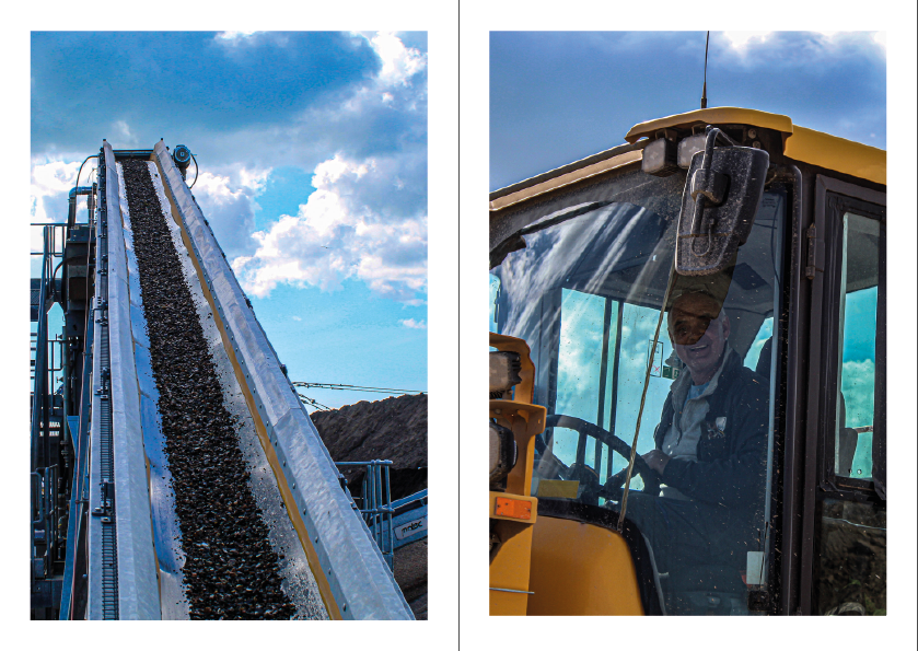
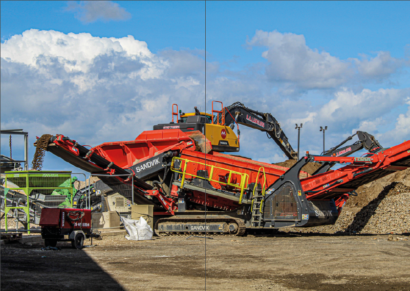
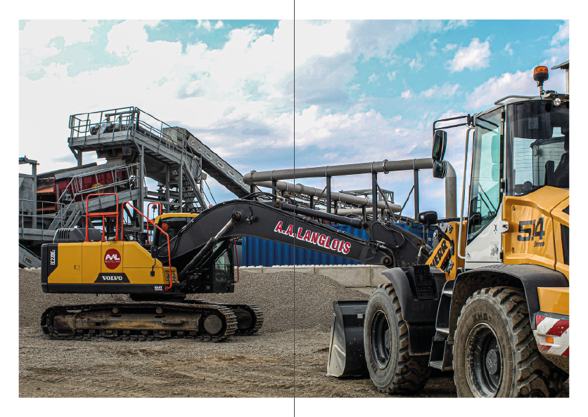
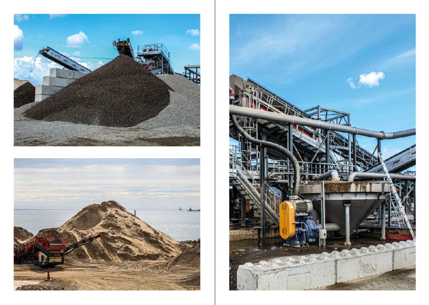
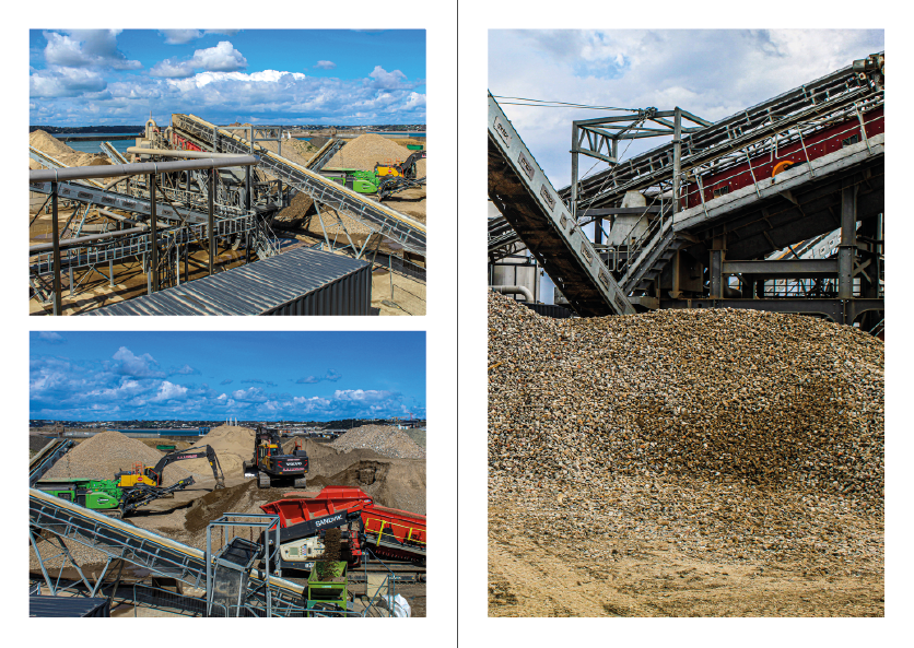
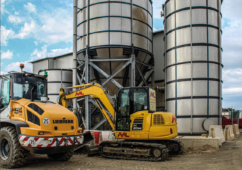
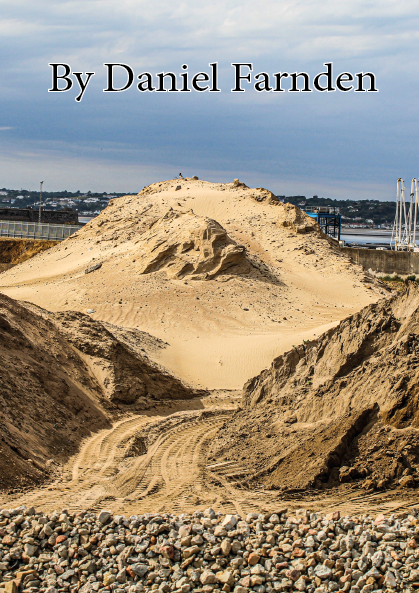
This was my first attempt of creating my zine in Adobe InDesign. During this zine i have selected all my best images from both my La Collette photoshoots. However I felt that the sequence of the images were not very good. this is because i would have the same page layout multiple times in a row as well as using poor images for the front and back cover of the Zine. For these reasons I rearranged the images and pages into a way where the pictures compliment each other better and the covers look more professional.
Final Zine
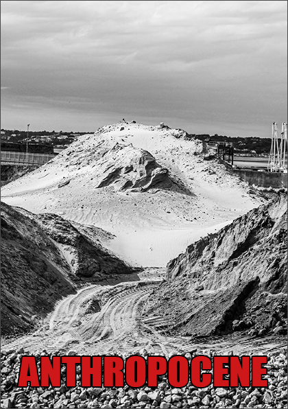
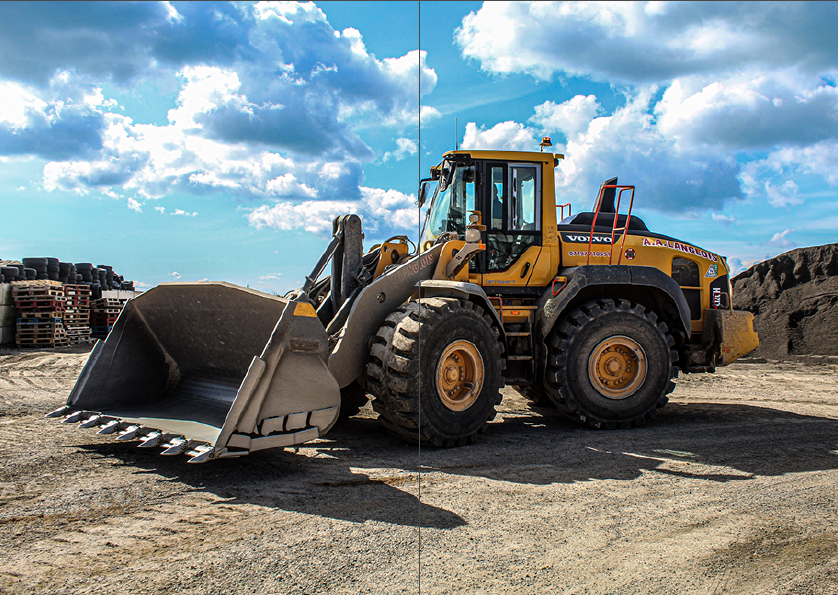
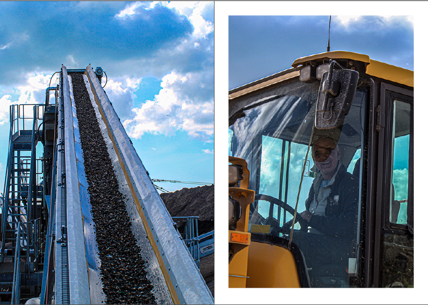
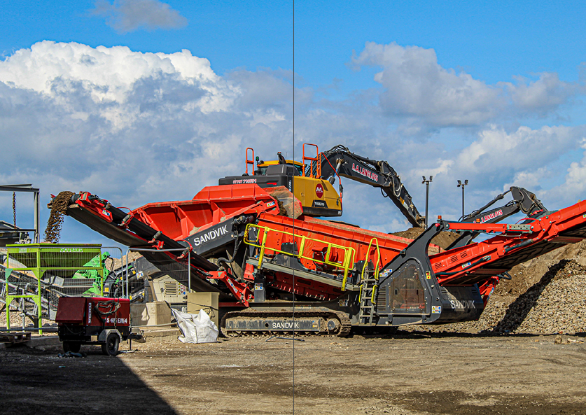
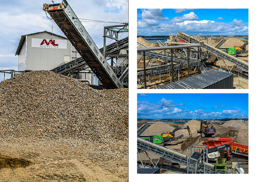
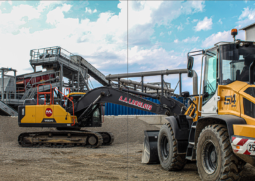
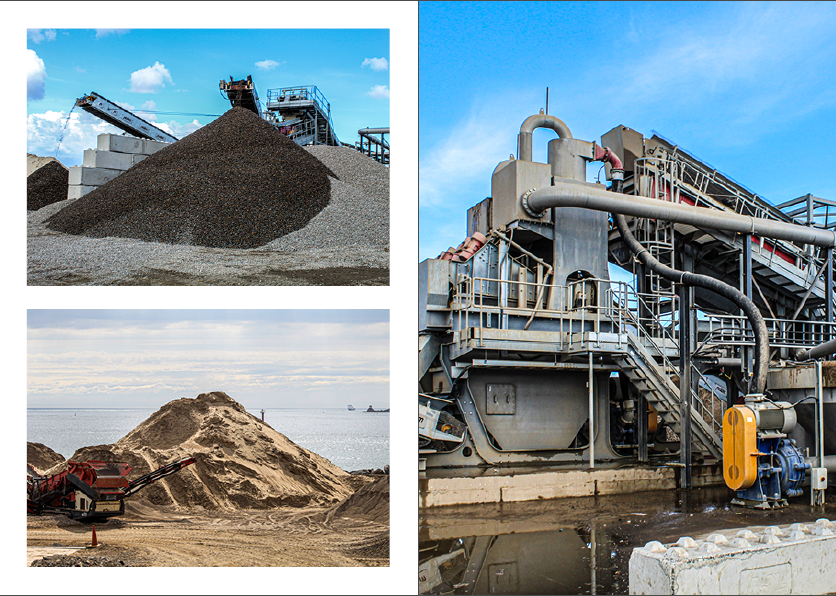
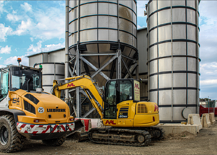
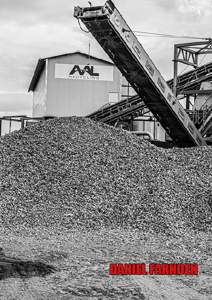
I feel that this zine is a lot better than my first attempt. This is because firstly I have added a more bold prominent title that can be seen better on the black and white background. Additionally the new black and white front and back covers give the zine more more aesthetic. The variety of page layouts throughout the book have made the zine much nicer to view rather than having loads of full page images all together.
