photos in response to Charlotta María Hauksdóttir’ and George marazakis
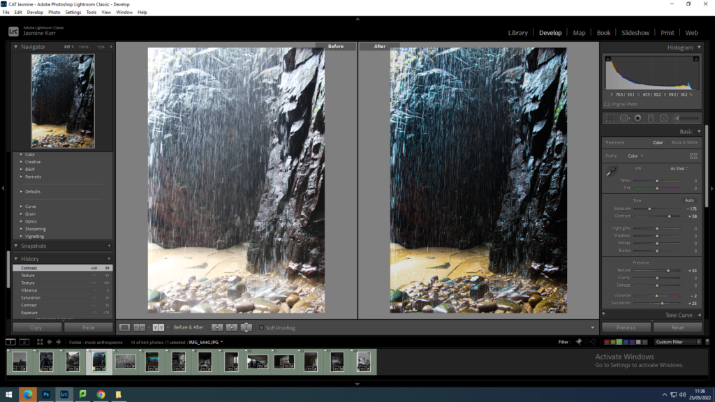
This image is in response to George Marazkis and Charlottas work. For this image I wanted to bring out the purple and yellow tones.I did this by increasing the saturation, decreasing the exposure to enhance the water dropping, and increasing the contrast to show the shar formations of the rocks.
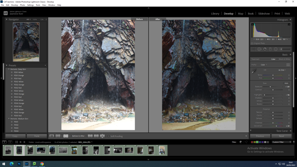
This image is in response to George Marazkis and Charlottas work due to the serenity and awe of the natural landscape. firstly I reduced the exposure and increased the contrast to emphasise the different natural colouring in the rocks underneath the waterfall. I then lowered the highlights so that you could clearly see the rock and sand formations. i wanted this image to be slightly darker so that the gave looked like it could go on forever.
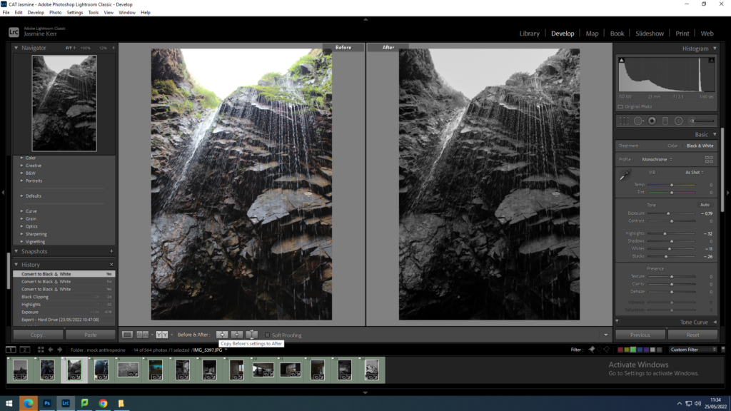
This image was also a response to George Marazkis and Charlottas work. In this image i wanted to reduce the brightness of the sky, due to it being a cloudy midday. However i chose to take this image on a cloudy day to create an ominous, dreamy effect. I then increased the contrast slightly so the rocks were more pronounced.
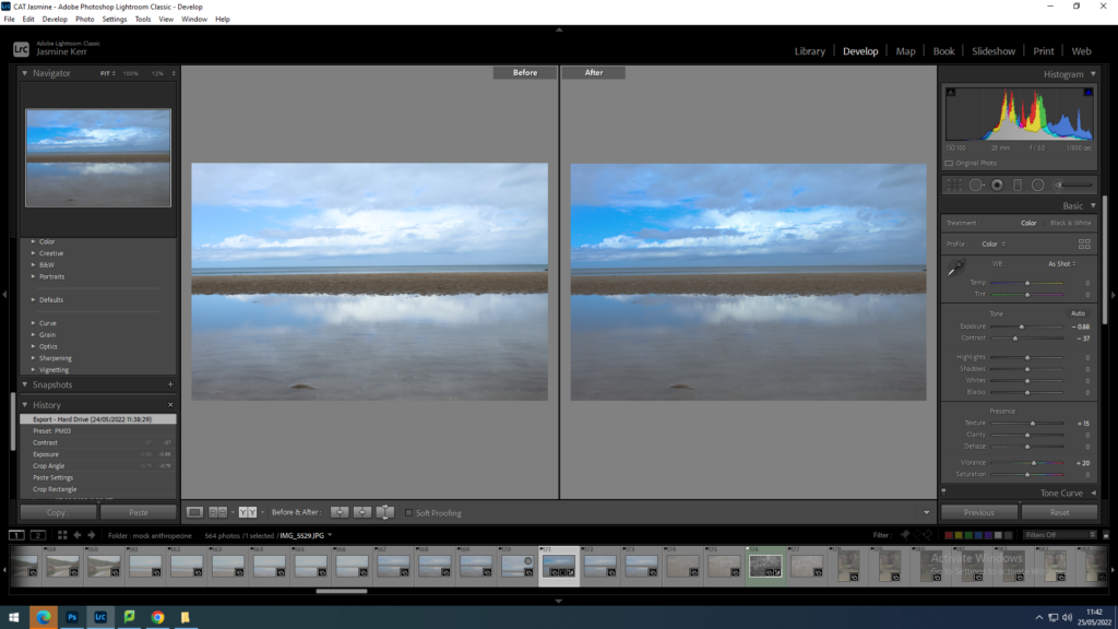
I am going to take this image into photoshop and distort it to make it look futuristic and almost like an optical illusion. I increased the contrast to make the sky appear more blue and increase the reflection.
photos in response to Andrew Moore
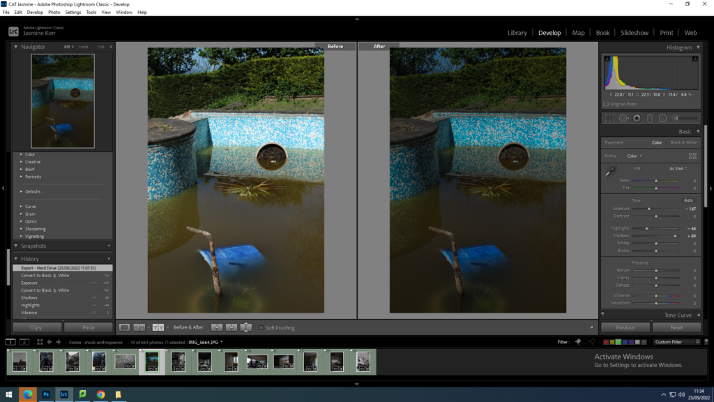
I kept this photo black and white to show the brightly coloured swimming pool, almost how it is viewed in a child’s eyes. i increased the contrast slightly to saturate the tiles around the pool. I also decreased the exposure to dim the whites slightly.
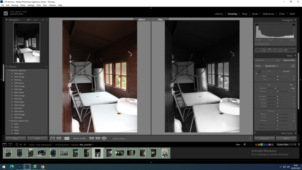
for this image i put it into black and white, to me this image is quite chaotic, which i quite enjoy. I decreased the highlights to that you can see the dirt on the tables.
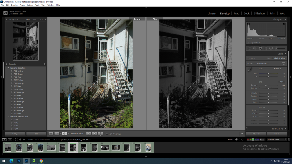
this is another image which I find quite chaotic. I put this in black and white because the image is originally quite dull, apart from the overgrown green weeds. I decreased the exposure slightly and increased the contrast to show the shadows in this image better.
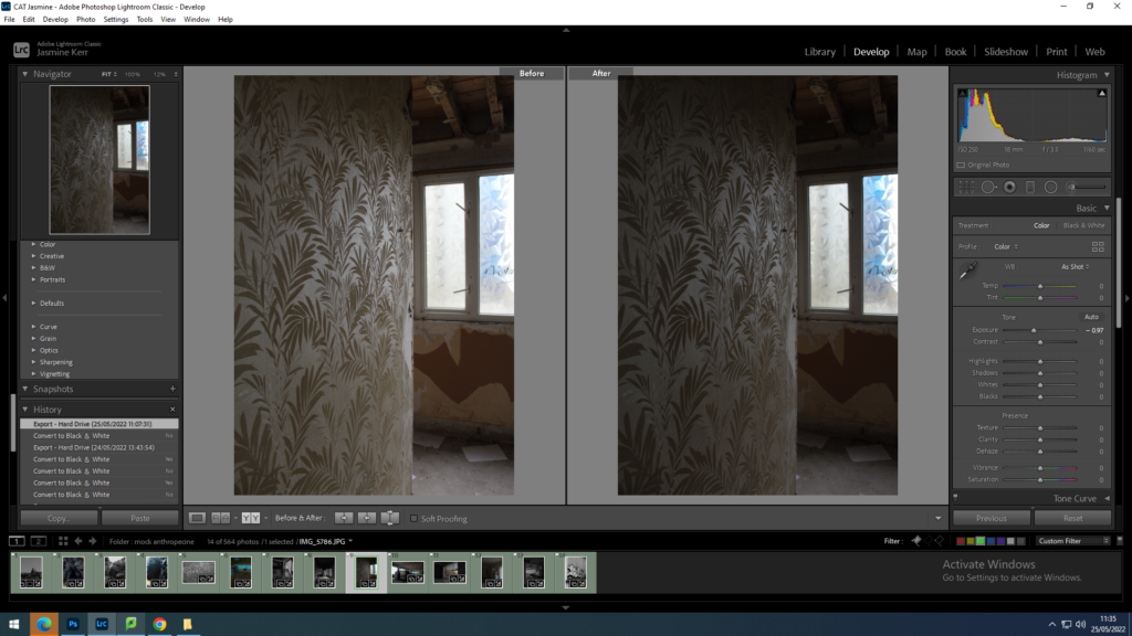
I wanted to keep this image in colour due to the bright blue from behind the windows. i increased the contrast and decreased the exposure to emphasize the wallpaper on the left of the image.
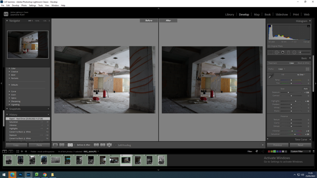
For this image I increased the saturation to highlight the fire extinguishers in the centre, and decrease the exposure and increased the contrast slightly so that it was the main focal point of the image.
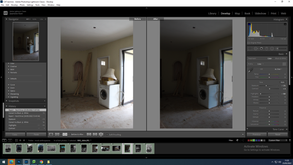
for this image I decreased the exposure and increased the contrast so that the light hitting the washing machine was cooler. i also decreased the highlights so that the whites in the image were dimmed.
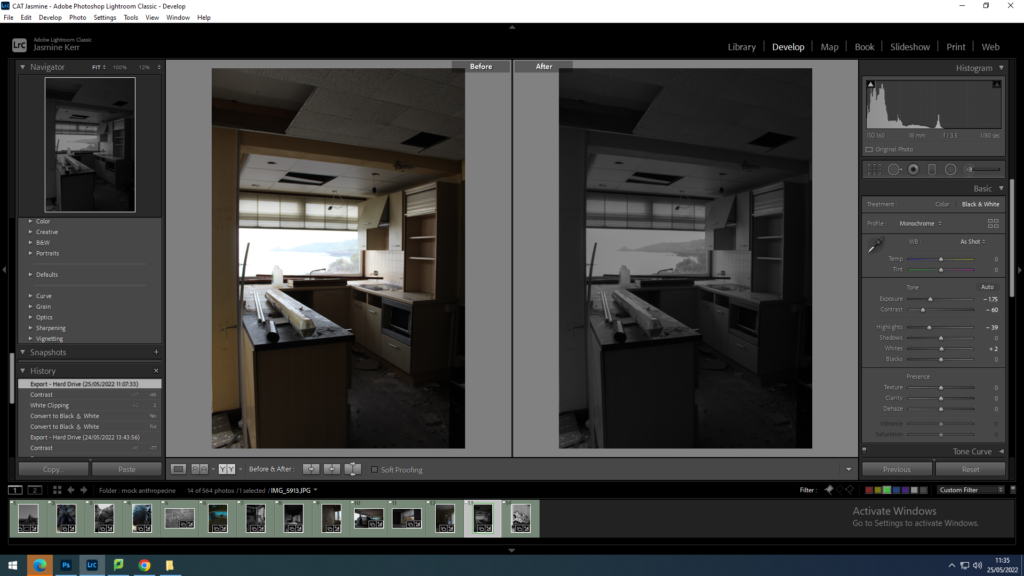
for this image I wanted to make the back in the window more clearer. I changed the image to black and white and decreased the exposure and increased the contrast so that the window almost looks like a painting or a television.
