——- Aaron Siskind ———————-


| Aaron Siskind (differences) | Similarities | My own photography (differences) |
| A lot harsher texture | Both display signs of peeling wall paint off a building | A lot softer in colour |
| Contains a lot more holes and peeling paint | Both share the same colour scheme | Contains not as much peeling paint |
| Monochrome colouring is a lot harsher | Peeling paint is quite spaced out |
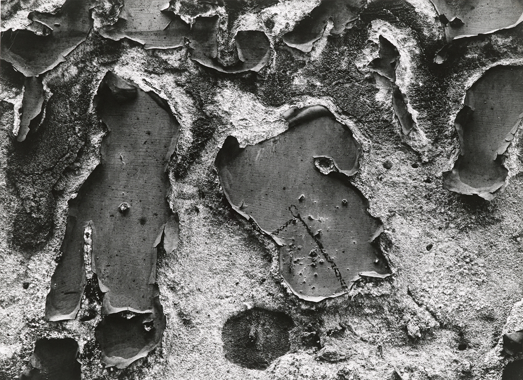
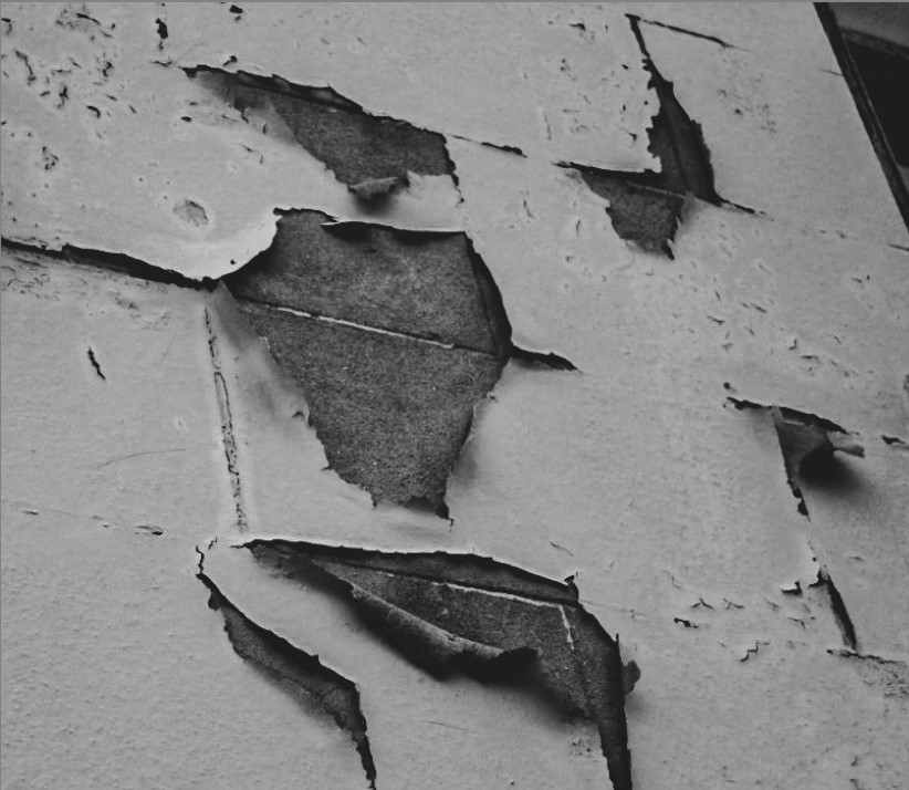
Both these images share a range of similarities and differences. To compare the two images, one being done by Aaron Siskind and one being done by me, I can first of all see that both of the photographs display the clear sign of a deteriorating building with peeling paint marks.
What I can also point out, is that both images share a very similar monochrome black and white colouring and tone. They’re both quite harshly coloured on the brick behind the paint and the paint itself.
Although I can also spot some differences between the two images such as Siskind’s work being a lot harsher and textured whilst mine on the other hand, is a lot softer and smoother. My photograph has presented that the peeling paint marks are very spaced out and contains not as many, whilst Siskind’s displays the marks being incredibly packed together and roughly carved out by old age.
——- Yves Marchand & Romain Meffre ———————-


| Yves and Romain (differences) | Similarities | My own photography (differences) |
| Incredibly harsh colouring on the building due to old age | Photograph of abandoned buildings | The plants block out more of the entire structure, blocking its view |
| Contains way more damage on the structure | Highlight the sense that nature has taken over the structure | Colouring of the overall image is a lot warmer than the other photographs |
| Central photograph | Taken at an angle | |
| Plants aren’t in front of the actual building | Plants are blocking a portion of the building |
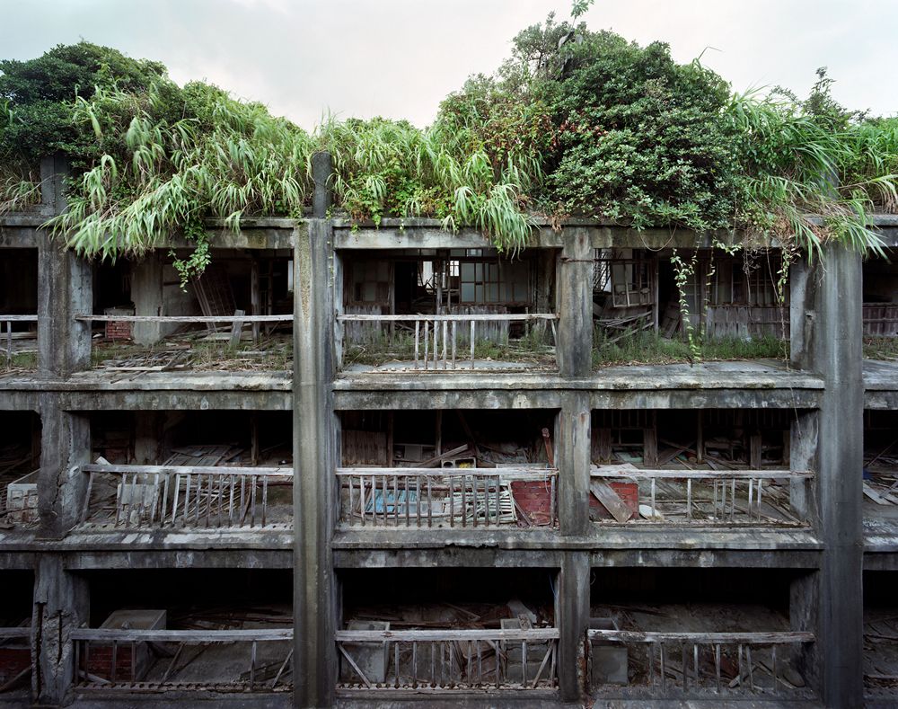
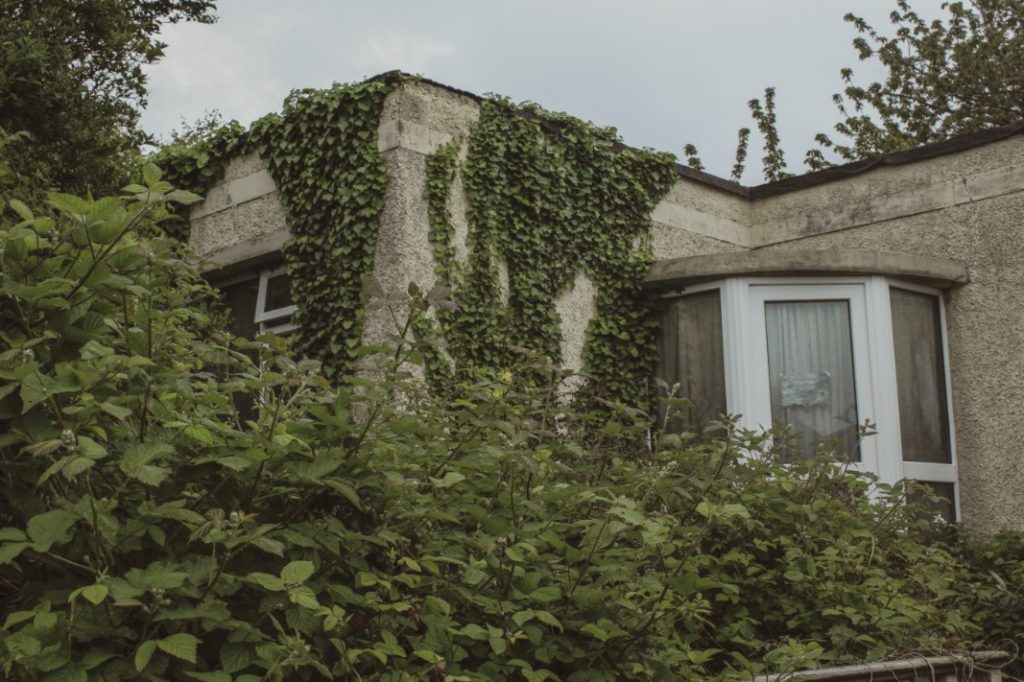
Both these images share a range of similarities and differences. To compare the two images, one being done by Yves Marchand & Romain Meffre and one being done by me, I can first of all see that both of the photographs resonate around abandoned and derelict structures.
I have also noticed that both images highlight the obvious impact that nature is having on the infrastructure itself. They are both being drowned in an abundance of greenery and plants. This clearly shows that nature continues to overpower humans and what they are willing to create.
Some main differences between the two photos however, are that the colouring for both images is different. My image is a lot warmer on the colouring of both the plants and the house itself, whilst the other photograph by Yves and Romain, is a much cooler tone and gives the building a slight greyer tone of colour. One other difference I have spotted, is that in the corner of my image is a huge pile of plants that block off a portion of the house, making it harder to see. Whilst the other photograph, contains the whole photograph in frame with nothing blocking its view. My photograph has also been taken at an angle whilst the other one is displayed in a perfectly central manner.
