
FINAL IMAGES
EVALUATION
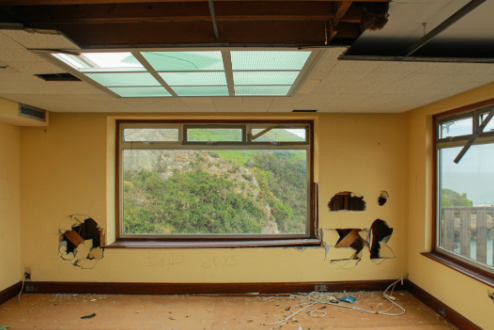
I like the yellow contrasted against the blues and greens of the nature through the window and the blue of the ceiling windows while attention being drawn to the dark tones of the holes in the walls which present a sense of depth as attention to drawn to the back of the room. The framing of nature through the window is interesting as the destruction and abandonment
CRITIQUE
The image is quite plain in its composition with not much happening. There is also a lot of darkness in the corners and top of the image as there are shadows and dark wood which looks unusual against the tone of the yellow.
EVALUATION
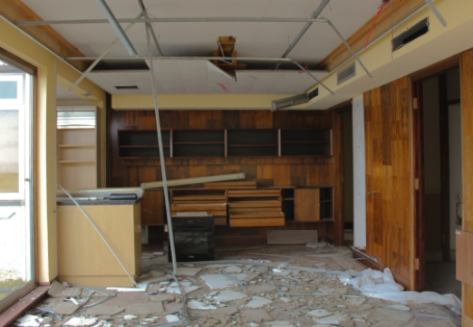
The image has depth as attention is drawn towards the back of the image, the theme of yellow is continued which looks interesting against the dark of the wood. The texture of the wood and floor is also very visible which is interesting to look at especially since there is such a large variety of colours.
CRITIQUE
The left side of image is overexposed and provides a large contrast between the dark tones of the wood, I could’ve cropped this out but the dimensions of the image would have been unusual.
EVALUATION
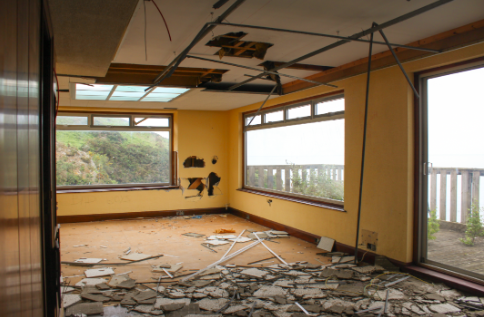
I like this image as destruction is shown throughout the image, with the ceiling tiles on the floor and the holes in the ceiling and walls, along with the obvious yellow motif.
CRITIQUE
The outside is overexposed which if I changed then the image would have been too dark to notice the yellow walls and soft lighting coming from outside.
EVALUATION
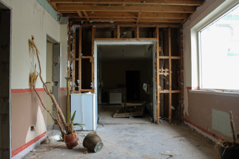
Attention is drawn towards the dead plant as it is the only slanted thing in the image, I find this interesting- especially as it is in front of the doorway- as it could symbolise the death of nature making way for human activity. I think this images has the best flow to it as composition-wise it is the most classic composition.
CRITIQUE
The right side of the image is overexposed but I didn’t want to lose the soft light coming in from the window so I decided to keep it.
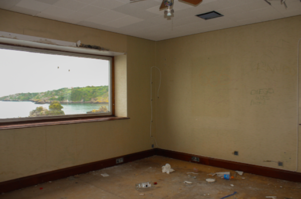
EVALUATION
I like how the stains and graffiti on the walls is visible alongside the obvious signs of human interaction with the room contrasted with the view of nature outside the window.
CRITIQUE
The image has quite a plain composition and the outside is overexposed.
FINAL ARRANGEMENT OF IMAGES
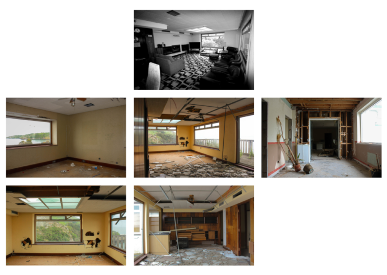
EVALUATION
I like the contrast between the plain rooms scattered with destruction against the black and white original image of the room. I also believe the negative space between the images works very well as it looks like a blue print- with the slight motif of nature/the outside in every image compared with only viewing nature through a derelict room is interesting especially in the nature of a blueprint.
CRITIQUE
Overall I do not like my final set of images, I preferred my last mock exam as with the theme Anthropocene it mainly focusses on nature and how humans are changing the world- I prefer taking images of people as I find it more interesting.