Within editing my images I wanted to present derelict buildings and abandonment through Sternfeld’s use of colour. A lot of the rooms in the derelict hotel I was photographing were yellow, leading to an interesting colour scheme throughout some images.
EXPERIMENTATION
First I experimented by changing the images to black and white.
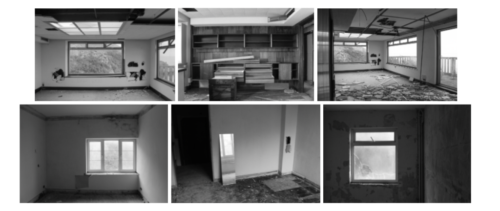
I realised quickly that changing the images to black and white means I lose Sternfeld’s influence and the images quickly became boring so I decided to keep them in colour and concentrate on the yellow motif occurring throughout the images.
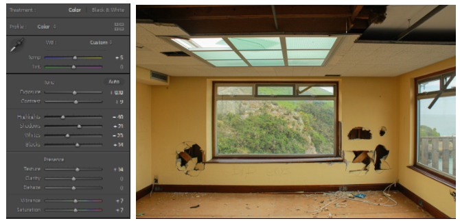
To maintain the yellow in the images I changed the temperature of the images to between +2 and +12, with this same rule going for the saturation and vibrancy of the images, this was so the images could be consistent in their colour scheme as some rooms were brighter than others.
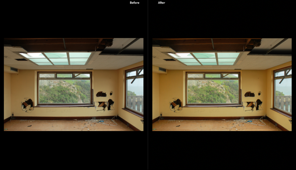
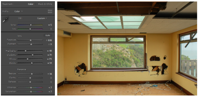
I edited all the other images similarly, making sure to erase areas of over/underexposure depending on the lightning of the room by changing the exposure and contrast. I also levelled the images to ensure that the horizonal lines were straight.
#2 SUB-SELECTION OF IMAGES AND EDITING
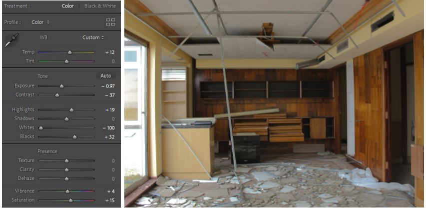
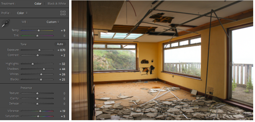
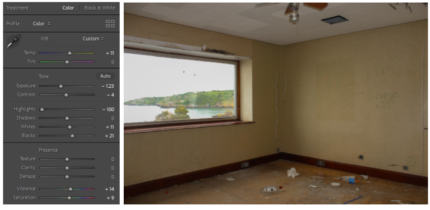
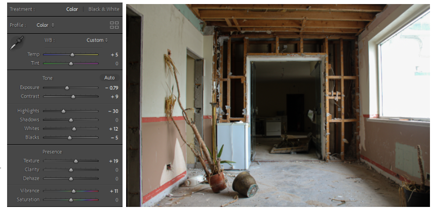

After editing all my images I did another sub-selection- finding inspiration from Sophie Calle’s ‘The Hotel, Room 47’, more specifically, the way Calle displayed her work- presented in a grid titled the room number of the hotel room she was photographing.
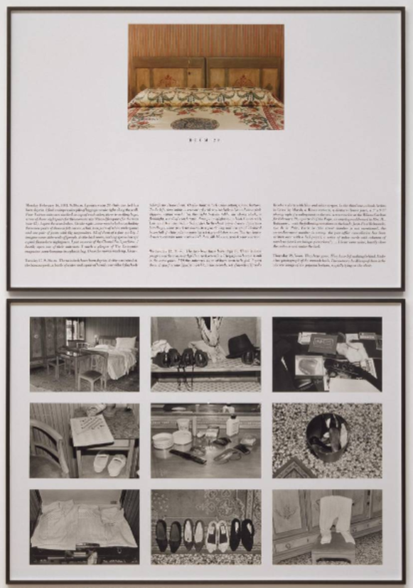
The obvious similarity is that Calle and I are photographing a hotel however Calle’s work is displayed alongside extensive descriptions of what the room was like and the ownings of the room inhabitants and presented as a catalogue of documentary-style images in grid format- which I would like to do in photoshop as I really like the irony of displaying images of a derelict area as if it was brand new.
ADOBE PHOTOSHOP EDITING
First, I printed and cut out the images I wanted to use in a set and arranged them by hand until I liked the arrangement- next I tried to recreate this arrangement on photoshop.
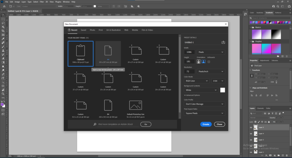
First I opened a plain A4 page on Adobe Photoshop and opened all my other images on separate tabs.
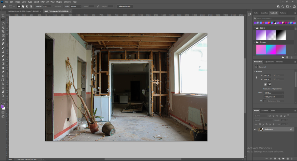
Then I dragged each image onto the plain white page and resized and arranged them until they fit the page how I wanted it to be like.
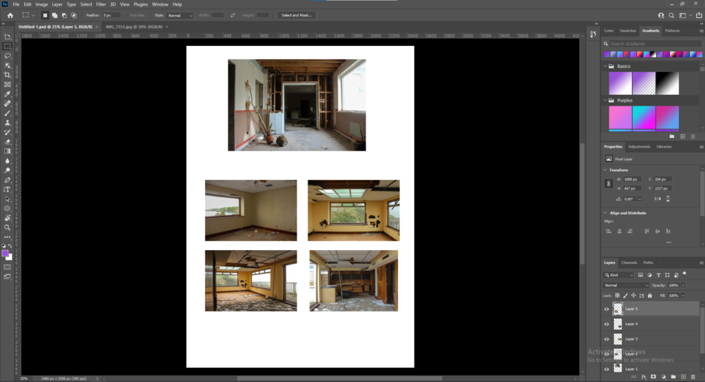
The images ended up on the page like this however I was unsure of this layout so I continued with some layout experimentation.
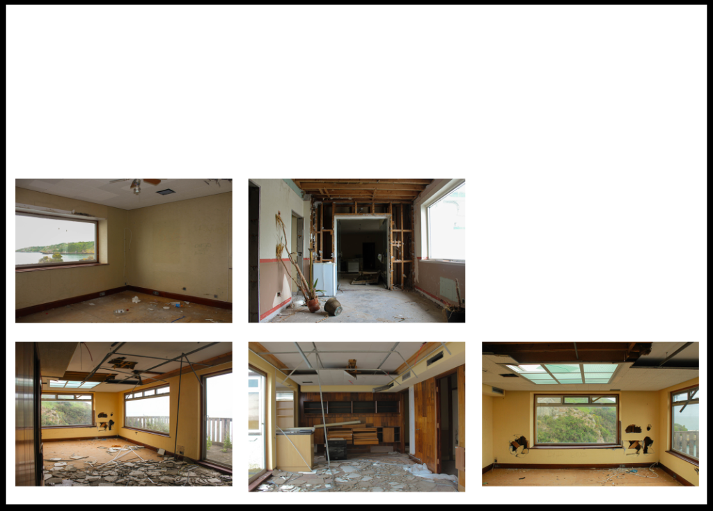
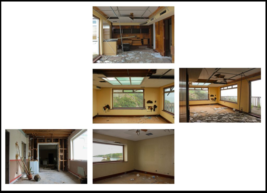
I really like the inclusion of negative space in my experiments as it reminds me of blueprints of building plans- an interesting contrast between ruin and new buildings.
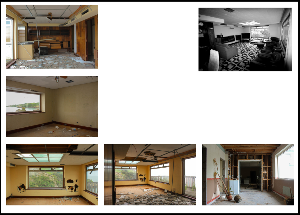
I also became interested in juxtaposing images of the hotel abandoned with images when it was still in business, as seen in the image above where a picture of the same penthouse room in the 2000s is distanced from pictures of the room in its current state by negative space- the black and white of the old image also being an interesting comparison as black and white is often linked to age- with old buildings often having been demolished quickly to make way for new buildings however in this case the black and white photo is showcasing the hotel when it was in a much better state compared to the yellow centred images- ironically, yellow being the colour that represents vitality and youth.
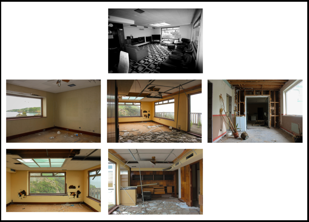
I ended up liking the last experiment (#4- seen above) the most as the arrangement reminded me of Sophie Calle’s work while the use of colour to Joel Sternfeld’s work and the depth of the images to Jeff Wall’s ‘The Destroyed Room’- especially in the bottom middle image. The negative space adds some abstraction to the piece which I find interesting as well.
