Experimentation
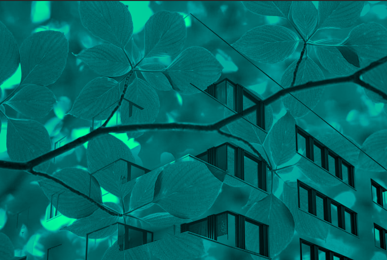
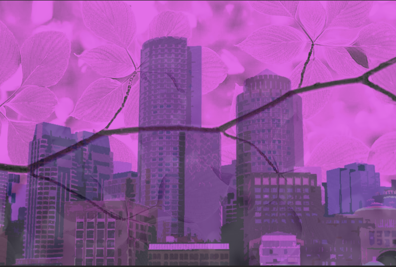
These two images were very early experiments I did (before I took any pictures for the project). I knew from the start that I wanted to use colour and have an abstract aesthetic, so these images were tests to see how I could achieve that. While I think there could be an interesting idea behind these images, I don’t think I have developed it enough to be worthy of a final piece.
This image is an experimentation for when I thought about making my images appear like an Autochrome photograph. While I like the look of this image, and I honestly think I may bring back the idea for a future project, I didn’t think that it would fit with my ideas for a ‘colourful’ and ‘abstract’ final piece, perhaps for a darker, less energetic photoshoot.
Andy Warhol

Warhol was an American artist, producer and film director who is most famous for his silkscreen paintings, such as Campbell’s Soup Cans and Marilyn Diptych. Warhol was the lead artist/figure in the Pop Art movement, which mixed art with popular media, such as advertising, comic books and mass produced objects, giving them a boring aesthetic, which created irony. The movement highlighted the banal elements of culture. Warhol’s works include some of the most expensive paintings ever sold, he is considered to be the ‘bellwether of the art market’
I chose to study Warhol because I think his pop-art work, especially the Marilyn Diptych, fits with my aim for the project nicely. I was inspired by Warhol’s work because I think his use of colour is what I was aiming for when I was thinking of ways to make my images appear more abstract through my use of colour.
Image Analysis

This image (and its variations) inspired me to create my final pieces in a similar way, with variations in colour in each image. I like these images because of their simple aesthetic (however I will not be using this for my final pieces as I want to keep some detail) and vibrant colours. To me, the lines appear soft and almost flower-like, which helps give the images an unnatural (for a portrait), manipulated look. The shapes in these images seem to be all independent from each other, the hair, lips, eyes, etc…, they blend together to create the portrait in a unique way. The simplicity of these shapes also gives the images (especially the less detailed ones) a more 2D look, which could be part of the reason why they are so distinct from other portrait images. The pattern created by copying the image and changing its colour (sometimes not changing the colour at all) is a staple for Warhol’s work.
Andy Warhol Experiments

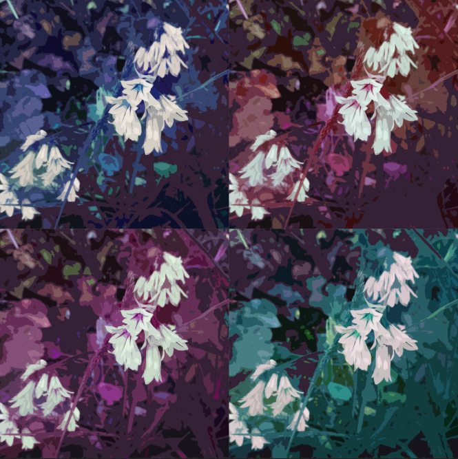
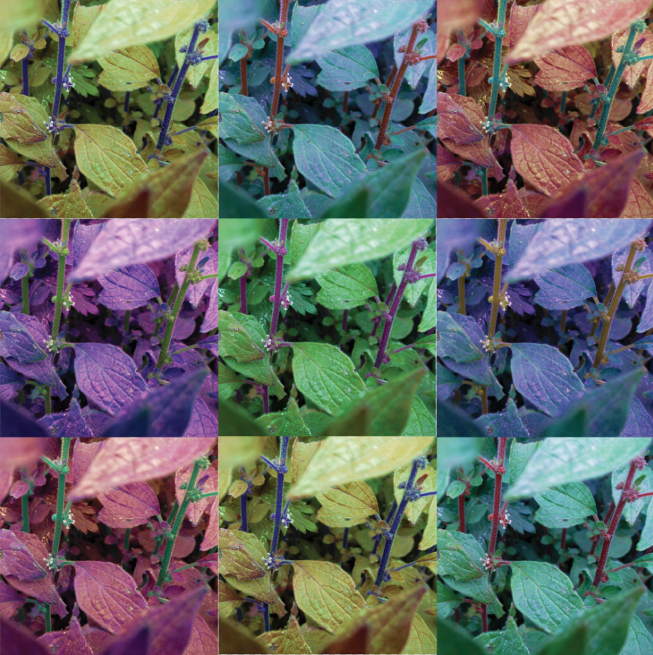
This is an experiment/test for using a similar style for an image in a similar style to Andy Warhol. I thought that changing the image’s colour and vibrancy on photoshop and then placing them in a 2×2 grid will mimic his style, but not completely. I wanted to keep as much detail in these images as I can, unlike Warhol’s images which tend to be more simplistic, in terms of shape, line, depth, etc… I like this turnout a lot and I think I will take it further into an idea for a final piece).

These two images are further experimentations for the Andy Warhol concept, this time I made my images square and used the Filter Gallery tool on photoshop to give the images a more simple look. I personally prefer the second image, as it retains some of the detail from the original image, while making the image appear more abstract.
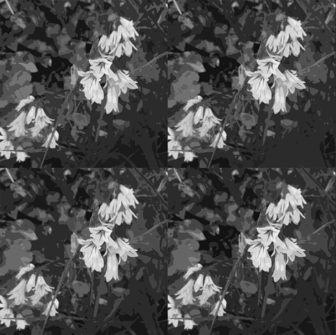
I have made a black and white version of this image to see how it would look. I thought the abstract shapes and difference in tones could make for an interesting black and white image.
This was an experimentation to see what different grids look like. This version is more akin to images such as Campbell’s Soup Cans, which include a higher number of images in the montage.

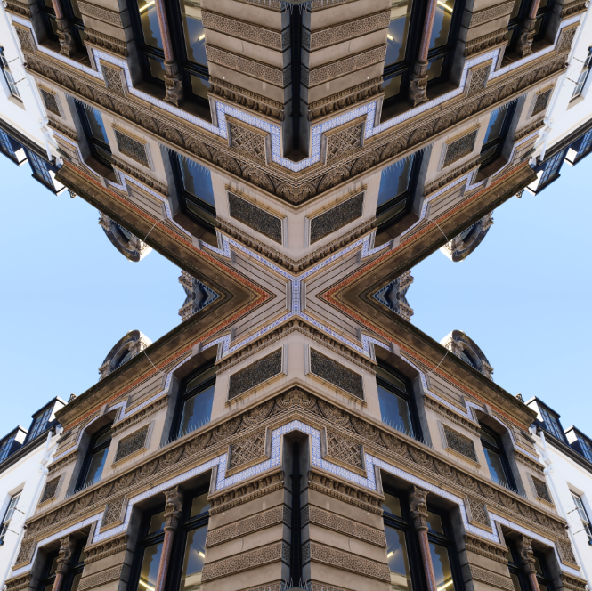
Here I wanted to look at different ways I could lay each image out, in this case I made it completely mirrored.
This is another variation of a mirrored sequence. I think these give the images an abstract look, however I think I’d rather stick to the regular style Warhol uses.
Statement of Intent
For my Final Piece for this project, I will be making multiple Andy Warhol inspired images using my photographs. I think this will work for the project as I am aiming for a colourful, abstract final piece, and I think this style most suits this prompt. I think this will fit for the theme of Anthropocene because I think that using abstract images, a style that I consider to be thought-provoking, as well as artistically interesting, will be a good way to conceptualize the theme of Anthropocene. This is because the Anthropocene is a theme that must be thought about, by everyone, so by making thought-provoking images, the Anthropocene will be thought about in the production and viewing of the final piece.
Images I will use for the Final Piece:
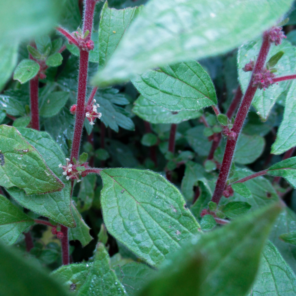
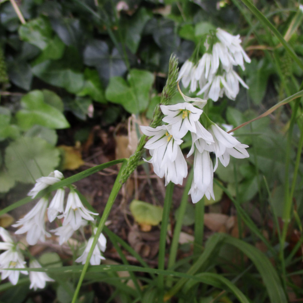
These are the images I consider to be the best out of all three photoshoots (I will use these to create the final piece):


Before making the sequences, I made a square version of each final image, as I thought it captured the style of Andy Warhol’s pop art better.