My process
After reviewing my images, I have decided to move away from the idea of Laura Romero and Anastasia Savinova’s collages, and more into the documentary photography of my studied artists: Peter Mitchell, and Sharon O’Neill. However, I am still interested in the idea of compiling my images in a collage, so am still influenced by my collage artists. The aim of my photographs is to show the reality of the housing crisis, and evidence of the strong class and wealth divide in the island – my editing will not hide or ‘sugar-coat’ anything in my pictures. I am planning to edit some of my images in Black and White, and some in colour, with a grainy look that emulates my chosen artists’ work, a lot of which is from the 80s/90s, so was taken on film cameras.
Further evaluation of my shoots and their relevance
In the end, as I have changed my idea and moved away from the idea of including industrial buildings, my shoot of finance and other industrial buildings are probably not going to be used in my final outcomes for Anthropocene. – this includes my images of the abandoned warehouse. This is because, after researching the housing crisis further, and with my interest in documenting this issue increasing, they became less relevant to my idea. I want to produce carefully linked work that shows a clear outcome from my chosen ideas and pictures, so therefore I chose not to use my images of industrial buildings. However, I do not regret carrying out these photoshoots, as they allowed me to choose what I thought was going to work within my project, and then develop this into a further photoshoot.
Edits from my first photoshoot: The cedars, Le Marais, and Marina Court
Original 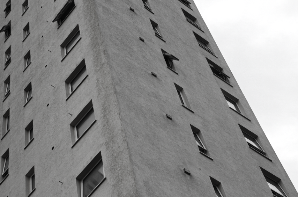
Edit
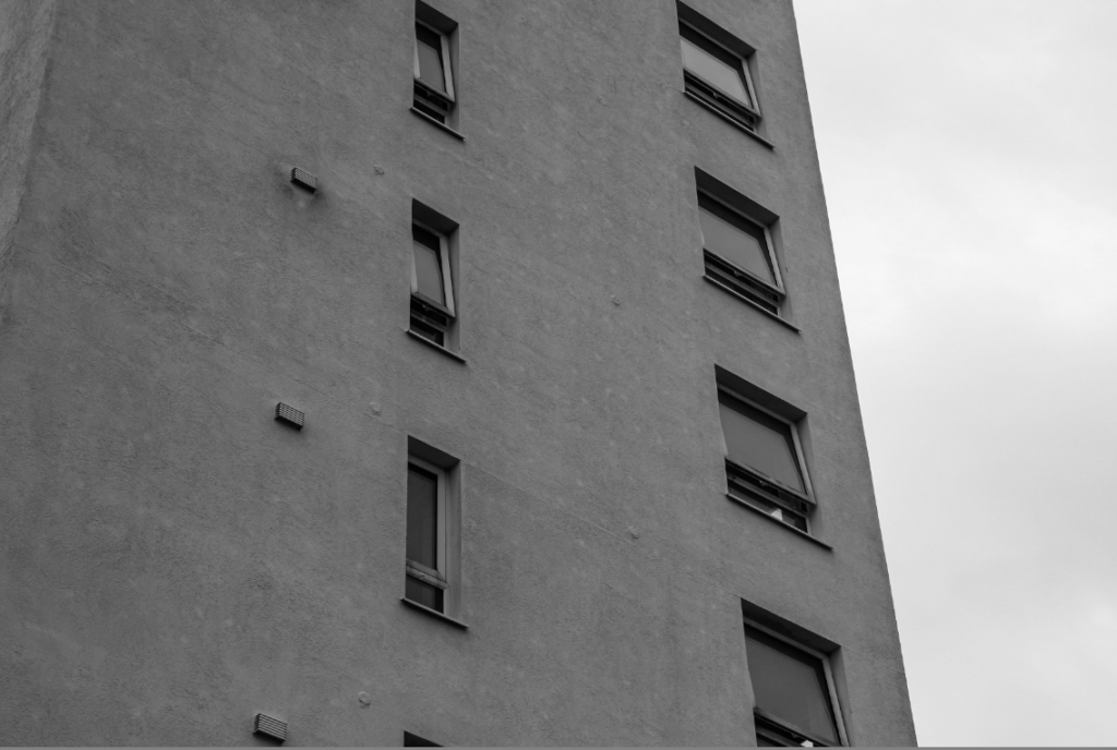
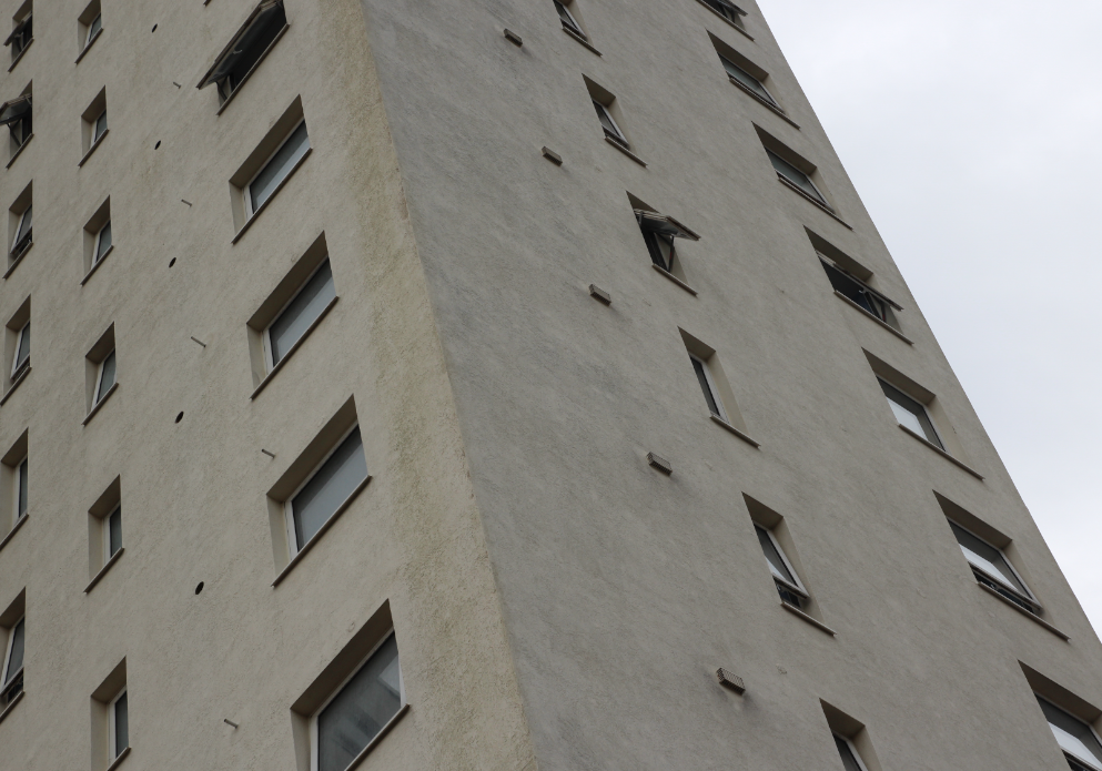
This edit is from Le Marais. I chose this image as one of my best images and to edit it due to the strong lines within the image – I also love the sense of repetition in the lines of windows in this image. In my editing, I used Lightroom to change my image to black and white, as well as adding higher contrast to the image. I think that adding contrast and adding shadow was important for this image – it helped to keep the harsh lines and repetition clear and sharp, which was important for me as they are what makes the image successful.
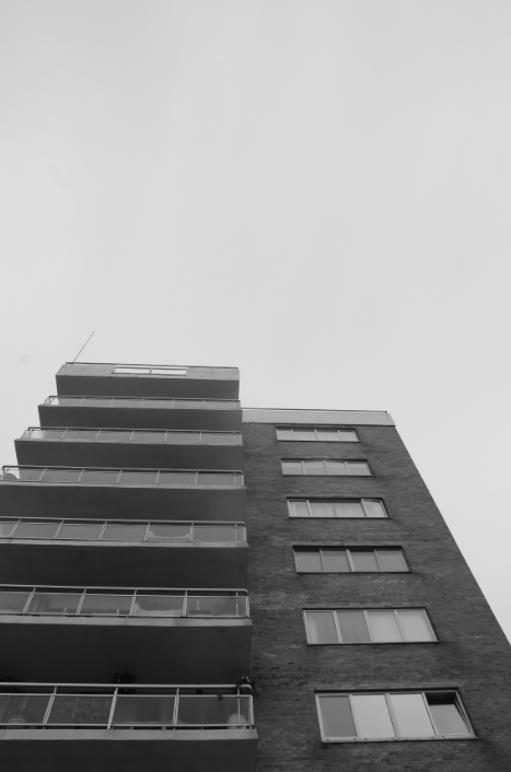
Turning black and white 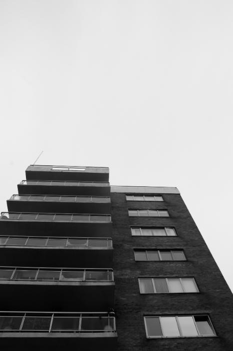
Adding contrast 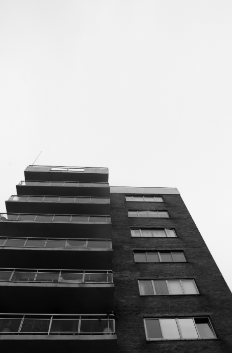
Shadows and whites added
Due to the high contrast between the sky and the building in this image, I wanted to enhance this further in my editing. I did this by increasing the contrast, but most importantly adjusting shadows, and adding whites. This meant that the areas of white, the sky and windows of the building, remained bright, but the darker areas stood out with high contrast at the same time.
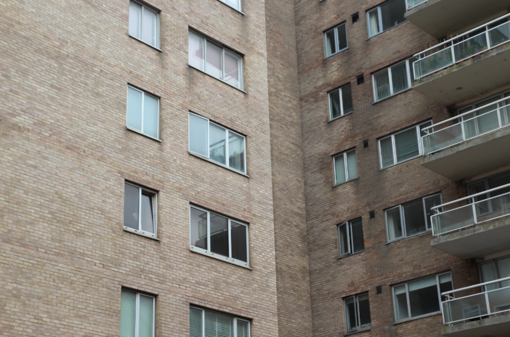
Original 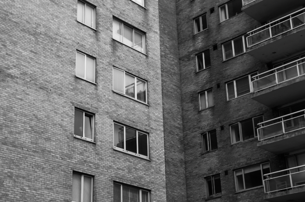
Edit
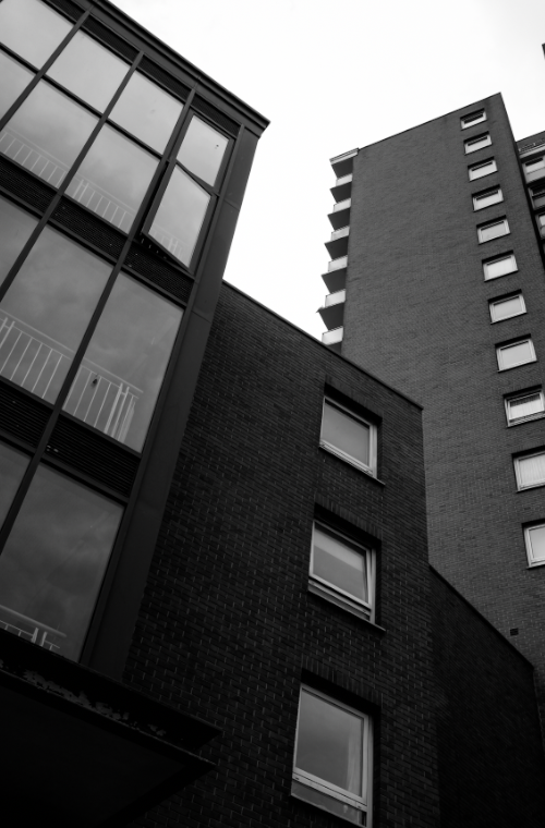
I chose this image as one of my selections/to edit, due to the way the light hits on the left of the building, but not the right – this creates a contrast between the sides of the image, between light and dark which I really like. In my editing, I wanted to keep this light vs dark in the image, so did not increase the contrast too much – I added a little exposure too, to ensure the bright parts of the images stayed exposed correctly with the added contrast.
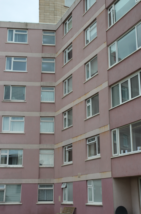
Original 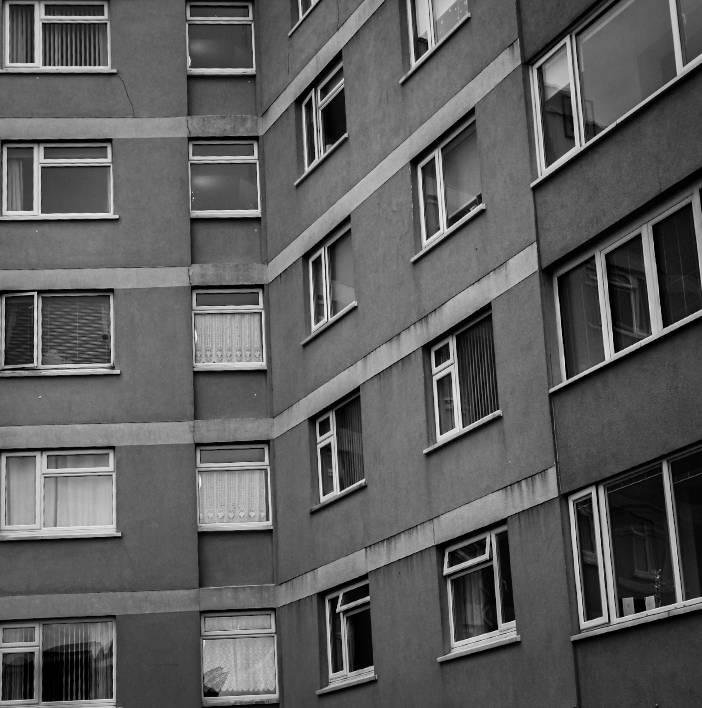
Edit
I used heavy cropping in this image – I think this helped the image’s composition a lot, as the eye is drawn purely to the sky, which takes the focus away from the actual building. Therefore, I think my cropping was effective in removing unwanted distraction in this image.
De Quetteville Images
Below are some examples of editing – completed on develop mode, in Lightroom Classic.
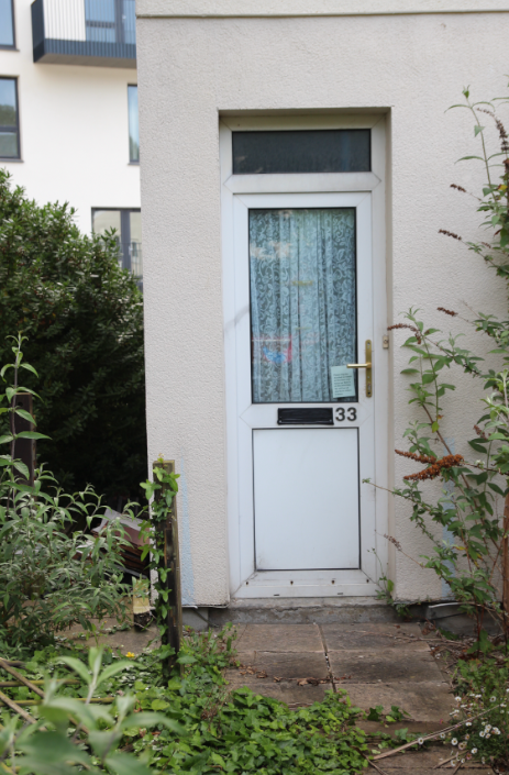
Before 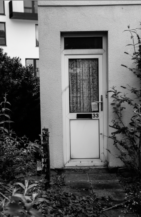
After
This image of my third photoshoot is one of my favourites from my shoot at De Quetteville Court – I used slight cropping in this image to make sure that the bushes framed the house, which I think worked best compositionally. – I used high contrast and low exposure, but upped the whites slightly to enhance the darker parts of the images but also to keep the white of the door and building behind bright and intense. I think this helped the cohesiveness of the image – the new building looked starkly different in the original, but with my editing, it blends quietly into the background – this creates a soft comparison between the old, dilapidated estate, and the new, modern tower behind.
Colour edit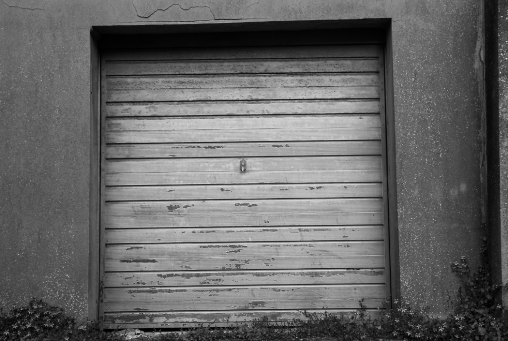
Black and White Edit
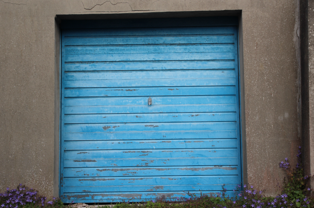
For this edit, the door had a really vibrant blue colour, as well as some purple flowers at the bottom which toned nicely with the blue – because of this, I edited in colour as well for this photo – I produced two edits using virtual copies in Lightroom.
Original 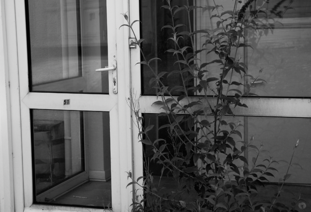
Edit
Original 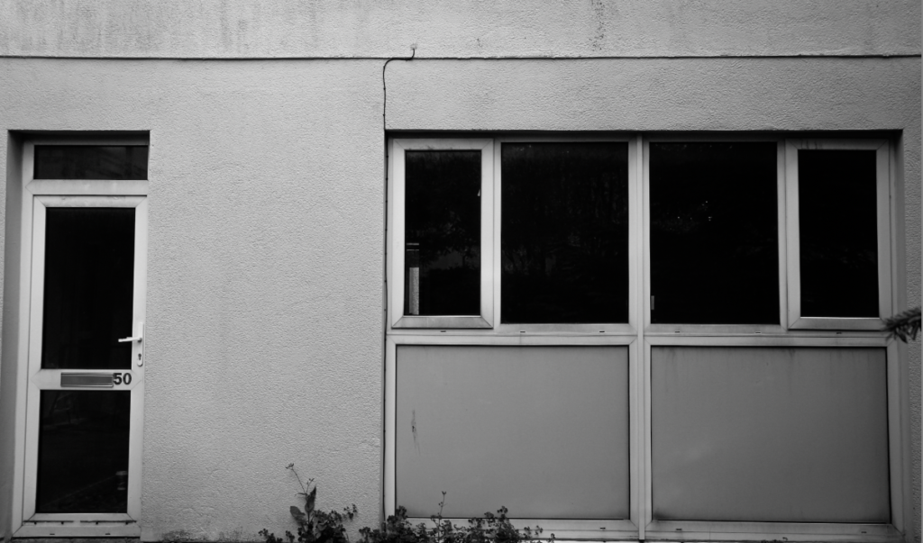
Edit
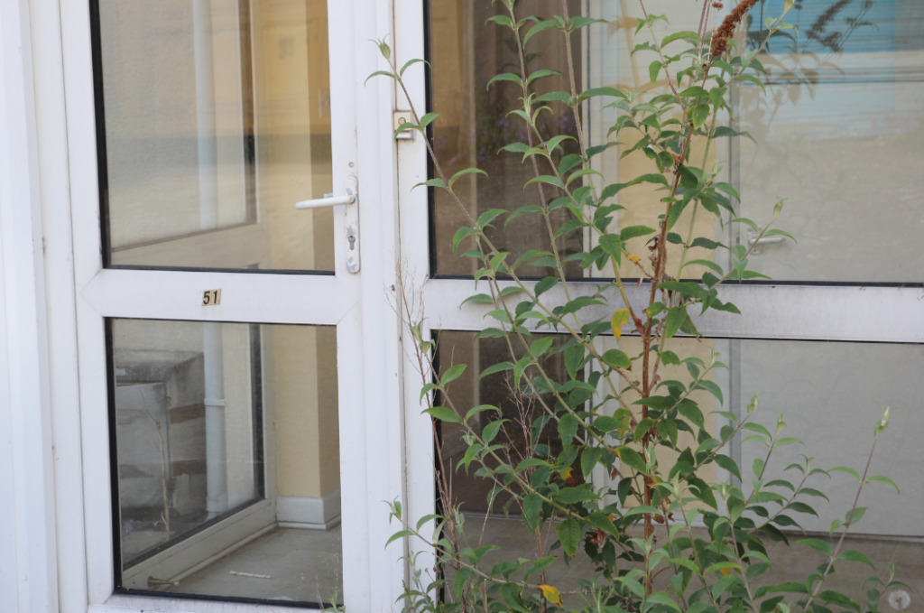
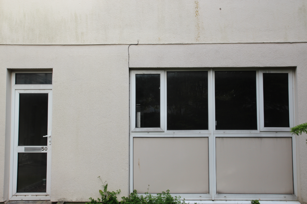
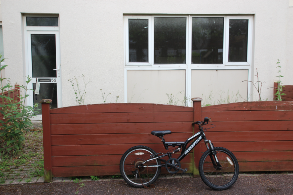
This edit and the one below are my two deadpan style images from this series – I used black and white again for these, but slightly more muted – I kept the exposure and whites up, to ensure the image didn’t get too dark as I added contrast and blacks.
Original 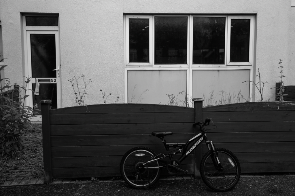
Edit
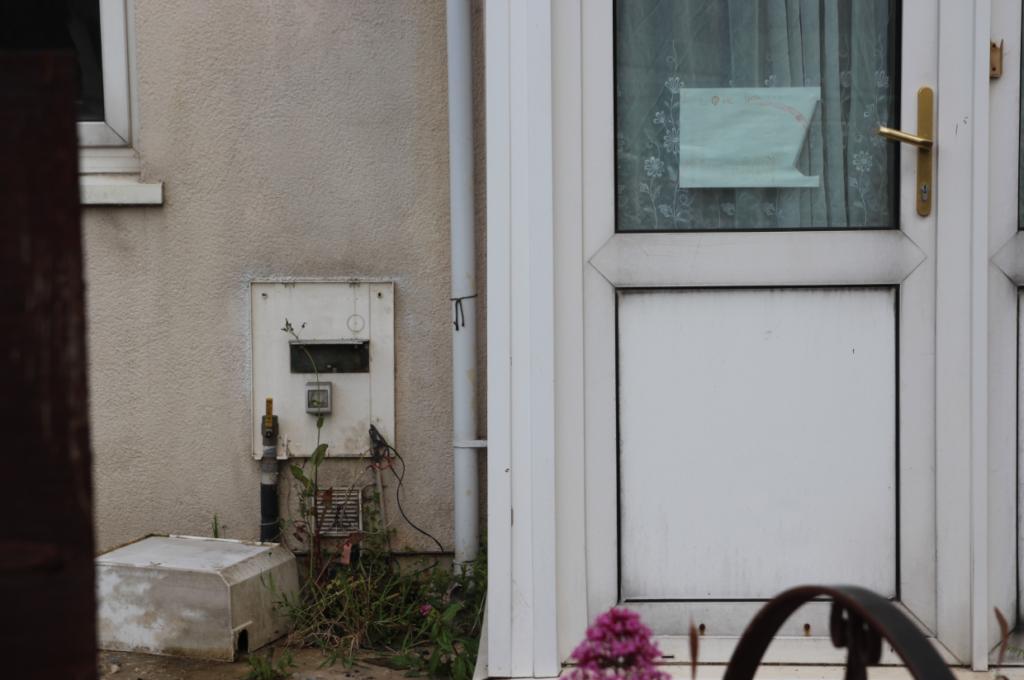
Original 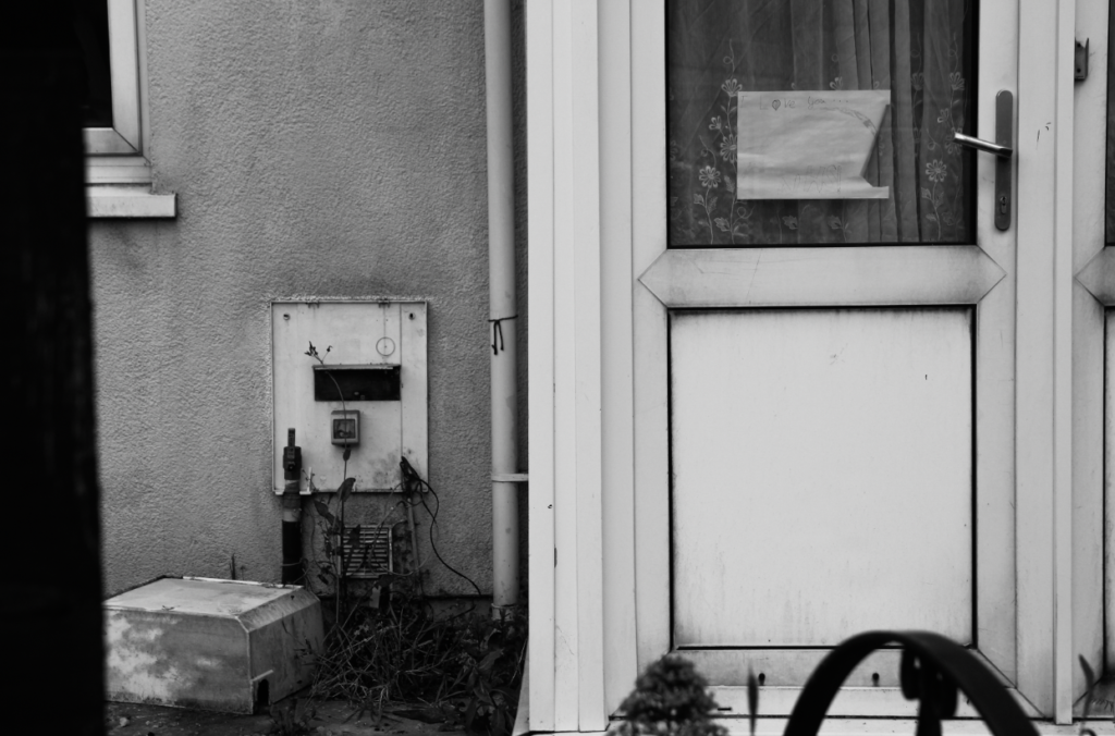
Edit
In this edit, I wanted to focus on the details in the image – I did this by using high contrast, but also using texture and clarity to ensure the fine details in this image stand out.
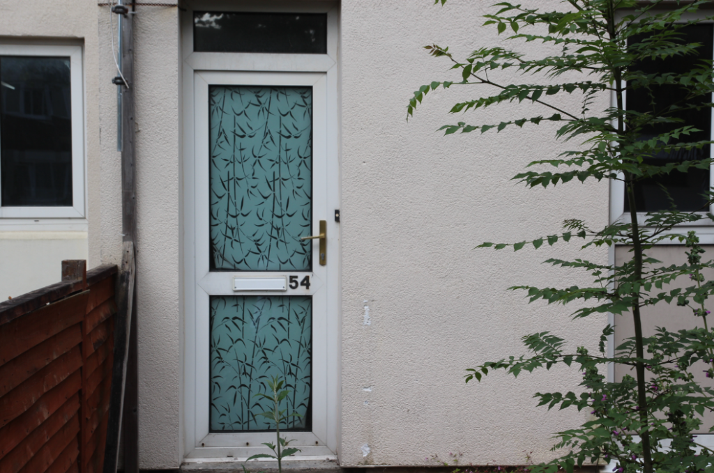
Original 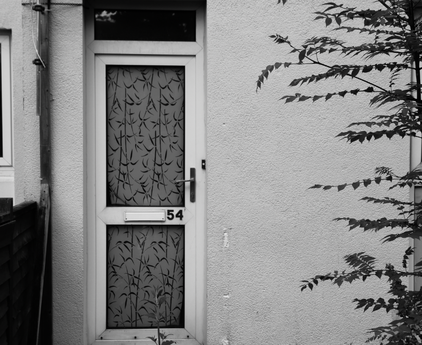
Edit
In this image, cropping in my editing was very important. I wanted the main focal point of this image to be the door, so I cropped the image in tighter – I left a little of the leaves to the side, as the darkness of the leaves when in black and white toned in well with the darkness of the door and fence – therefore I think cropping and editing in Black and white for this image made all the parts work more cohesively together.
Original 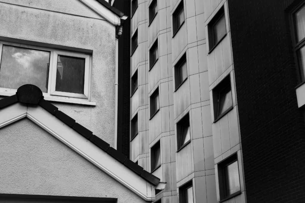
Edit
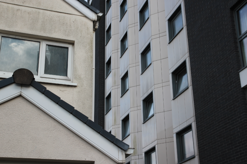
Due to the strong sense of geometric shape and line in this image, I thought that editing in black and white with high contrast would fit well – the sense of line and shape in this image was strengthened by the use of clarity, texture, and contrasting blacks and whites.
Other examples of my editing
Evaluation of my editing
Overall, for this project, I think my editing was quite successful. As I was editing, I thought about each particular part of an image, and how the different parts would work together with different editing tools. I think that black and white was the right choice with my types of images – the high contrasted nature of my edits helped to highlight the strong sense of line and repetition in my images, as well as helping to contrast the light and dark elements of my images, which were often strong. These pictures were taken on overcast days, which produced bright and sometimes overexposed images – editing in black and white helped this, as it blended the blacks and whites in the whole image, not just highlighting overexposure in one area.
Links to my theme and artist references
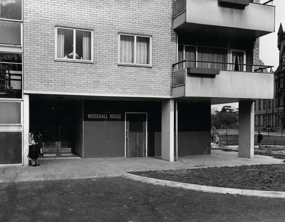
I think that my editing links well to my idea of documenting the reality of the housing crisis – black and white allowed me to show the plain reality of my area I was photographing, without glossing over anything or hiding any ‘unwanted’ parts of my images. My work I think links closely with the work and comparisons of Sharon O’Neill. – both the images she was comparing to, and hers. Even though Sharon was comparing time directly in her series, by using archive images from the architect of the building, and I did not use direct comparisons, I think that my work still comments on the passing of time, and ‘desirability’ or ‘undesirability’ of an area, like Sharon O’neill did, – I showed how buildings that used to be ‘desirable’ when built, have now been discarded, overtaken by newer buildings – showing evidence of the lives of those who lived in flats, and also the architecture of those still lived in with my images from housing estates not abandoned.
Sharon O’neill 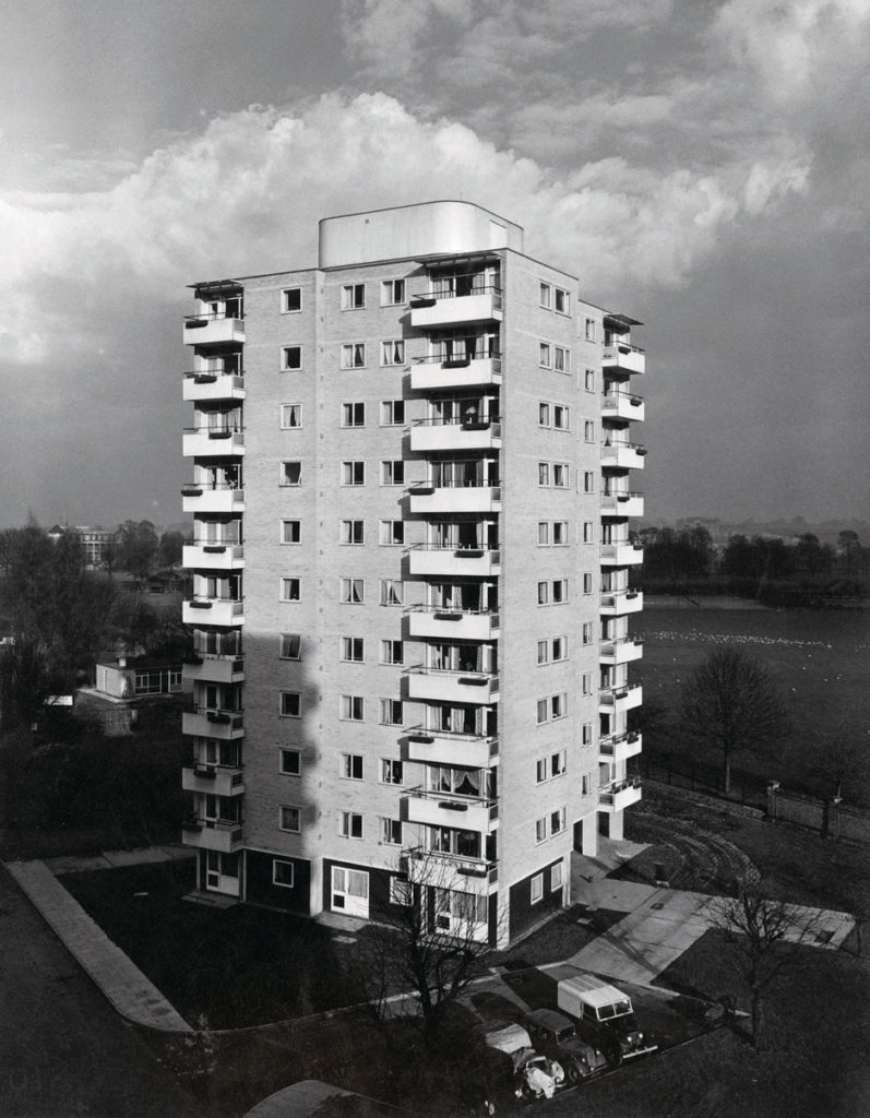
Sharon O’neill 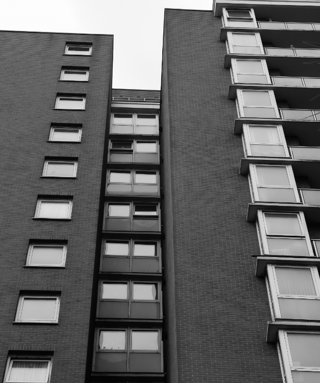
My work 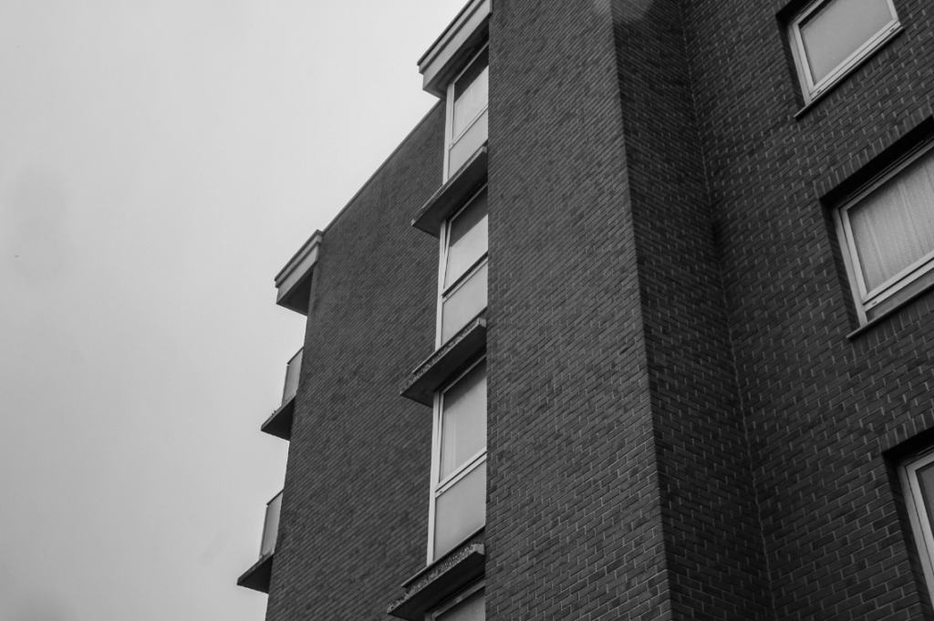
My work
Furthermore, although my images are not edited in colour, I think the deadpan style and angles, as well as the actual subjects, link very closely to Peter Mitchell. However, after comparing my image with Peter’s, I realise that to mimic his style of shooting, I should have used less zoom on my images, with the whole building in shot. However, I think that the theme of Peter Mitchell’s work, photographing the mundane, links heavily to my work – I tried to inspire my work by his in this aspect, by photographing the mundane reality of what parts of St Helier look like as a result of the growing housing crisis and wealth divide.
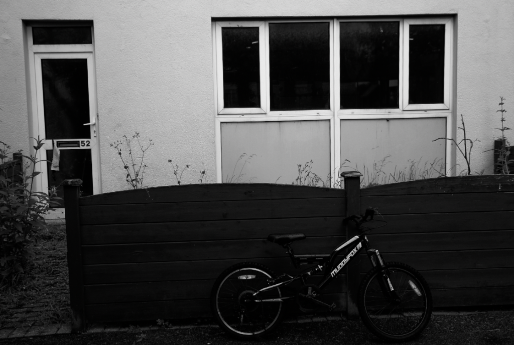
My work 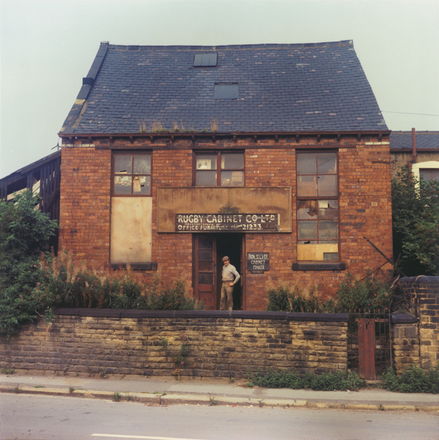
Peter Mitchell
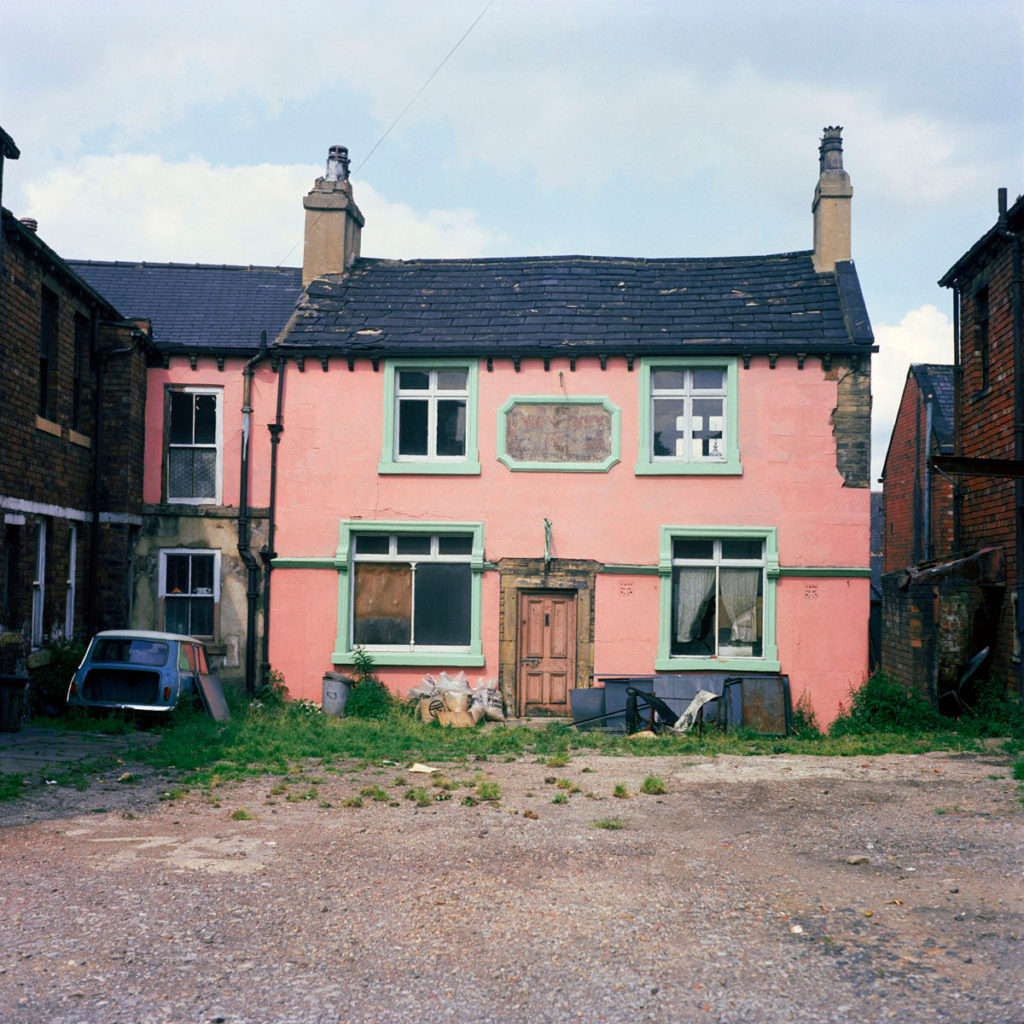
Peter Mitchell 
My work


