During my visit to Hamptonne, I took pictures of objects within and around the farm. These objects were a mix of things such as crockery, food, clothing, personal objects and books.
A contact sheet of my object images: using colour label (green) to set images apart from one another. Also using white flags to show my best images in my selection.
My Best Images
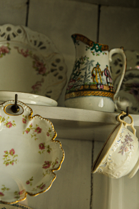
Edited – adding things like grain, shadow and contrast. I also changed temperature and tint in this image to combat the overly yellow tones, by adding cooler blues and adding contrast. This im age is lit from the right – the objects were inside a glass cabinet which created interesting reflections on the objects and added unusual shadows.
Edited – added basic editing tools but also grain and vignette to add depth and mood. This image was lit from the right naturally from a window – this created soft shadow and light, helping to add shape and aided my image to not be as flat.
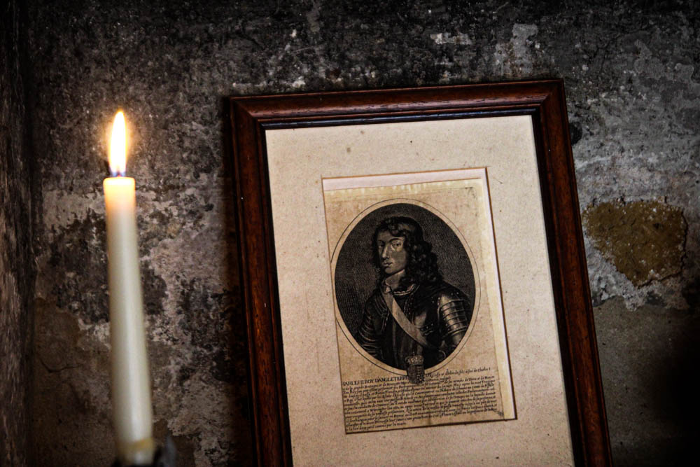
Edited – I struggled with this image due to the backlit nature of the picture. I combatted overexposure in the corners of this image with increasing vibrance of warmth to really bring forward the green, brown and orange tones.
Edited – i turned this image black and white – I did this to accentuate the high shadow and dark tones, and to help to combat the yellow tones in the image. I also added grain, and after adding a preset “high contrast B and W”, I added further grain and contrast, as well as a slight vignette.
The before and after – shadows are shown better and overly yellow image corrected.
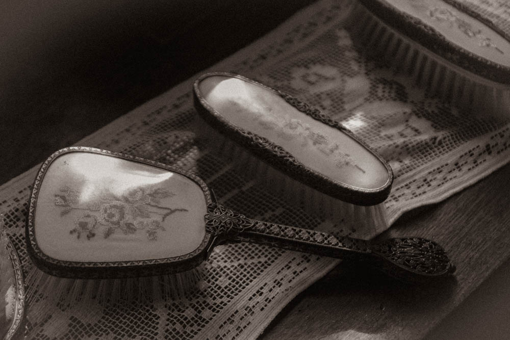
Edited – after increasing contrast, and decreasing exposure, I used a preset: “sepia toned B and W” I then added grain, shadows and slight highlights to show the light on the top of the brushes, coming from the window that is lighting the image.